SHAPE
Cambrian College School of Arts and Design
GRAPHIC DESIGN GRADUATING CLASS OF 2011
Adam Rekela Chantal Larochelle Darren Doucette David Ayer Jeff Martell Jessica Cashman Jessica Szydlowski
Kassandre Jolin Kayla Quinn Kristen Cavanagh Kyla Lytwynec Lucas Johnson Sarah Sabourin Shawn Hamilton
Stacy MoffatStephanie Aube Stephanie DeslogesStephanie Laprade Steven Fisher Tim Richer
What has shaped you?
I am, as the saying goes, "a product of my environment", shaped by the will and aspirations of my parents and the continual drive that my wife and children provide me with. Through diligence and hard ethics, I have finally found my way to the career I had envisioned for myself since I was 11 years old. Life has a funny way of meandering, but when you are dedicated and don't lose sight of your end-goal, you can achieve your dreams. If I had not had the backing of my wife Marlene, my son Jacob and my daughter Emily, I would not have made it through the long hours of homework, hard financial times, and governmental bureaucracies, to reach the end of my race and become a graphic designer.
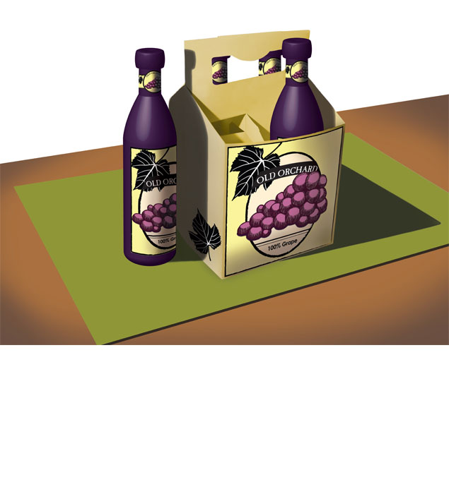
package design
In this project the problem was to create a mock-up of a 4-bottle package along with a design for a particular style of beverage to utilize this package. My solution was a redesign of OLD ORCHARD'S. Their usual look is modern and simple. I felt that an old style look was more indicative of their ideology of fresh, all natural juices. I replaced their current look with one of old illustrative style, muted colour pallette and more traditional looking label. I also choose to redesign the style of bottle that OLD ORCHARD uses as well, I felt that to go with the more classical look an elegant wine-like bottle would be appropriate.
 return to top
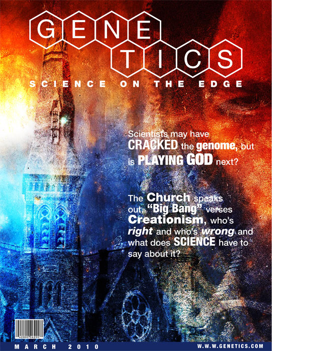
editorial cover
This project involved a start to finish production of a magazine cover. I was required to research the demographic, create the masthead, research articles and create the cover image to appeal to the demographic I had based the magazine on, a look at genetics and the pros and cons of its use in science. This magazine would carry interviews and current scientific articles into not only genetics but also fringe sciences and their impact on society.
package design
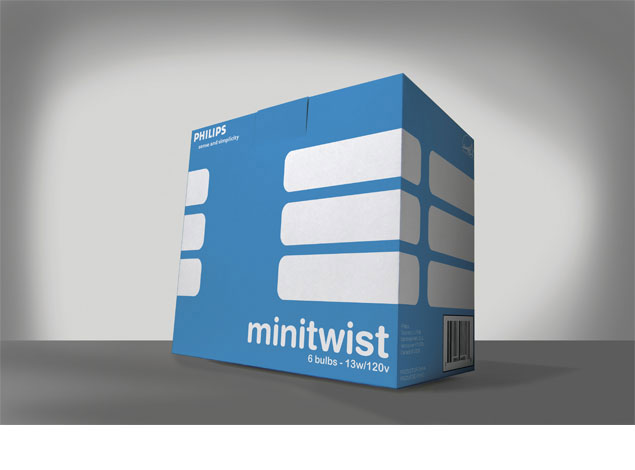
Similar in context to the 4-bottle package, this project required the creation of a package that would hold six PHILIPS 13w fluorescent bulbs. The project required us to come up with a name for the bulb; to keep in mind that these bulbs were designed to be eco-friendly and our packaging should reflect that. I chose to utilize a 2 colour abstract view to represent the shape of the bulb. When stacked side-by-side the boxes would continue the image unbroken, creating a mosaic of abstract bulbs. I chose to use Helvetica Rounded as this type reflects the image I had created without having to develop my own logotype.
poster design
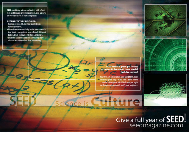
This playful layout piece was designed as a multi-fold insert. The task was to create a look that combined the idea held true by the magazine itself, i.e. a mix of science and culture. Three of the images on this piece (the three images on the right side) are not mine, they are stock photography. The main image of this insert is made up of a combination of layers starting out with a drawing of a mathematical equation I found in a text book. I used Myriad Pro as the font family as it lent a scientific sans-serif look to the piece and had a large range of variations for the different type layouts required.