SHAPE
Cambrian College School of Arts and Design
GRAPHIC DESIGN GRADUATING CLASS OF 2011
Adam Rekela Chantal Larochelle Darren Doucette David Ayer Jeff Martell Jessica Cashman Jessica Szydlowski
Kassandre Jolin Kayla Quinn Kristen Cavanagh Kyla Lytwynec Lucas Johnson Sarah Sabourin Shawn Hamilton
Stacy Moffat Stephanie Aube Stephanie Desloges Stephanie Laprade Steven Fisher Tim Richer
What has shaped you?
I'm greatly inspired by a few outstanding artists; the masters of abstraction who invoke deep thought through distilling realism to the bare minimum. Pablo Picasso, Jackson Pollock and Wassily Kandinsky all shaped the way I, as a designer and as an artist, look at the world around me. You must completely understand the subject in its original state before you can begin contorting and simplifying its reality.
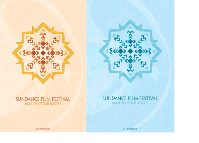
poster design
Challenge: To create a promotional poster for the Sundance Film Festival. Solution: I traced Sundance back to it's native roots where I was inspired by their geometric tapestry weaving. The illustrations reflect a sunburst/snowflake as well as a light flare to tie in to the film festival.
 return to top
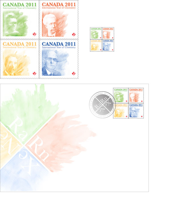
stamp design
Challenge: To design a stamp collection for the International Year of Chemistry 2011. Solution: Year 2011 was the 100th year anniversary of Marie Curie's discovery of radium. Through my research I discovered radium was used in some colour pigments, thus providing the inspiration for my illustrations. I expanded this idea to include other great chemists that discovered other elements that also had a use in the creation of the corresponding colour pigments.
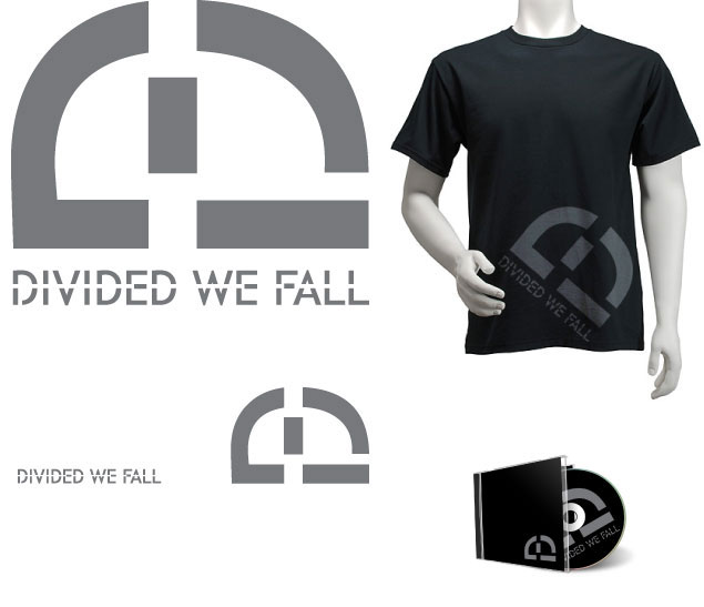
corporate identity
Challenge: To develop a brand identity for a heavy metal band. Solution: Through research I came to the conclusion that a clean legible logo immediately distinguishes Divided We Fall from other heavy metal groups. The logo incorporates "D", "W" and "F", allowing it to be versatile with or without the typography.
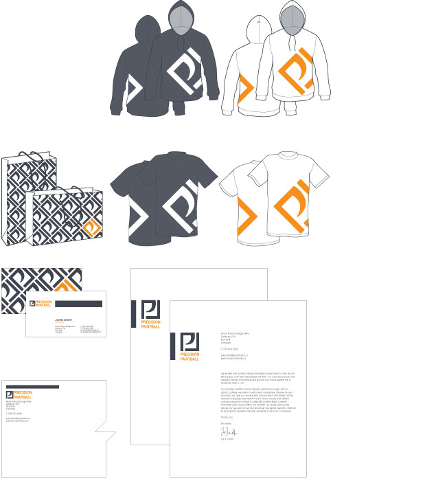
corporate identity
Challenge: To redesign and develop a corporate ID of an existing company, "Dodge This". Solution: The new name for "Dodge This" was developed, along with the new logo, to sophisticate the company's identity. Precision Paintball allows for the consumer to relate to what the company is specifically, and not confuse it with any other unrelated franchise. The slick geometric shape of the logo presents the visual of a "P" that can represent the company name, Precision Paint. Also apparent in the logo is a profile view of a gun trigger.