SHAPE
Cambrian College School of Arts and Design
GRAPHIC DESIGN GRADUATING CLASS OF 2011
Adam Rekela Chantal Larochelle Darren Doucette David Ayer Jeff Martell Jessica Cashman Jessica Szydlowski
Kassandre Jolin Kayla Quinn Kristen Cavanagh Kyla Lytwynec Lucas Johnson Sarah Sabourin Shawn Hamilton
Stacy MoffatStephanie Aube Stephanie Desloges Stephanie Laprade Steven Fisher Tim Richer
What has shaped you?
From a young age I've been interested in the arts, and my appreciation grew as I got older. I enjoy things that can be improved upon and refined. I find influence from everywhere and learn by experience. I love to know what the world has to offer and find solace in knowing that I have so much else to learn. I utilize, but do not rely on technology and I'm always looking for new methods and new outcomes.
thesis
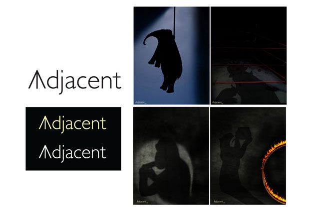
"Adjacent" was created to educate and provoke individuals to take action against animal cruelty, specifically captive animals, i.e. Circuses, Zoos... The word adjacent refers to the way we should live with wildlife. Live adjacent to, not interfere with. Yellow is used in the logo because it symbolizes warm and optimism, as well as warning or urgency. The vertical line in the A refers to the geometric definition of adjacent. The idea behind the poster campaign is that the animals shown have become so demoralized from the abuse and poor living conditions they are taking their own lives.
 return to top
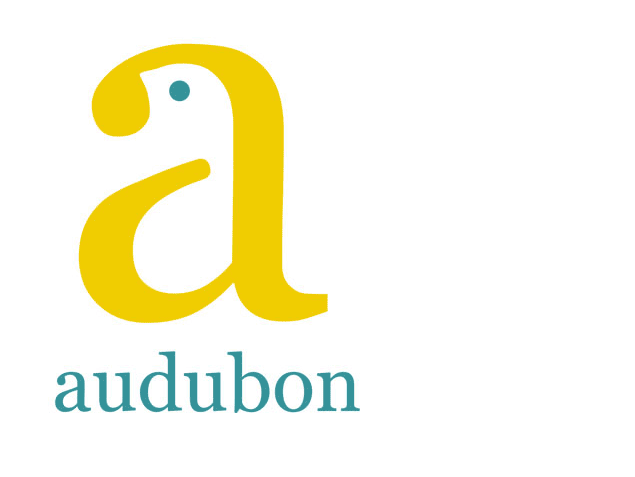
corporate identity
The logo for the Audubon Society needed to be both clean and benign, while combining a sense of comfort, with urgency. The letter "a" itself symbolizes beginning and structure, and of course the first letter in the name Audubon. By slightly altering and adding a single dot, the logo is now both an "a" and a small bird. The colour represents birds in general, yellow being a distinguished and prominent colour for birds. The tone of the yellow is powerful enough to stand on it's own against most backgrounds, while remaining dignified and calm. i.e. not overly loud. The colour of the typeface and the "eye" of the bird keep the logo natural and respectful. The overall simplicity and welcoming quality of the logo is highlighted by the clean and organic look of the typeface, which reinforces the caring and conservative feel of the organization. The entire logo comes together with a warm, hospitable feel, conveying a since of peace and reassurance.
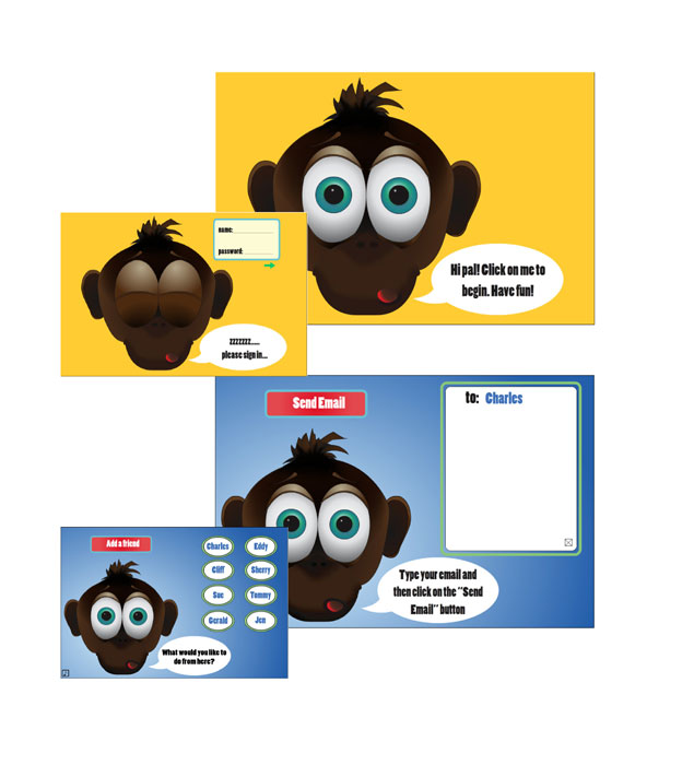
e-mail interface
The challenge behind this piece was to create an easy to use e-mail interface for children around the age of 5. I decided to use a friendly character to guide them through the process and what better to use than a monkey. He greets the user and makes the experience rewarding and fun for the child. Sound effects and subtle animations were utilized to enhance the experience. All buttons and type are large and easy to read. Colours are generally primary and contrasting.
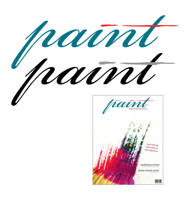
editorial cover
With this piece I wanted to symbolize an actual paintbrush stroke with stylized type. The typeface is smooth and flowing, complimented with an even more "brush like" dot on the "i" and cross on the "t". The main colour is used to assist in the appearance of paint and to give a calm, friendly feeling. The red stroke completes the piece and adds character to catch the eye and force interest.