SHAPE
Cambrian College School of Arts and Design
GRAPHIC DESIGN GRADUATING CLASS OF 2011
Adam Rekela Chantal Larochelle Darren Doucette David Ayer Jeff Martell Jessica Cashman Jessica Szydlowski
Kassandre Jolin Kayla Quinn Kristen Cavanagh Kyla Lytwynec Lucas Johnson Sarah Sabourin Shawn Hamilton
Stacy MoffatStephanie Aube Stephanie Desloges Stephanie Laprade Steven Fisher Tim Richer
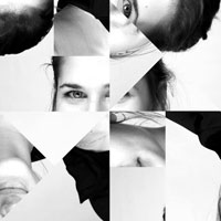
What has shaped you?
I am shaped by my core values, which define the contours of my edge. My journey in creating my values has given me the building blocks to grow my understanding of visual concepts. As graphic designers, we have every aspect of design at our disposal, but it is my interpretation and personal identity that allows me to leave an impression. Anyone can create a shape, but I create movement, emphasis, balance and unity within these shapes. Through a combination of teachings from professional designers and my own creative thoughts, my career is beginning to take shape, which will only grow and evolve with every lesson learned.
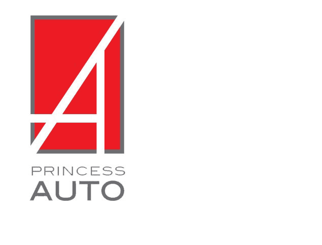
corporate identity
Challenge: To improve and re-design the existing Princess Auto brand logo. Solution: I attempted to offer a simple design that would allow the symbol itself to be recognized without the company name present. Straight and bold white lines carve out an "A" on a sporty red canvas. The automobile theme in supported by the straight lines intersect like roads on a map.
 return to top
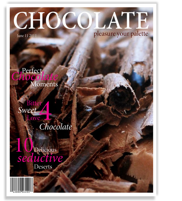
editorial cover
Challenge: To produce an effective design for magazine and masthead applications, tailored to a specific demographic. Solution: I created a dessert magazine targeted at women, aged 25-35, with a higher income and social status. Topics related to desserts also integrate aspects of everyday life including health, food, love, and leisure. My cover, a simple, yet elegant shot of shaved chocolate provides an appealing look to the cover and lures the eyes. The name, CHOCOLATE has a bite out of it, implying that the entire magazine is edible.
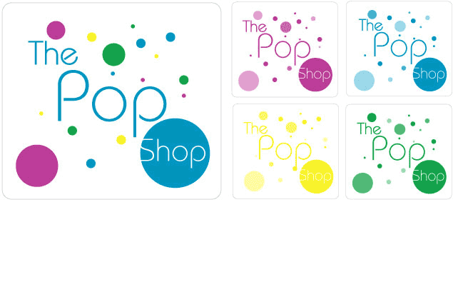
packaging design
Challenge: The objective was to define a unique characteristic element to the Pop Shop package design. Solution: I focused on the bubbles of the pop, utilizing white space to make the design appear clean and crisp. The key was to give it a new carbonated look to attract and inform pop lovers.
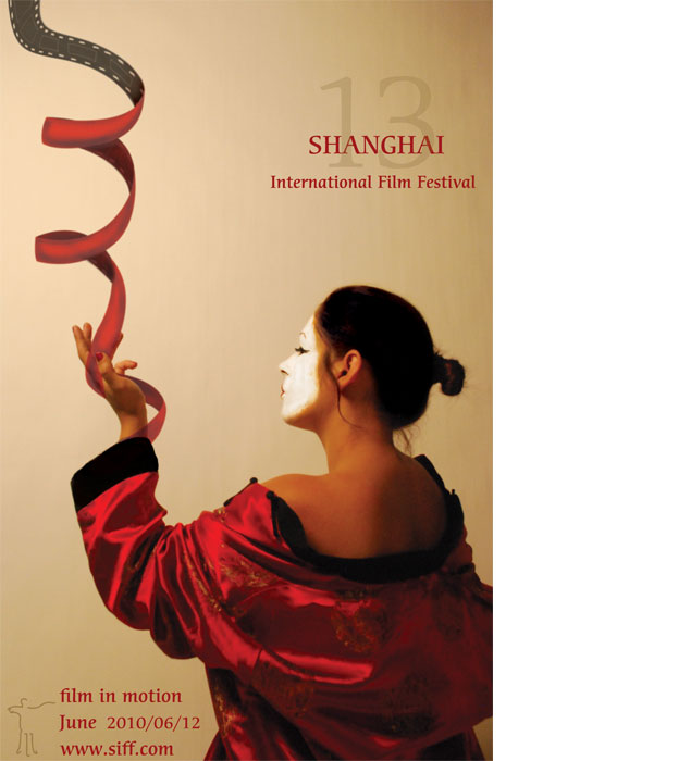
poster design
Challenge: Create a modernistic design poster for the Shanghai International Film Festival, yet keep with tradition. Solution: A film festival and cultural theme become one simplified image. It is achieved through an elegant photo of a geisha twirling a ribbon that finishes as cinema film. Striking typography brings together the image and festival information.