SHAPE
Cambrian College School of Arts and Design
GRAPHIC DESIGN GRADUATING CLASS OF 2011
Adam Rekela Chantal Larochelle Darren Doucette David Ayer Jeff Martell Jessica Cashman Jessica Szydlowski
Kassandre Jolin Kayla Quinn Kristen Cavanagh Kyla Lytwynec Lucas Johnson Sarah Sabourin Shawn Hamilton
Stacy MoffatStephanie Aube Stephanie DeslogesStephanie Laprade Steven Fisher Tim Richer

What has shaped you?
What has shaped me, is the need for more sustainable products and designs that from start to finish, have a smaller carbon footprint and can bring value to our society. We can no longer create things that are meant to be disposable. Too many products and designs are wasteful of resources and have no regard for the environment. It has been my goal to find ways to change the way we view "disposable" products, and with designers like Chris Hacker who have raised the bar for sustainable design, it is not hard to see where it can go from here.
corporate identity
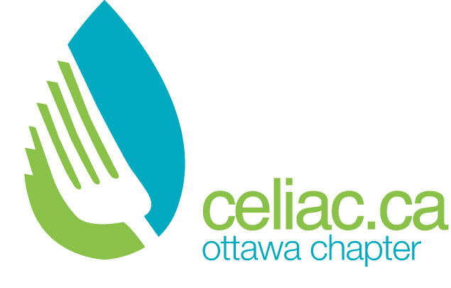
The Canadian Celiac Association is an online entity that helps give advice for those who suffer with the disease. The problem with their current logo is that it looks identical to many other gluten-free companies which encompasses an image of wheat with a bar through it to signify it's bad. The solution to this negative image was to focus on remedies to sooth a sore stomach. The new logo is representative of a mint leaf and a utensil and is much more friendly and inviting.
 return to top
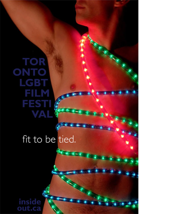
poster design
The Toronto Lesbian, Gay, Bisexual & Trans-gendered Film Festival needed a poster done that represented the lifestyle and attitudes of their community. Taking the shock factor and sexuality into the mix, the finished product shows this off without blatantly offending anyone. The shock factor ends up being more cheeky then offensive, which is the intent.
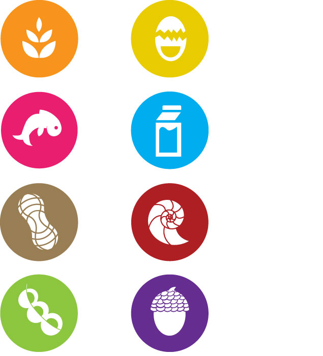
icon set
With food allergies being so prevalent today it would make sense that there is a standardized way to label food packages so everyone can easily determine if they can eat it or not. Unfortunately there is no such labelling system in place. These labels were designed for that purpose and would be placed on food packages in the area under the ingredients list to make it easy for everyone to find.
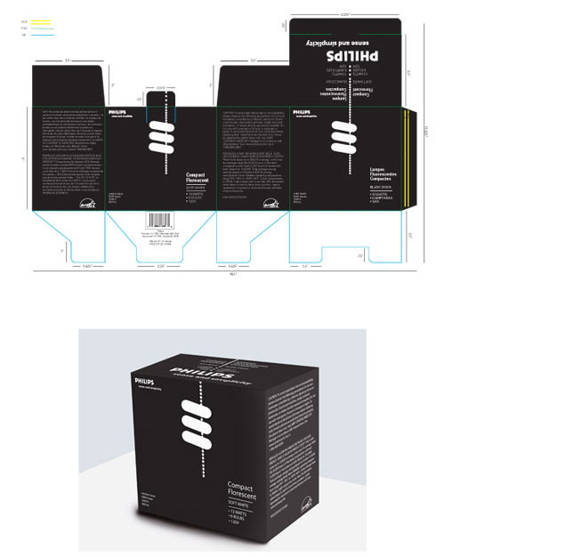
package design
The problem with light bulb boxes is that they all seem to look the same, and yet you can never find the important information you need within a few seconds of looking at the box. This redesign allows for the most sought after information to be front and center without any distractions. It's modern layout and monochromatic colours also make it stand out from all of the competition.