SHAPE
Cambrian College School of Arts and Design
GRAPHIC DESIGN GRADUATING CLASS OF 2011
Adam Rekela Chantal Larochelle Darren Doucette David Ayer Jeff Martell Jessica Cashman Jessica Szydlowski
Kassandre Jolin Kayla Quinn Kristen Cavanagh Kyla Lytwynec Lucas Johnson Sarah Sabourin Shawn Hamilton
Stacy MoffatStephanie Aube Stephanie Desloges Stephanie Laprade Steven Fisher Tim Richer
What has shaped you?
Less is more: this statement impacts the way I live and design. There is a need for more simplicity and eloquent messaging. Balance: that's what design is – visually and logically. Questions: why? Because finding answers is awesome.
poster design
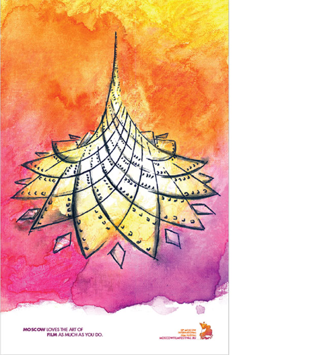
Solution: The Crystal Island superstructure is currently being built in Moscow. It will be a symbol of international recognition and cultural impact. Media: The colours directly reflect the festival's official palette. Materials such as hard canvas, ink, black marker and watercolour were used.
 return to top
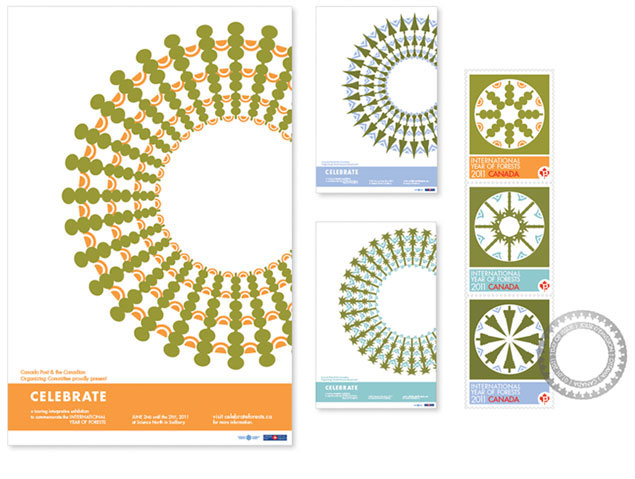
stamp design
Solution: The focus was to positively display an appreciation for the world's forests. Media/layout: The climate elements are used as complementary color and shape to the radial design. Different shades of green help differentiate the groups while staying consistent. Using a constructivist approach to the artwork played a role in keeping the design harmonious and contemporary.
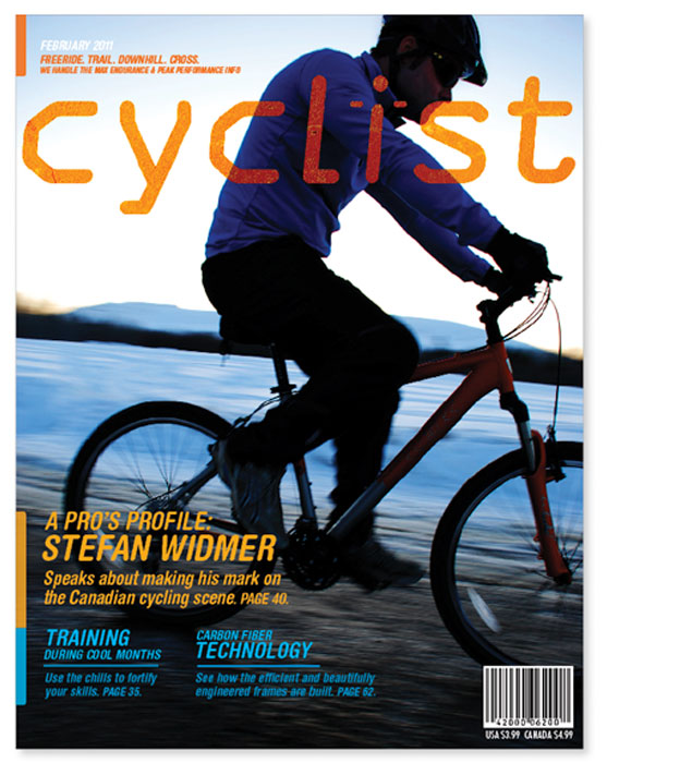
editorial cover
Solution: The magazine focuses on technical and performance aspect of biking. The masthead's font anatomy supports the technical aspect while its round edges add an organic touch. Media/layout: Sizing and colour association help create hierarchy of type. The bright orange is used in balance with the photo's blue tones.
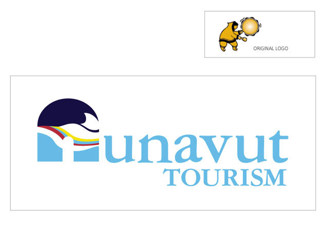
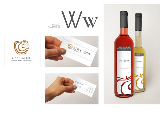
corporate identity
Solution: The tourism industry and culture of Nunavut are closely related to the vast and beautiful land. The goal was to create a feel of cool mystery and outdoor adventure. Media/layout: The logo is a digital illustration using a colour harmony which relates to the regional flag and cultural art. The modified serif font complements the curves of the main visual while providing a traditional finish.