SHAPE
Cambrian College School of Arts and Design
GRAPHIC DESIGN GRADUATING CLASS OF 2011
Adam Rekela Chantal Larochelle Darren Doucette David Ayer Jeff Martell Jessica Cashman Jessica Szydlowski
Kassandre Jolin Kayla Quinn Kristen Cavanagh Kyla Lytwynec Lucas Johnson Sarah Sabourin Shawn Hamilton
Stacy MoffatStephanie Aube Stephanie Desloges Stephanie Laprade Steven Fisher Tim Richer

What has shaped you?
I feel that the three years of this program have done the most to shape who I am. The reasoning that art can have a purpose and a function in society is a powerful insight. The many facets of design, and the impact one can make with a great piece of thought, is something I can say I am eager to strive for. To say that a single designer has helped shape me or to focus on one aspect of such a vast career seems too hard of a decision to make. I admire the risk takers like Stefan Sagmeister, the timeless quality of Massimo Vignelli, and the fresh typography of Paula Scher; true innovators of the industry. Every graphic designer looks towards these motivational and iconic individuals for inspiration. It is a great feeling to be able to say that my career choice has shaped my view on the world and has impacted how I live my life. I look forward to the opportunity to contribute to this field.
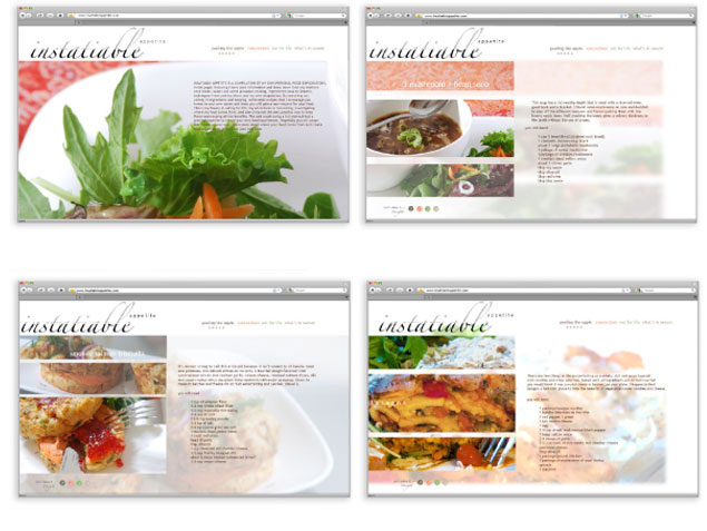
website design
Challenge: To interactively utilize photography Solution: Using the food photography as a main focal point I designed a website layout. The main menu being different colors pages are designated by an icon. Step-by-step instructions with further images are separated by another menu near the bottom of the page.
 return to top
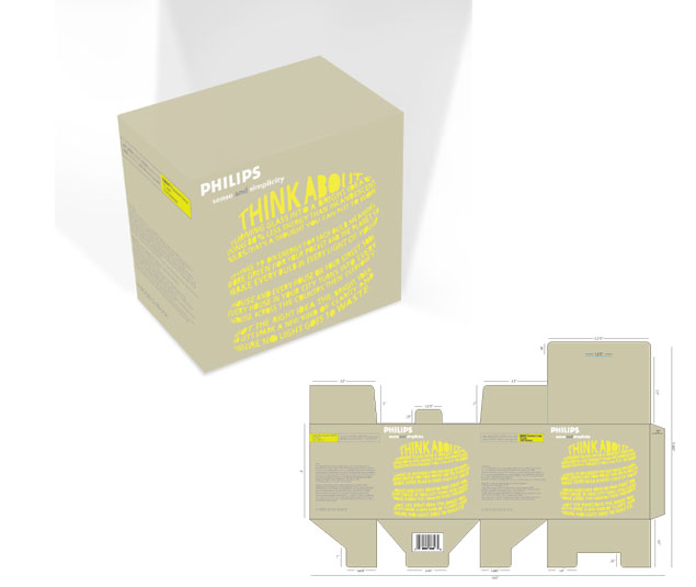
package design
Challenge: To design for an energy efficient bulb without resorting to common eco-friendly imagery. Solution: Using creative copy to highlight the benefits of the product and illustrate the product itself. The typographic style is more organic and the color choice is meant to give an impression of light emitting from the type.
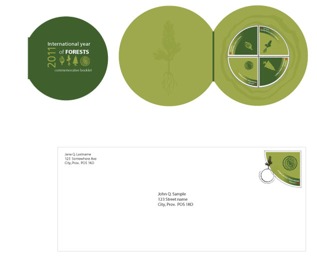
stamp design
Challenge: To design for an event in a creative way and confined space (stamp format). Solution: The shape of the stamp was changed to better accent the life-cycle of a tree. Icon-based imagery in a monochromatic color scheme.
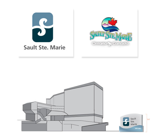
corporate identity
Challenge: To re-design an existing logo. Solution: Focusing on the natural resources of St. Mary's River and the new wind farm in Sault Ste. Marie the light and blue signify air and water. Sault Ste. Marie has a twin city in Michigan across this river that the dual colors also hint at. The white area implies an 'S' and is done in a script, almost wave-like fashion to soften the logo overall for a friendly appearance.