Noah Robinson
The hat I’m wearing is web/ui. This is an extremely vital skill as it often a first impression, strong ui can turn potential viewers into loyal clients.
The hat I’m wearing is web/ui. This is an extremely vital skill as it often a first impression, strong ui can turn potential viewers into loyal clients.
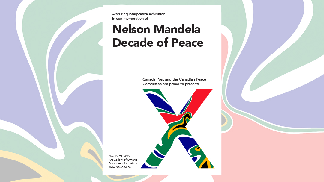
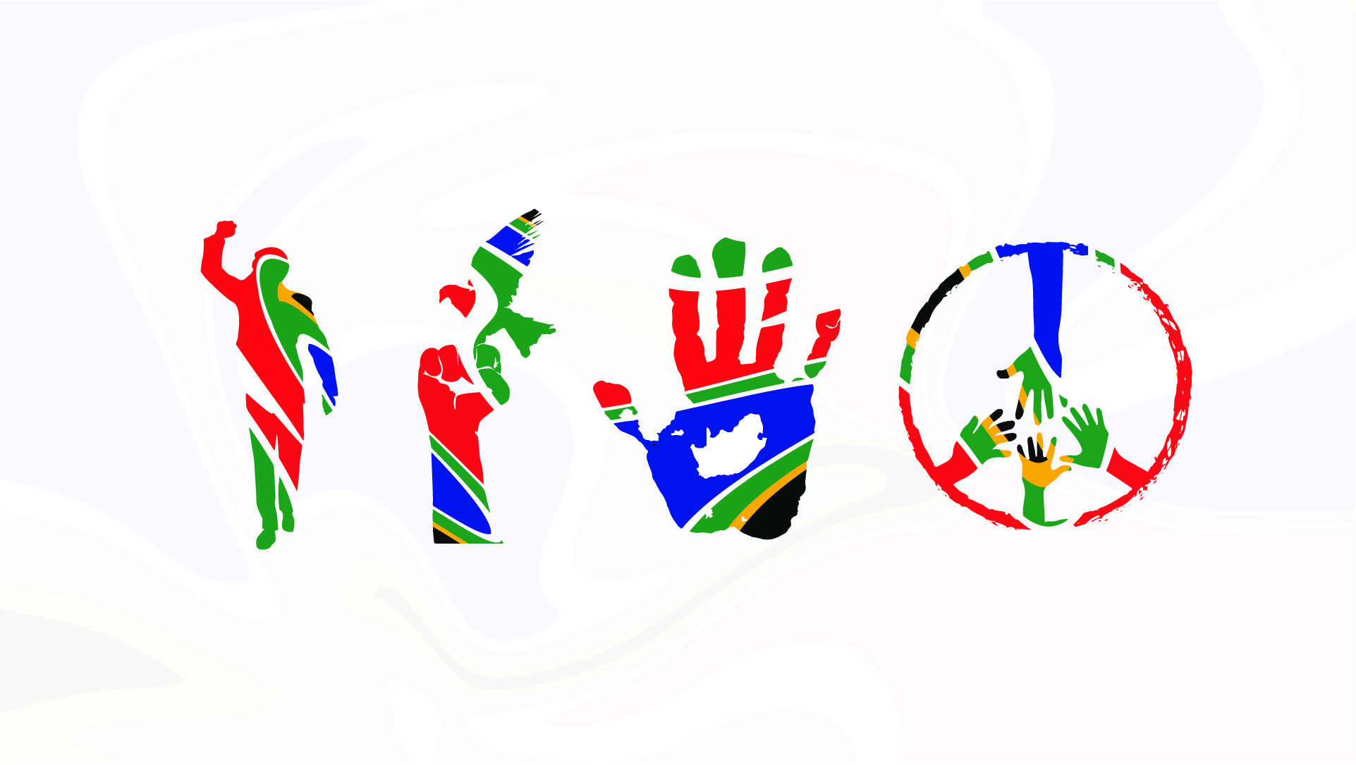
This assignment started out with a simple stamp design and grew to a full exhibition. I was lucky enough to get Nelson Mandela, Decade of Peace. This was a very exciting piece to work on and I really tried to experiment and create something different while using elements from Nelsons life. Each piece showcases his beliefs along with his home countries colors.
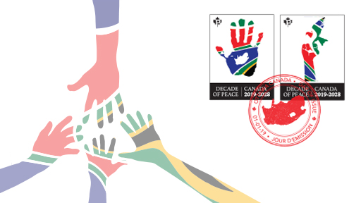
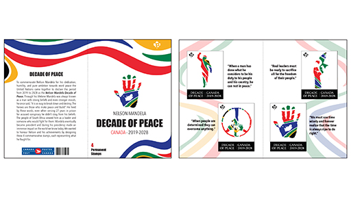
Throughout each piece I used the same color scheme (south African flag), as well as similar illustration styles. Seeing as the designs were fairly abstract I wanted the rest of the piece to be very minimal. In my opinion, the use of negative space increases the focus on the design.
This assignment taught me a great deal about research, after several revisions I really learned the importance of understanding what you're designing.
This assignment started out with a simple stamp design and grew to a full exhibition. I was lucky enough to get Nelson Mandela, Decade of Peace. This was a very exciting piece to work on and I really tried to experiment and create something different while using elements from Nelsons life. Each piece showcases his beliefs along with his home countries colors.
What is a Good Yute? It is someone with drive and motivation. My friends and I created a clothing brand/company which accumulated almost 1000 followers and thousands of views online. What seemed to start off as a fun passion project quickly escalated into a small business. This was a surreal experience for my friends and I as we learned how much one could do simply with the use of social media.
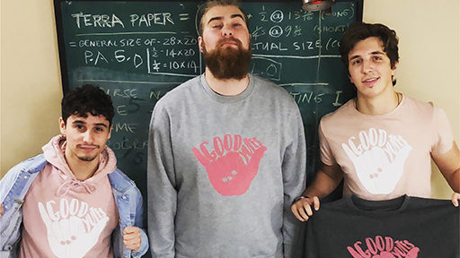
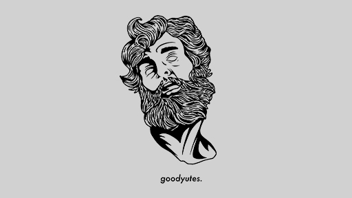
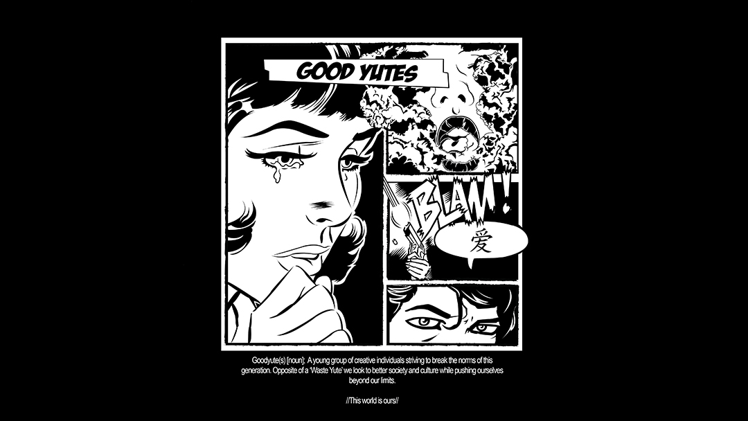
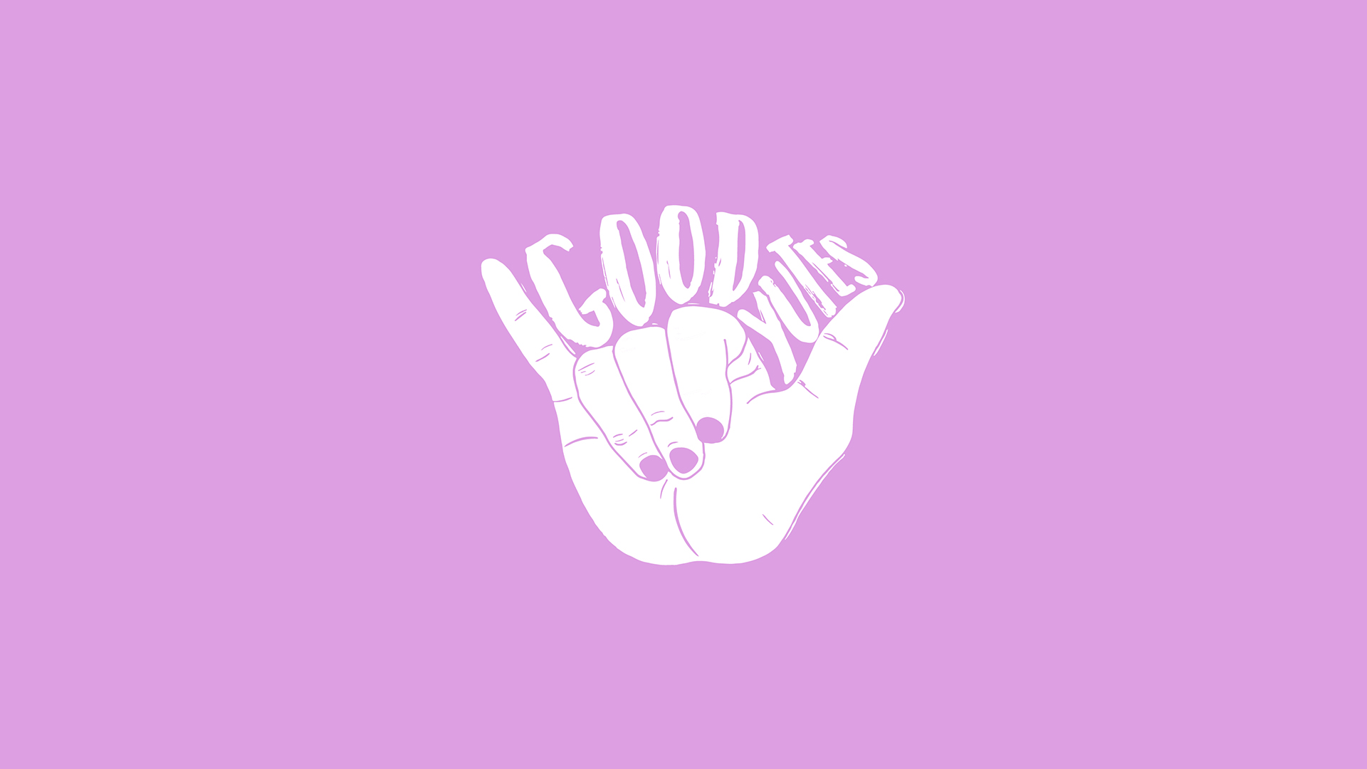
To the left you will see Ryan, Hunter and David (also graphic design students) after our first all-nighter screen printing sweaters. To the right (and below) is a few other designs I created for the brand.
We all made the decision to pause this project so that we could focus on school. Now that we are all graduating I am eager to continue working on the brand.
What is a Good Yute? It is someone with drive and motivation. My friends and I created a clothing brand/company which accumulated almost 1000 followers and thousands of views online. What seemed to start off as a fun passion project quickly escalated into a small business. This was a surreal experience for my friends and I as we learned how much one could do simply with the use of social media.
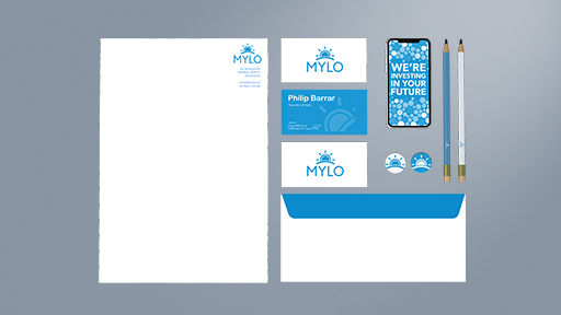
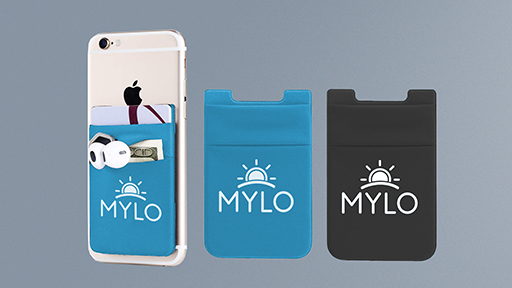
Last semester I was given the task to take an existing brand and give them a face-lift. I chose the Canadian banking app, Mylo. With this re-brand I created a new logo, chose a new identity color and created a few potential mock ups. My goal with this project was to re-brand the company without completely shocking the client, I didn't want the change to be too extreme so I stayed true to their original colors. With the simple changes made to the logo and branding guide I aimed for the company to have a friendlier approach.
With the new slogan were investing in your future I wanted to create a logo that would match those words and the overall image of the company. This is when I came up with the doubling meaning sun rise/coin design. One one end it looks like a coin being deposited, and it also looks like a sunrise. I found this to tie nicely into the idea of investing in your future.
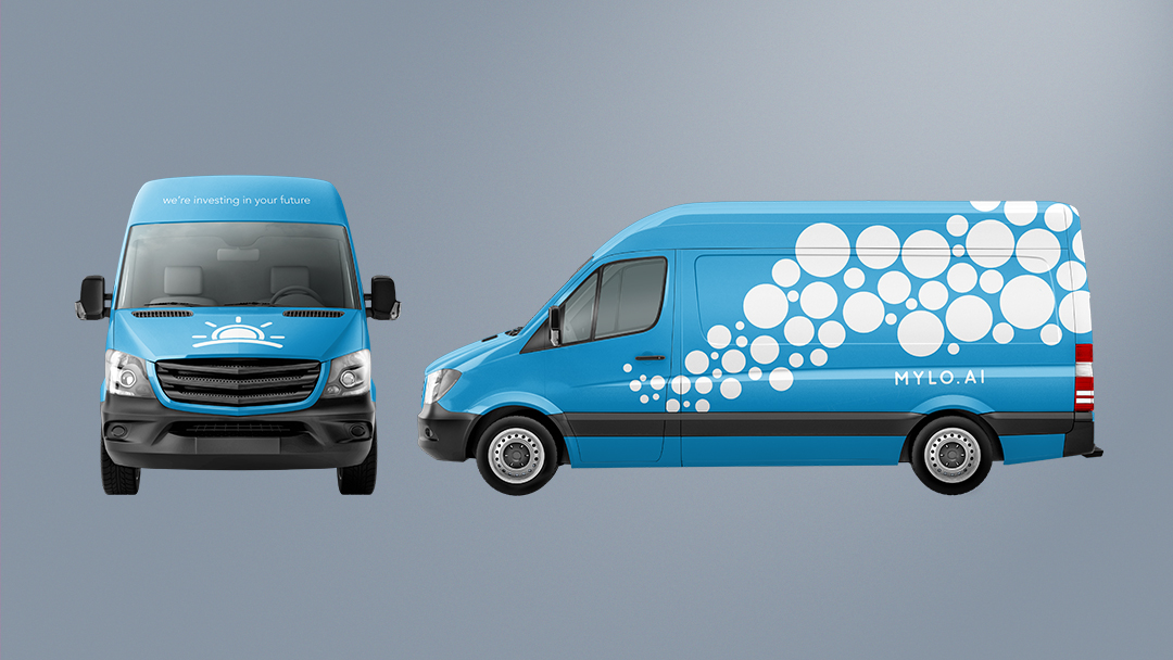
This was a very exciting project to work on as it allowed me to explore many ends of cooperate identity. I especially enjoyed implmenting my designs across various mediums such as buildings, vehicles, merchandise, etc.
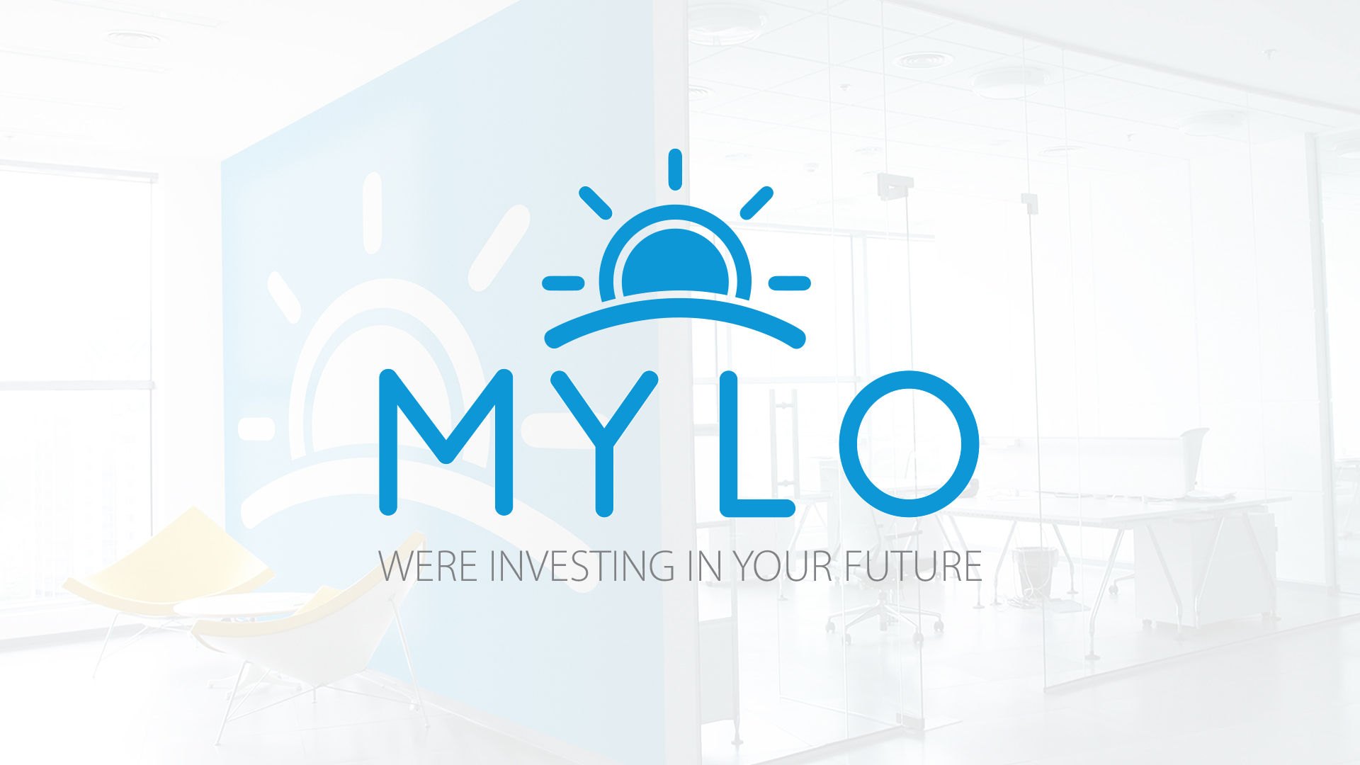
Last semester I was given the task to take an existing brand and give them a face-lift. I chose the Canadian banking app, Mylo. With this re-brand I created a new logo, chose a new identity color and created a few potential mock ups. My goal with this project was to re-brand the company without completely shocking the client, I didn't want the change to be too extreme so I stayed true to their original colors. With the simple changes made to the logo and branding guide I aimed for the company to have a friendlier approach.