David Gagnon
My favourite hat to wear is definitely advertising. I love the idea of being able to create something that can create a feeling in someone, that specifically benefits the brand or campaign the ad is working for.
My favourite hat to wear is definitely advertising. I love the idea of being able to create something that can create a feeling in someone, that specifically benefits the brand or campaign the ad is working for.
Compass Magazine is a self help/philosophy magazine with the goal of personal growth in mind. I started this project in my 2nd year typography class when we were tasked to use creative typography to create a masthead; mine was Compass. Then we continued the assignment into our editorial class and created a magazine around our masthead.
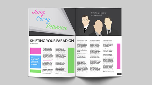
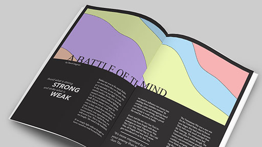
Each article was written by me and designed in a way to fit the information it contained. Copywriting was the longest part of this assignment, but also really enjoyable because it felt like I was really bringing this creation to life by giving it a voice.
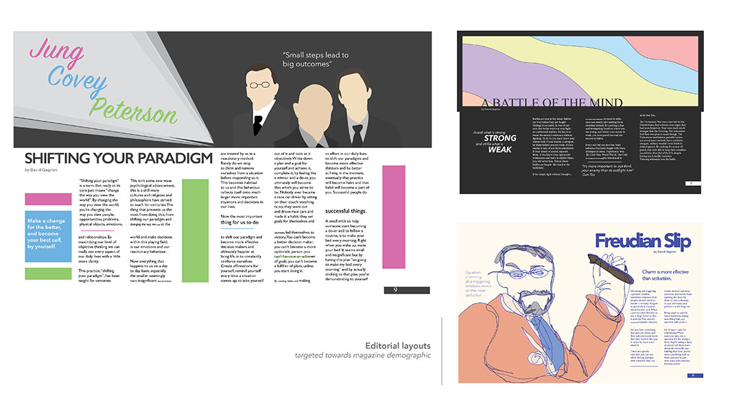
The artistic/design method for this assignment was quite fun to run through. I used an assortment of different mediums for different aspects of the magazine. For the articles I used specific illustrative styles, and for the cover I used a combination of photography and hand crafting. The chair on the front cover was made by 1 continuos

Compass Magazine is a self help/philosophy magazine with the goal of personal growth in mind. I started this project in my 2nd year typography class when we were tasked to use creative typography to create a masthead; mine was Compass. Then we continued the assignment into our editorial class and created a magazine around our masthead.
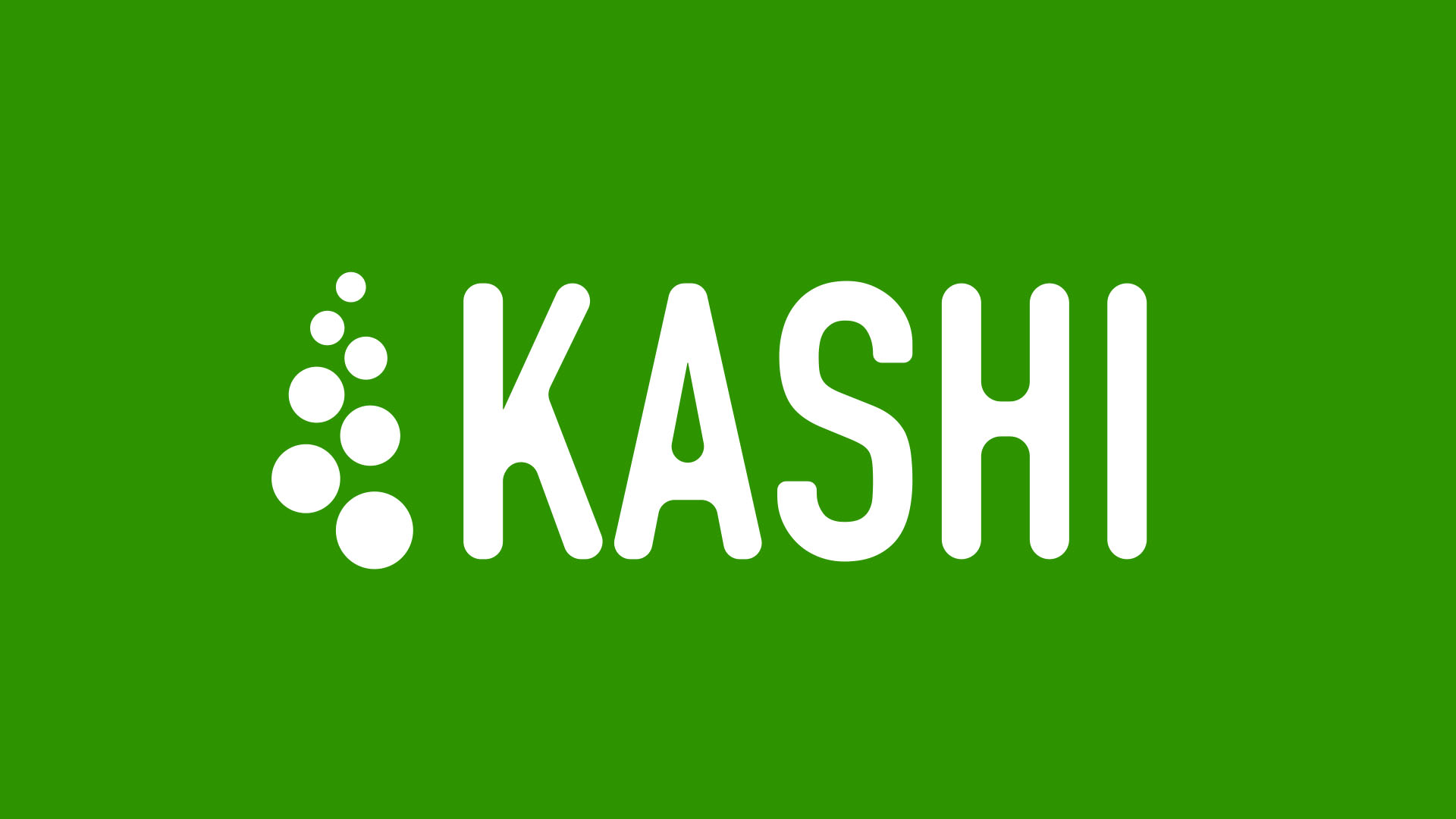
In corporate identity class, we were tasked with rebranding a company of our choice. I chose Kashi because I felt like the brand needed some refreshin, and a little bit of a modern touch to it. I didn't want to take away from the organic look and the relation it had to healthy living, but I also wanted to clean it up and make it more unique and modern.
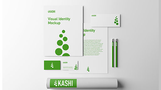
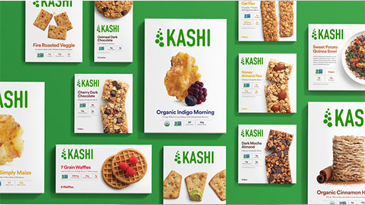
The biggest challenge for me with this rebrand was trying to keep the natural and organic theme, while also trying to completely modernize the logo. I had to take organic symbols and make them abstract. The symbol of the seven dots in the logo is an abstract simplified piece of wheat, which is a symbol they use in their old branding. Another bit of symbolism in the logo is the seven dots also represent the seven grains of Kashi; "the seven grain company".
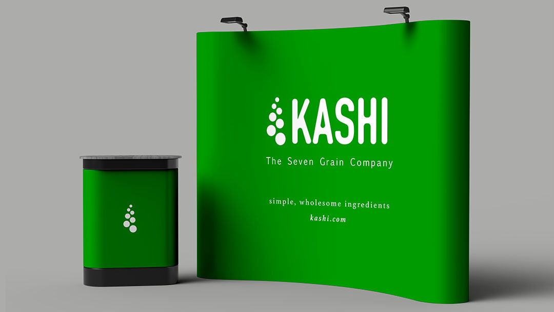
Another tough decision for me to make with the brand was the colors. I considered going completely black and white at first but decided in the end to stick with their choice of using an organic green color. I decided to choose a more playful green to once again modernize it and make it seem more fresh, rather than the more organic earthy green that they had used prior.
In corporate identity class, we were tasked with rebranding a company of our choice. I chose Kashi because I felt like the brand needed some refreshin, and a little bit of a modern touch to it. I didn't want to take away from the organic look and the relation it had to healthy living, but I also wanted to clean it up and make it more unique and modern.
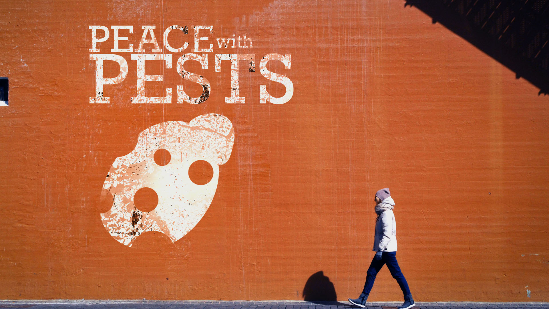
Peace with Pests is a campaign I created in support of the International Year of Plant Health. The task was to design a set of stamps for the Canadian Postal Service and create a campaign around your idea. The intention behind Peace with Pests is to bring awareness around the symbiotic nature that plants and crops have with pests, and we need to keep the balance healthy so that we don't sabotage our food security when it comes to farming and harvesting.
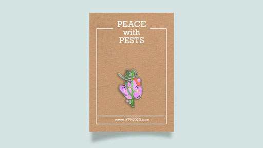
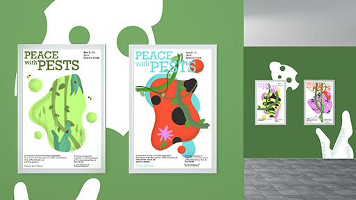
I decided to go with a design style that was reminiscent of children's books. I created abstract blobs and patterns to represent pests and crops that would give it alot of personality. I also tried to keep that same style consistent throughout the deliverables and packaging as well.
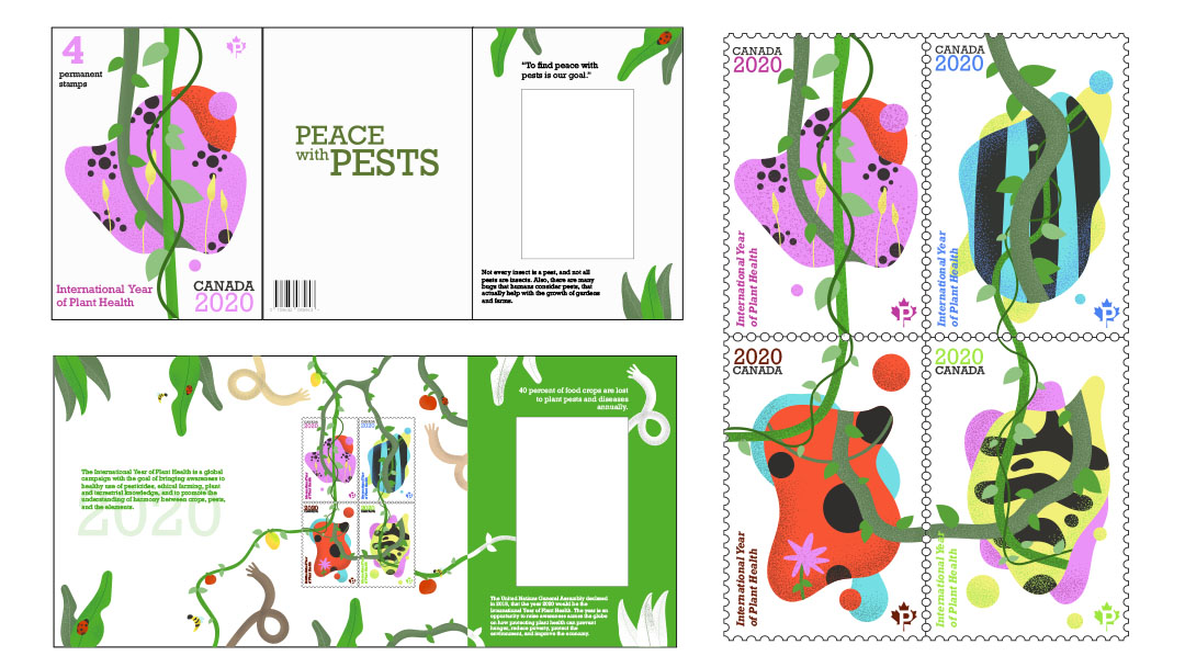
The packaging for the stamps was the most difficult part creatively because I had to think of an original way to represent this idea of opening up a story book that gets more and more visually stimulating as you go deeper.
Peace with Pests is a campaign I created in support of the International Year of Plant Health. The task was to design a set of stamps for the Canadian Postal Service and create a campaign around your idea. The intention behind Peace with Pests is to bring awareness around the symbiotic nature that plants and crops have with pests, and we need to keep the balance healthy so that we don't sabotage our food security when it comes to farming and harvesting.