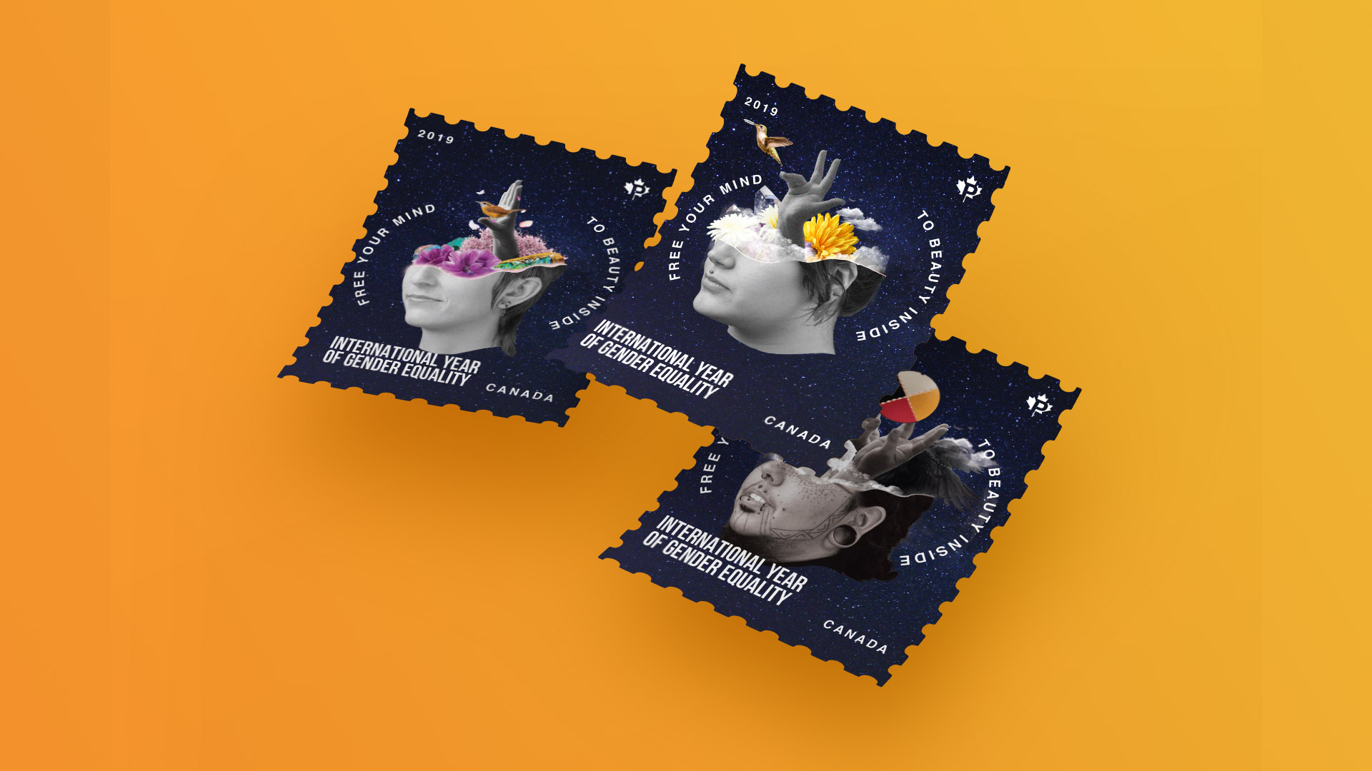
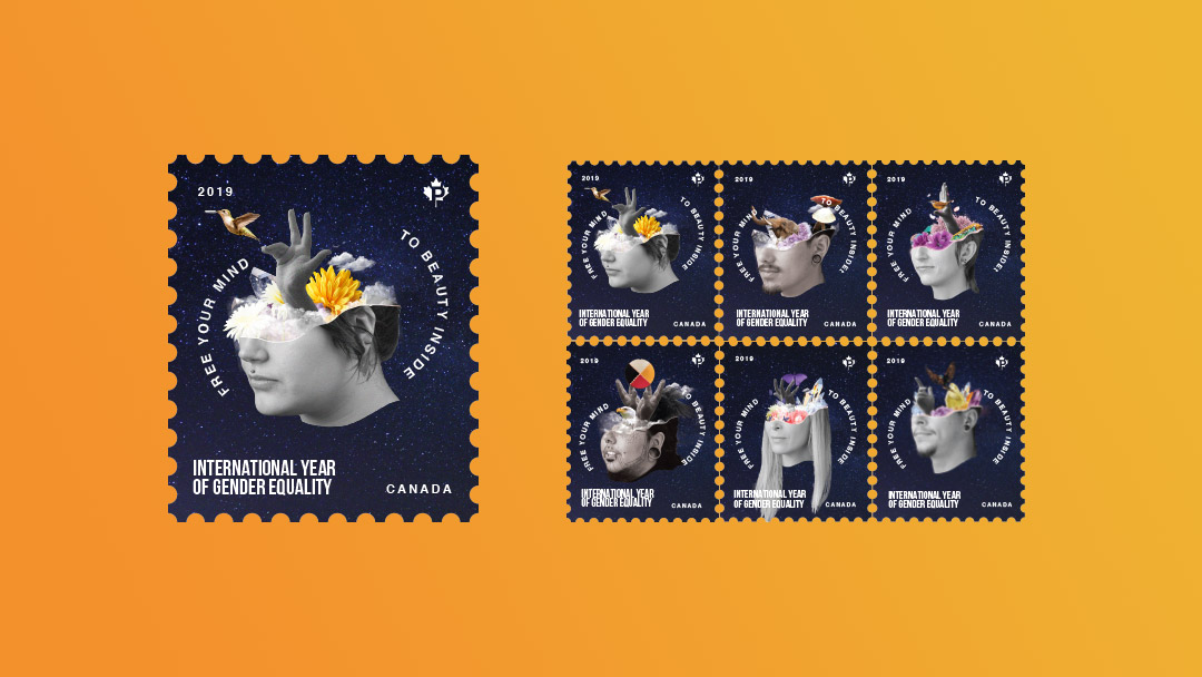
International Year of Gender Equality Stamps
Hats:
Photography
Communication
Print Design
When we think about gender even further, it is a very complicated topic. Gender is freedom. It is non-binary, it is fluid, it is non-discriminatory. As gender is such a grey area, and it is definitely not black and white – it was very challenging taking on a large concept.
What transcends gender, however? Our qualities, characteristics and attributes as people. This is what truly makes us equal – the idea that we have our own unique characteristics that make us human. I believe the concept that beyond gender, we all have unique qualities that transcend barriers.
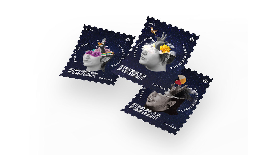
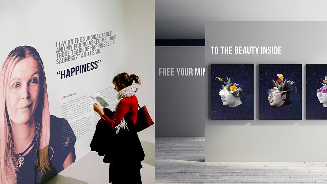
For International Year of Gender Equality, I created an all-inclusive stamp design. The main goals were to encapsulate themes of inclusivity, belonging and care for people of all genders and backgrounds through an artistic and conceptual approach. For each stamp, I photographed people ranging in identities, from bisexual, genderqueer to transgender. I carefully interviewed and spent time getting to know each person and collaborated on the final display of collage elements. The elements within the head display the aspects that make up that person’s unique identity: their personality traits, personal characteristics as well as elements that make up their gender identity.
Throughout the creative and interview process, I respectfully learnt a lot about gender identity and fluidity, as well as what this means to each person. I wore the 'resilience' hat often because the creative process was quite challenging to be able to respectfully represent each person and their gender identity. I also wore the photography, illustration and ultimately the branding hat often. Good branding and an overall finished product meant that I had to diligently craft a visual that fit to each person's identity and ultimate vision of their final collage.
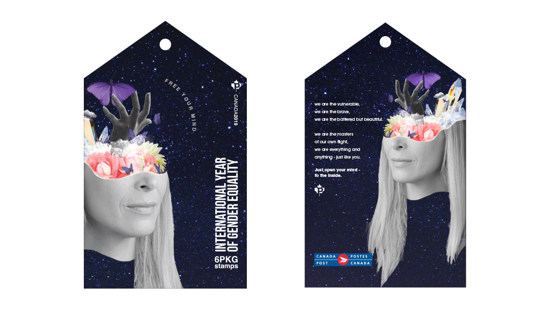
Someone who touched me very personally throughout the project was Danica Rain (a well-known Canadian transgender advocate) who I had the fortunate opportunity of interviewing, getting to know on a personal level and ultimately using for the main cover of the project. She told many touching stories about her struggles through adolescence and her amazing international feats to fight for gender equality. It was awe-inspiring.
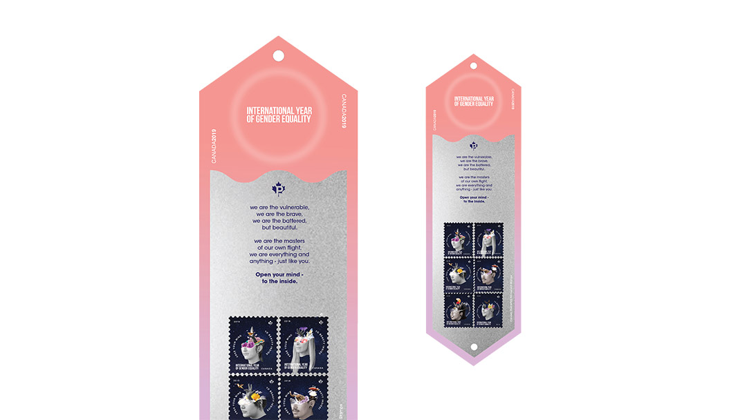
For the final package, I included a poem I wrote that struck me halfway through the project. It represents the the tenacity, utter strength and beauty and strength of these people I have had the chance to get to know:
we are the vulnerable,
we are the brave,
we are the battered,
but beautiful.
we are the masters
of our own flight,
we are everything
and anything, just like you
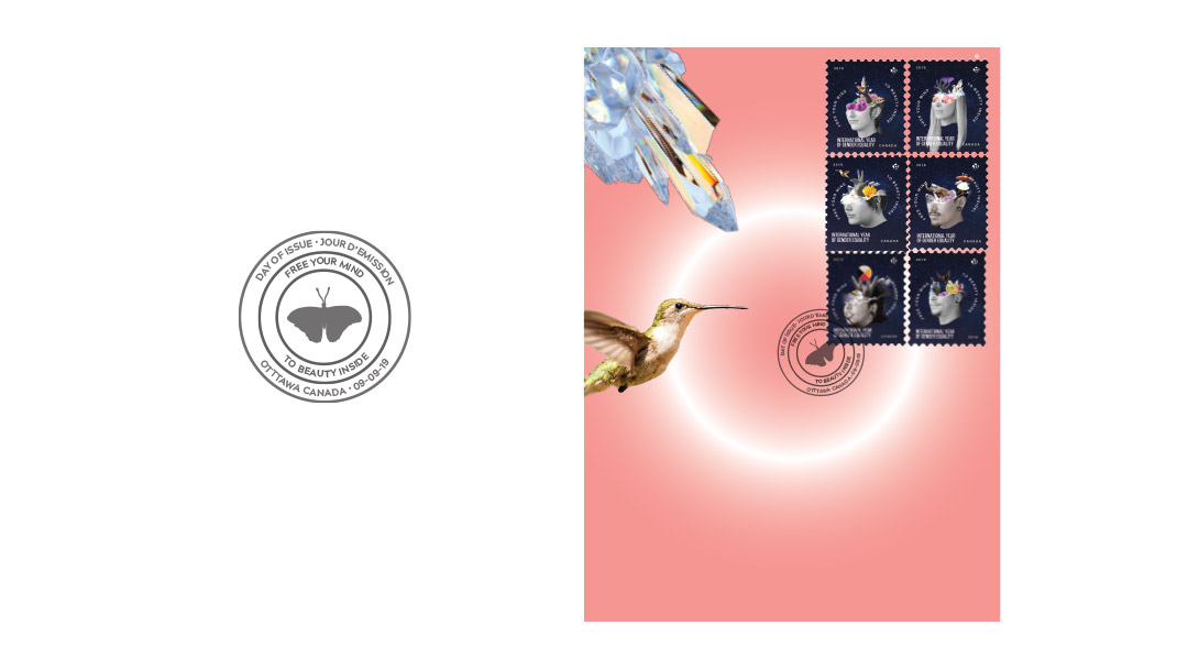
I also created a postmark and first day letter that encapsulates the theme of the project. The tagline, "Free your mind, to beauty inside" overarches the core theme that it is our innermost qualities that make us equal.
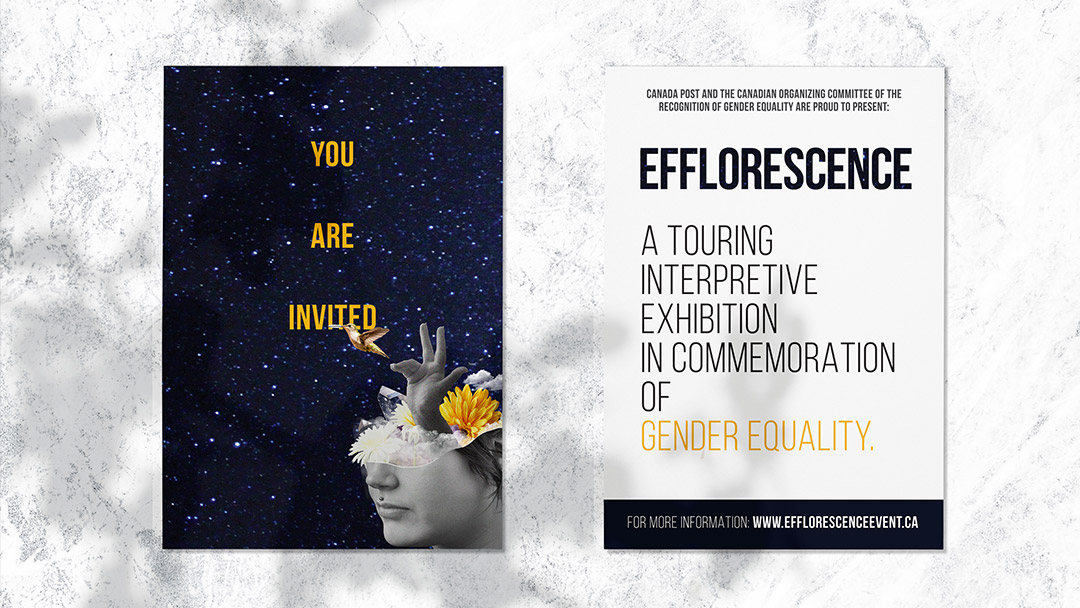
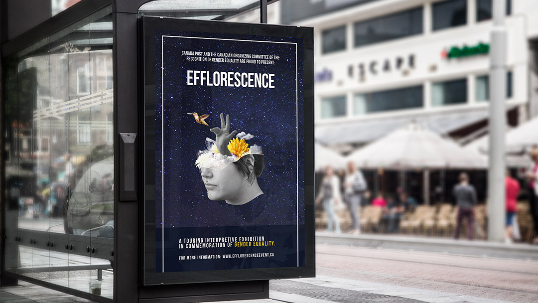
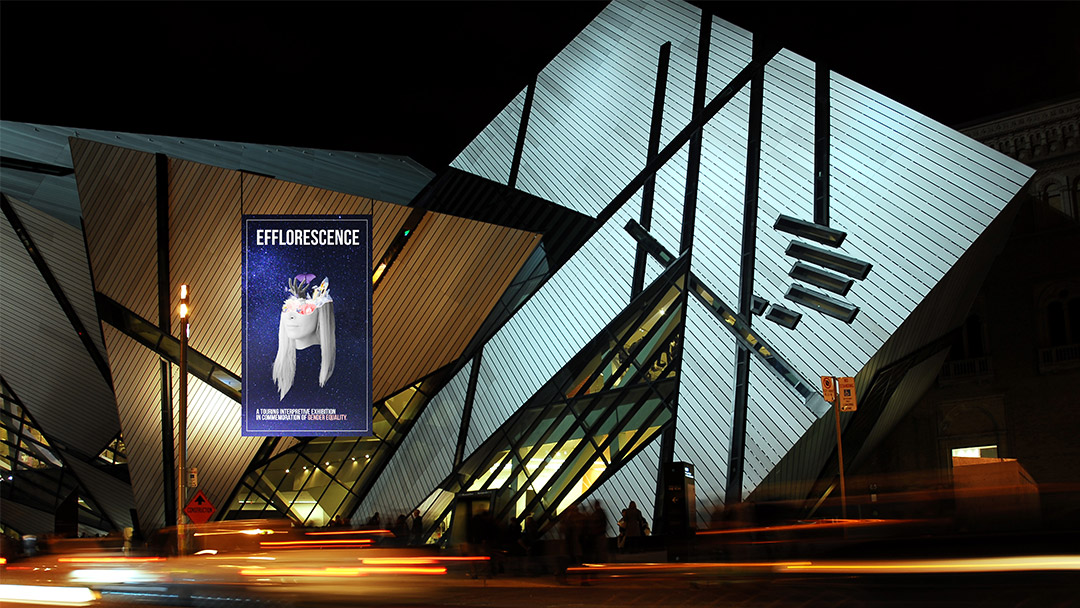
A branded event attracts both students and intellectuals, called Efflorescence. It would be a nod and tribute to gender equality across all spectrums and a innermost look at the lives of different people, as well as a glance at their stories and struggles.
The ad campaign would largely scale across billboards and bus shelters to attract student and intellectuals in metropolitan areas to the event.
The event would be held at a museum. I also had to wear the 'adaptability' hat to be able to brand from a small stamp to a large-scale event. It was a rewarding challenge.