Cameron Marshall
The hat I'm wearing is Typography, it can often make or break a design, typography helps you convey a message through copy all while serving as a visual element.
The hat I'm wearing is Typography, it can often make or break a design, typography helps you convey a message through copy all while serving as a visual element.
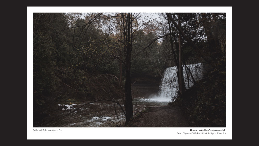
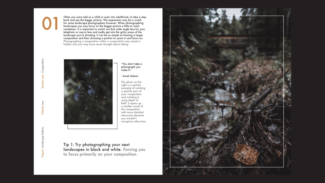
Tripod magazine was a concept I developed with the goal of giving amateur photographers a place to showcase their work. This assignment gave me a chance to practice my copywriting skills and creative typography usage, but most importantly an outlet to showcase my personal photography work that is often sidelined.
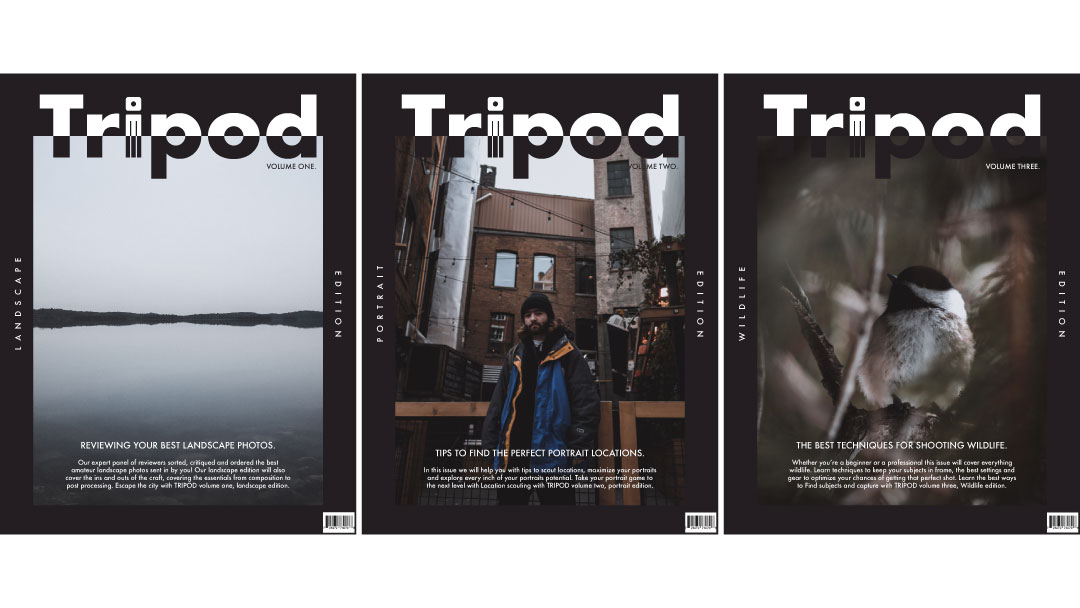
My main design goal for tripod was to offer a magazine with a little more flavour and personality, steering clear of the traditional cookie cutter photo magazine layout style.

Tripod magazine was a concept I developed with the goal of giving amateur photographers a place to showcase their work. This assignment gave me a chance to practice my copywriting skills and creative typography usage, but most importantly an outlet to showcase my personal photography work that is often sidelined.
Old Navy was a personal challenge I decided to take on during corporate identity class, Old Navy was in dire need of a rebrand. The biggest problem with their current identity was a lack of adaptability, my solution was to provide them with a symbol that encapsulated their current brand ideals with a fresh new look.
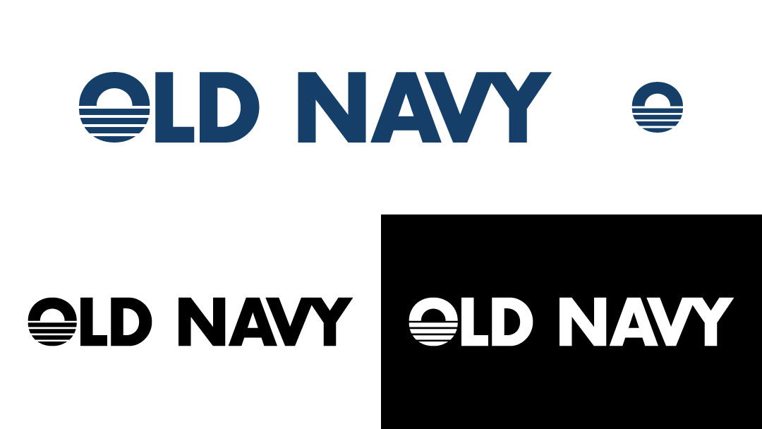
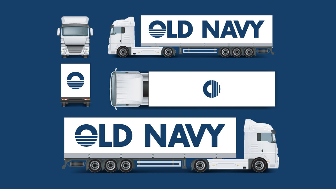
Old navy can use this new brand to expand their advertising reach onto a myriad of different mediums, transport trucks being a fast way to bring attention to your business as well as continue brand continuity as often as possible.
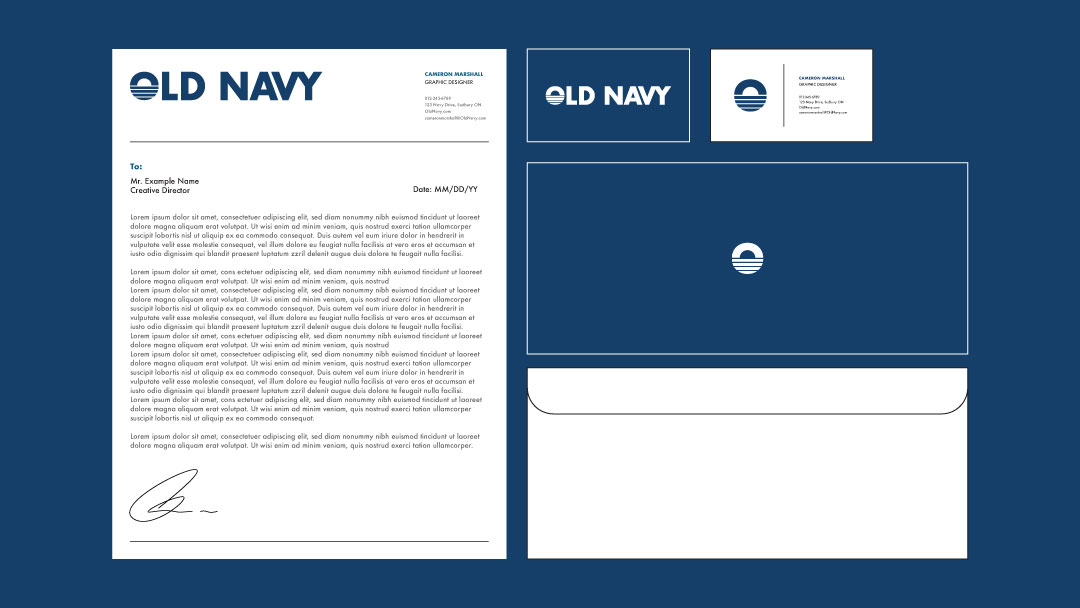
Stationary can really tie a brand together on a corporate level, the new brand allows Old Navy to do just that, while retaining their current care free image with an updated look.

Old Navy was a personal challenge I decided to take on during corporate identity class, Old Navy was in dire need of a rebrand. The biggest problem with their current identity was a lack of adaptability, my solution was to provide them with a symbol that encapsulated their current brand ideals with a fresh new look.
Sudbury's downtown core has always lacked organization in regards to their parking. My goal was to take the existing elements within sudbury's parking system and organize them to create an easily consumable app, updated parking map and e-mail campaign for my target demographic all surrounded by a fresh new brand melding old a new parking elements together.
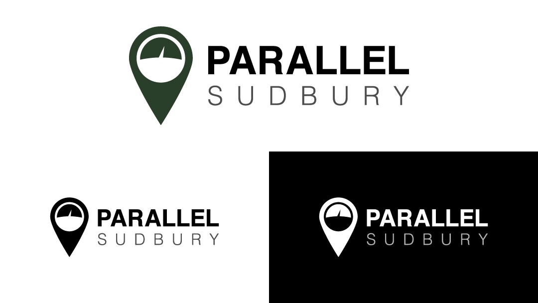
Parallel's logo can be broken down into two simple elements, a location marker and inside a minimal take on the original parking meter. My goal was to merge the worlds of old and new technology together to create something new, while still remaining familiar.
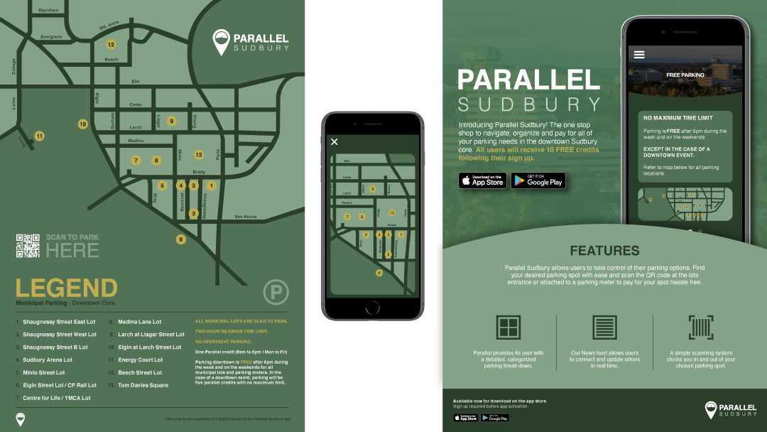
A detailed but simple parking map easily accessible in a print or digital format for easy navigation accompanied by a direct e-mail campaign to promote the app during its initial release.
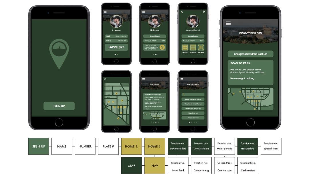
This app breaks down Sudbury's municipal parking lots into sections to give you precise searching abilities, a version of the parking map can be found within the navigation for fast access to a favourite parking location. In app currency (Parallel credits) lets you pay on the go using a QR code scanning system and can be replenished using the app store.

Sudbury's downtown core has always lacked organization in regards to their parking. My goal was to take the existing elements within sudbury's parking system and organize them to create an easily consumable app, updated parking map and e-mail campaign for my target demographic all surrounded by a fresh new brand melding old a new parking elements together.