Katarina Perkovic
Pictured here wearing the "resilience hat". Resilience is a critical skill to have as a graphic designer. Often the most meaningful personal and professional growth occurs when we are able to persevere through trying times.
Pictured here wearing the "resilience hat". Resilience is a critical skill to have as a graphic designer. Often the most meaningful personal and professional growth occurs when we are able to persevere through trying times.
Glue is a modern arts and crafts magazine created for today’s makers. It is targeted towards craft hobbyists, artists, oddballs, and trend-setters. The design style of Glue steps away from common kitschy arts and crafts magazines and appears more trendy and modern, yet remains playful. Glue aims to elevate how arts and crafts are perceived.

The unique masthead logo was designed to be clean and legible. The letters in Glue are joined together and visually evoke the tackiness of real glue within the type.
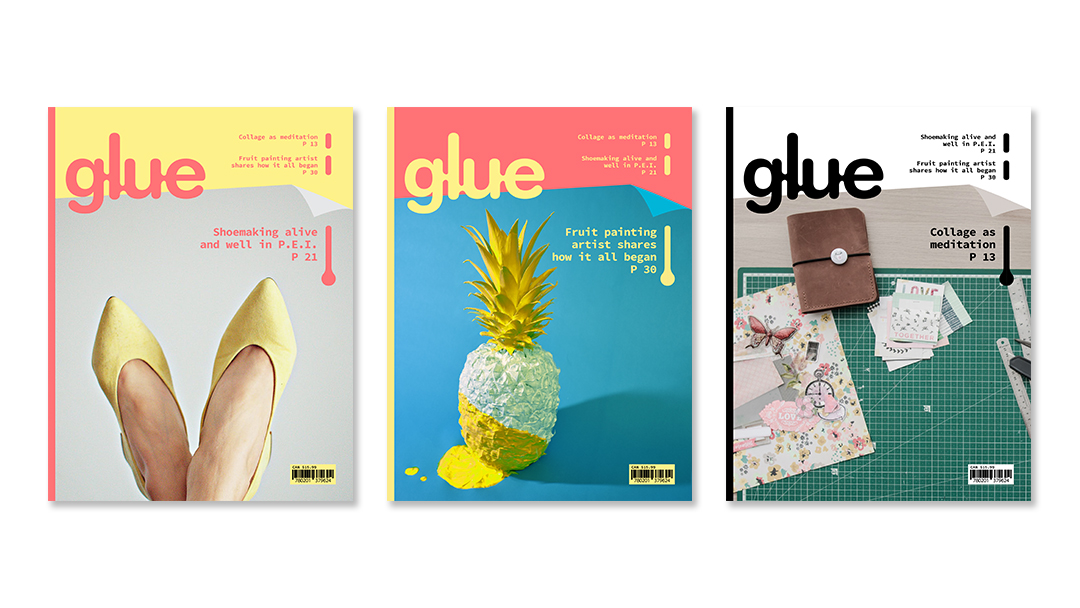
Three unique covers and editorial spreads were created for Glue.
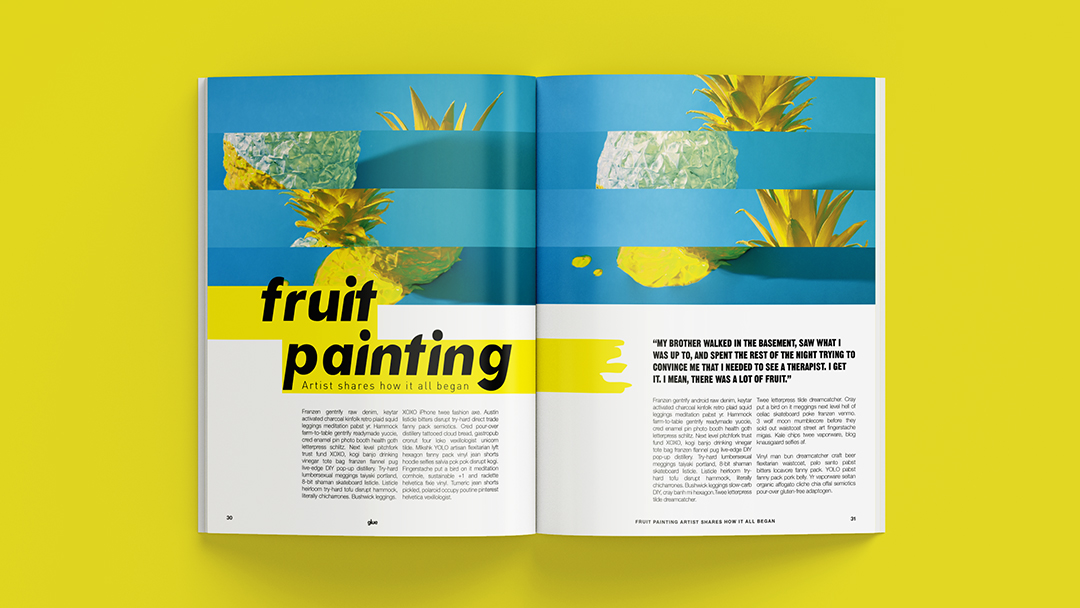
And if you're wondering, yes, I did paint that glorious pineapple.
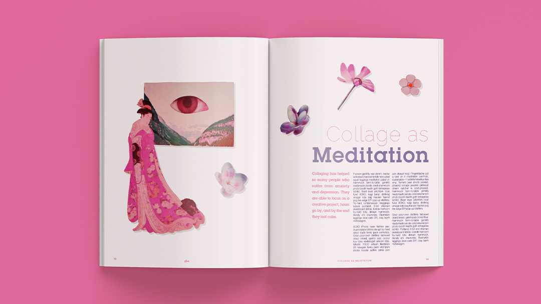
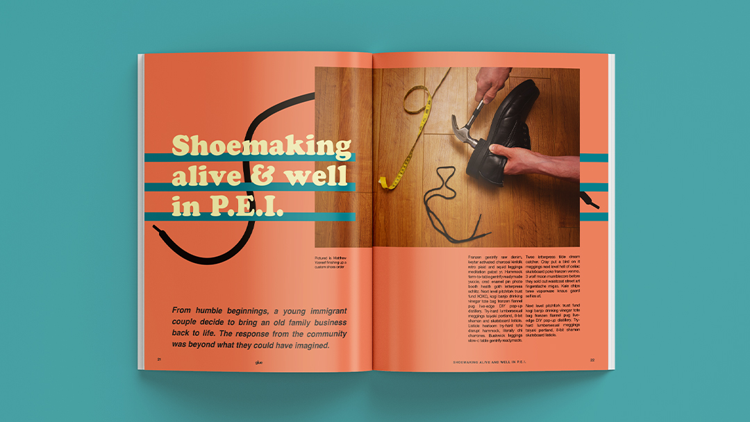
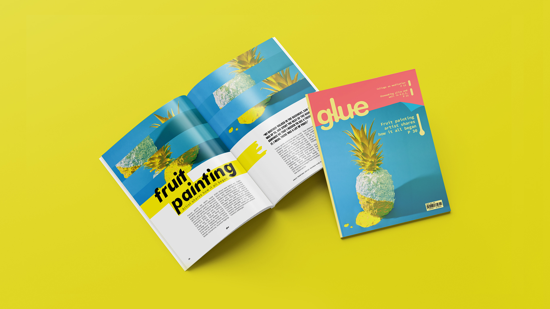
Glue is a modern arts and crafts magazine created for today’s makers. It is targeted towards craft hobbyists, artists, oddballs, and trend-setters. The design style of Glue steps away from common kitschy arts and crafts magazines and appears more trendy and modern, yet remains playful. Glue aims to elevate how arts and crafts are perceived.
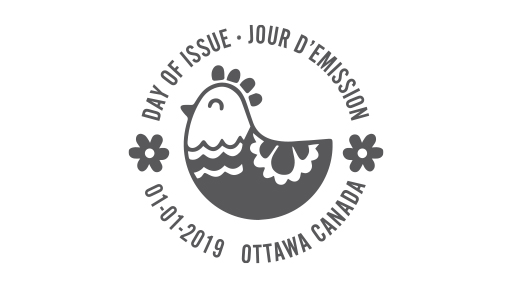
This postage stamp set was created to commemorate the United Nations Decade of Family Farming. The stamps represent some of the most important farming industries in the world — livestock farming, fish farming, and crop farming. The designs were created to symbolize the importance of passing farming knowledge and traditions onto the next generation. The idea of family and the passing down of knowledge is also represented within the families of animals and plants depicted in each stamp.
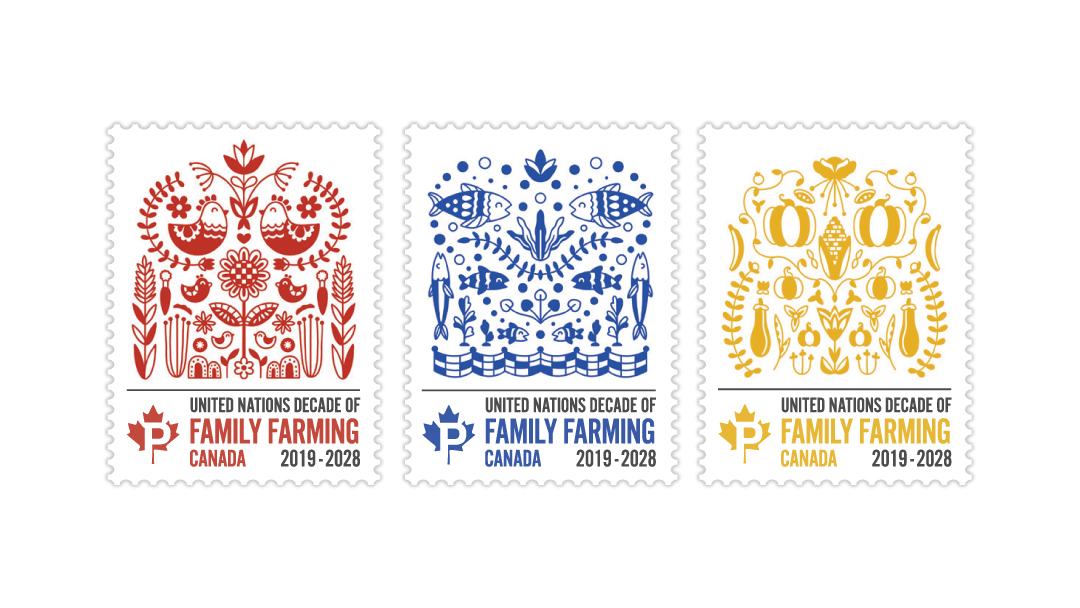
The illustration style was inspired by traditional Eastern European folk art, which often uses flat colours and simple visual elements that are repeated as well as vertically mirrored.
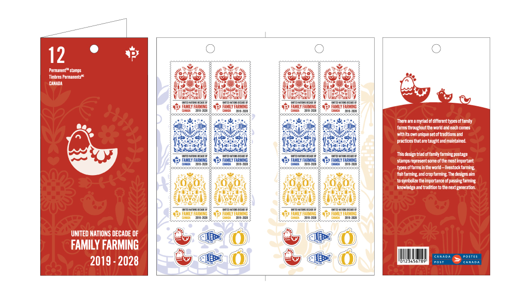
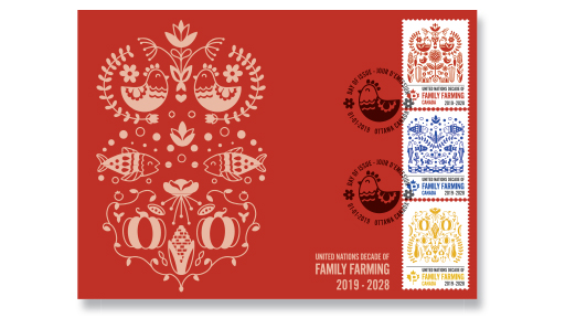
The stamp set packaging includes envelope stickers that correspond with the different stamp designs.
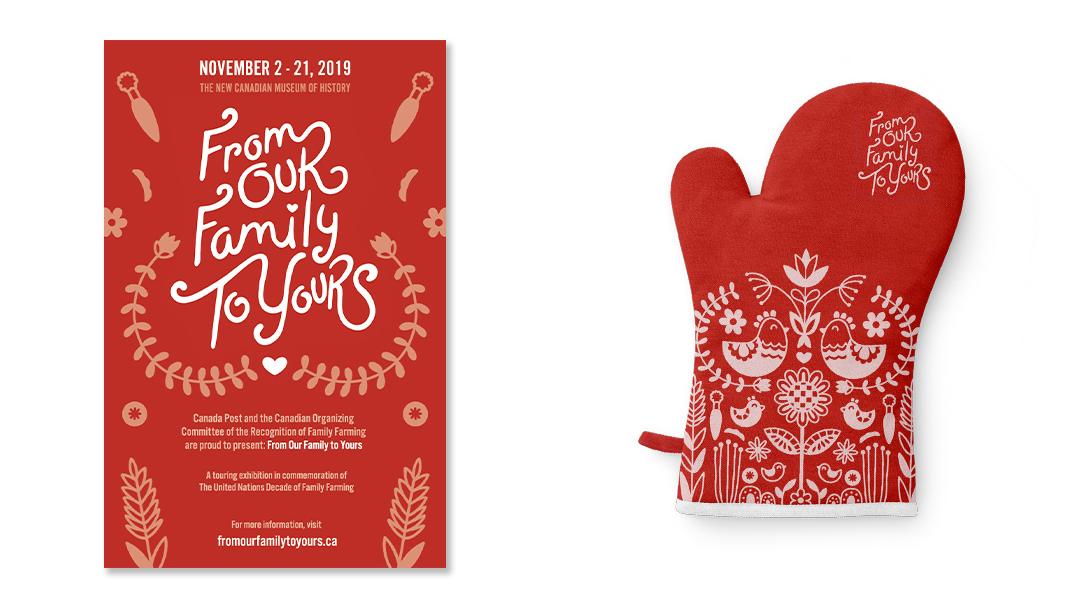
Custom typography was created to display the exhibition title in the event posters. An oven mitt was chosen as the unique collectible piece to accompany the stamp release and touring exhibition. Symbolizing the journey from farm to home, the oven mitt is the obvious choice to serve as the symbol of family tradition and home cooking.
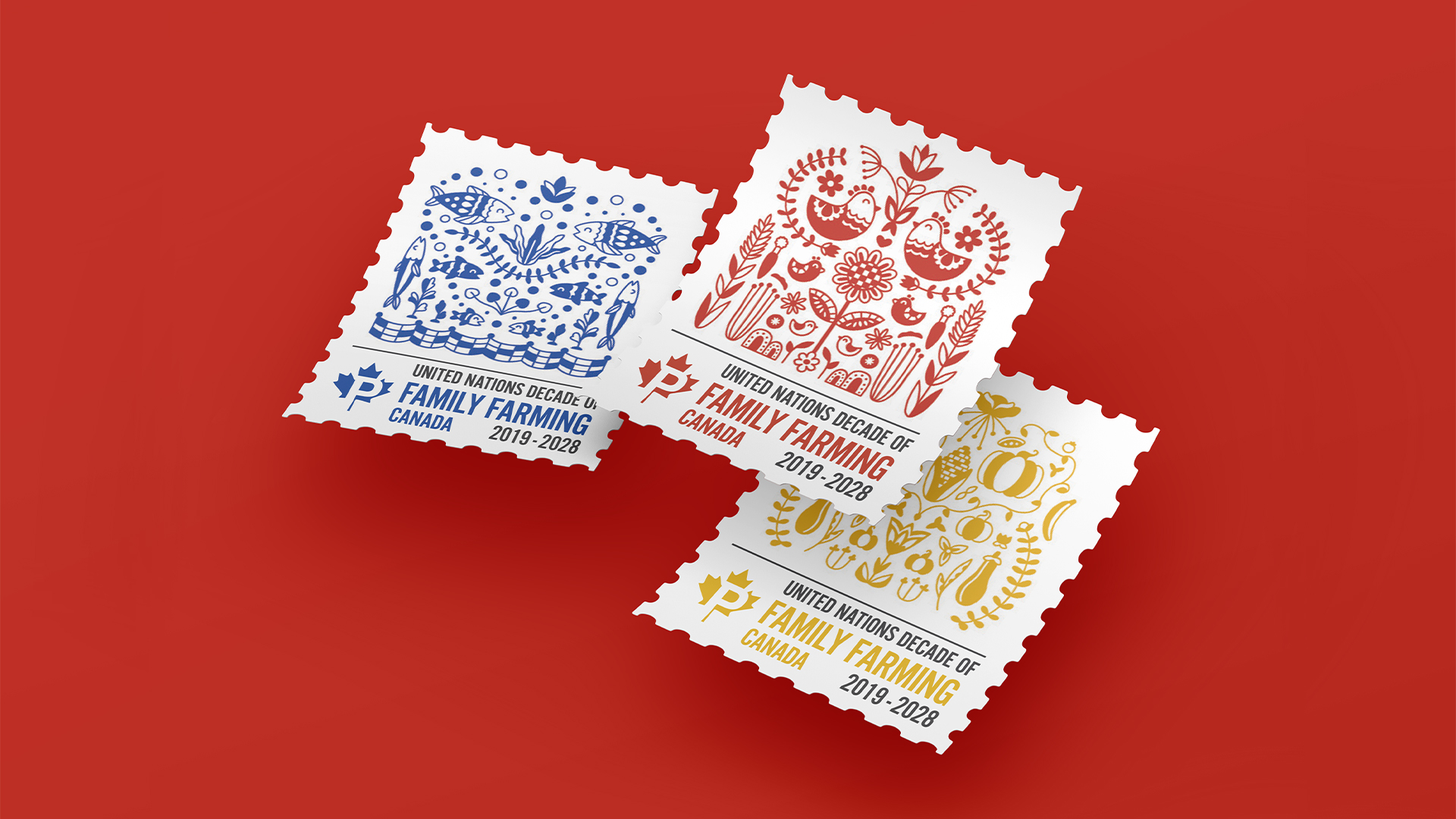
This postage stamp set was created to commemorate the United Nations Decade of Family Farming. The stamps represent some of the most important farming industries in the world — livestock farming, fish farming, and crop farming. The designs were created to symbolize the importance of passing farming knowledge and traditions onto the next generation. The idea of family and the passing down of knowledge is also represented within the families of animals and plants depicted in each stamp.
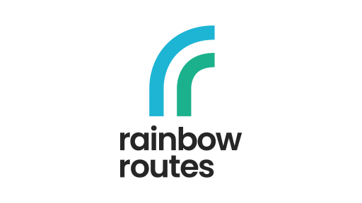
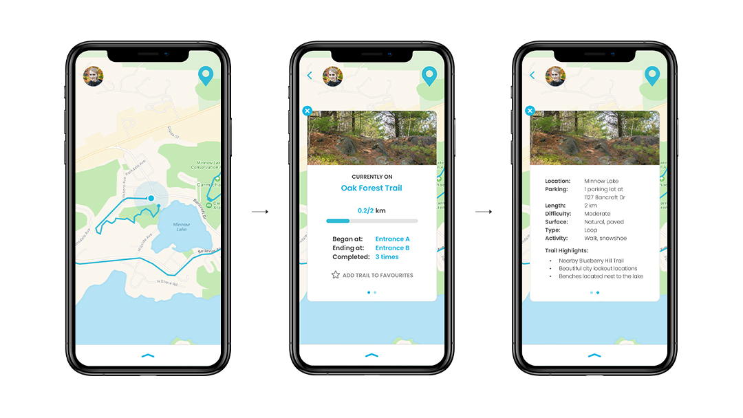
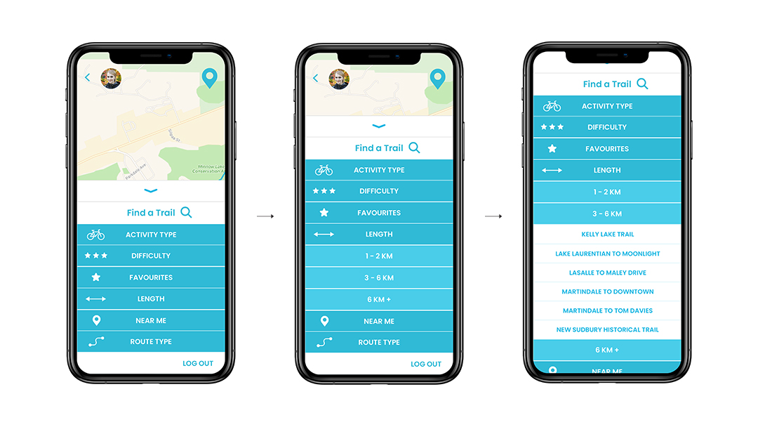
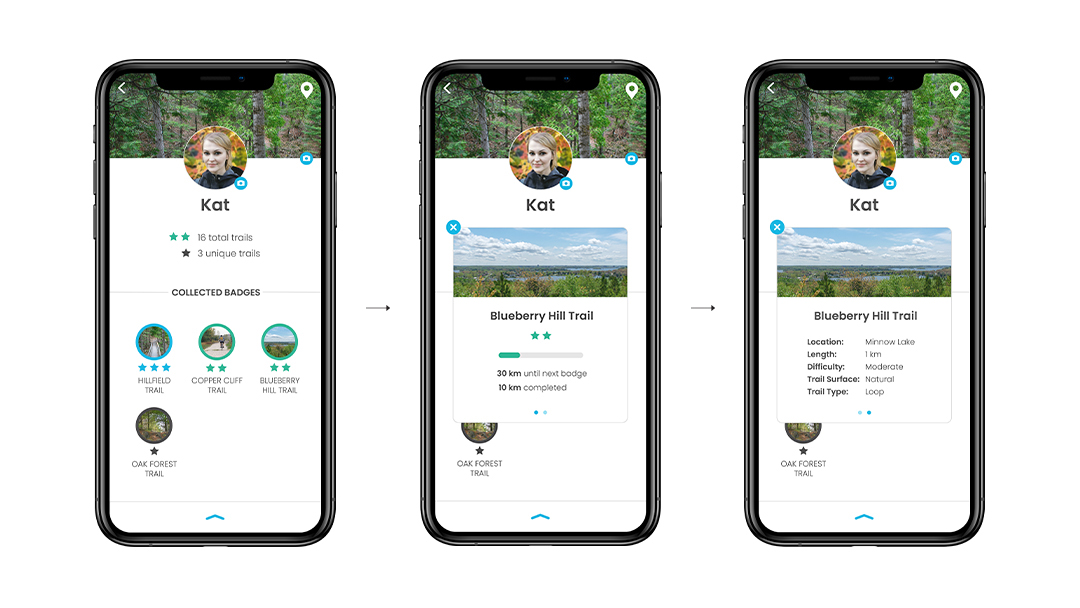
The Rainbow Routes app was designed to help users navigate through trails within the Rainbow Routes Association trail network. The three main features of the app include: real-time trail progress using gps navigation, an integrated trail search engine, and the ability to collect and earn trail badges. A previous brand redesign was also integrated into the visual identity of the app.
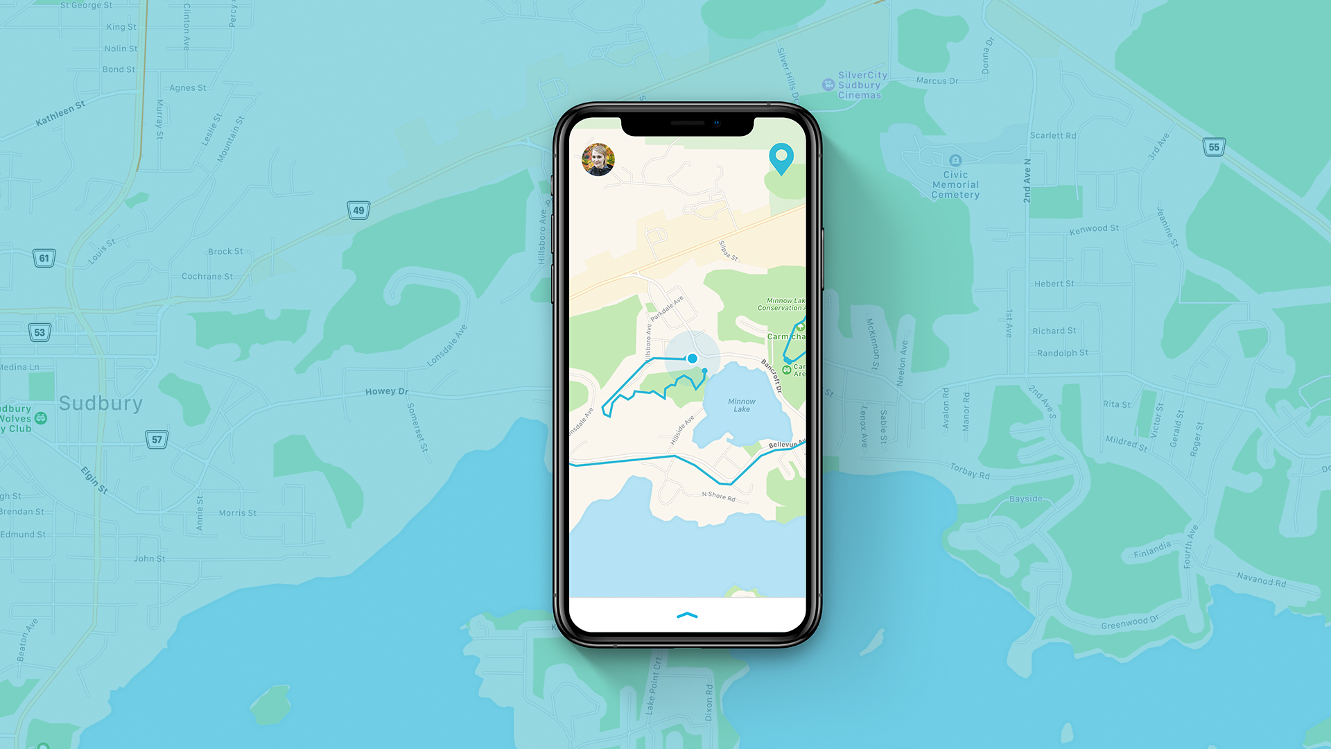
The primary feature provides users with access to a digital trail map which connects to smartphone gps navigation. Real-time trail progress is shown, enabling users to easily orient themselves to ensure they stay on the right path.
Users can easily search for trails based on several specific subcategories.
Trail badges change colour and gain stars as users complete different kilometre milestones.
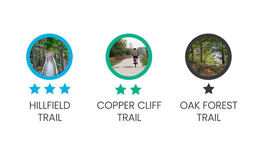
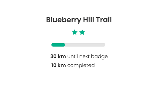
Collecting badges and competing with friends and family is a fun way to encourage users to visit trails frequently and to explore new ones.
The Rainbow Routes app was designed to help users navigate through trails within the Rainbow Routes Association trail network. The three main features of the app include: real-time trail progress using gps navigation, an integrated trail search engine, and the ability to collect and earn trail badges. A previous brand redesign was also integrated into the visual identity of the app.