
Designed by: Lauren Nykilchuk

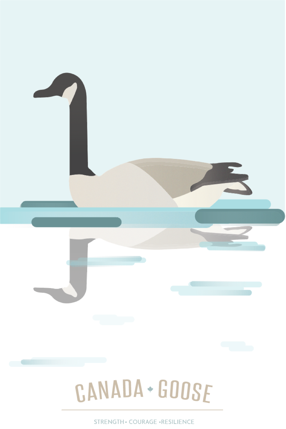
Regal, tenacious and protective, the family-oriented geese find strength in numbers. These strong qualities are what inspired me to choose the Canada Goose.
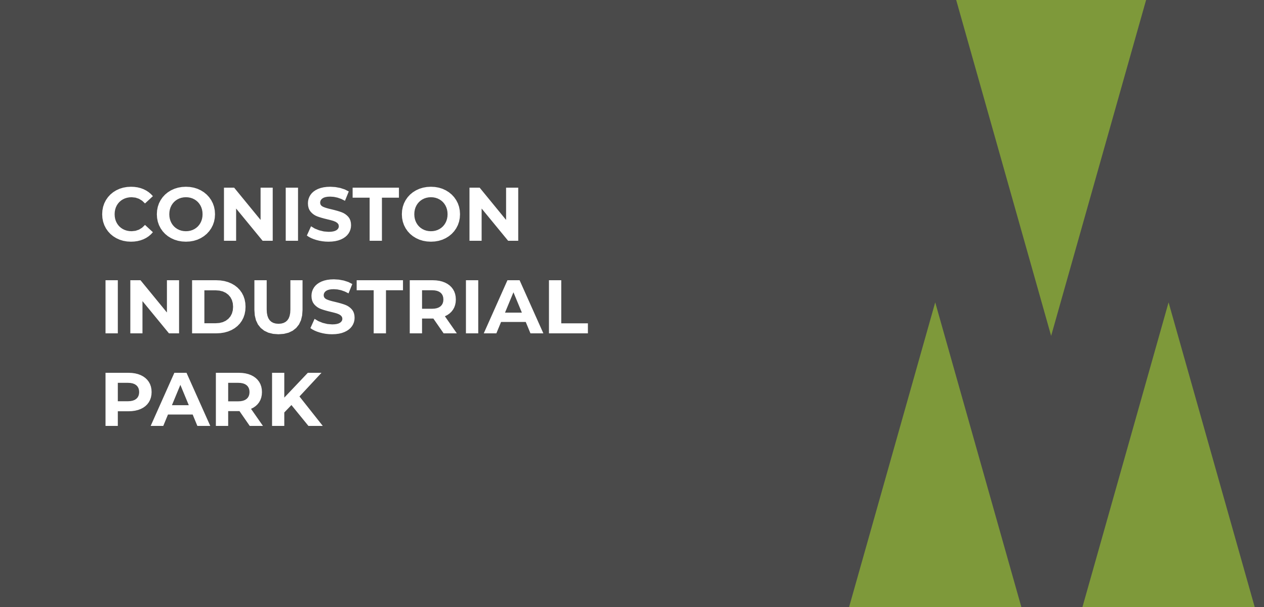
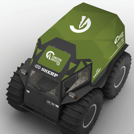
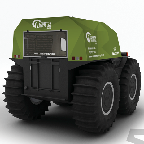
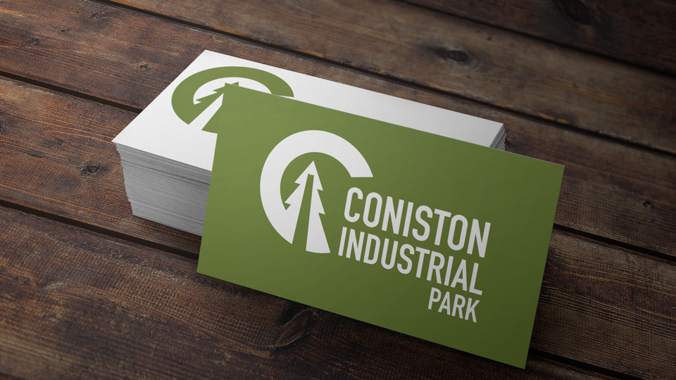
Coniston Industrial Park was in diar need of a revamp. The tacky gradient in the old logo and use of three inconsistent typefaces needed to be retired. The new logo is simple and recognizable, combining the park’s iconic elements — Coniston (the C), a tree for their dedication to regreening, and the iconic smoke stacks.

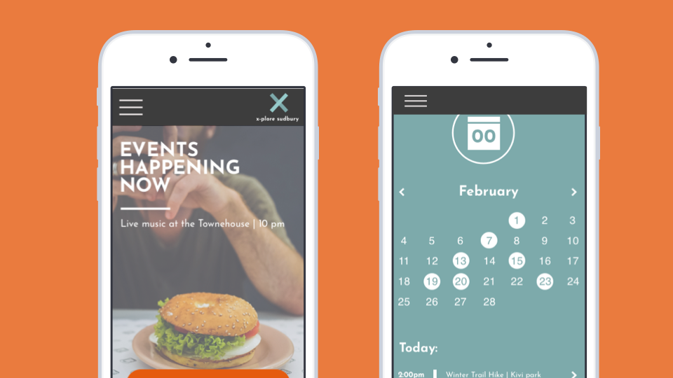
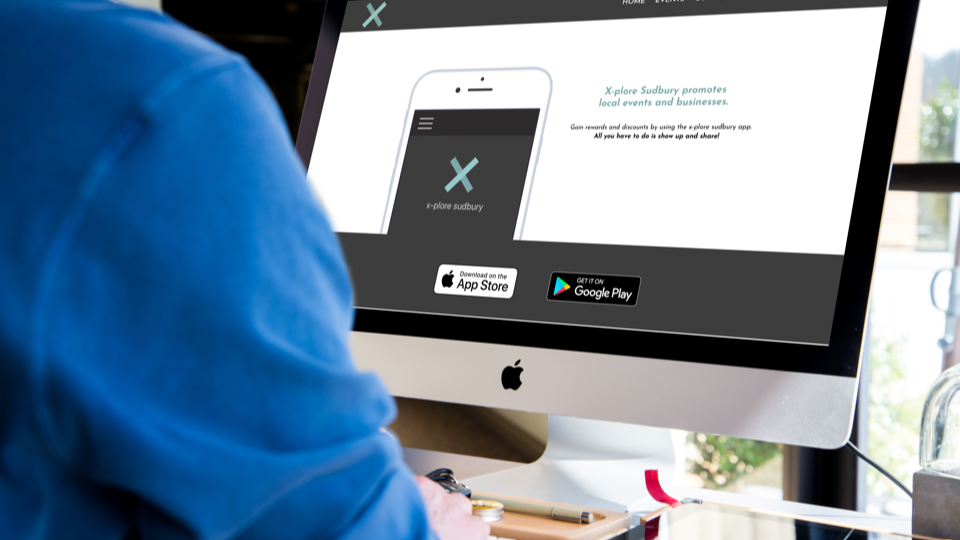
x-plore sudbury is an app designed to get people to realize that Sudbury isn’t just a mining town.
By making all of the events happening in town accessible on one platform, x-plore sudbury encourages community involvement. This initiative would partner with local businesses by providing discounts to the app users when they use social media at an event.

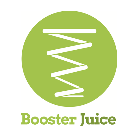
Booster Juice is a great company; they’ve developed a loyal customer base and have expanded their company over the years.
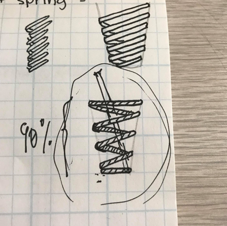
However, since starting up as a small-town smoothie bar, their identity has lost touch. The new identity plays off the natural boost that a spring has and combines it with the cup.
