emattila1987@hotmail.com
@mattiladesign
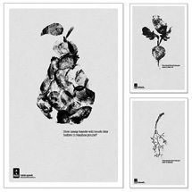
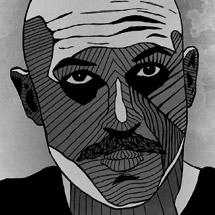
It's the most basic survival instinct. Everyone and everything is predisposed to exist in their current setting, but other elements get introduced that turn everything we know on its head. My goal is to not only design with logic, but to withstand foreseeable change in its environment.
Noteworthy Influences:
1. Michio Kaku
2. Marcus Hopson
3. Paul Rand
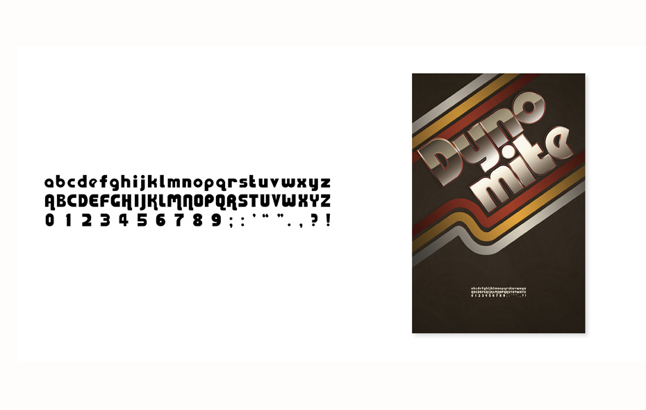
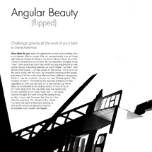
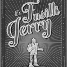
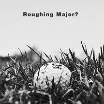
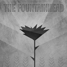
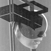
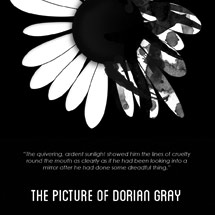
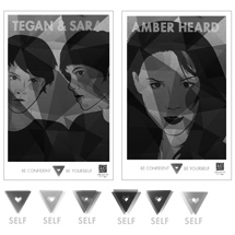
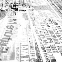
Inspired by Bauhaus design and the 1970's, this typeface is designed to convey a fun, nightlife personality which is enforced in the poster design.

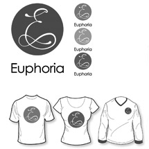
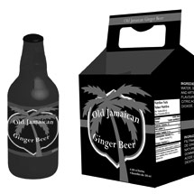
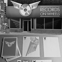
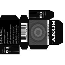
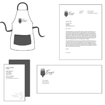
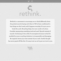
Merging the two words into one symbol, the purpose of designing this identity was to give the company a new look that doesn't infringe on copyright laws.
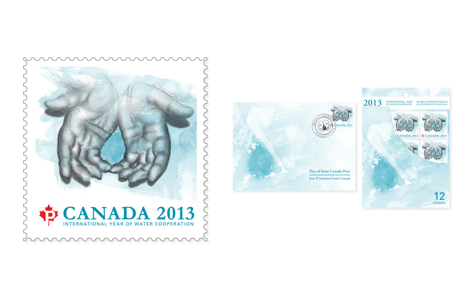
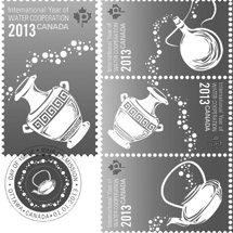
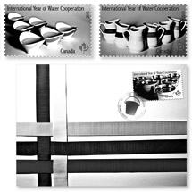
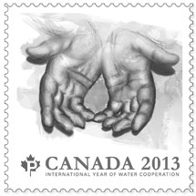
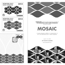
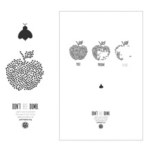
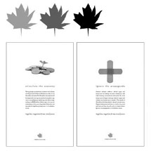
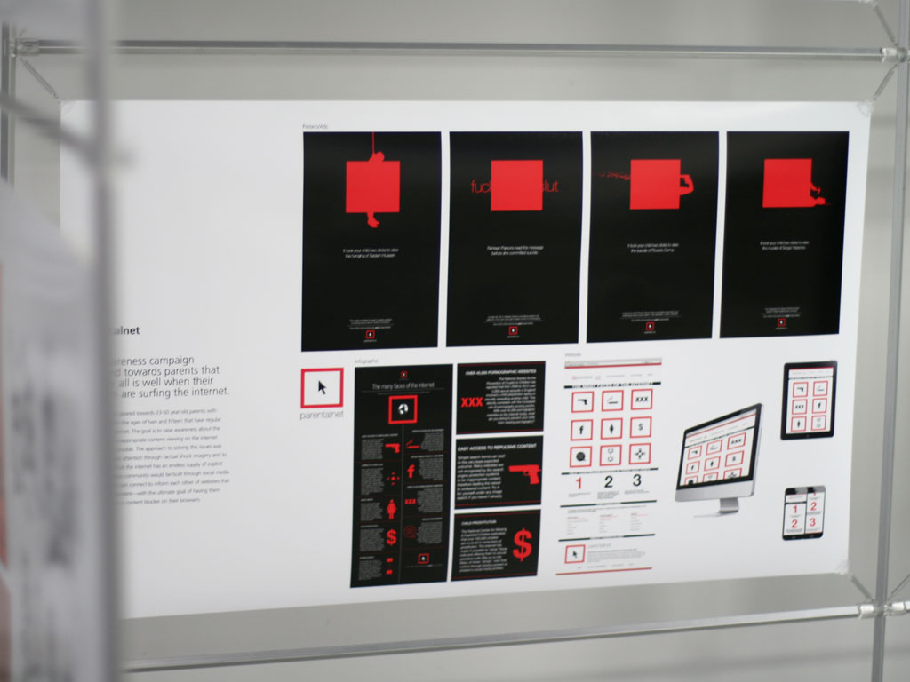
The solution to showing water cooperation was to take a "hands-on" approach. With that idea, every aspect was made to appear hand made in this campaign.
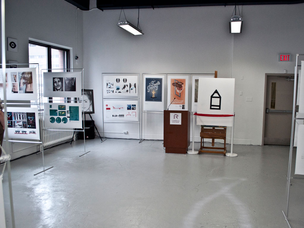
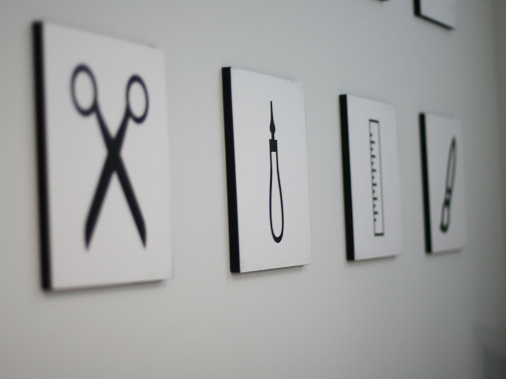
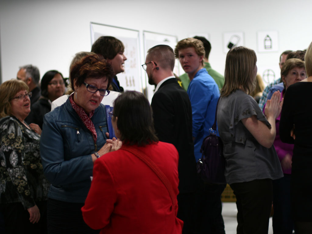
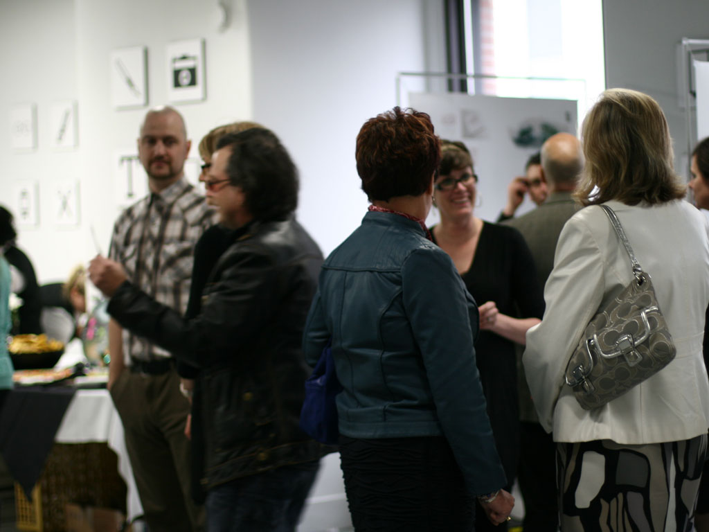
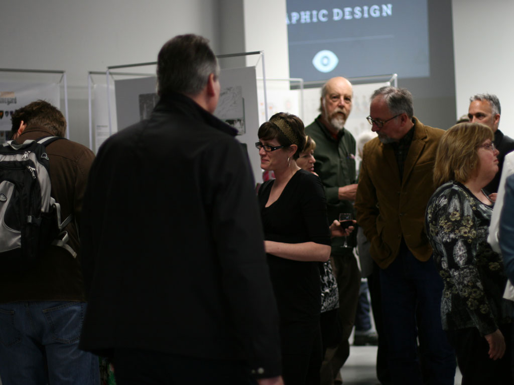
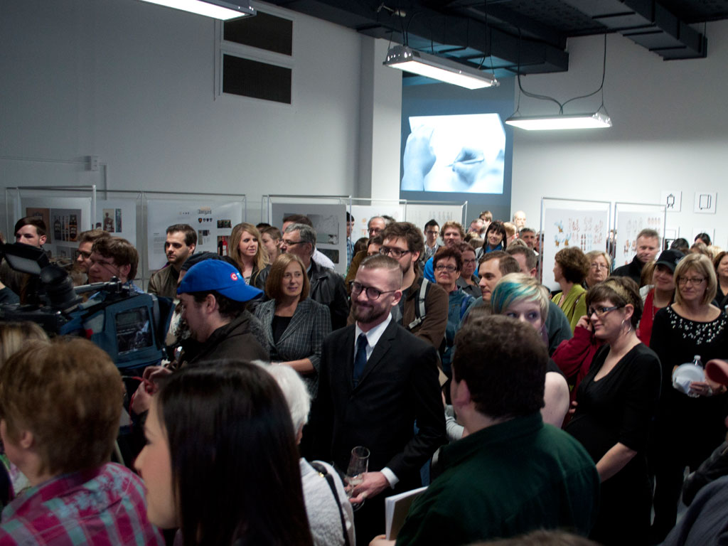
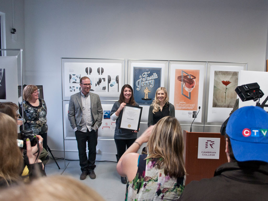
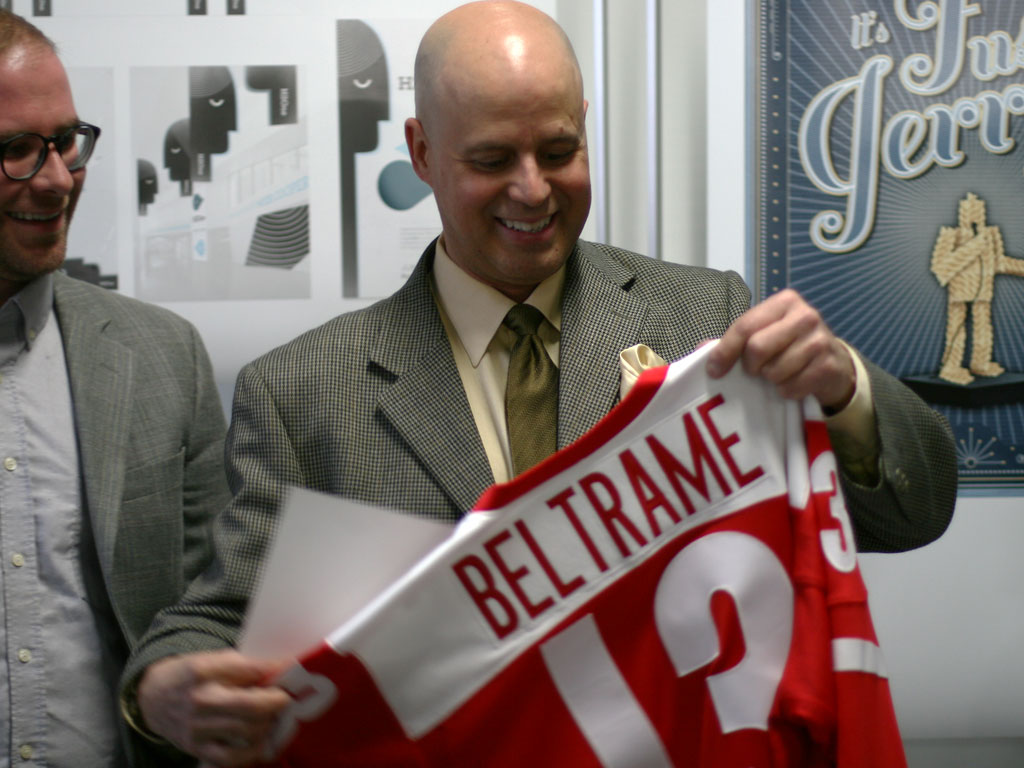
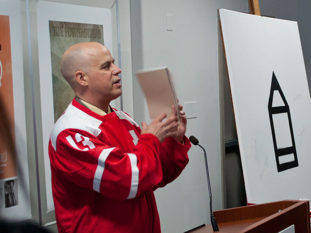
Field Notes was the inaugural event for Cambrian College's Open Studio, located at 93 Cedar Street in Downtown Sudbury. It took place on April 18th, 2013. Here's a look at the festivities:


The promotional video was the product of a small and dedicated group of 3rd year Graphic Design students. Special thanks to those who took on this project: Paul Morse, Terrie Barksey, Chad Weiss, Jennaka Urisk, and Terri Scherzinger.
Supportive Associations: