chelsea_r_b@hotmail.ca
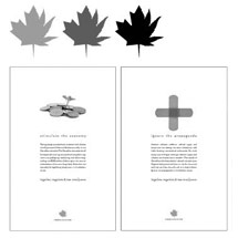
To translate is to express a message in an understandable language to a targeted audience. As in design, the project has a demographic, and the message must be understood visually. I try to communicate the message in the most effective way to the audience in each project.
Noteworthy Influences:
1. Jessica Hische
2. Rei Inamoto
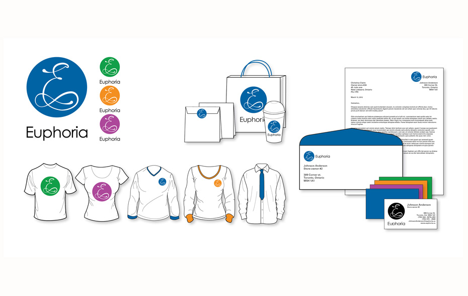
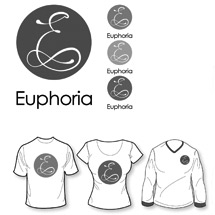
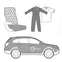
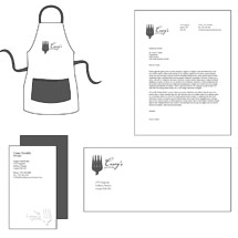
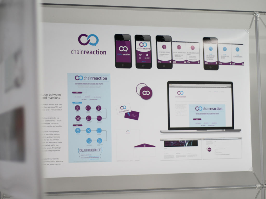
Euphoria smoothies is a healthy beverage/food chain in Canada. The project composed of an identity redesign, stationery, uniforms, packaging, website, signage, and a corporate ID manual.
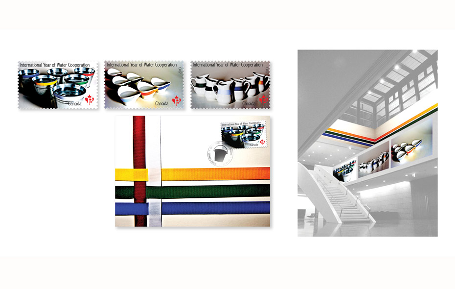
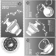
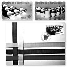
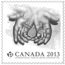
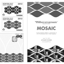
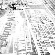
This project required the design of a postage stamp for the International Year of Water Cooperation. The design must demonstrate the cooperation of countries and clean drinking water. This project is composed of three postage stamps, a first day cover, packaging, a event poster and signage of an exhibition.
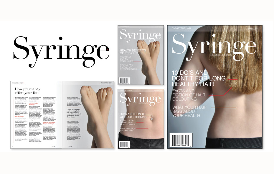
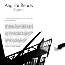
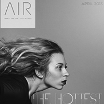
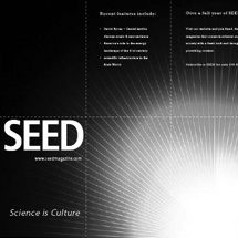
This magazine was designed to replace the syringe and plastic surgery by providing articles to readers about new products, diets, exercise routines and advice on beauty and fashion. This project is composed of the design of a mast head, variations of covers and the layout of articles.
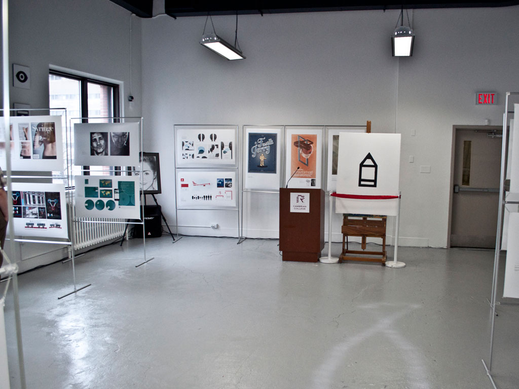
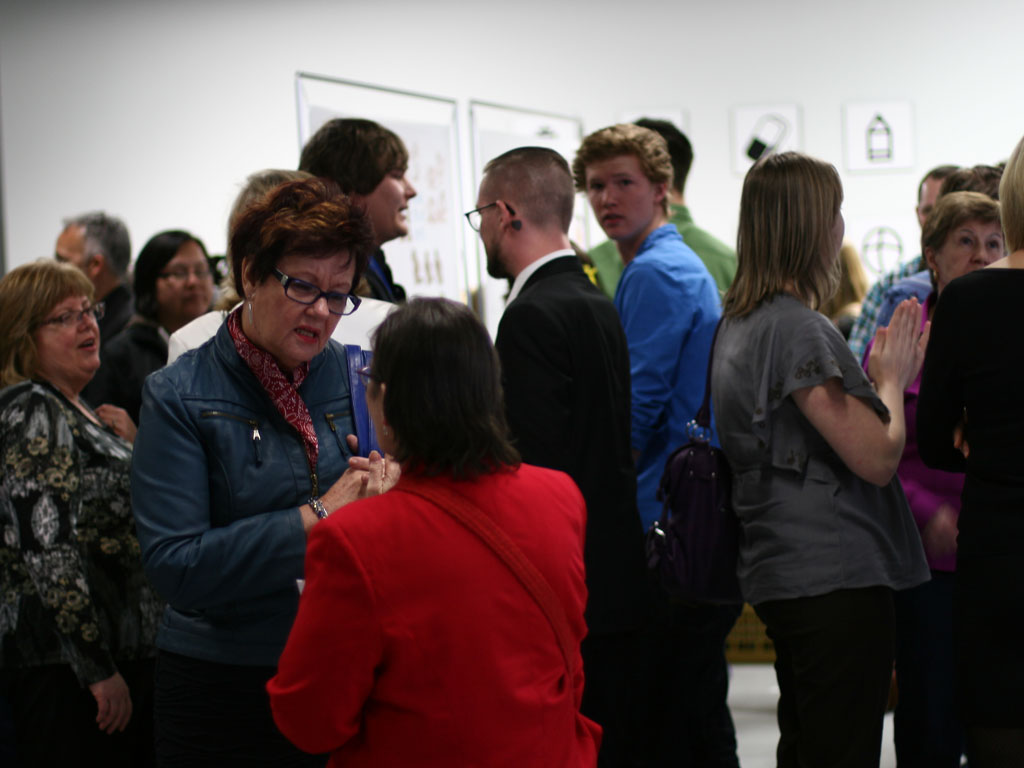
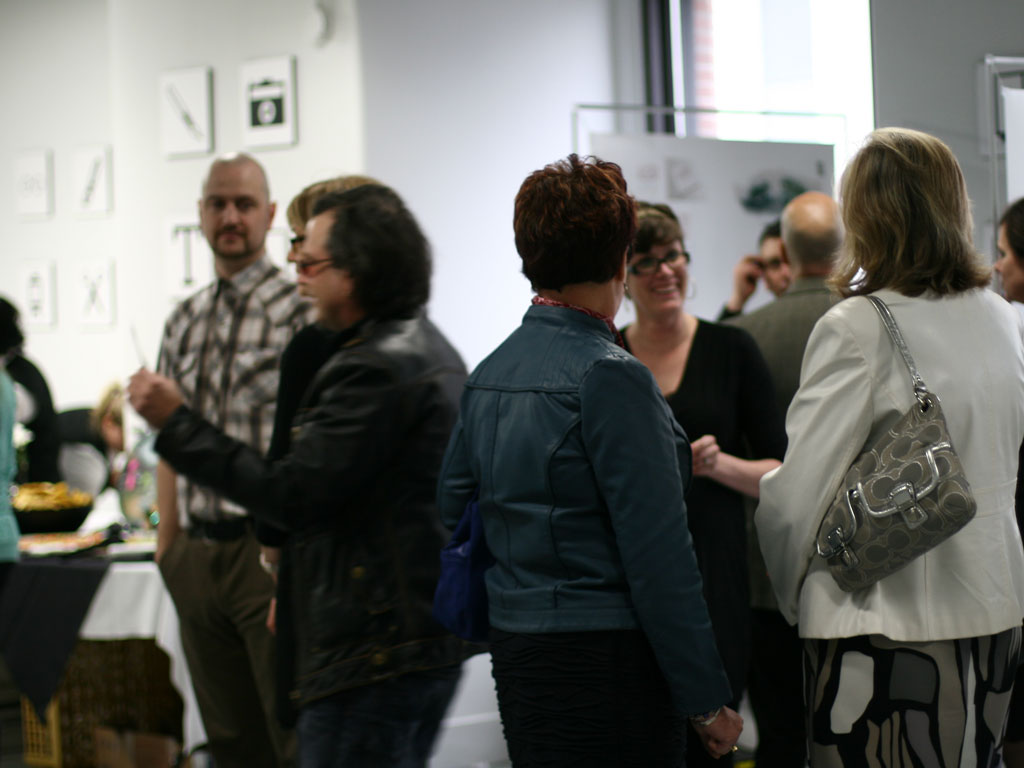
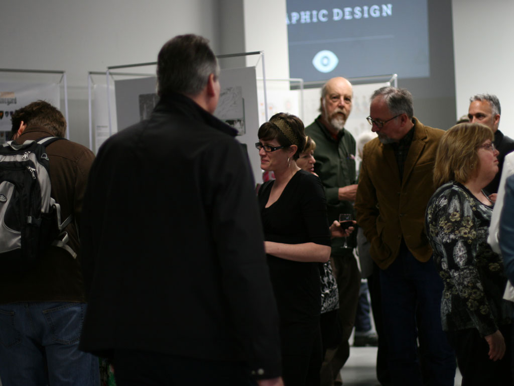
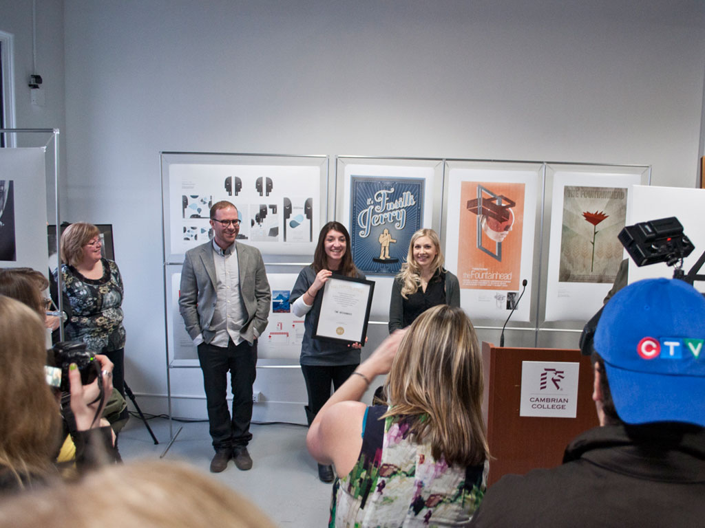
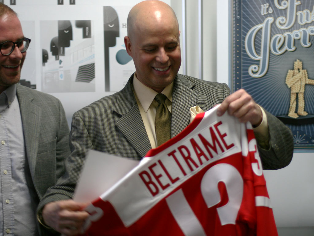
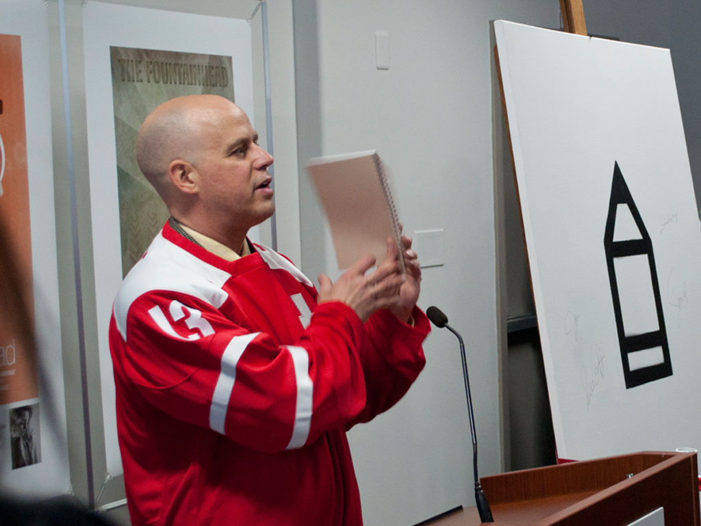
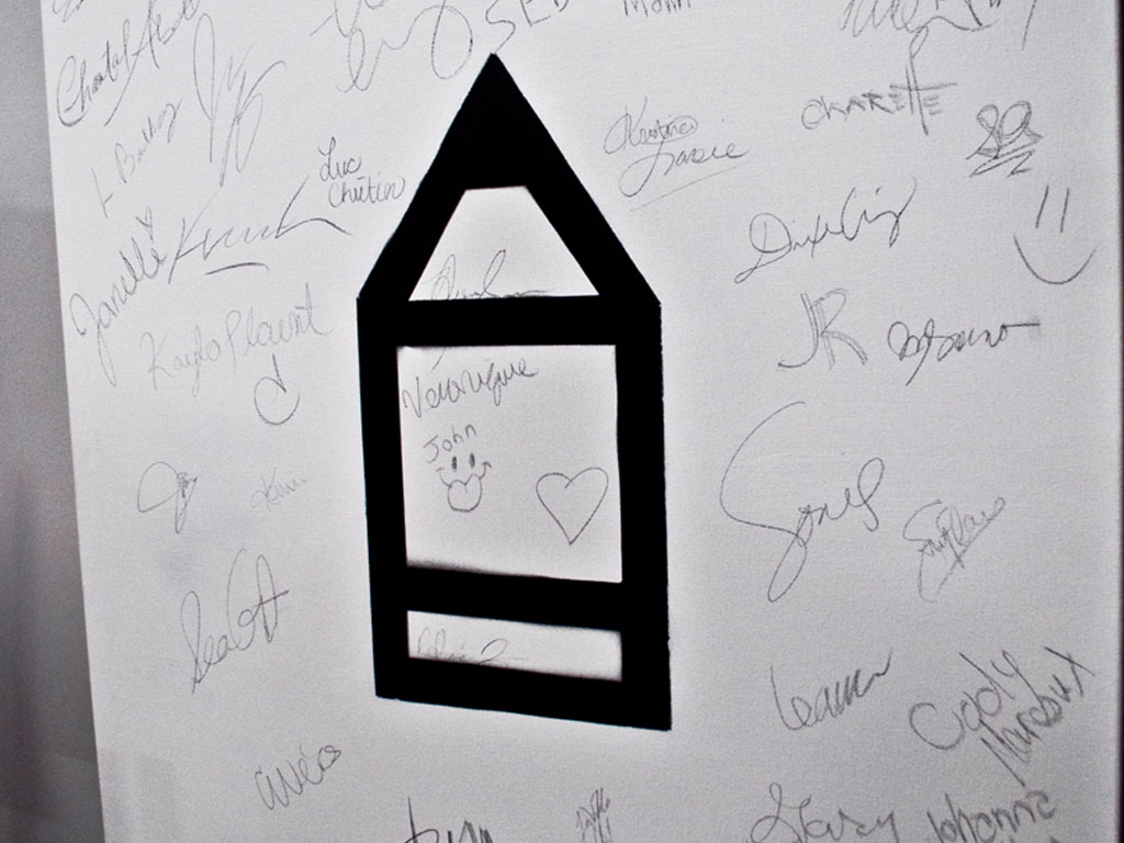
Field Notes was the inaugural event for Cambrian College's Open Studio, located at 93 Cedar Street in Downtown Sudbury. It took place on April 18th, 2013. Here's a look at the festivities:

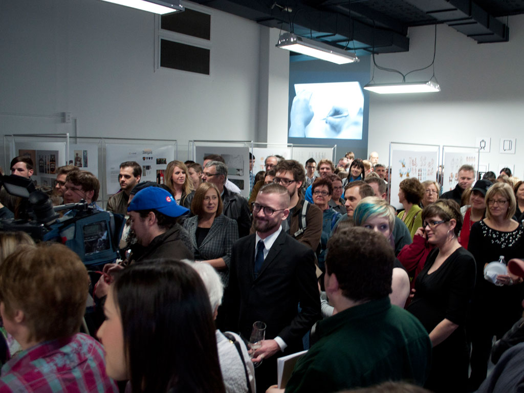
The promotional video was the product of a small and dedicated group of 3rd year Graphic Design students. Special thanks to those who took on this project: Paul Morse, Terrie Barksey, Chad Weiss, Jennaka Urisk, and Terri Scherzinger.
Supportive Associations: