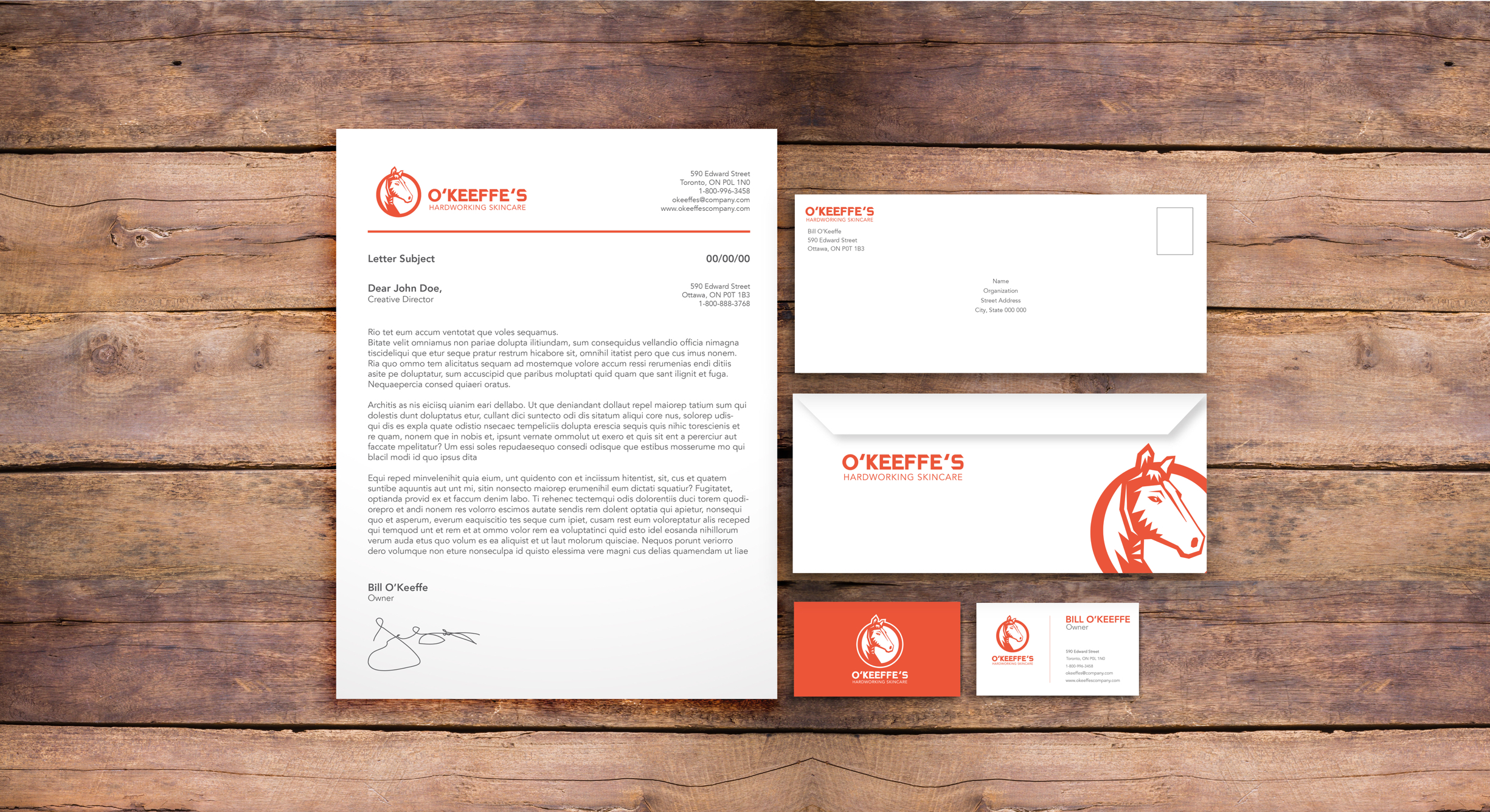
The original O'Keeffe's logo appears dated and difficult for use in modern applications. This redesign represents Bill O'Keeffe's background as a rancher.

The horse symbolizes the founder’s hardworking history and the “O” signifies the name O’Keeffe’s.

The orange colour remains, to maintain brand equity and the connection to the construction industry.
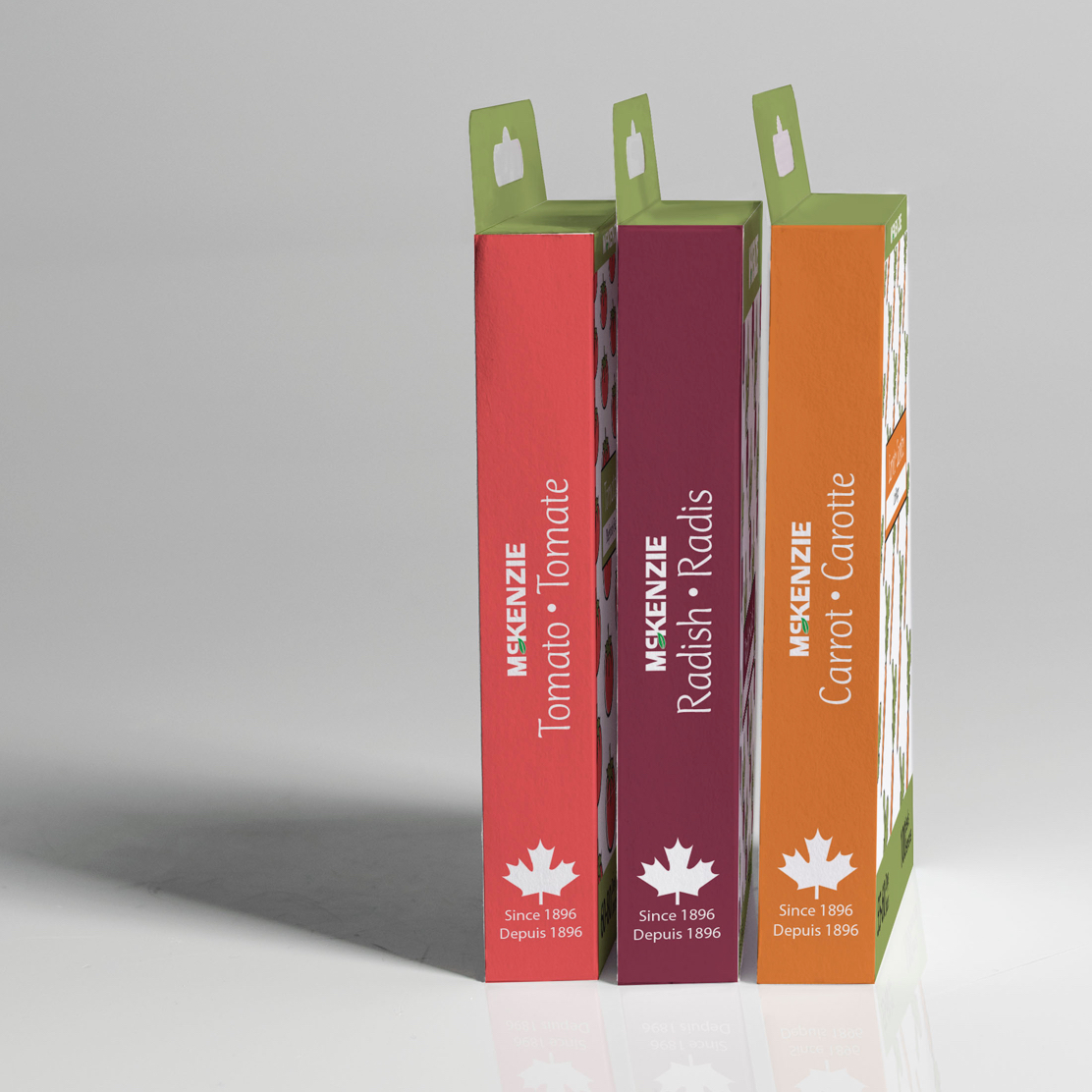
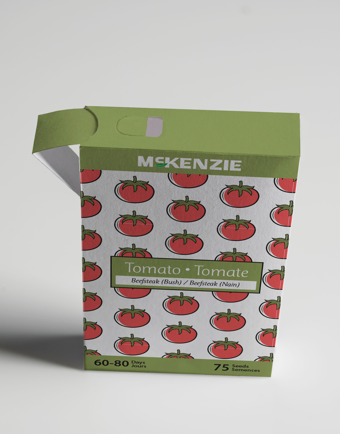
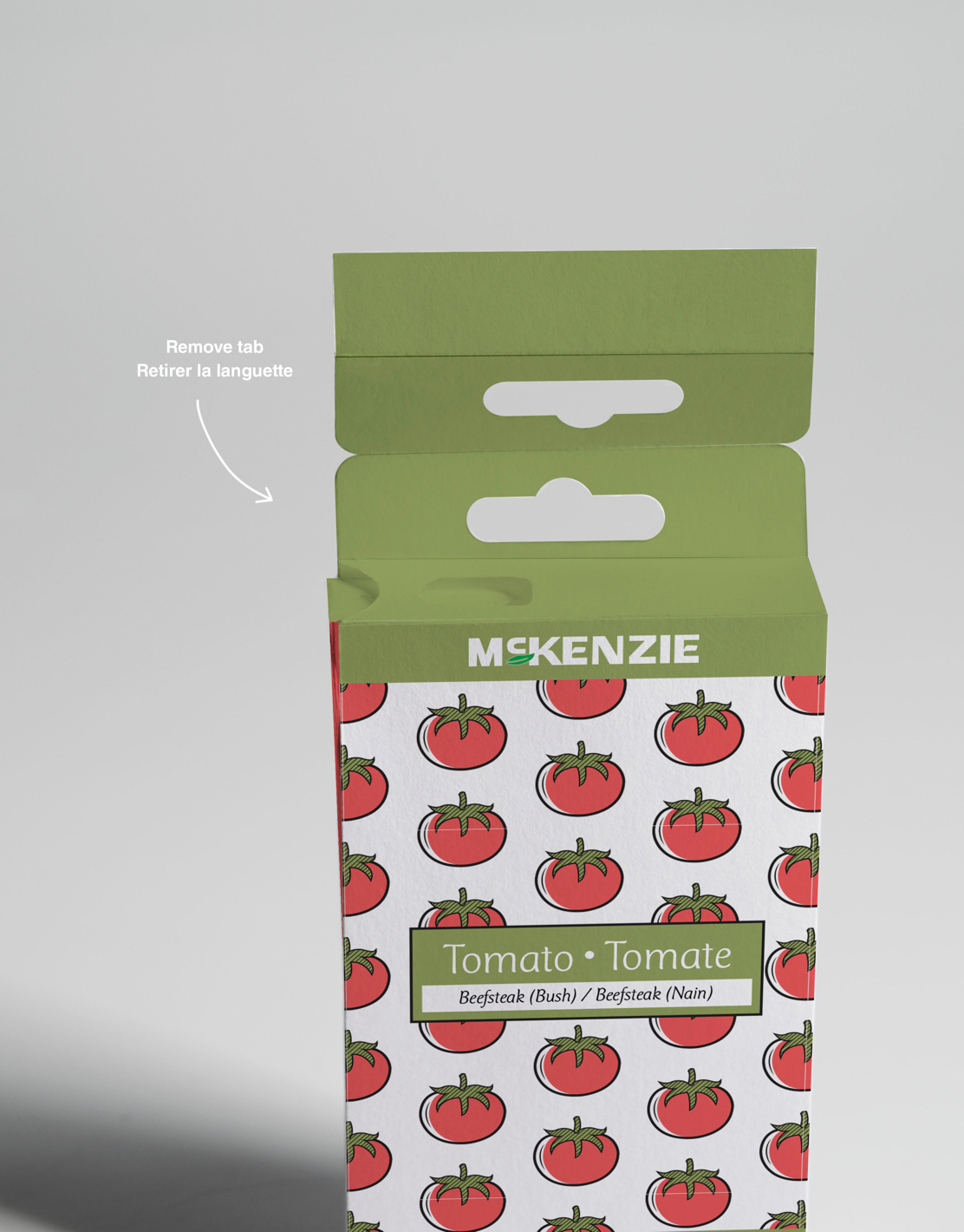
This redesign of the McKenzie Seeds traditional envelop package, appeals to a younger audience with simple, eye-catching illustrations.
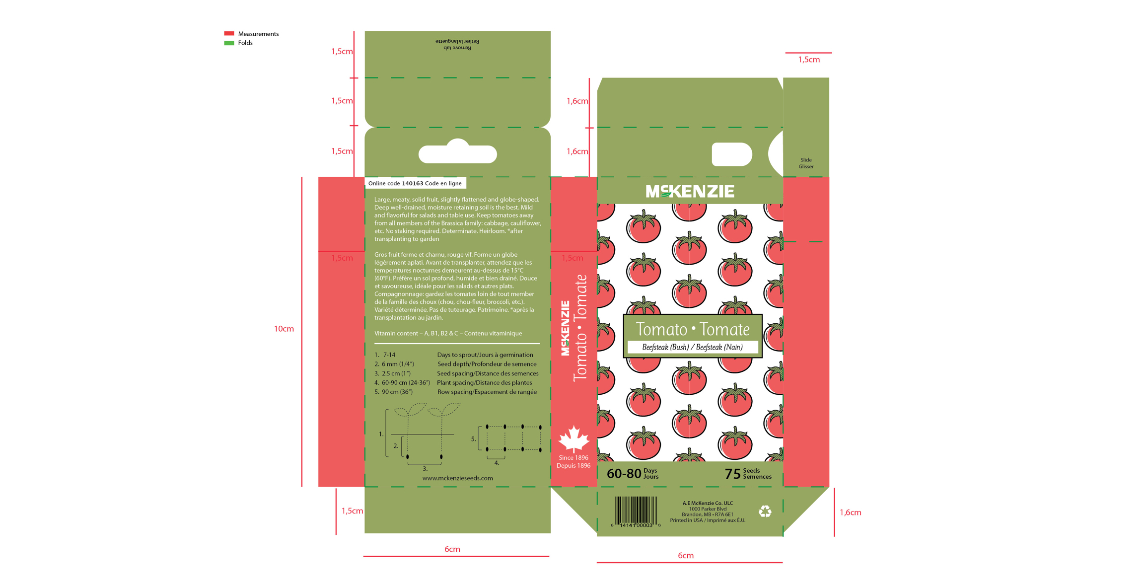
Instructional diagrams demonstrate when and how to plant for best results.
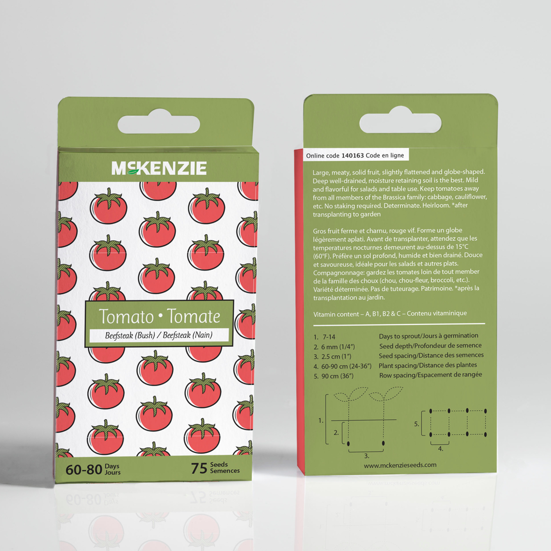
An innovative tab, allows control over the amount of seeds, while the upright container is easily stored for next season.
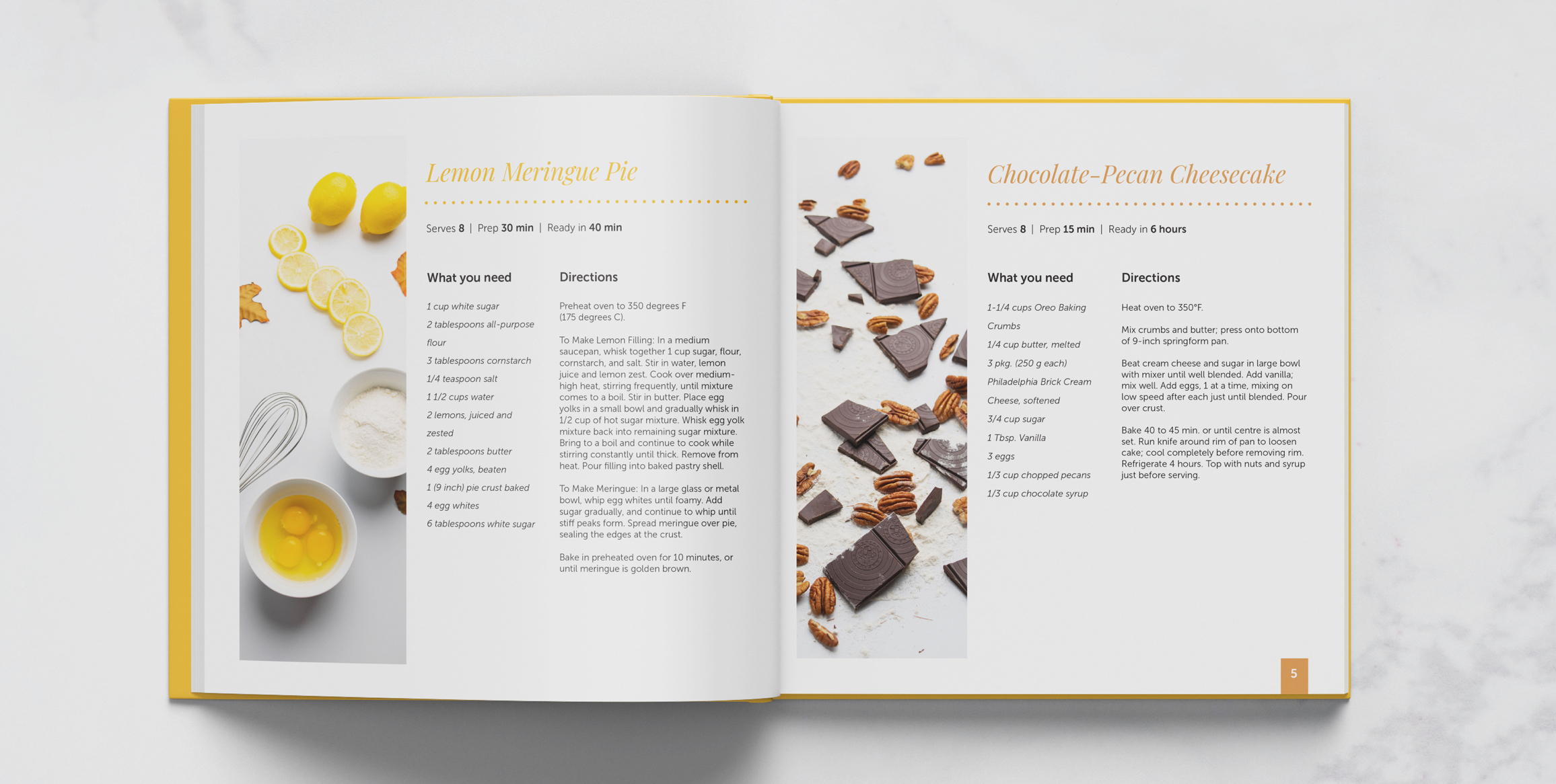
Home Baked Desserts is a cookbook for all things sweet and delicious.
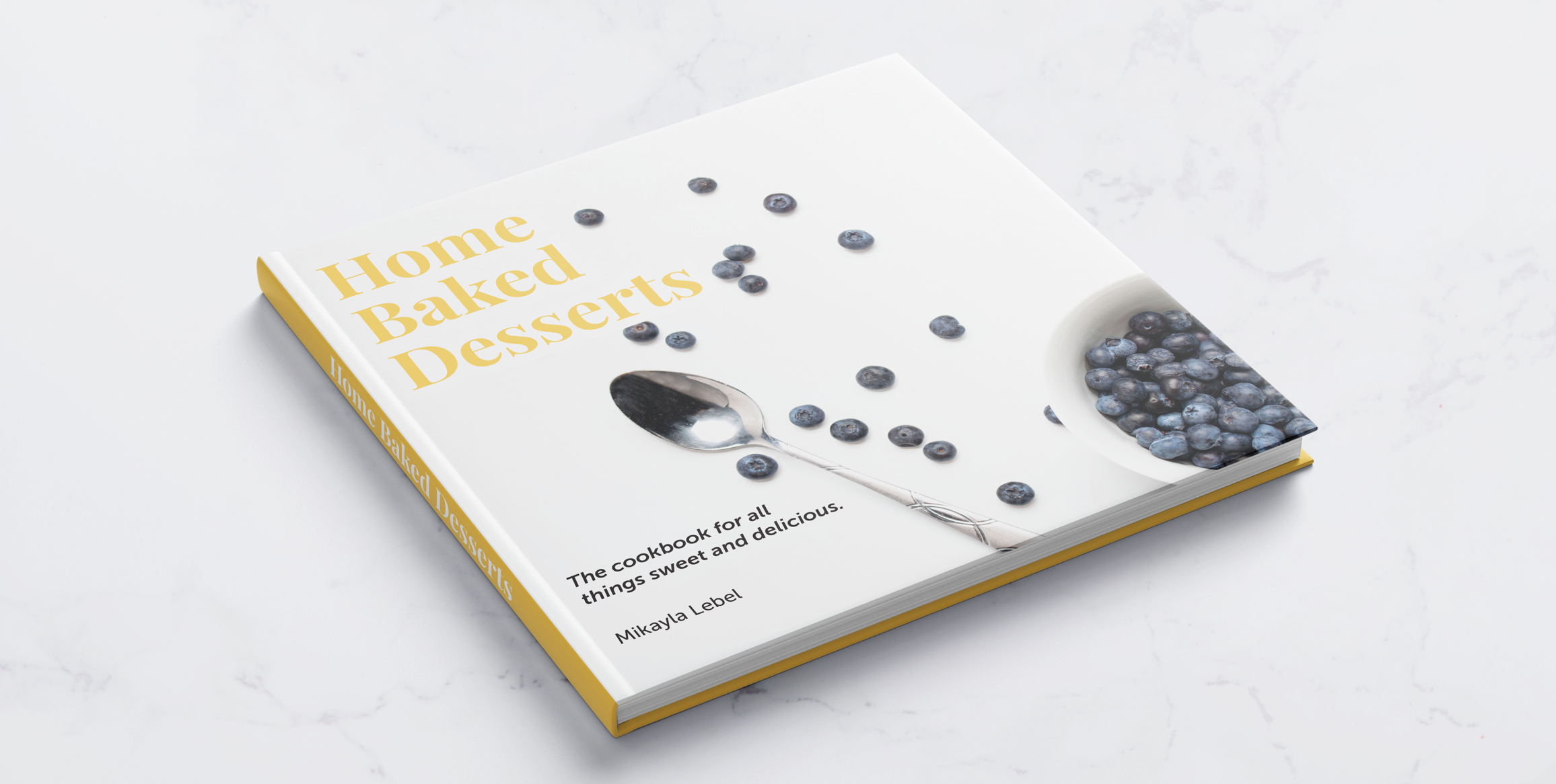
The objective was to take photos of the ingredients used in each recipe and create a simple, clean and modern cookbook.
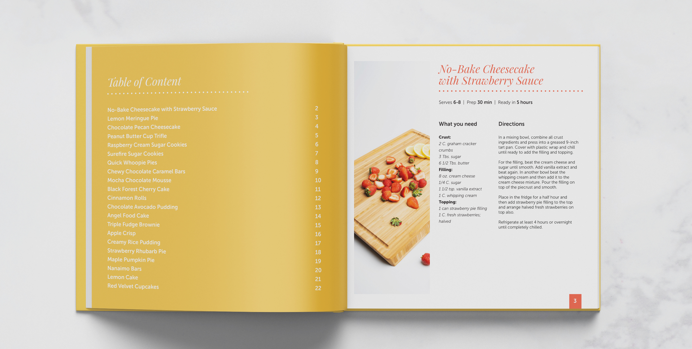
Typographic colours were selected based on the colour palette found in the photography.