Independent Living’s goal is to create an inclusive and accessible society where people with disabilities are valued equally. Their current corporate identity lacks uniqueness and standard application.
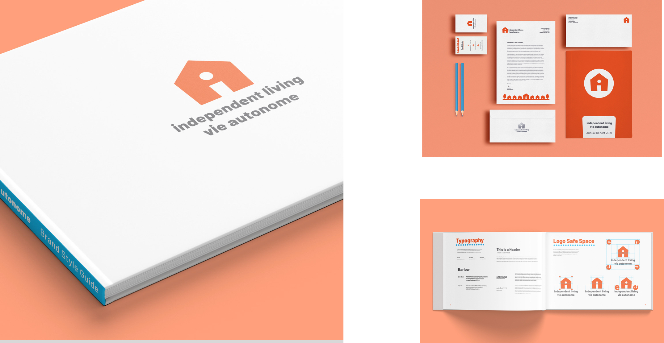
Their current corporate identity lacks uniqueness and standard application. This new friendly, modern and simple design uses the “i” to form the door and window of the house, as well as representing the individual’s independent living.

This new friendly, modern and simple design uses the “i” to form the door and window of the house, as well as representing the individual’s independent living. The colour orange was used because of its association with joy, happiness, determination, strength and endurance.


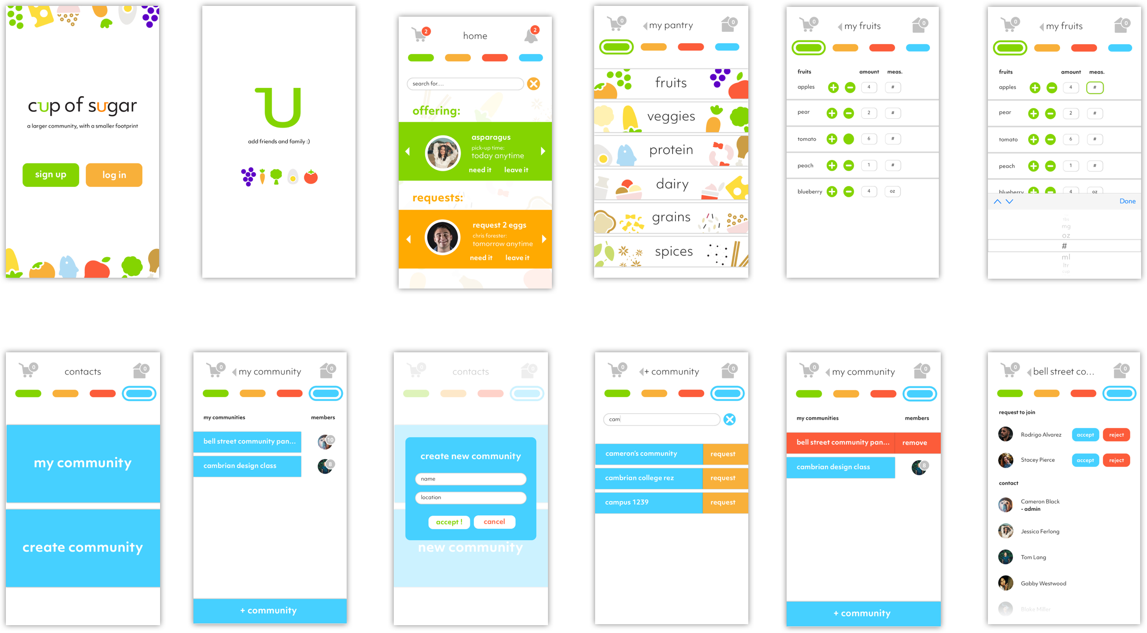
Cup of Sugar is an app that will help reduce food waste by allowing neighbours, friends, family members and coworkers the ability to share spare ingredients or items of food that are about to expire.
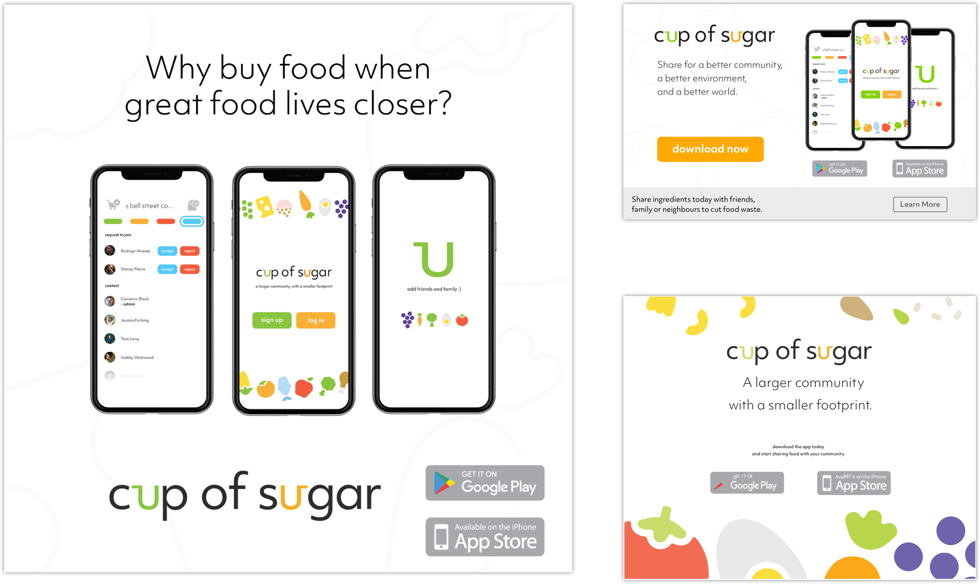
Within the app, everyone has their own virtual pantry to keep track of their stock. When an item is at risk of being unused, it can be added to their community pantry.
Items can also be requested in the community pantry, and scheduling pickup or delivery is easy!

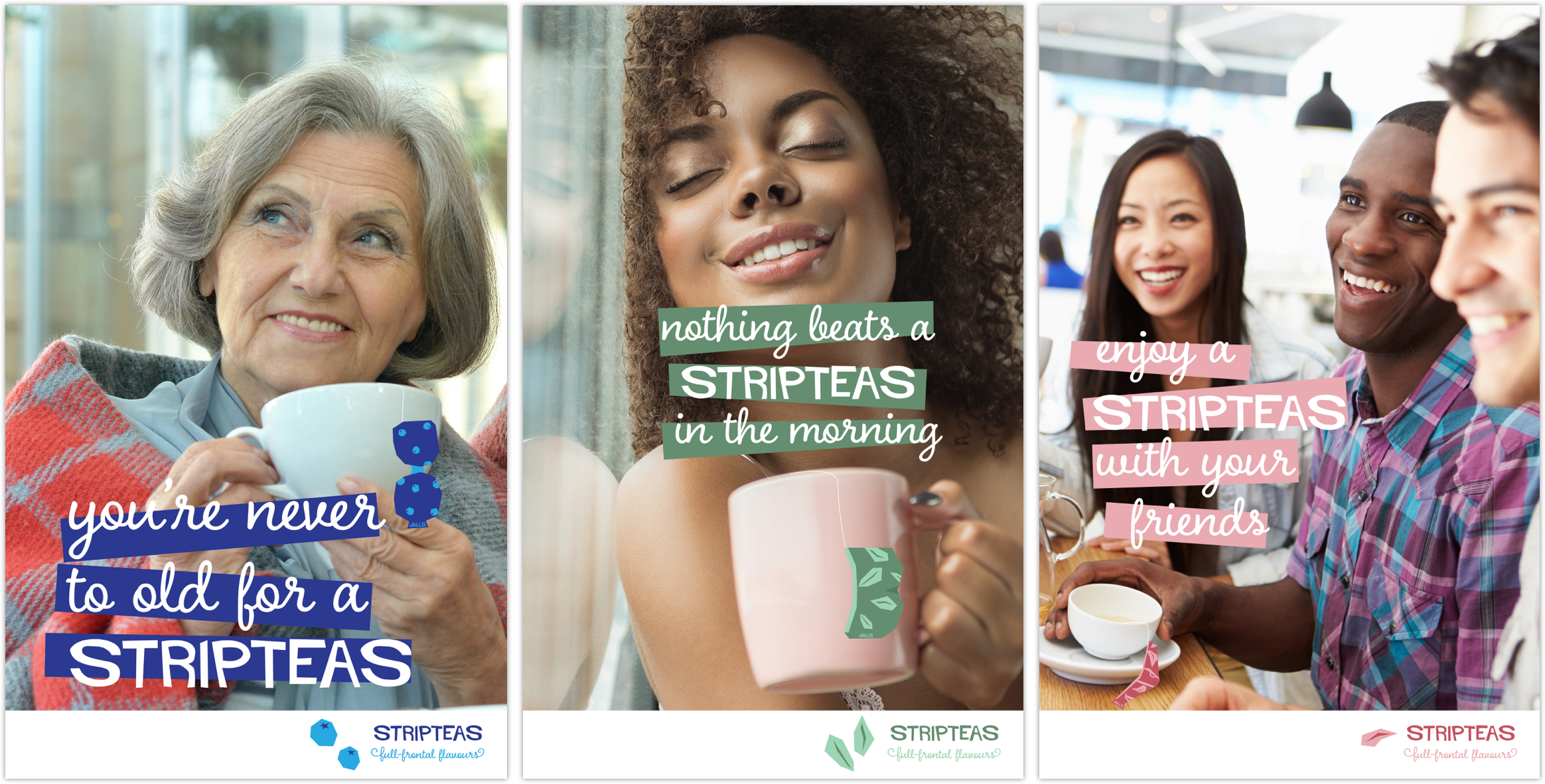
This smart and sassy, Saul Bassy, branding campaign and package design takes your average tea experience to new sensual heights.
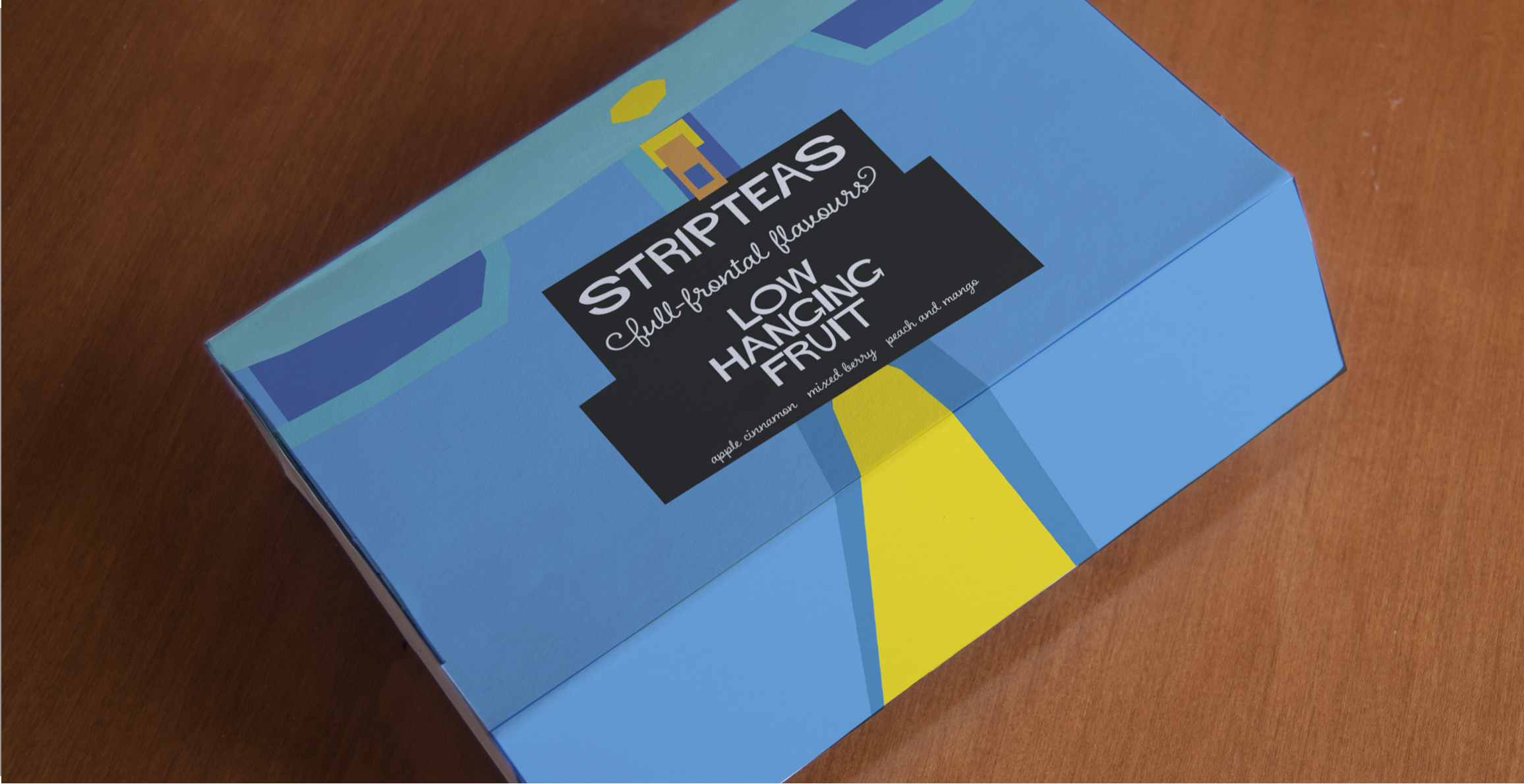
Stripteas takes inspiration from Saul Bass, his simple and geometric style of design. Each tea packet is opened by “stripping” off the undergarments, which then hang outside the cup appearing to be thrown in a moment of passion.
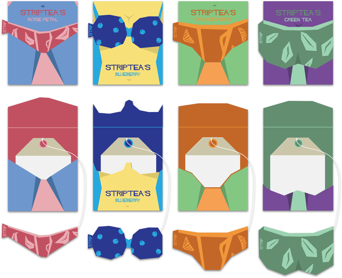
Additional campaign advertising helps to reinforce this clever brand.
