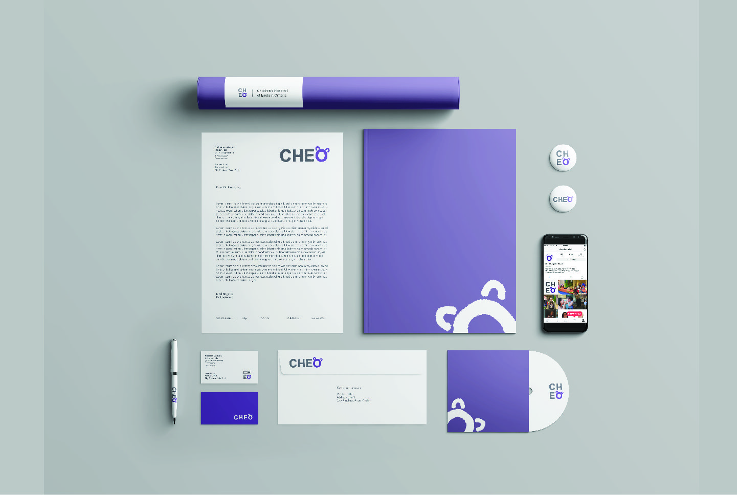
The objective was to strengthen the Children’s Hospital of Eastern Ontario brand by creating an identity that would be friendly and professional.
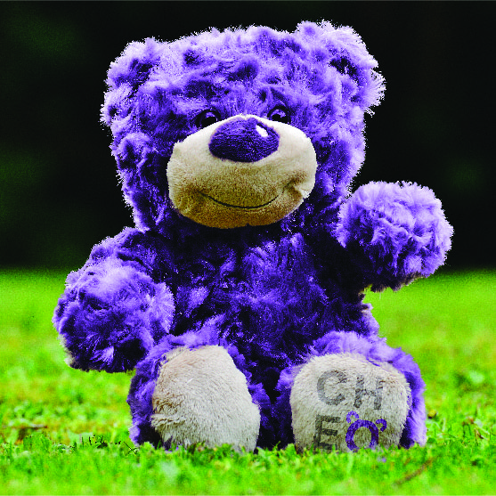

Inspired by the original logo, the stuffed bear was deconstructed* into a simple symbol.
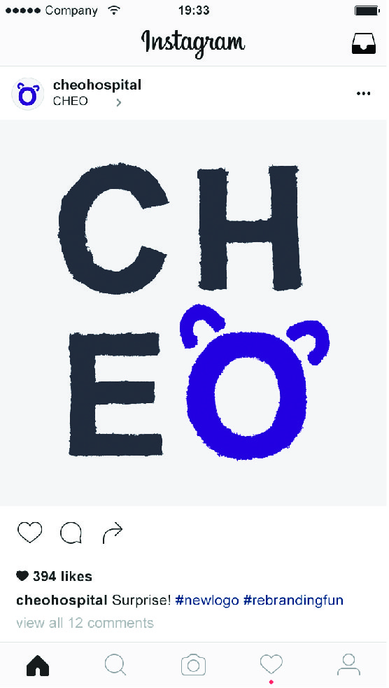
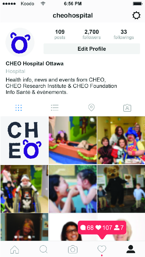
This symbol is ideal for modern applications online and in print.
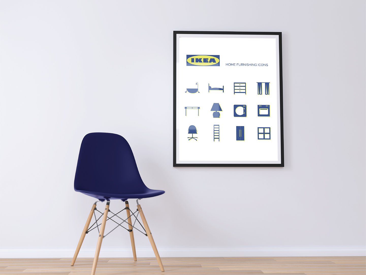
The icons were designed to be an easy way to navigate through the store and to be carried through online and in print.
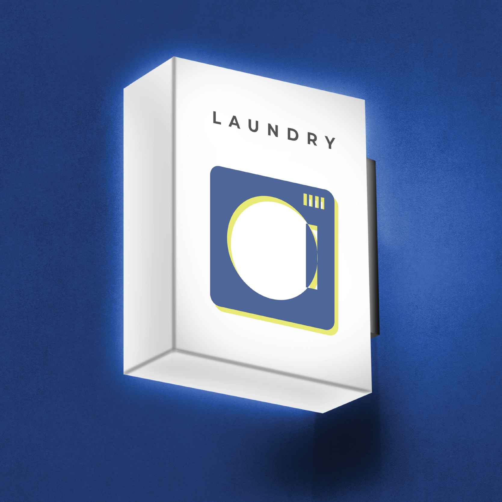
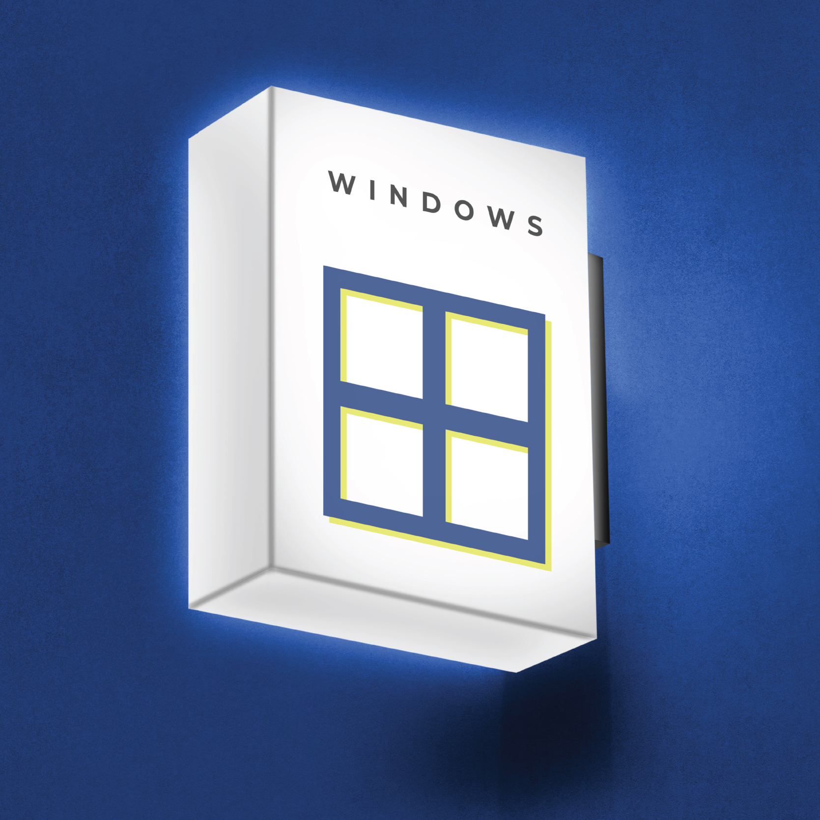
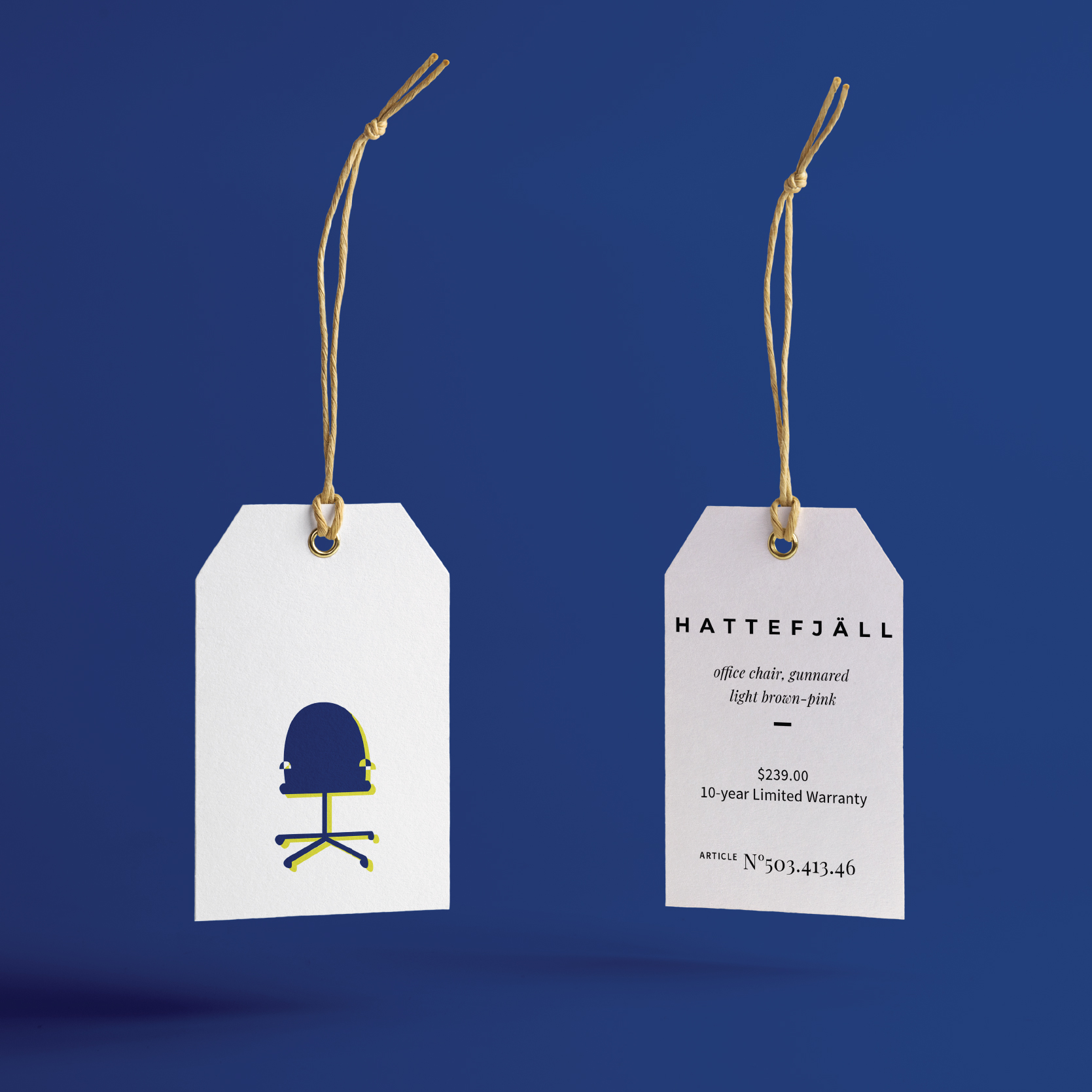
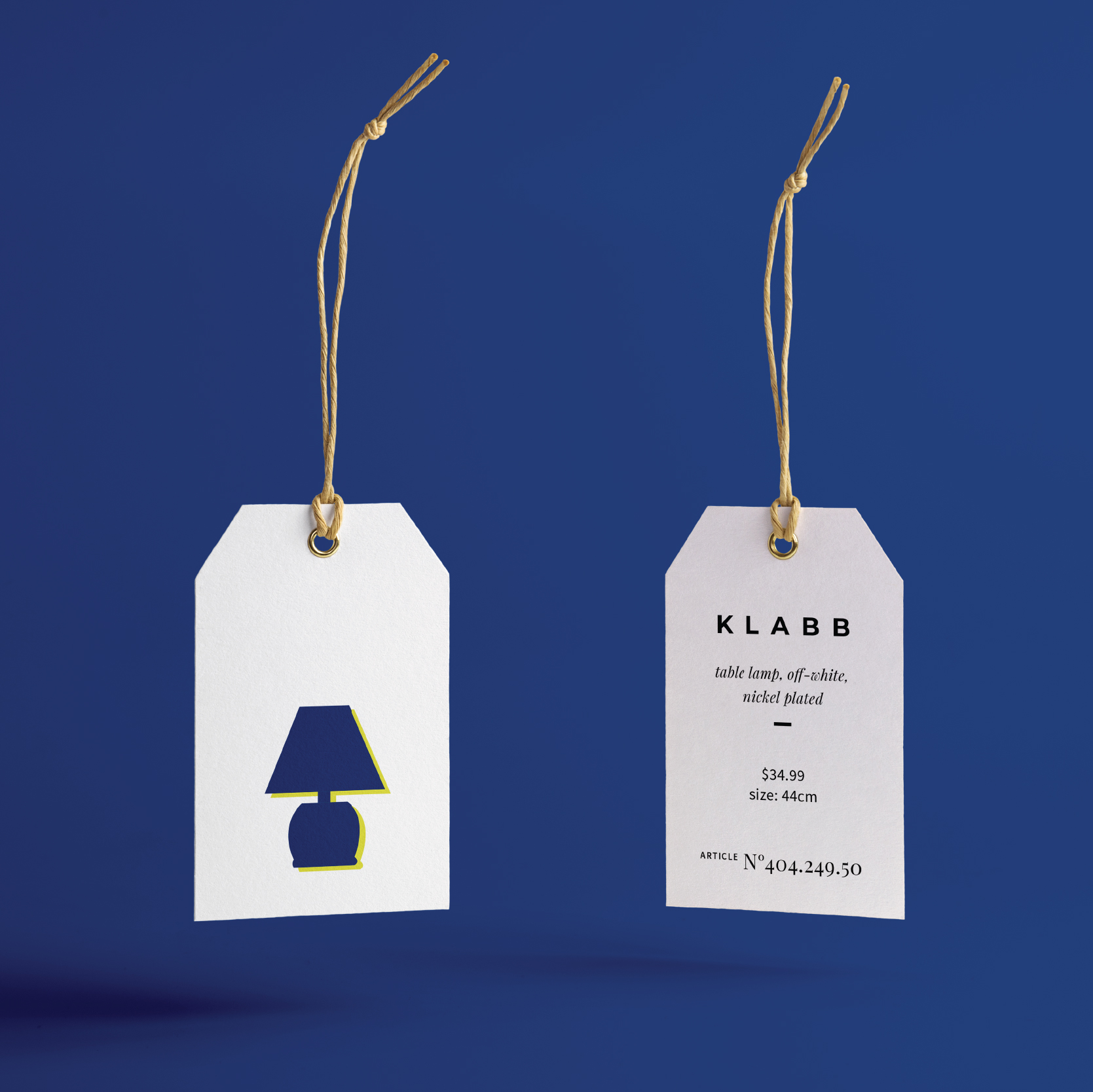
Ikea’s exisiting brand colours are used throughout this icon set, with blue and yellow colours offset.
Additionally, carried through to the design of an annual report to educate shareholders and sponsors on the benefits to potentially investing in the Kidi Box brand.
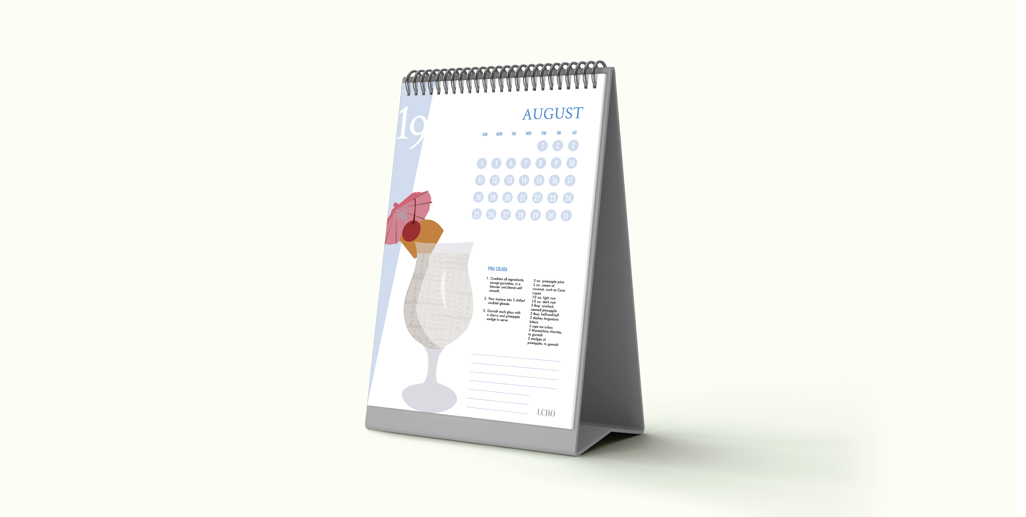
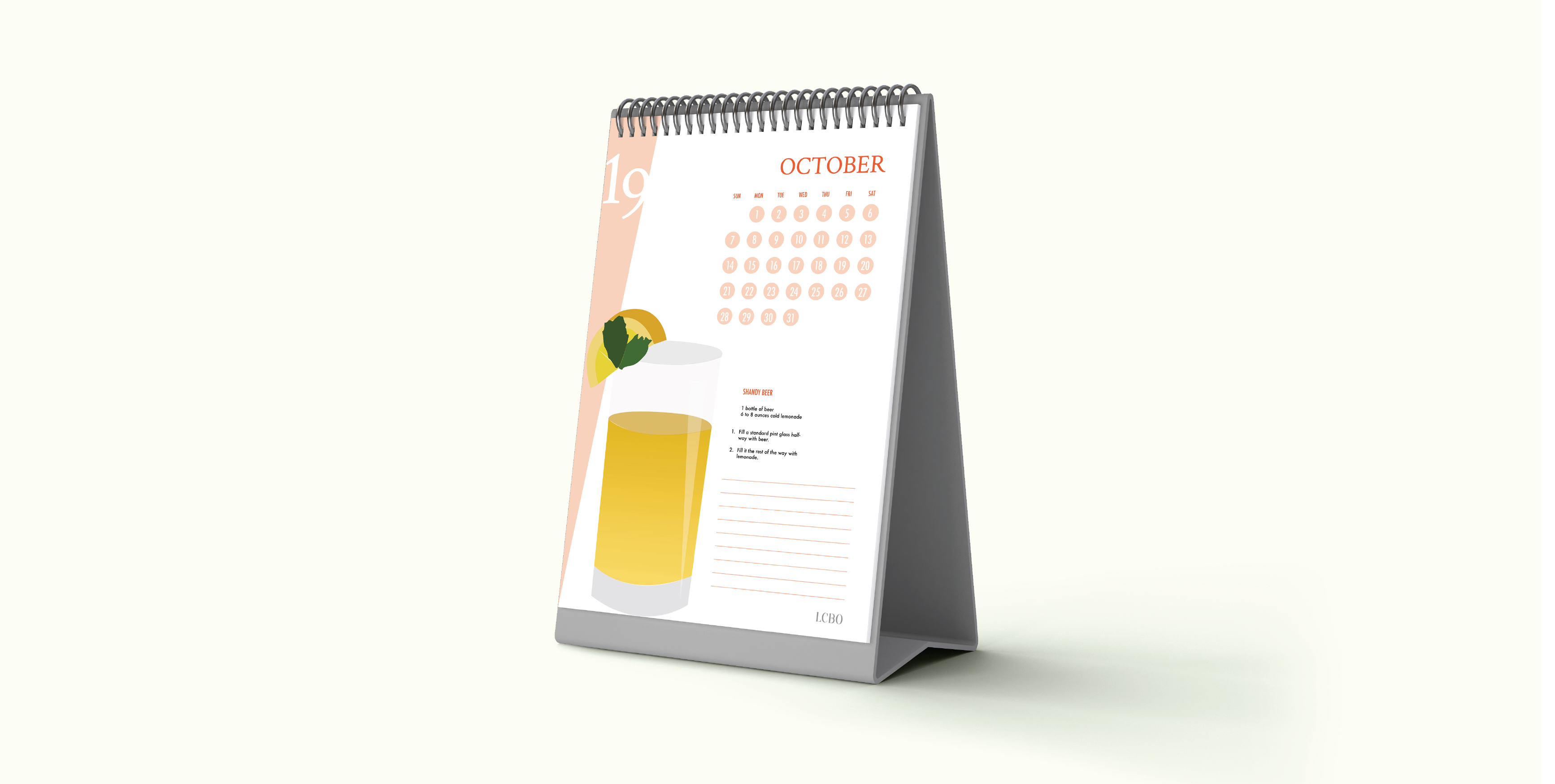
This promotional item, distributed by the LCBO, features seasonal cocktails made from alcohol found in the store.
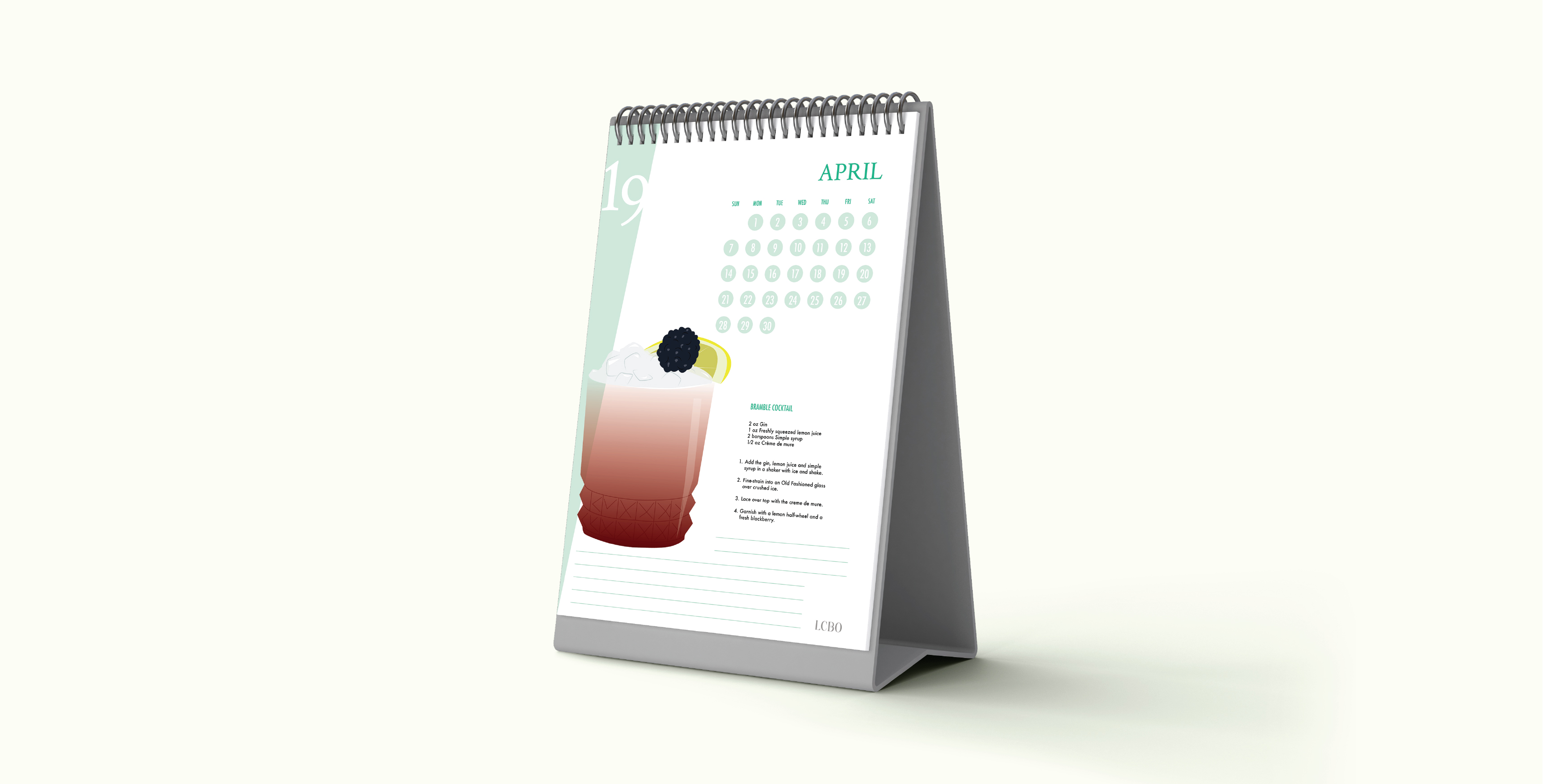
The illustration helps the consumer to visualize the cocktail and the written recipe instructs them how to prepare it.