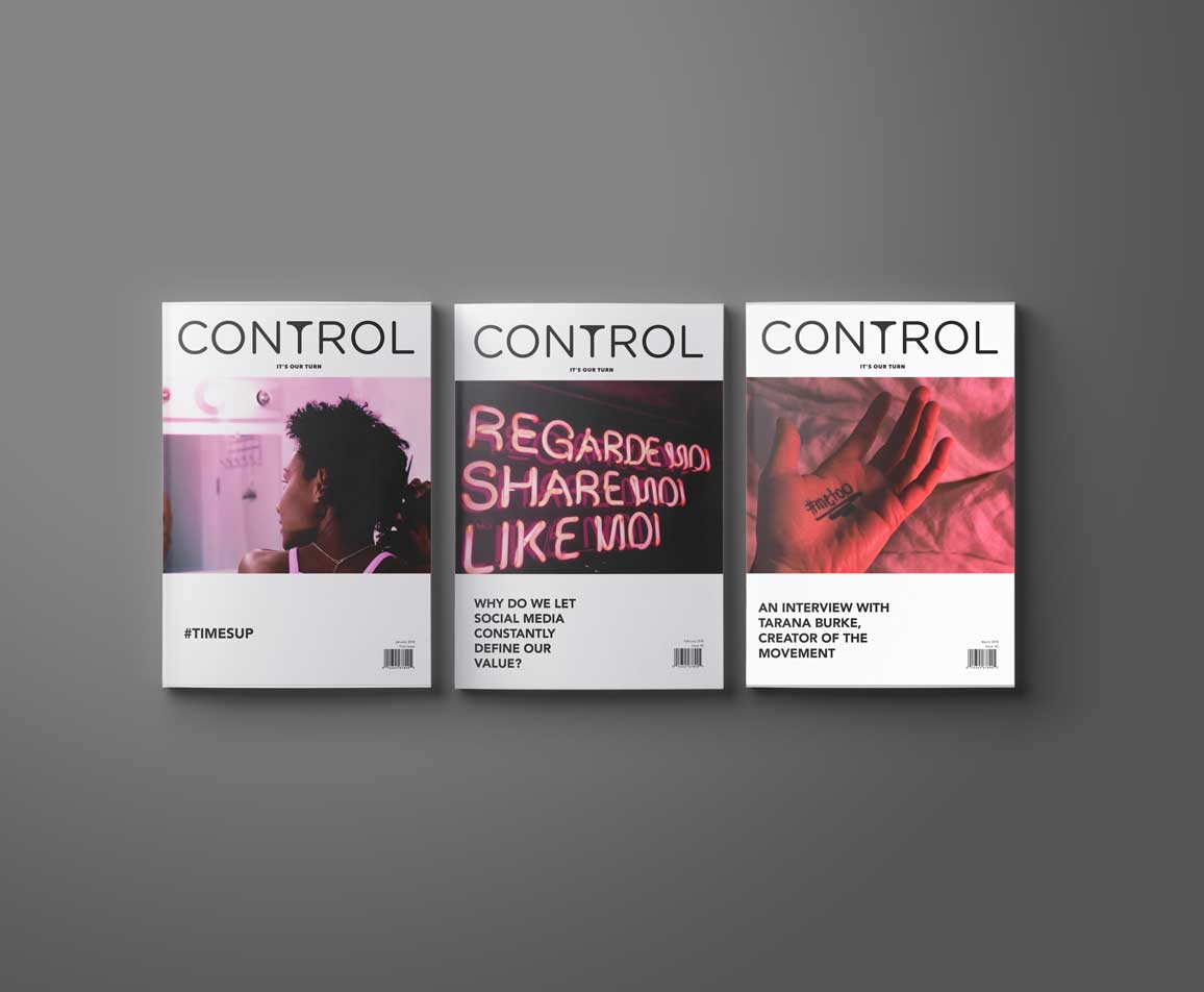
This magazine, about women and non-binary people doing
notable things, targets a demographic between 18-35.
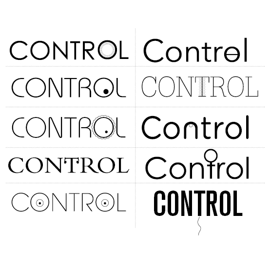
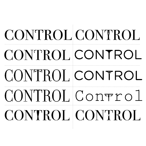
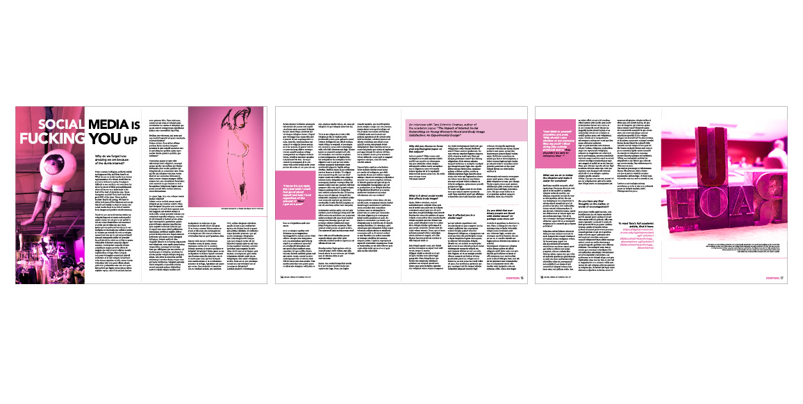
Through exploring possible manipulations of typography, a subtle yet provocative custom masthead was created to represent this audience. A colour unity is created between the cover and the featured editorial spread, allowing for a striking cover that can be reinvented with new imagery.

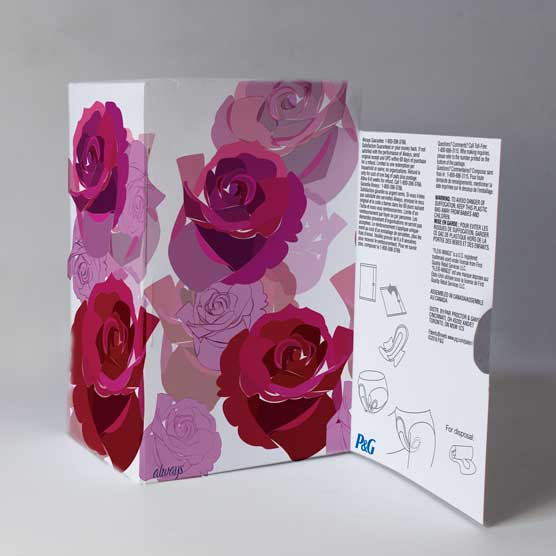
Traditional feminine hygiene packages often end up stuffed under the bathroom counter—making it inaccessible to the user.
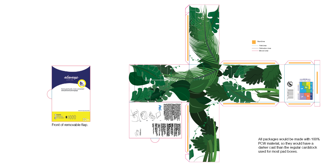
This redesign uses stylistic illustration to complement bathroom aesthetics, encouraging people to place the package in an open area, for better access.
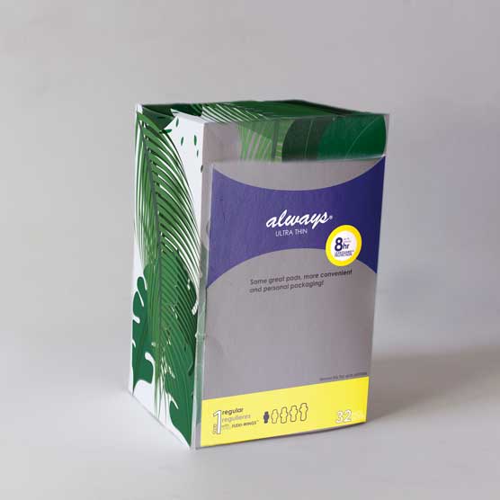
A convenient gravity-fed opening allows the user easy access to the product.

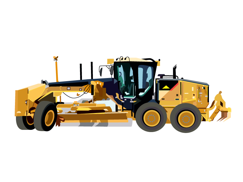
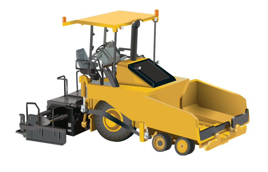
CROSH needed illustrations of their heavy equipment to use in guides and presentations. Creating realistic renderings provides the consumer/operator a full understanding of the structure of each machine, and can be used for safety and educational training.
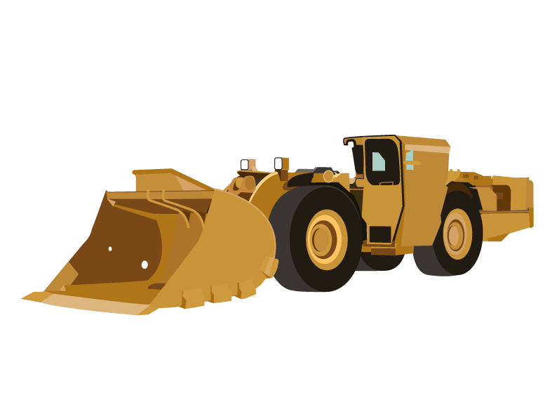
Above is an underground LHD and below is a grader.
