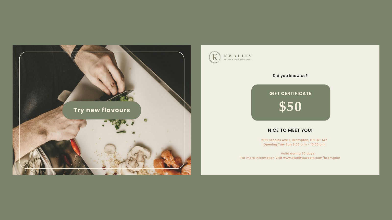
The rebranding of the “Kwality Food and Restaurant” logo underscores a dedication to creating design that is accessible for all. By modernizing and simplifying the logo, the restaurant ensures that its visual identity is inclusive and resonates with a diverse audience.
The decision to rebrand the logo for “Kwality Food and Restaurant” stems from a strategic initiative to modernize the brand’s image and resonate more effectively with today’s consumers. The previous logo may have been perceived as outdated or lacking in contemporary appeal, prompting the need for a fresh, modern design.
By undertaking this rebranding effort, the restaurant aims to position itself as a forward-thinking and innovative dining destination that caters to the tastes and preferences of modern customers.Additionally, the rebranding process provides an opportunity to streamline the logo’s design, making it more versatile and adaptable across various marketing channels and applications.
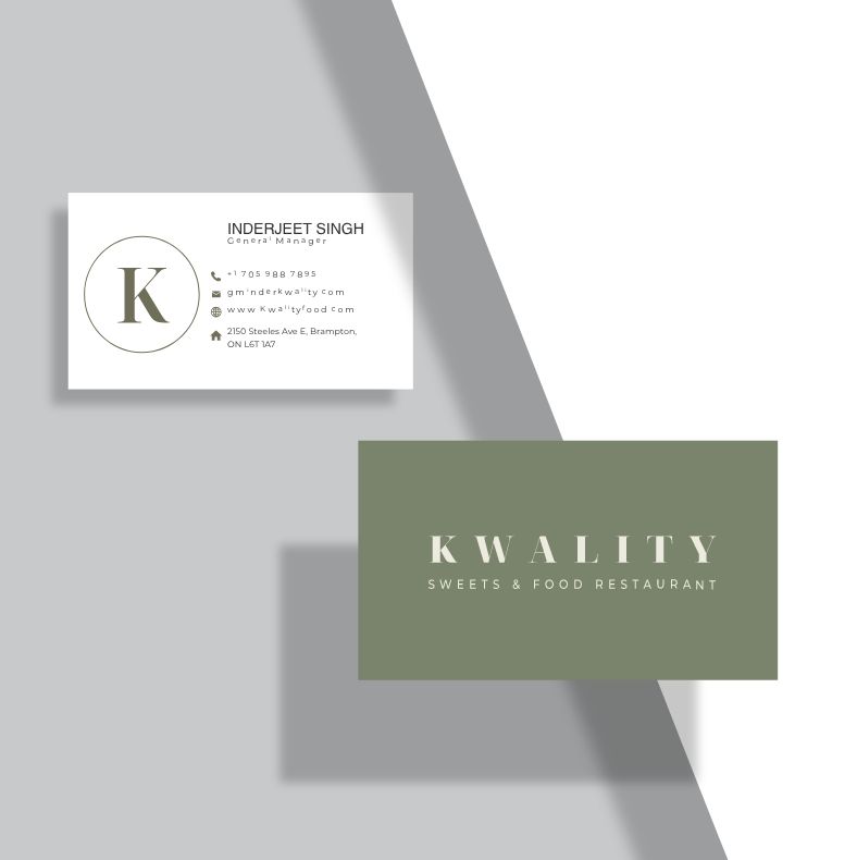

A simplified and refined logo can enhance brand recognition and memorability, ensuring that “Kwality Food and Restaurant” stands out in a crowded marketplace. The new logo should convey the restaurant’s commitment to quality cuisine and exceptional dining experiences, while also projecting a sense of professionalism and sophistication.


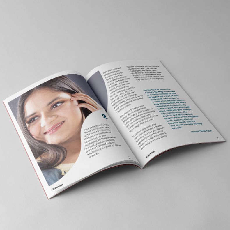
Throughout this project, the audience is asked to emotionally connect with the subject through humour and witty copywriting.
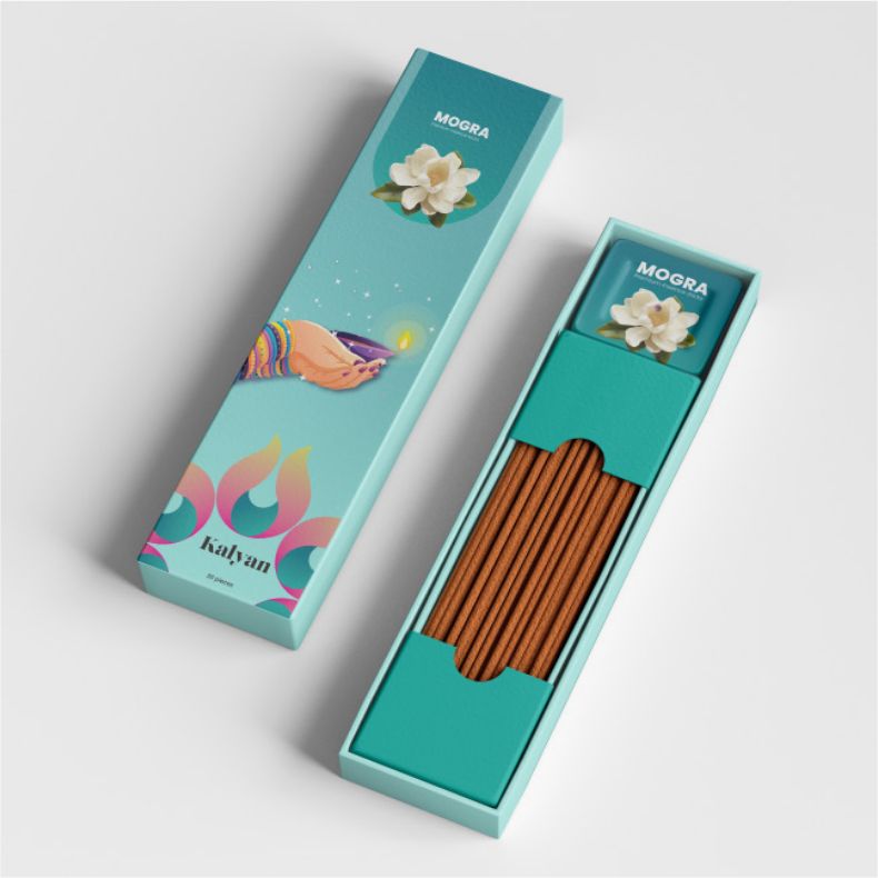
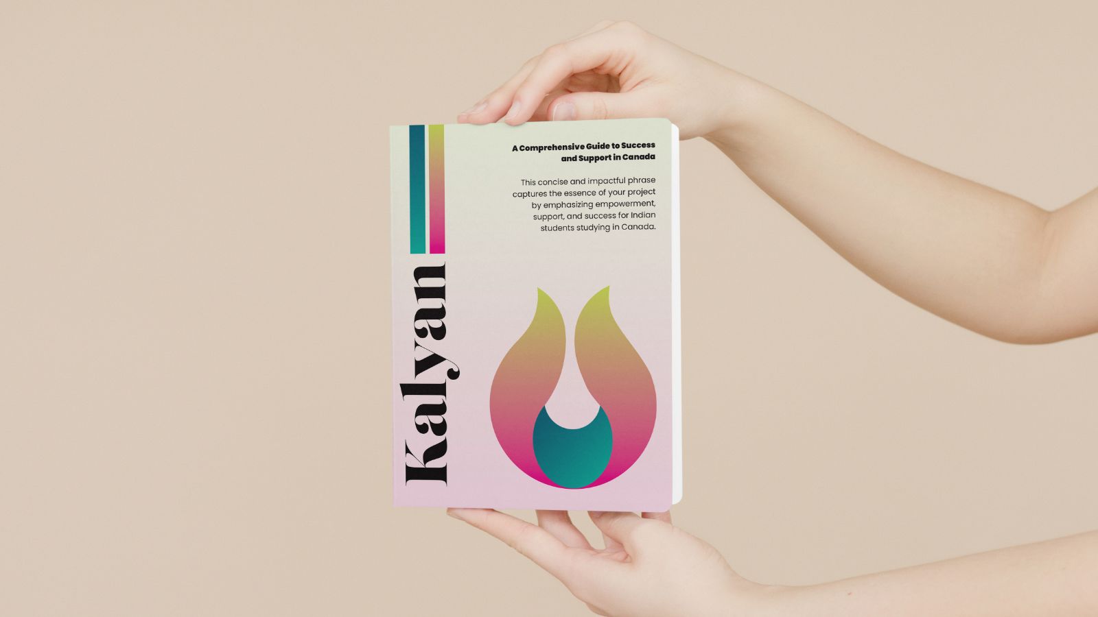
The visual identity of the Kalyan project embodies its core values and objectives, aiming to empower Indian students studying in Canada. Vibrant colours were carefully selected to evoke the richness of Indian culture while maintaining a professional appearance.
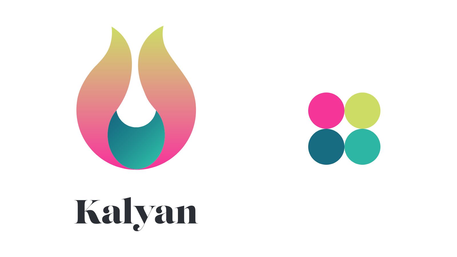
Inspired by the Trishul, the logo symbolizes strength, growth, and cultural heritage, aligning with the project’s mission to support students in their educational journey abroad.

Kalyan project reflects its overarching goal of empowering and supporting Indian students while promoting cultural integration and well-being in the Canadian academic landscape.

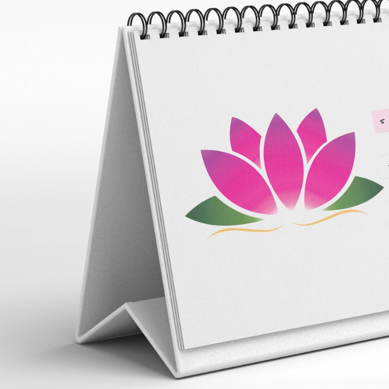
Calendar with illustrations of flowers sparks new and innovative ideas by infusing each month with the beauty of nature, inspiring creativity and imagination. As users engage with the vibrant artwork, they are transported to ever-changing landscapes that evoke feelings of wonder and renewal.
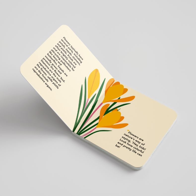
Designing a calendar with illustrations of flowers is an opportunity to combine functionality with aesthetic beauty. The rationale behind this project lies in the universal appeal of floral imagery, which has a timeless quality that transcends cultural boundaries. By incorporating illustrations of flowers into each month of the calendar, you create a visually captivating experience that resonates with people of all ages and backgrounds.

Flowers evoke feelings of joy, renewal, and connection to nature, making them an ideal subject matter for a calendar intended to brighten up any space.Furthermore, the inclusion of botanical illustrations serves a practical purpose beyond mere decoration. Each flower can be carefully chosen to correspond with the seasonality of its respective month.
By leveraging the universal appeal of flowers and the practicality of a calendar, this project has the potential to attract a wide audience and generate interest from individuals seeking both beauty and functionality in their everyday lives.