


This project encourages open discussions about alcohol abuse among young adults. It provides resources and information to an audience under the legal drinking age, which is not often targetted by sobriety campaigns.
The focus group is teenagers from the age of 14 to 18 years old. This brand educates them before they are of legal drinking age, which may have a better outcome than trying to educate those who are already drinking and possibly have already experienced alcohol abuse.
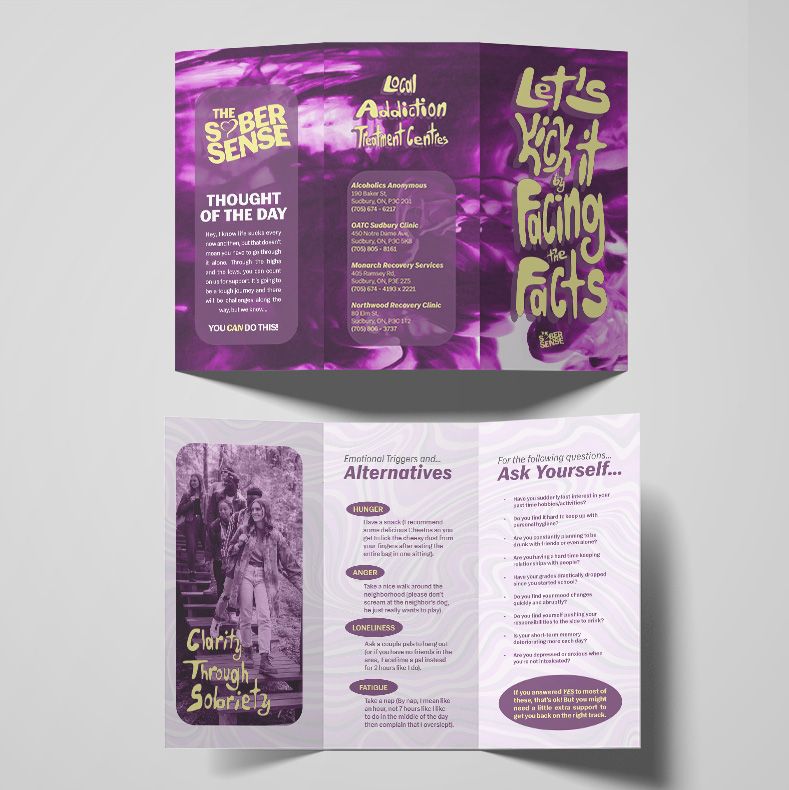
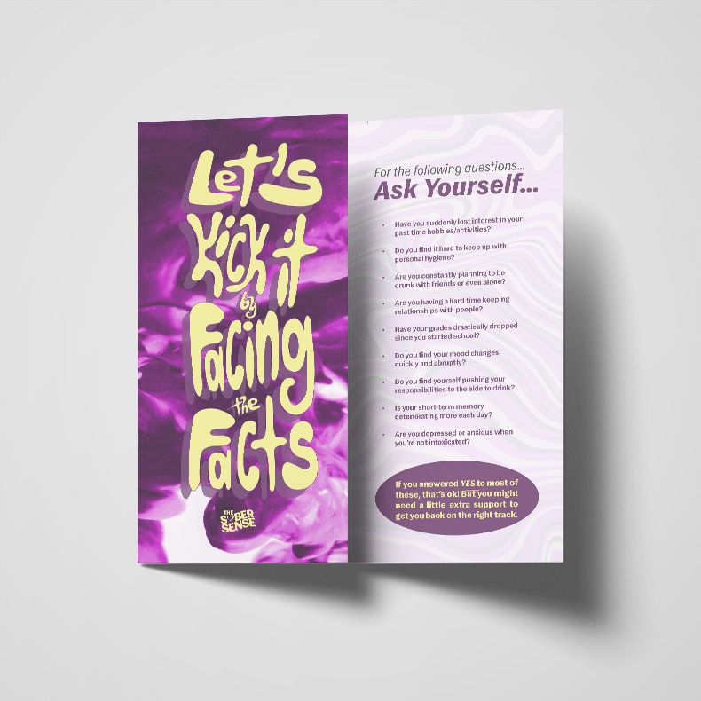
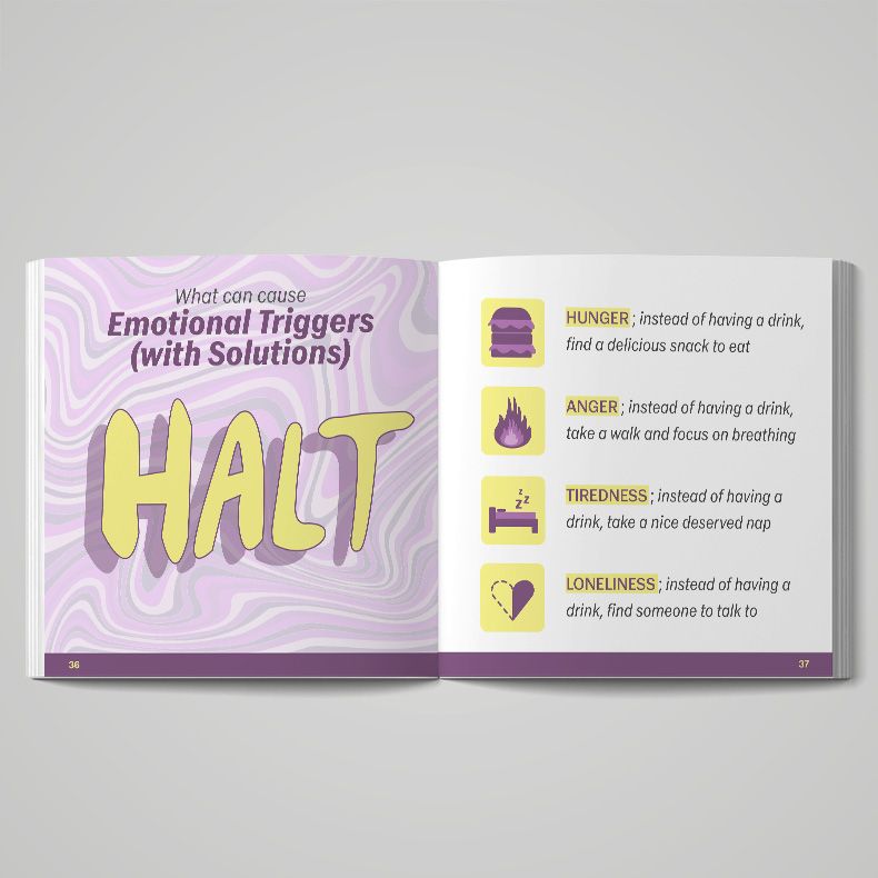
The brochure would be found in high schools and colleges around Sudbury, Ontario. It can also be placed at the reception desks of medical facilities (clinics, hospitals, etc). It lists the emotional triggers along with alternatives that can be done instead. It also has a small quiz that may help people understand how to identify alcohol dependence for themselves and others.
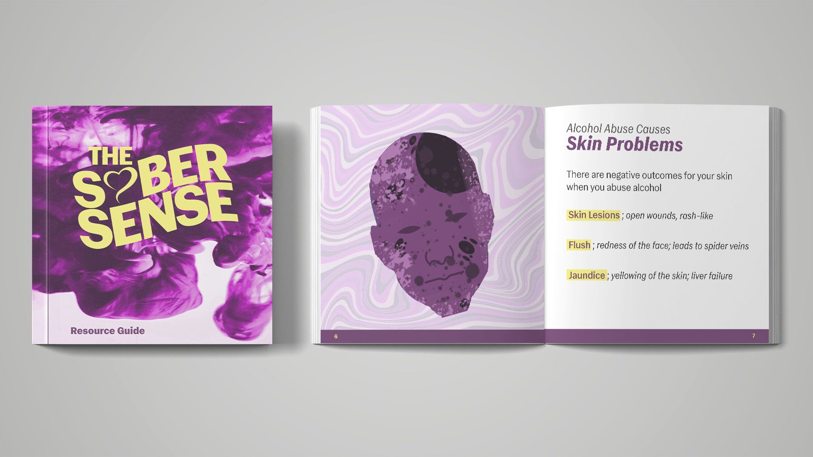
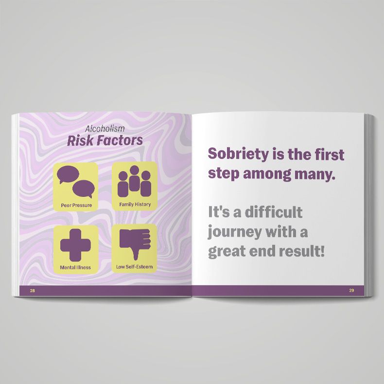
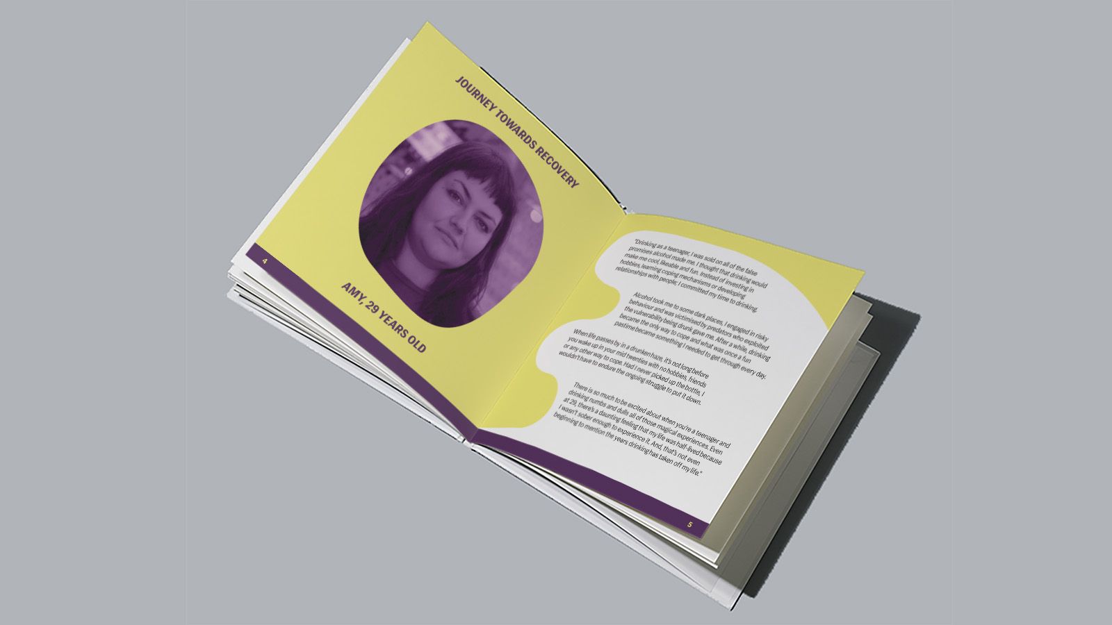
The Resource Booklet contains symptoms that are caused by alcohol abuse and local addiction centres that provide services for those struggling with alcohol dependence. It also contains a small infographic about the risk factors, relapse and recovery statistics, the cycle of relapse and triggers. Stories of individuals who have struggled with alcoholism are divided throughout the booklet.
This project is dedicated to make The Home Depot more inclusive with an audience who is not familiar with their products by using a more simplified and friendly approach.
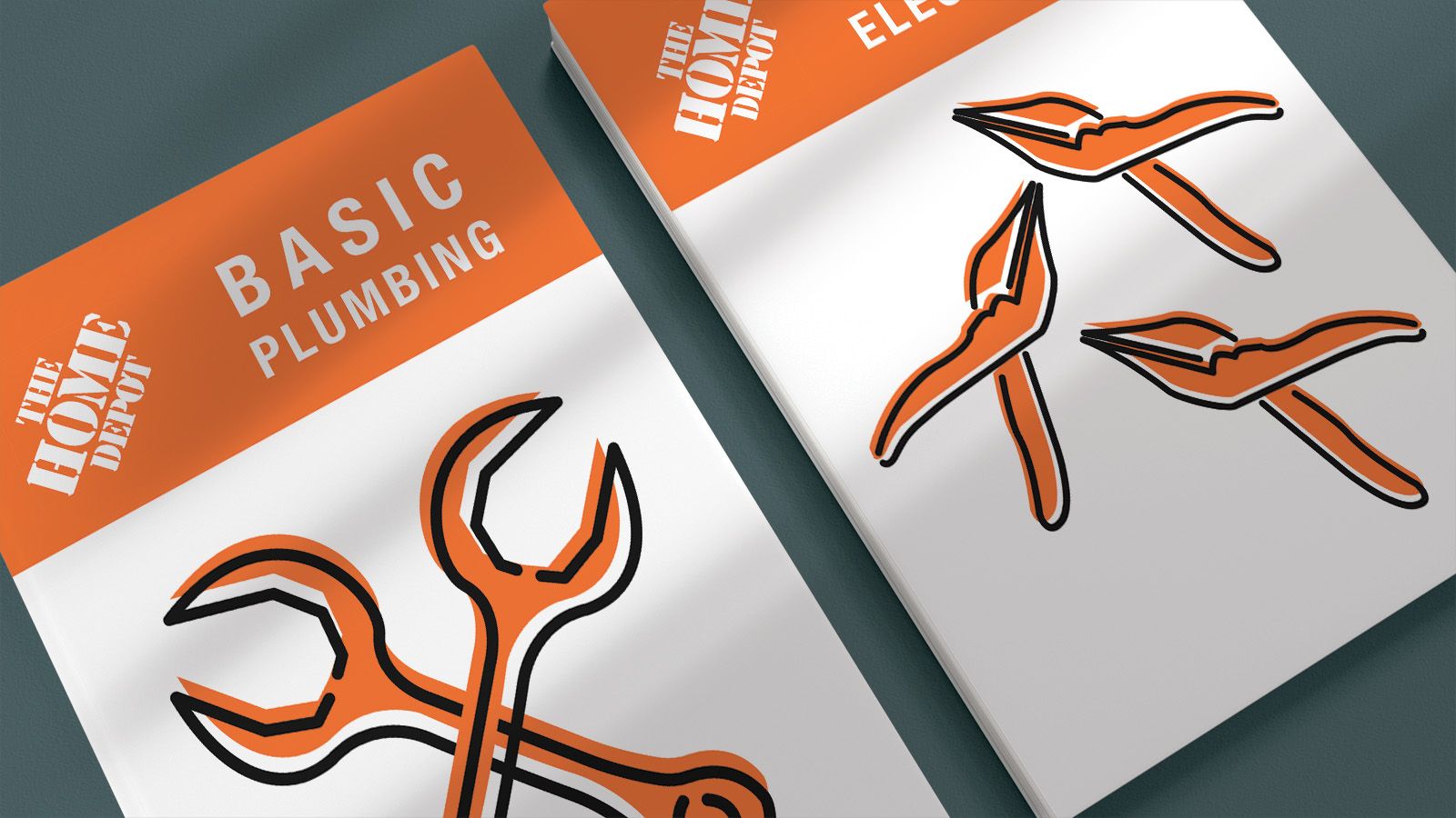
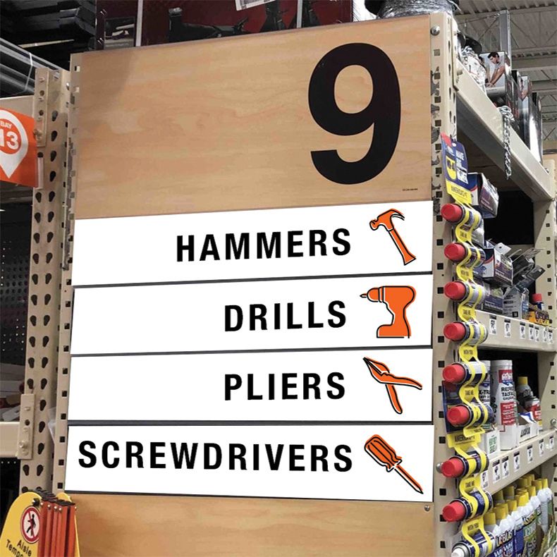
The icon set was created in relation to Home Depot’s branding. These icons are used in infographic cards, packaging for first-time renovation kits, and signage within the store. The icons give a friendly approach to starting your journey in DIY projects. The orange is the colour within the Home Depot brand. The black is a great contrast and gives more dimension.
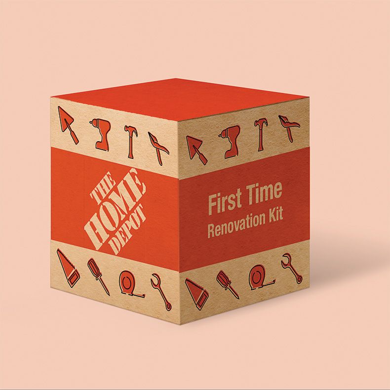
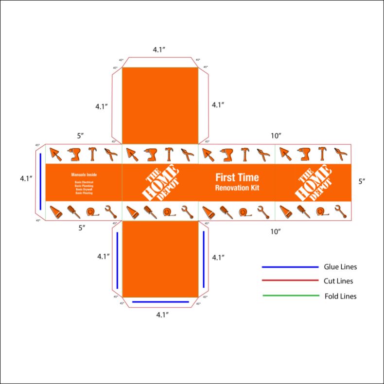
Newcomers inspire this First Time Renovation kit. It contains basic manuals containing information like plumbing, electrical, fixing holes, etc. This would be available to purchase at any Home Depot. The wayfinding would be found at the beginning/end of every aisle for simple navigation throughout the store. The infographics can be found in the kits, end of aisles or cash registers.

This project aims to motivate families and children to learn about three different mammals who are at risk of becoming extinct.
The Species At Risk exhibit is inspired by the style of low-polygon art. Using geometric shape and texture, the three species of the exhibit are represented cohesively, yet have their own unique traits in order to have a distinction between each other and memorable features.
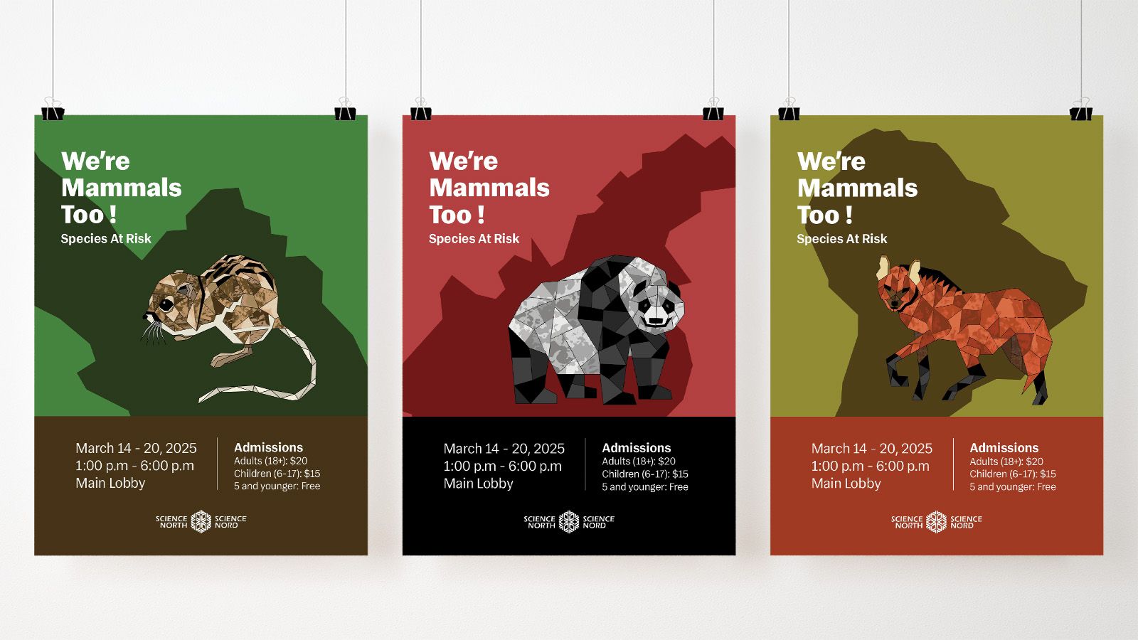
These posters are for advertising purposes. They would be visible throughout the Science North establishment, as well as other facilities around Sudbury to promote the event.
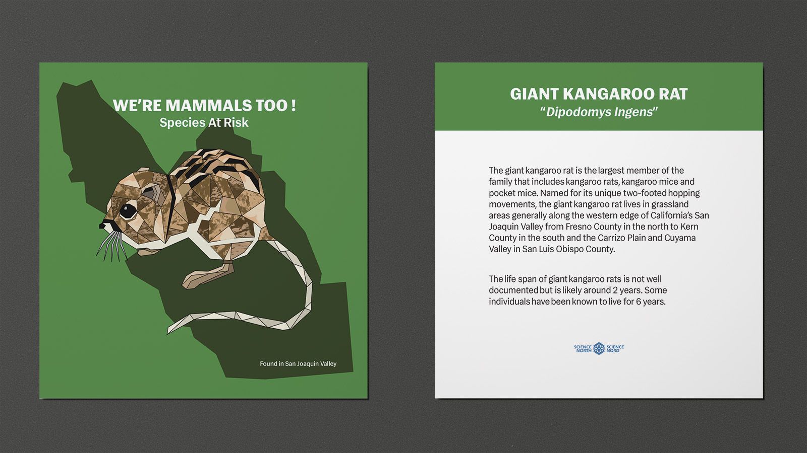
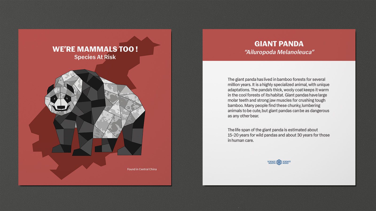
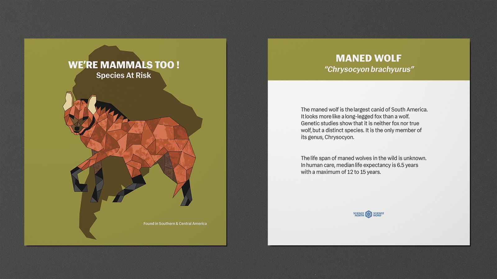
These infographic cards would be handed out to the children and parents at each designated station. Each card contains and low-polygon artistic render of each animal, a solid outline of the places they can be found and a small biography on the back of the card.
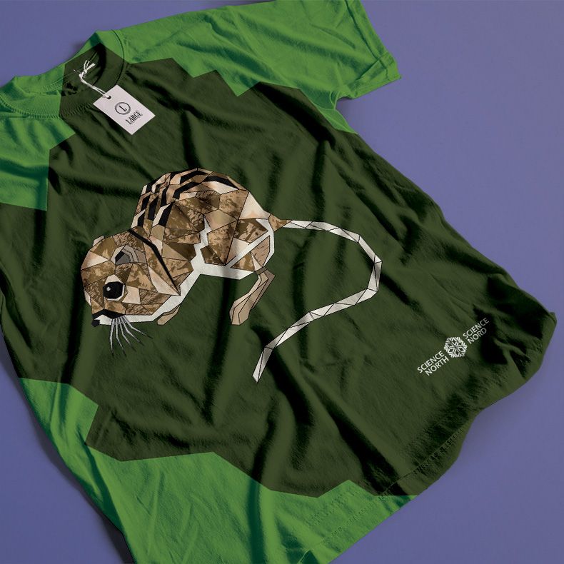
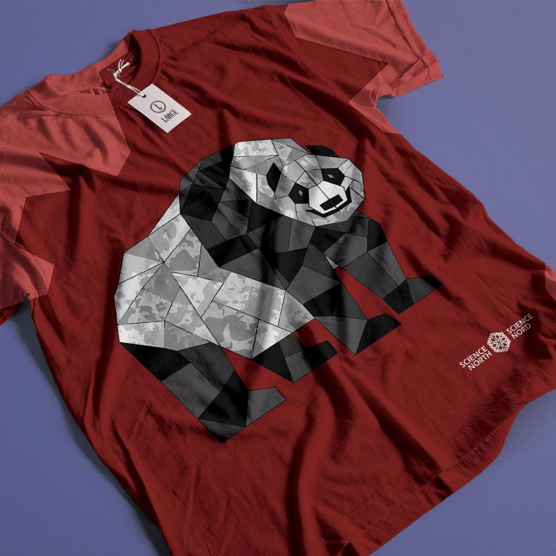
These shirts would be available to purchase at the Whizards gift shop, located at the entrance lobby of Science North. They would be available in both youth and adult sizes.

