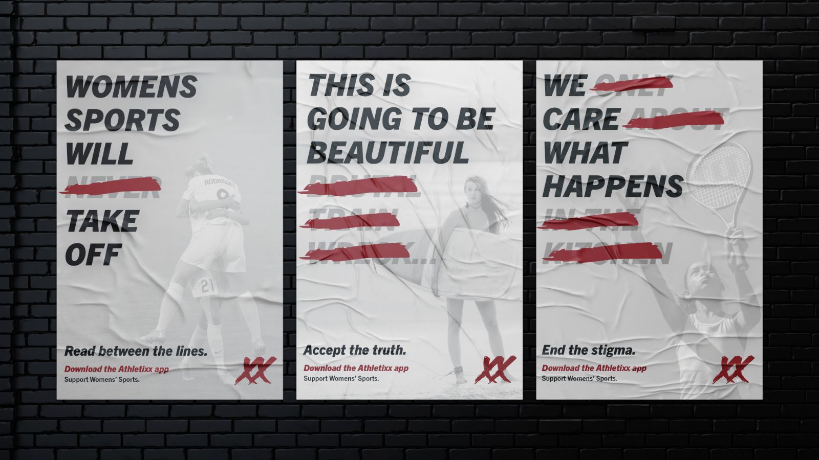
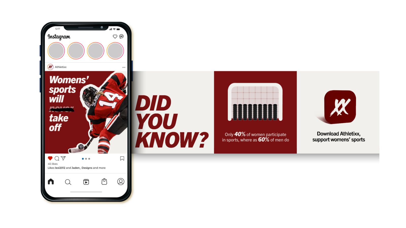
The visual identity was designed to convey the feelings women in sports understand too well—frustration, anger, and aggression. This aesthetic, visually represents the emotions experienced by competitive females in professional sports.
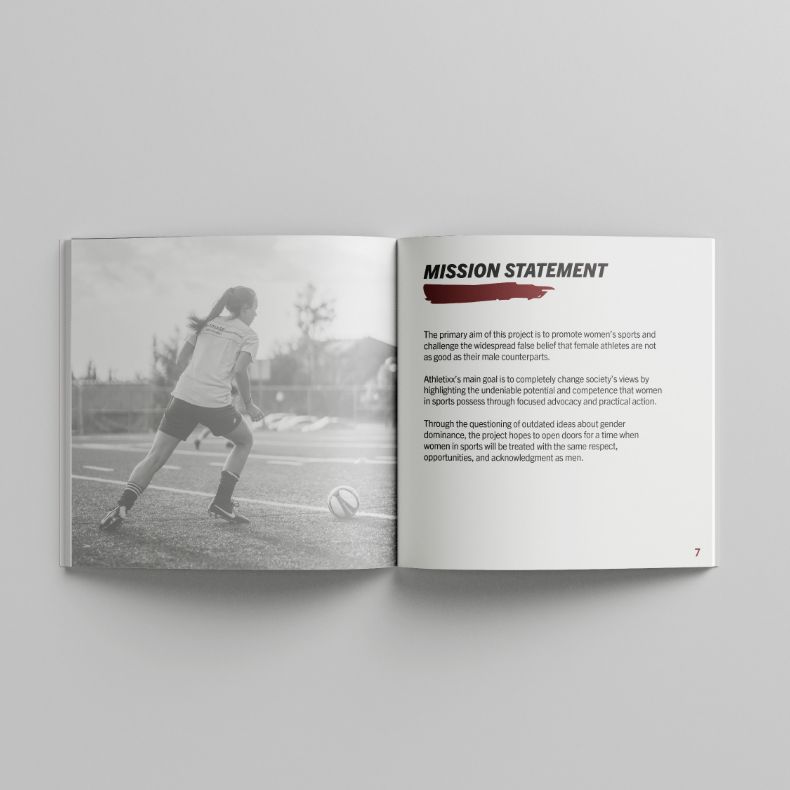
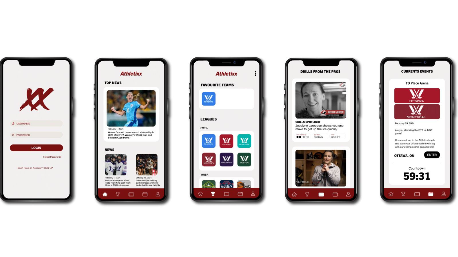
Athletixx - a concept design to help support womens’ sports. For decades, women have tirelessly battled for recognition within the sports industry, from securing spots in the Olympics to advocating for equal pay and broadcast coverage. Athletixx stands out by offering a dedicated platform for the visibility of womens’ sports through promotional materials and a user friendly app. Athletixx aims to inspire young women by demonstrating the amount opportunities available to them.
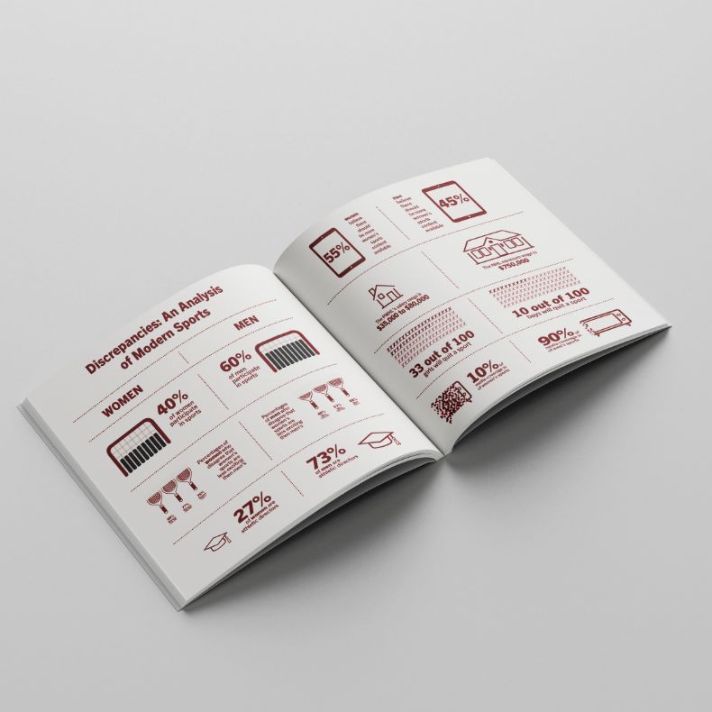
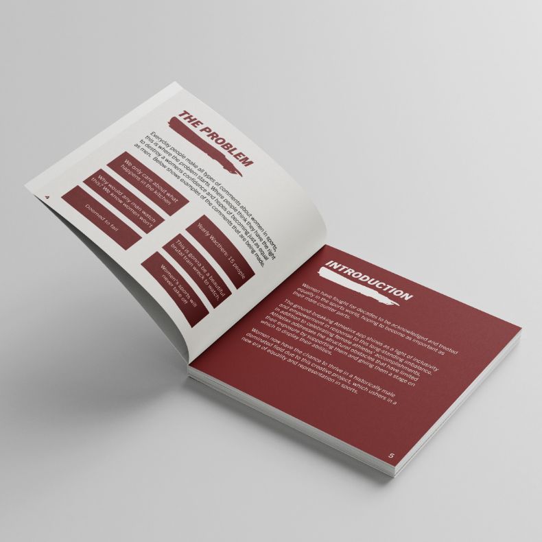
Negative comments on women’s sports posts, criticizing their quality or predicting low viewership, are all too common. It’s time to redirect that negativity into something positive and use it as an Athletixx campaign.

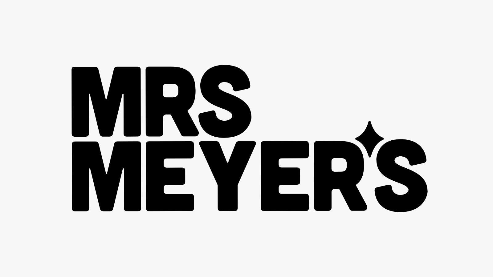
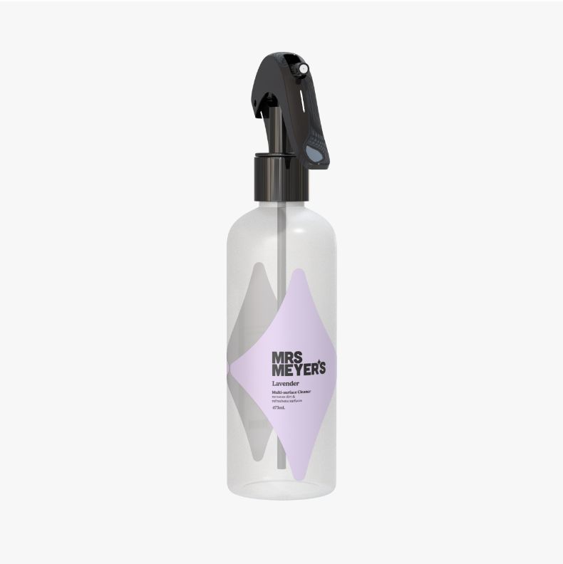
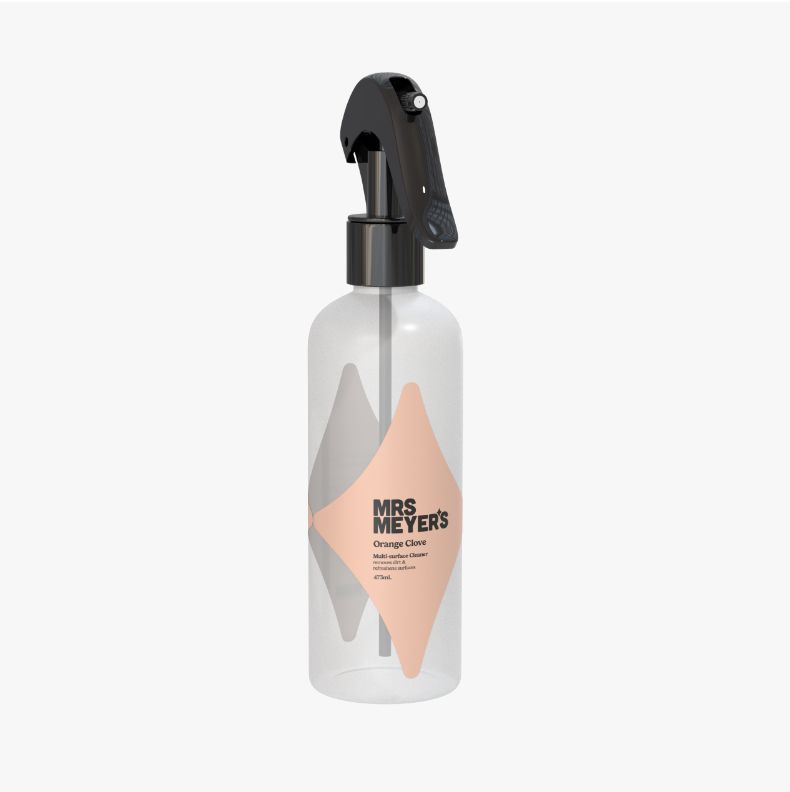
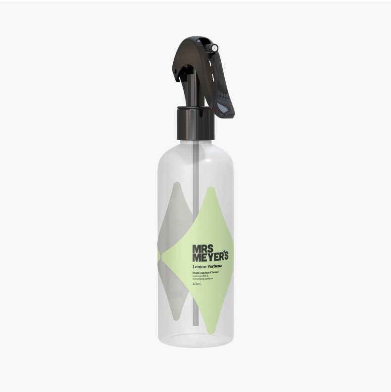
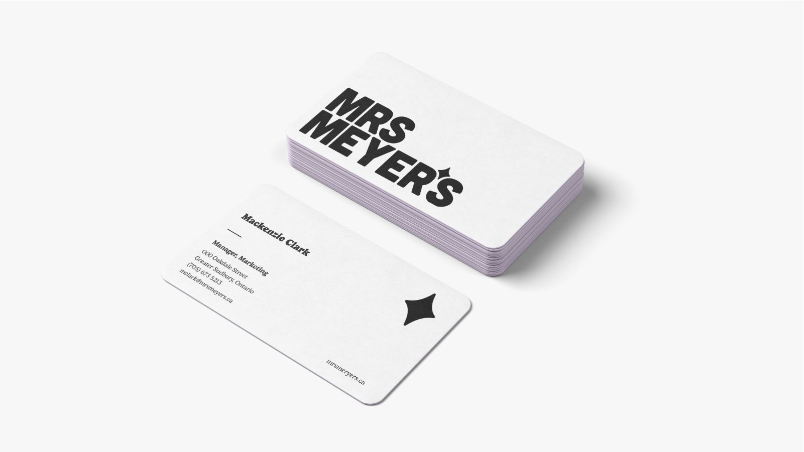
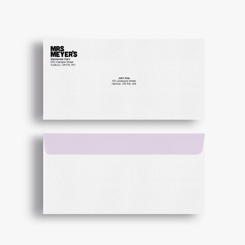
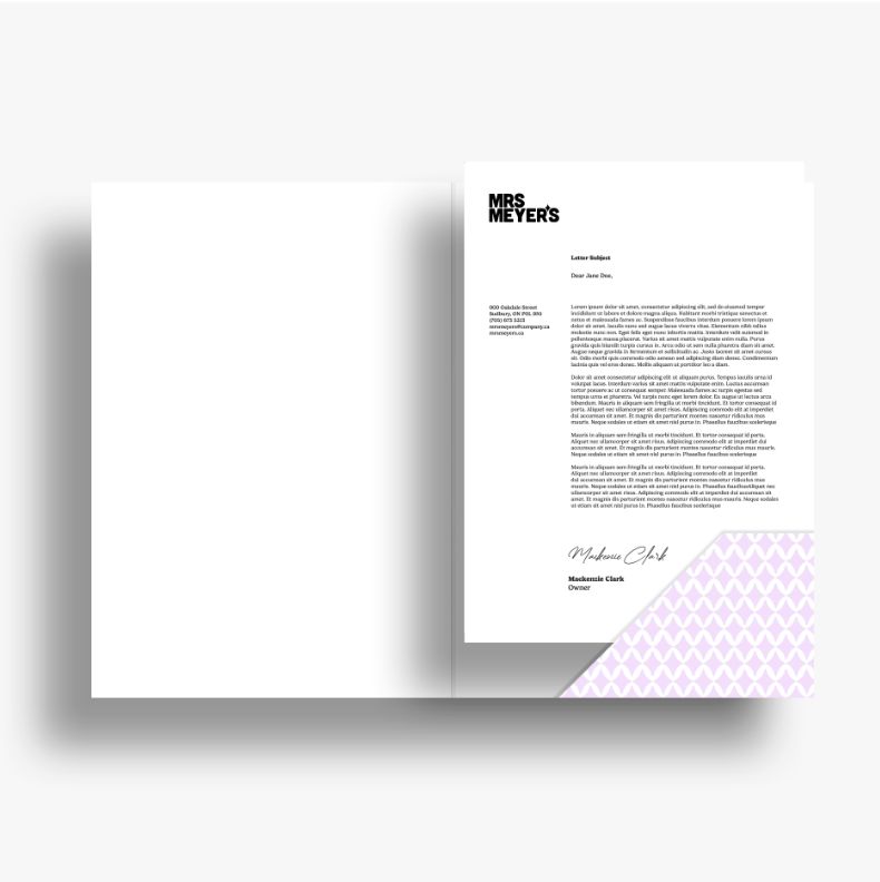
This contemporary redesign captivates and inspires new consumers by distinguishing Mrs. Meyer’s from other brands.
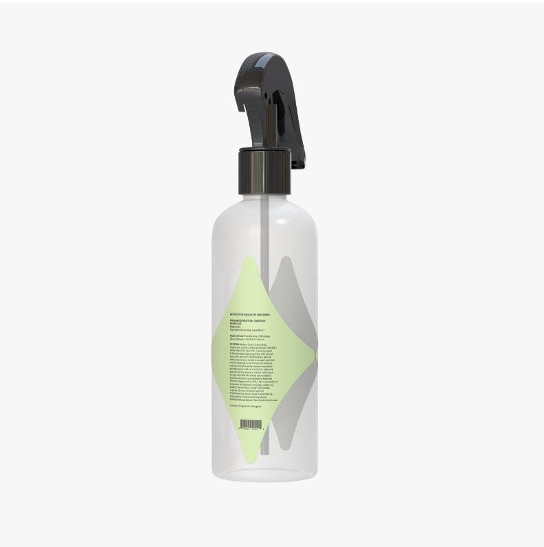
Mrs. Meyer’s, an organic cleaning brand offering a range of cleaning products. The initial design had problems with legibility as it used three different typefaces and weights. The revised Mrs. Meyer’s logo reflects the brand’s warm, caring, wholesome, happy, and energetic personality while also ensuring clarity. Additionally, the revised product labels are unique and display the logo and information without any legibility issues.
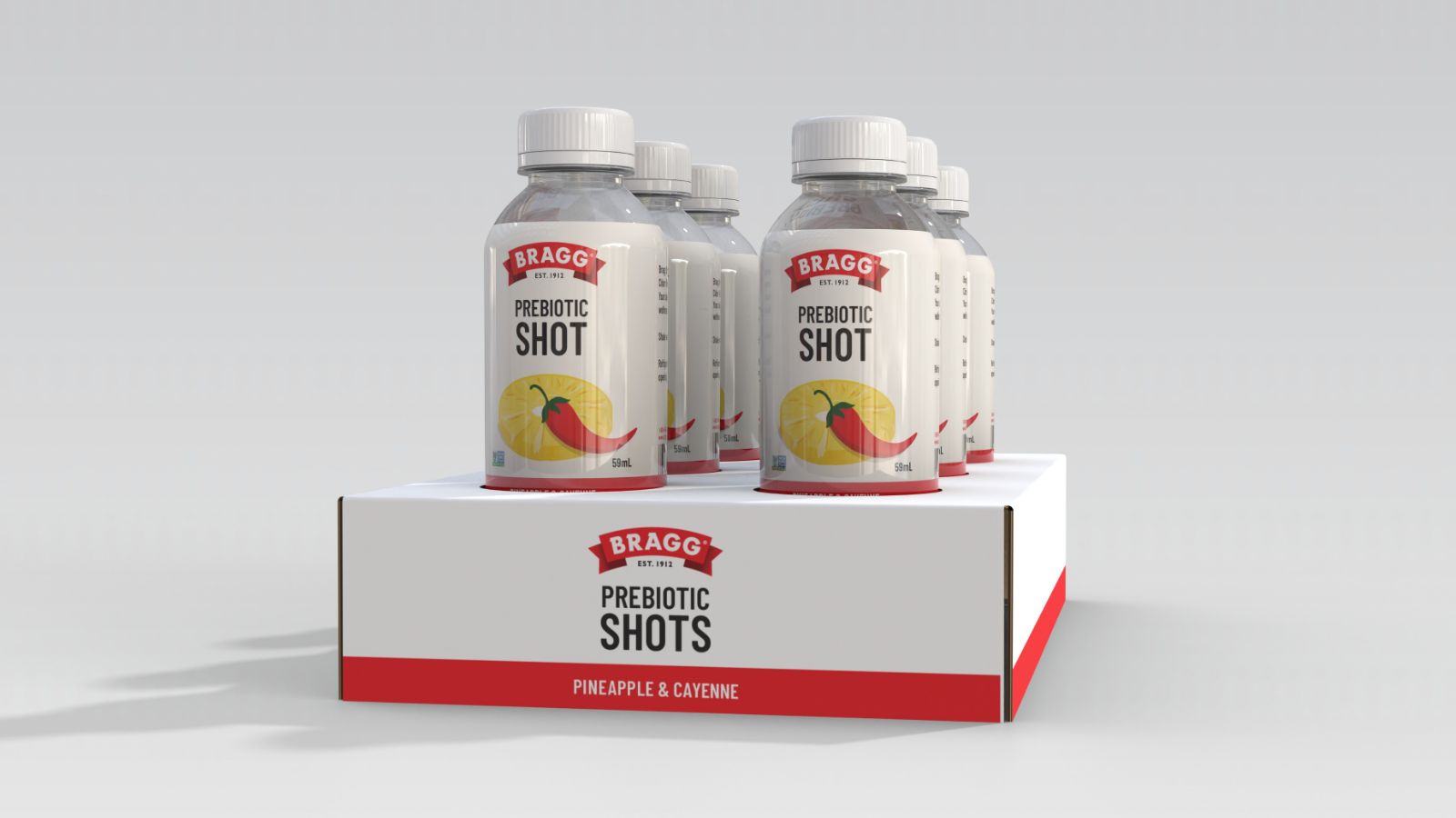
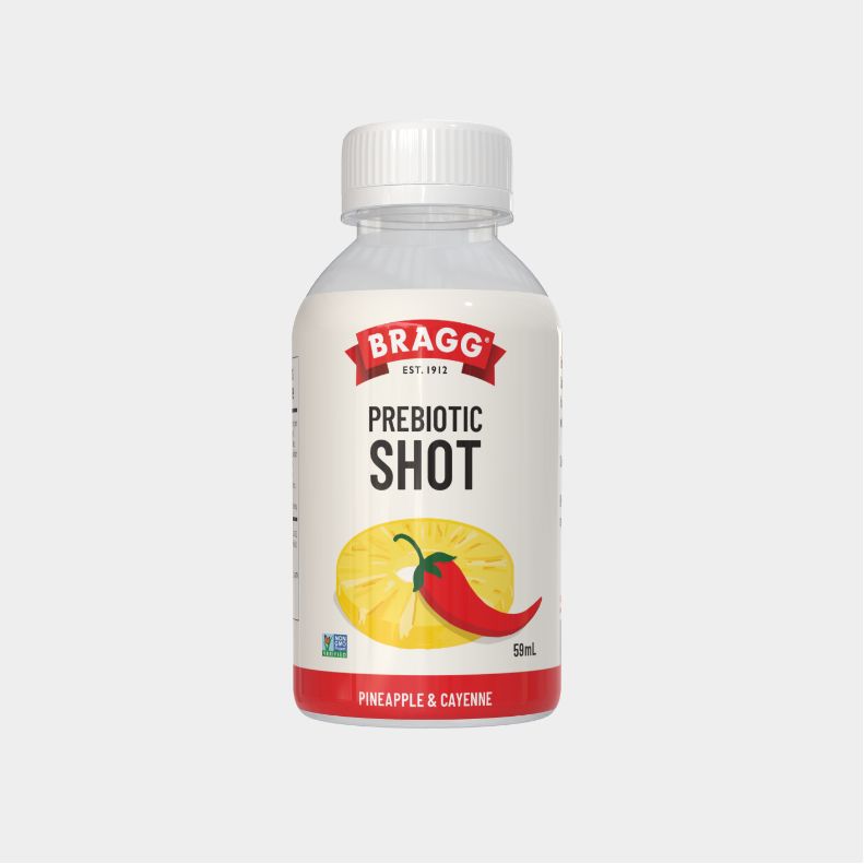
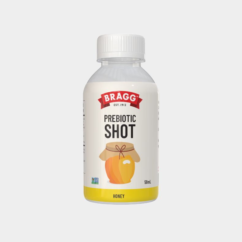
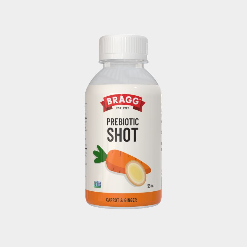
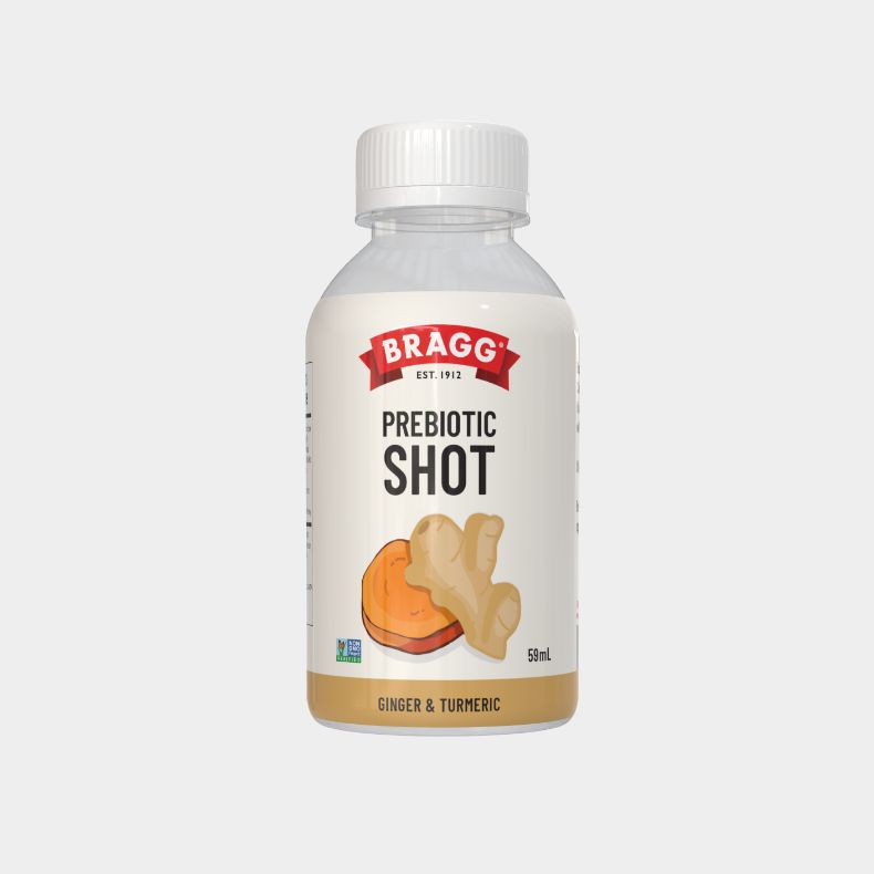
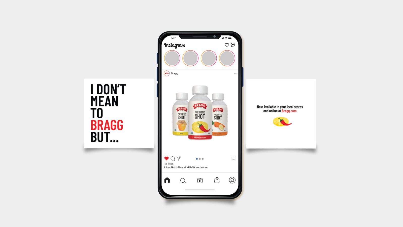
The vibrant, clean illustrations effectively communicate the flavour combinations in the beverage—helping to motivate the consumer to feel confident in their selection. Additionally, these illustrations aid in distinguishing between different flavours.
The original Bragg packaging had significant design issues with legibility and clarity. The new design guarantees that crucial information is immediately visible by implementing important changes. Such as ensuring good contrast, and a greater amount of negative space for better readability, and ultimately improving the customer’s experience. Thus establishing a closer bond between the product and its users.