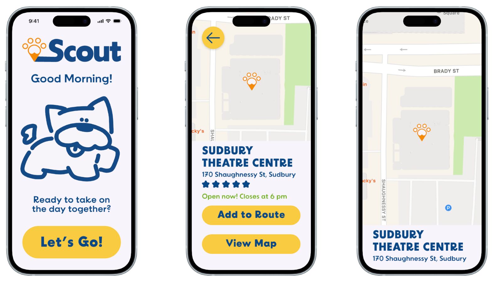
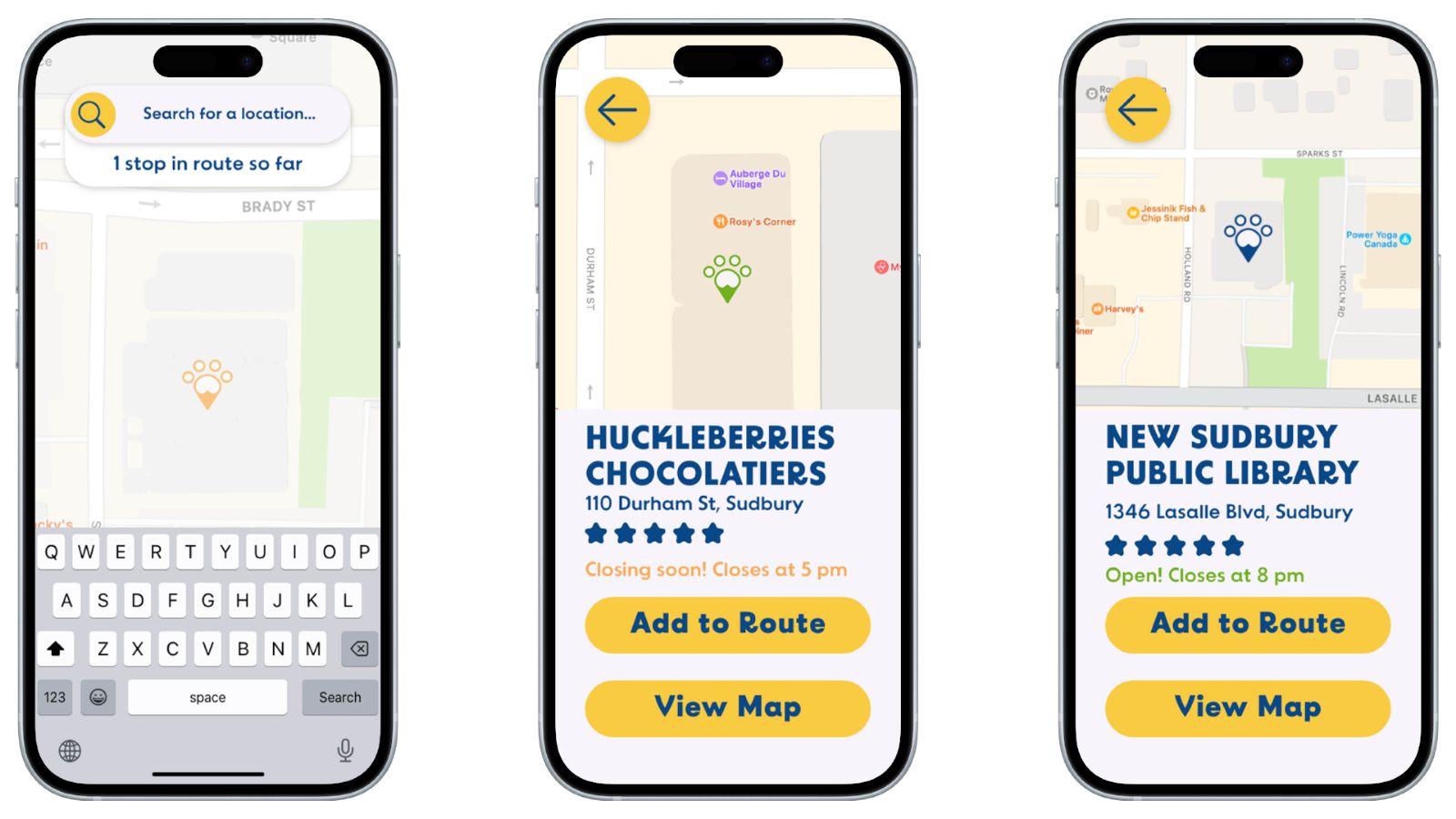
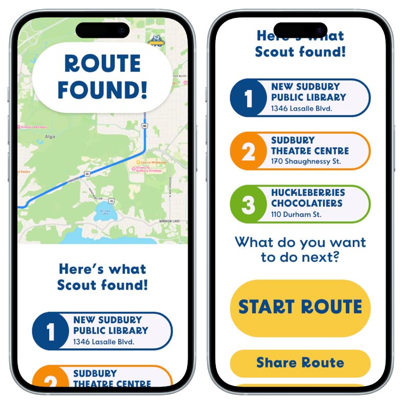
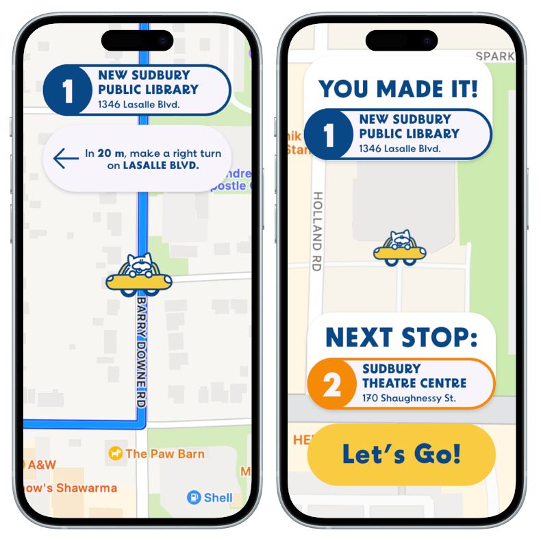
Most digital maps don’t implement route organization into their route-making functions, despite the fact that the technology to do so already exists. This puts great amounts of stress on people visiting an area for the first time… who are usually the ones relying on a map.
Modern-day map apps assume its users already know the best way between each stop on a route - implying they don’t actually need a map. Scout, a dog-themed route organizer, is an app that sorts its users’ routes based on distance.

Targeted at young adults aged 16-24, Scout uses fun visuals and friendly copywriting to guide them along their routes.


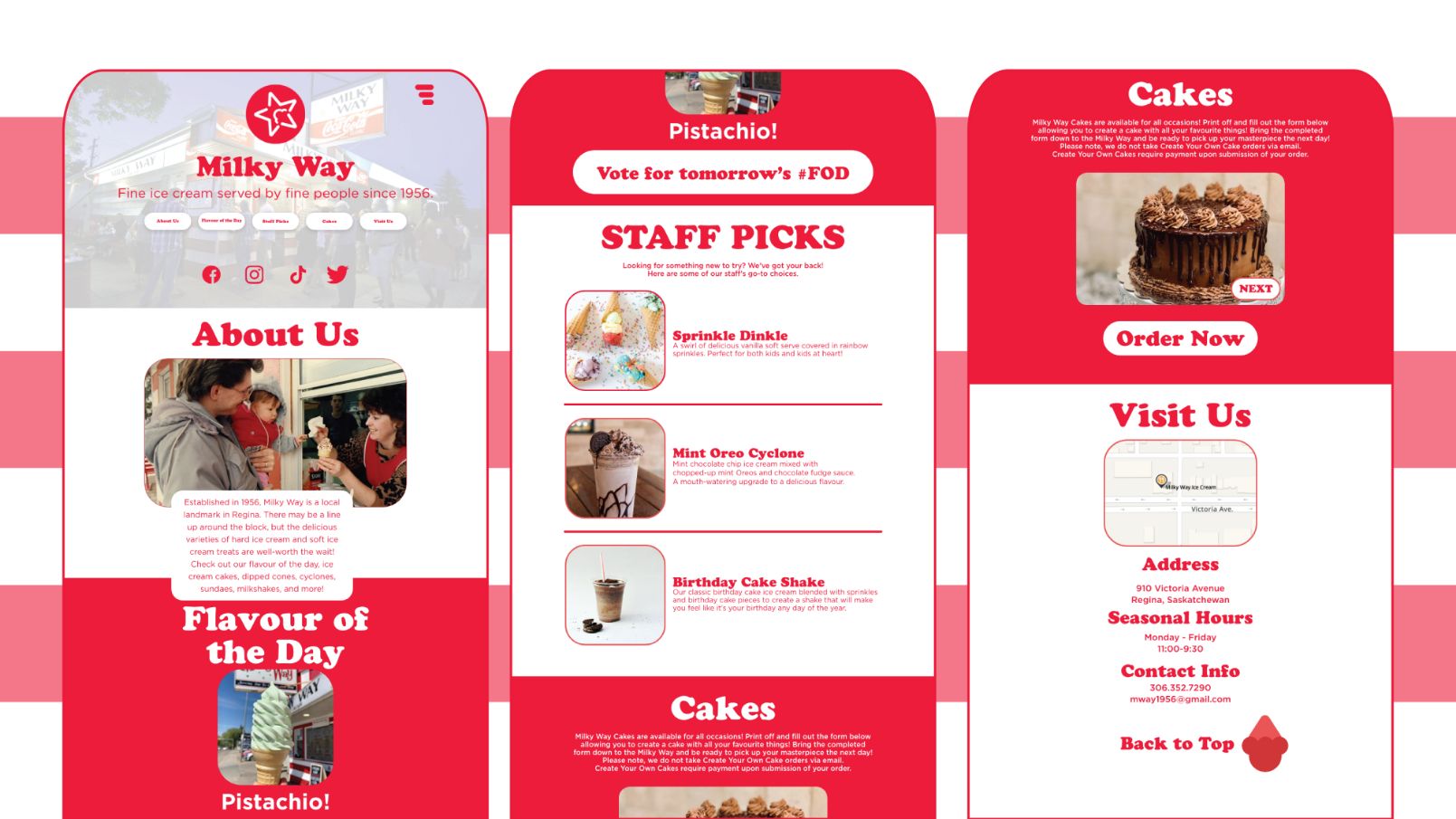
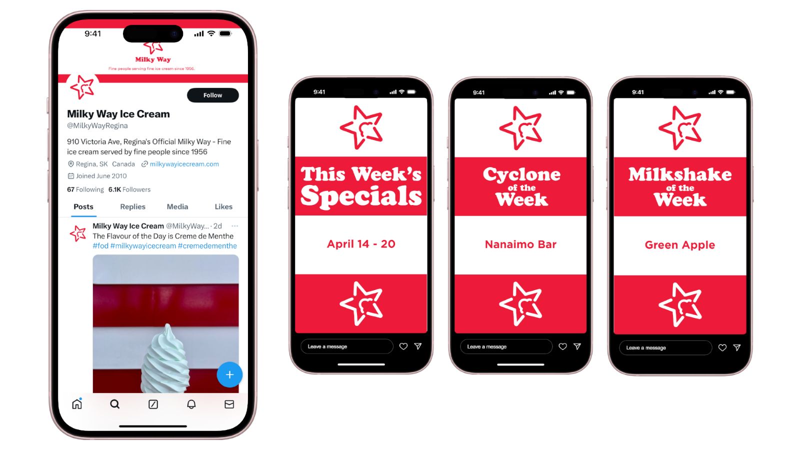
The goal of this project was to motivate Milky Way to choose one identity and stick to it, and to update their online posting habits.
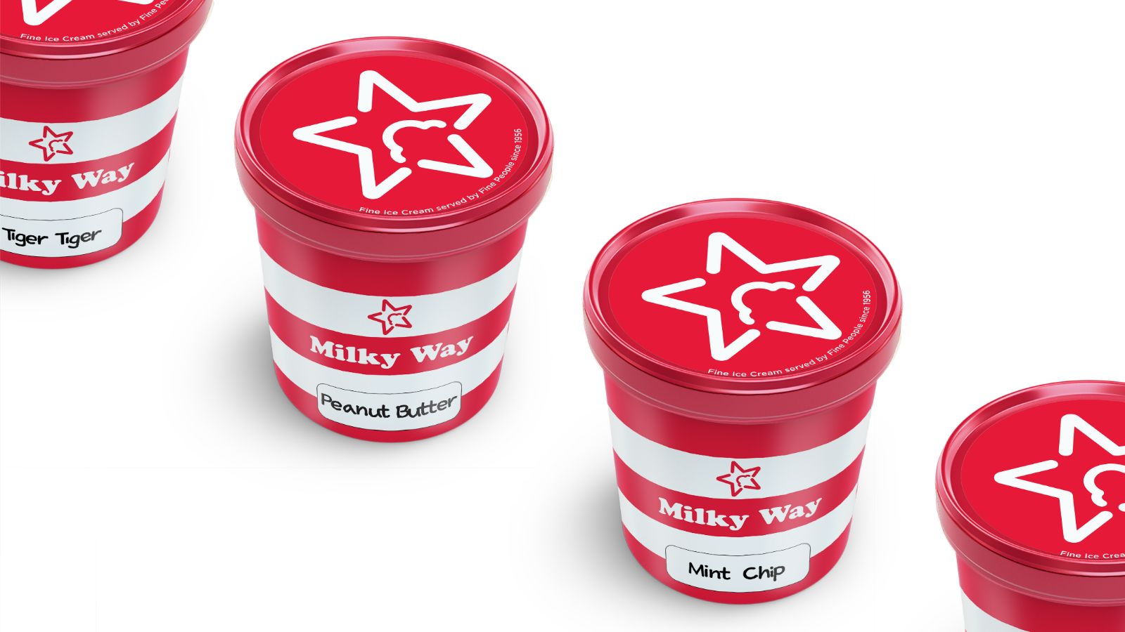
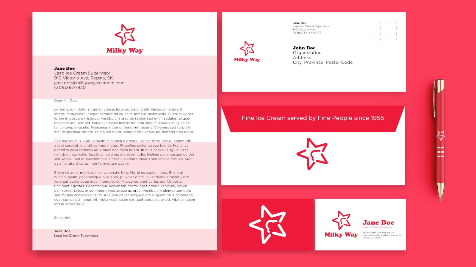
Milky Way, a very iconic ice cream shop in Regina, Saskatchewan, has been in business since 1956. Their only competition is Marble Slab, which has only remained in business in Regina because they’re able to stay open in the winter. Despite this, they lack a cohesive visual identity, and their online presence (both on social media and their own website) makes users question whether their accounts are official, and if the shop is even still up and running.
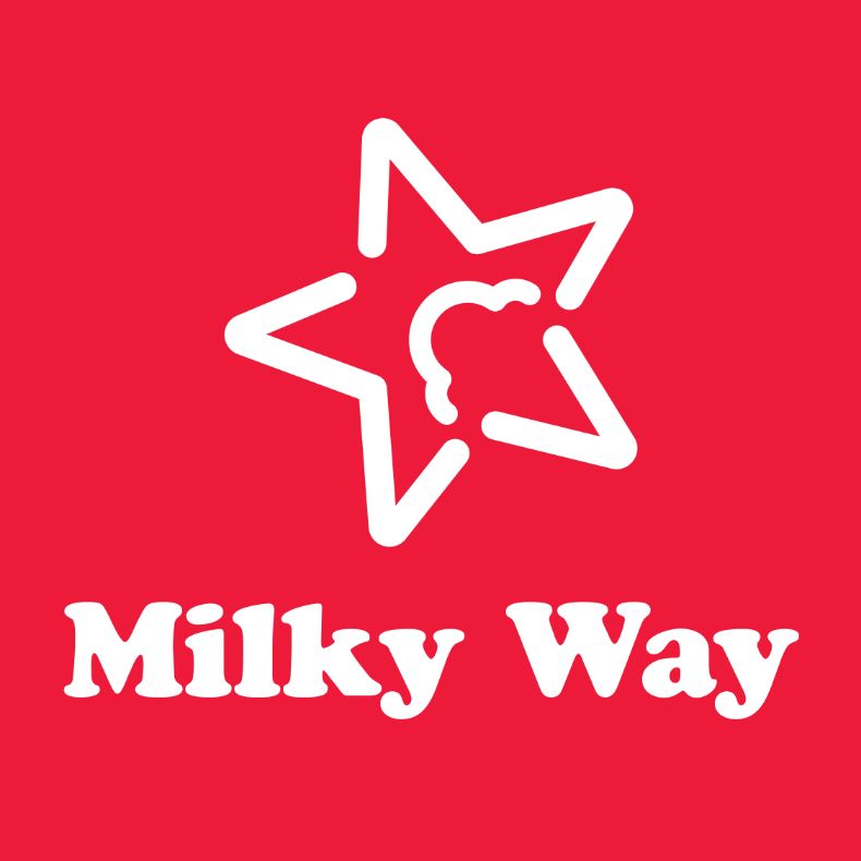
This design utilizes both new and preexisting elements present at Milky Way - namely, the red and white colour scheme and typeface, currently used for their Flavour of the Day sign.

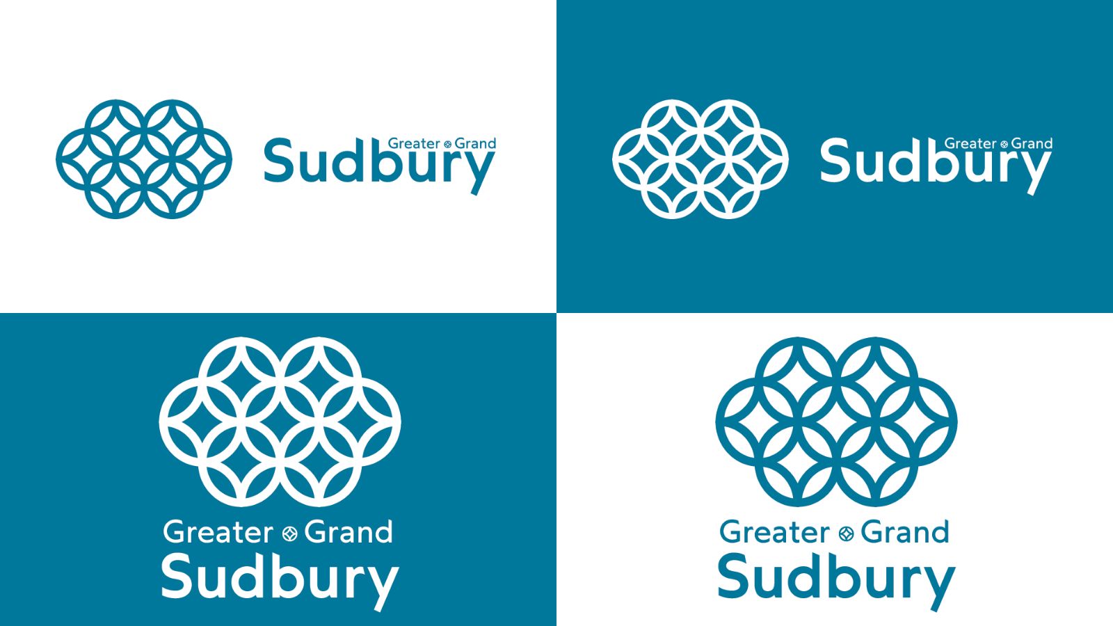
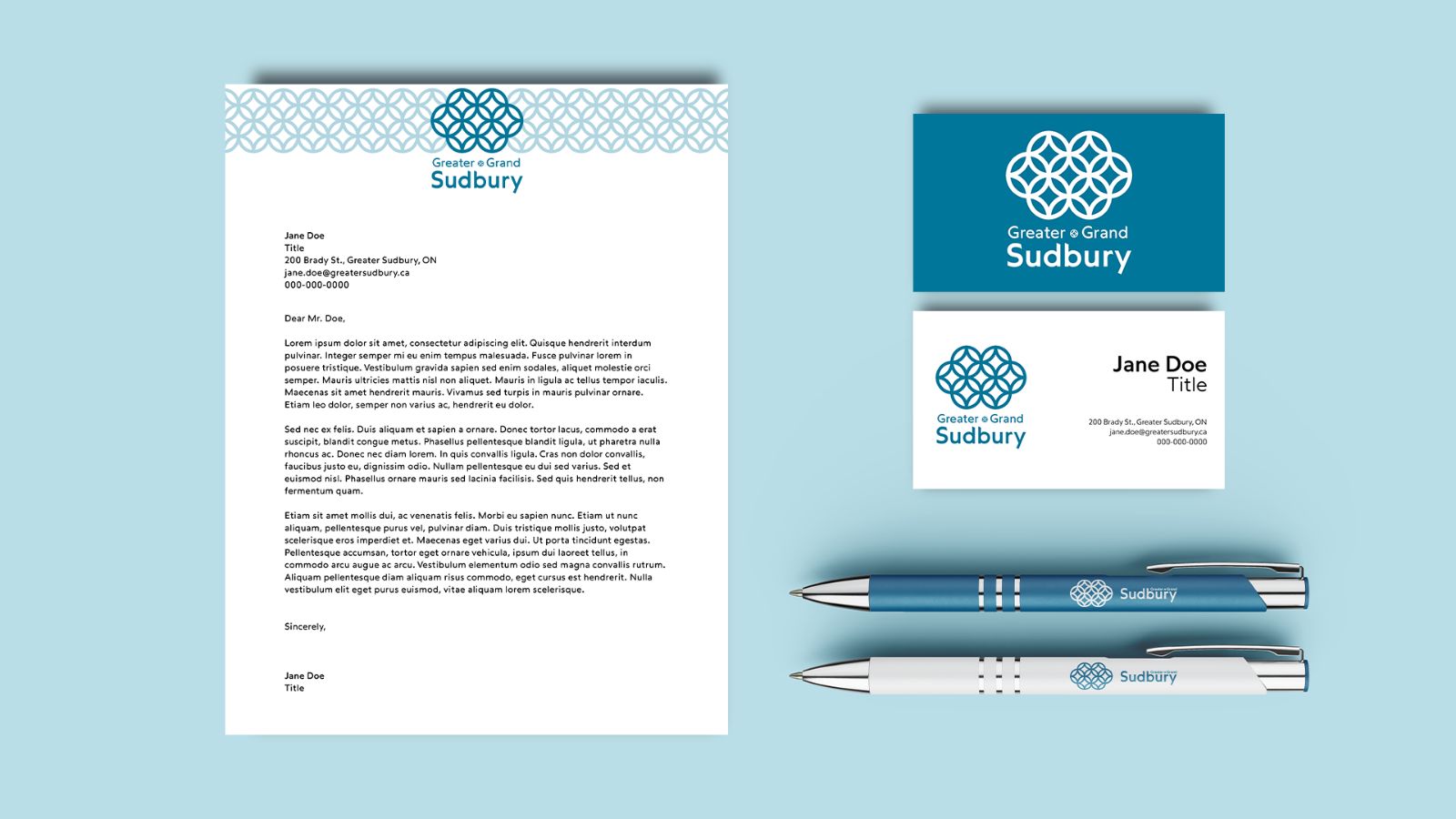
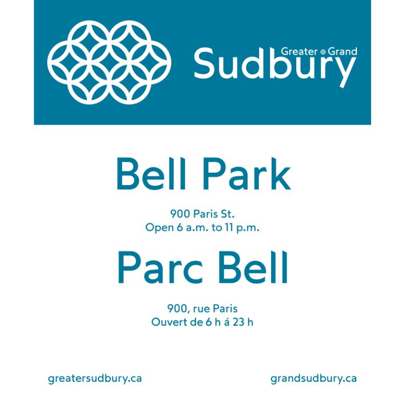
This design was created to spark discussions about the impact Greater Sudbury’s current visual identity has on the public perception of Sudbury - both inside and outside of the city, and how those perceptions can change for the better.
The City of Greater Sudbury’s visual identity is based on divisive symbolism, and the original iteration of its logo is nearly impossible to use in many scenarios due to accessibility issues. This redesign is centred around Sudbury’s interconnectedness and natural features, and is significantly easier to use in both digital and physical spaces.