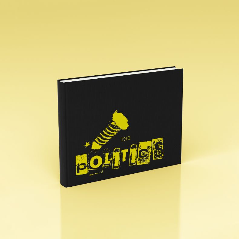
This campaign takes on new methods to evoke motivation within its audience, using contrasting design elements and copywriting to create drive and emphasize the need for a change in attitude towards Canadian politics.
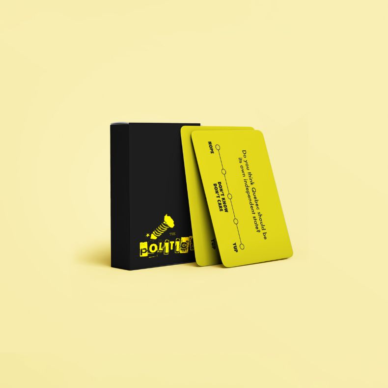
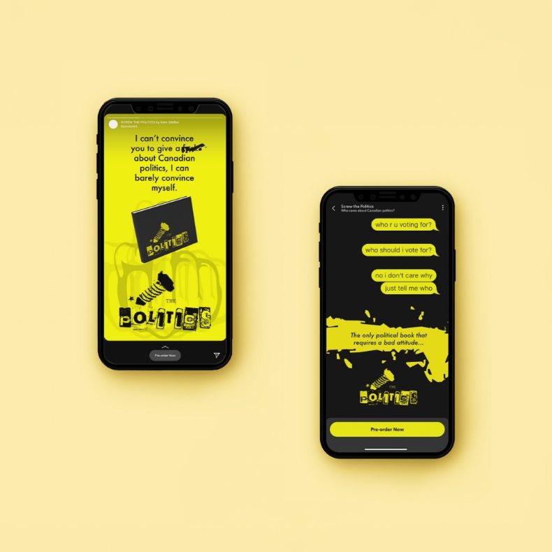
Let’s all be honest with ourselves, politics are boring as f*ck. Screw the Politics is a book written to reflect the reality that politics are uninteresting. Utilizing contrasting design elements to motivate a younger demographic to involve themselves in the political process.
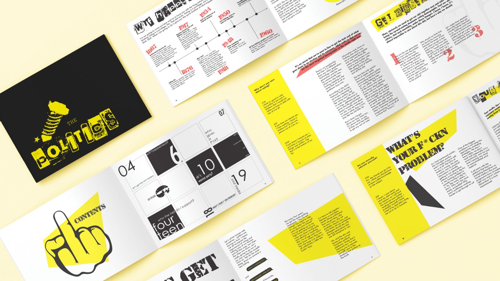
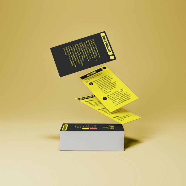
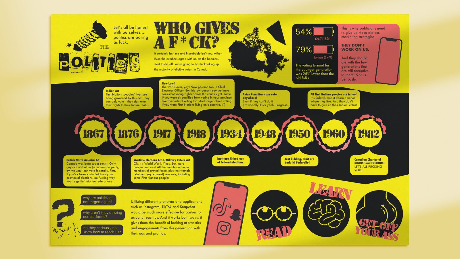
The evolving promotion strategy includes a complete visual identity, card game, infographic and social media advertisements. Each deliverable contains a call-to-action directing the viewer back to the main source of the campaign, the book itself.
By focusing on classic design elements and principles, this fresh visual identity is designed to be timeless. Incorporating simplicity, elegance and detailed aesthetics to ensure this brand can be easily implemented anywhere in the past, present and future.
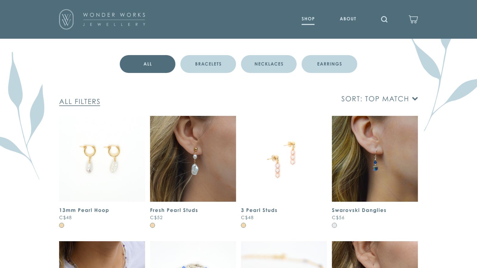
This small business needs to stand out among its competitors, including leading jewellers. A new brand identity with coherent photos of the products increases brand consistency and creates a better visual image for consumers to recognize the label.
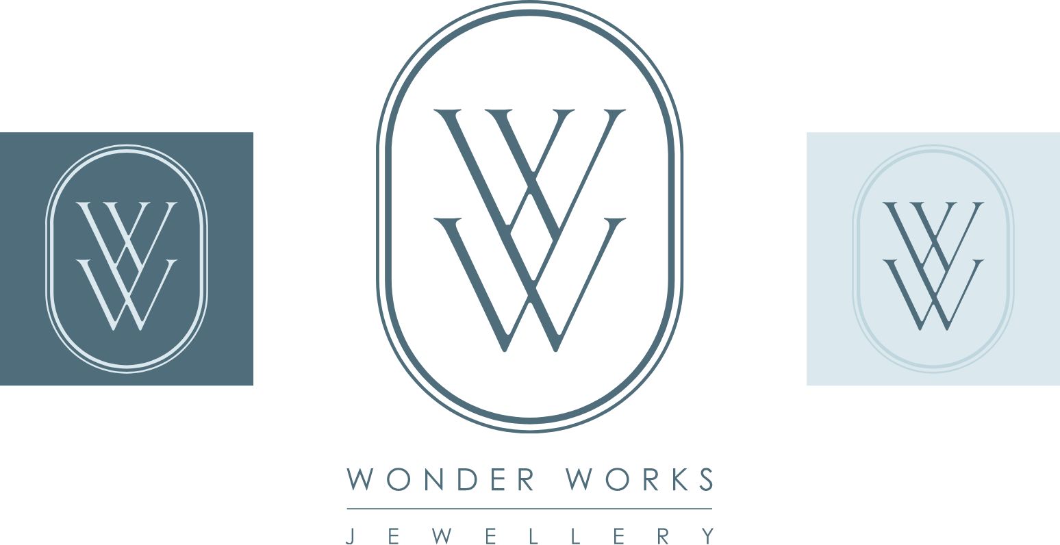
Using minimalist graphic design elements such as a limited colour scheme, sans-serif supporting typefaces and simple accompanying graphics creates a professional and approachable appearance to complement its products.
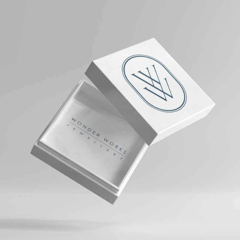
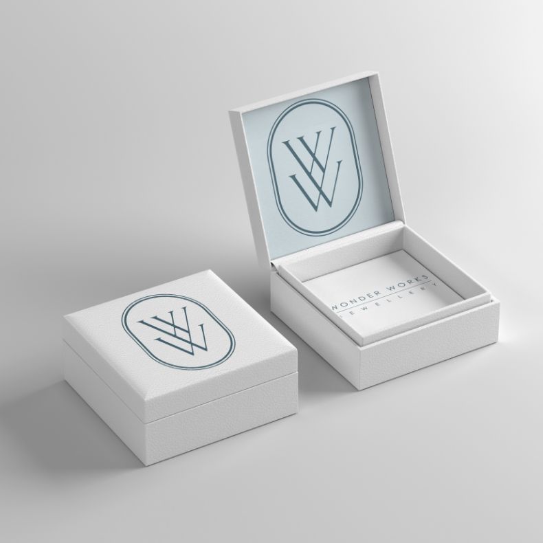
Its elements are designed to be applied with ease to any deliverable including an e-commerce website, packaging and any other application as needed, securing the brand’s longevity and effectiveness across many platforms.
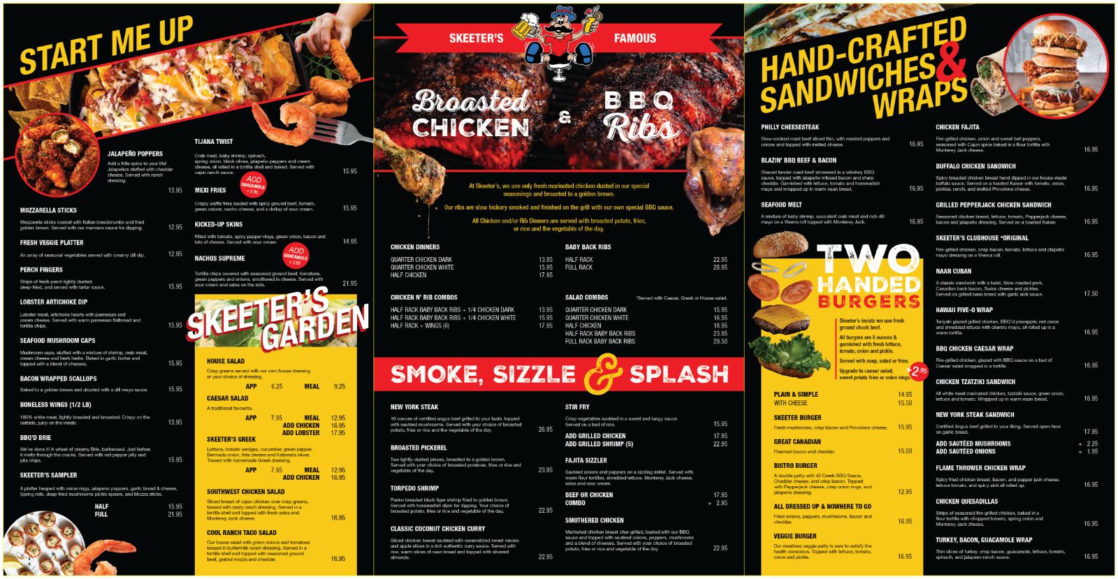
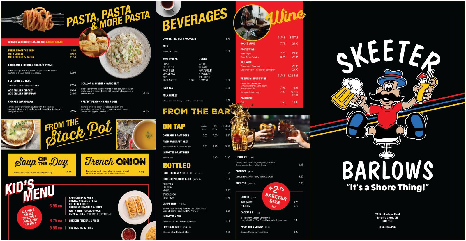
Implementing functional design elements into the redesign process of a menu with a large volume of items makes the menu visually appealing, user-friendly and welcoming to a diverse range of customers, ultimately enhancing the overall dining experience.
Creating a solution for redesigning a menu with extensive content and incorporating images requires planning for an effective and logical layout and maintaining accessible design elements.
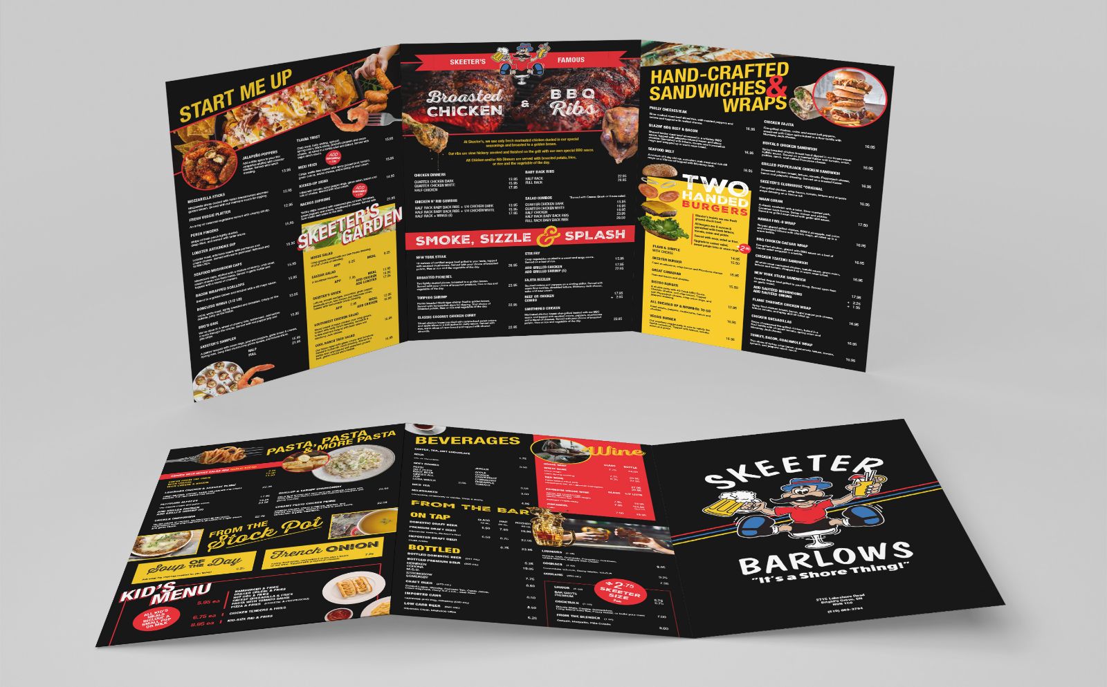
This design utilizes sans-serif typefaces to enhance legibility, combined with appropriate text sizes and high contrast between type and background colours to improve its usability. Organizing the sections of the menu logically with clear headings and professional-looking imagery to support the items enhances its visual appeal while guiding the reader’s eye throughout the entirety of the menu. By integrating these accessibility considerations, the content becomes more digestible and welcoming to all customers.