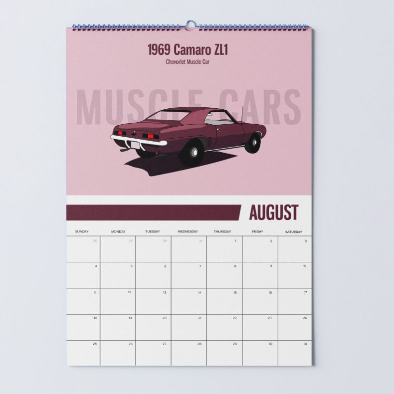
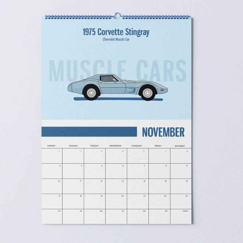
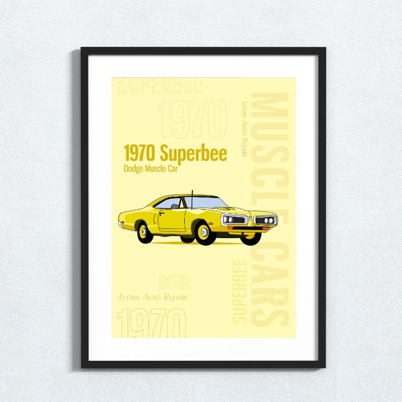
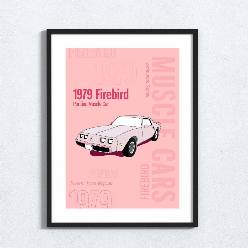
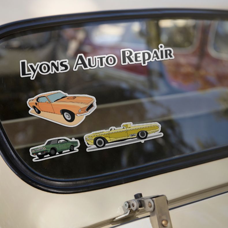
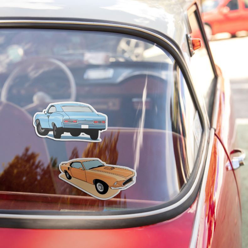
The promotional calendar and stickers motivate Lyons customers to recall the business after their service appointments. These free items, align with automobile enthusiasts by featuring classic car illustrations.
The goal was to revitalize the shops calendar and poster designs by showcasing classic vehicles and maintaining a cohesive visual theme. Through meticulous attention to detail and an iterative design process, the materials were individually tailored using adobe illustrator, resulting in a polished, timeless, and vibrant presentation.

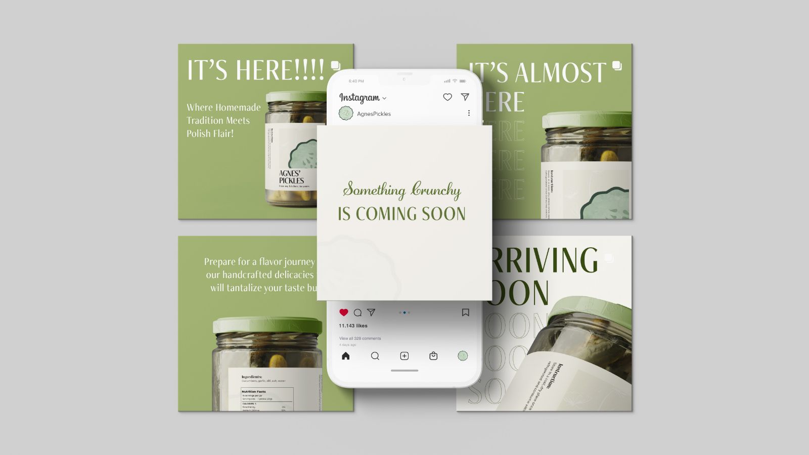
The Conversation icon aligns with Agnes’ Pickles by sparking discussions about its branding and packaging design choices, particularly its organic and standout features. These conversations deepen understanding of how Agnes’ unique packaging stands out from competitors, guiding her in refining her brand’s visual language to better connect with her audience and emphasize her commitment to quality and innovation.
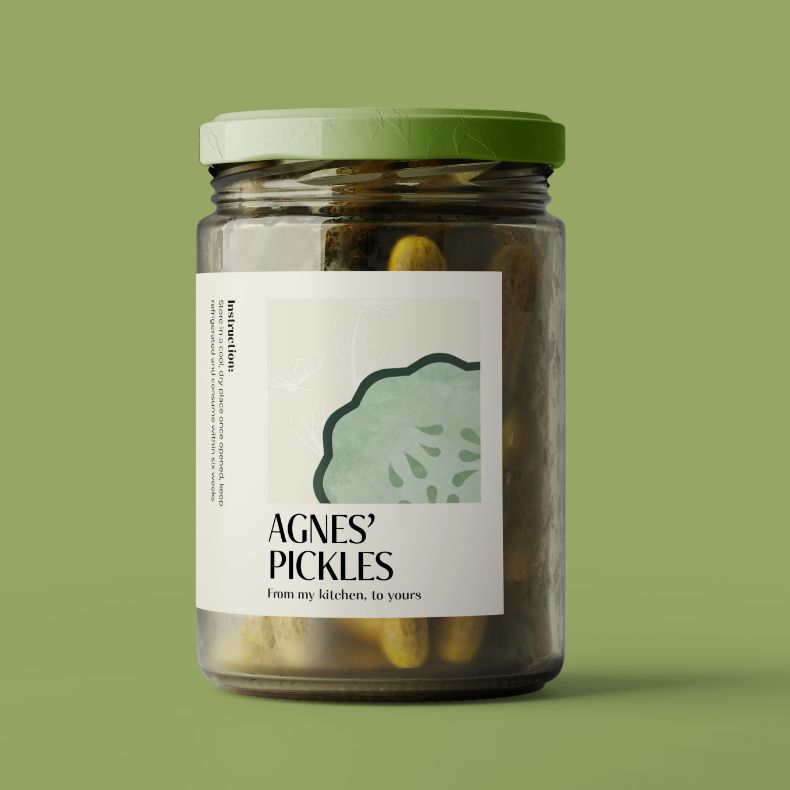
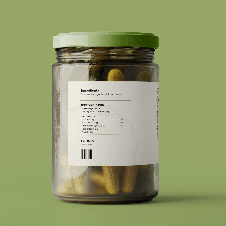
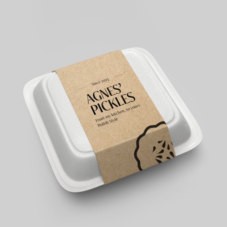
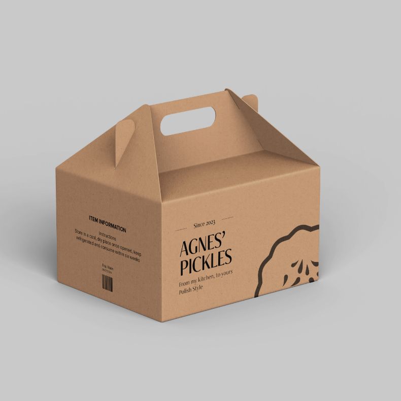
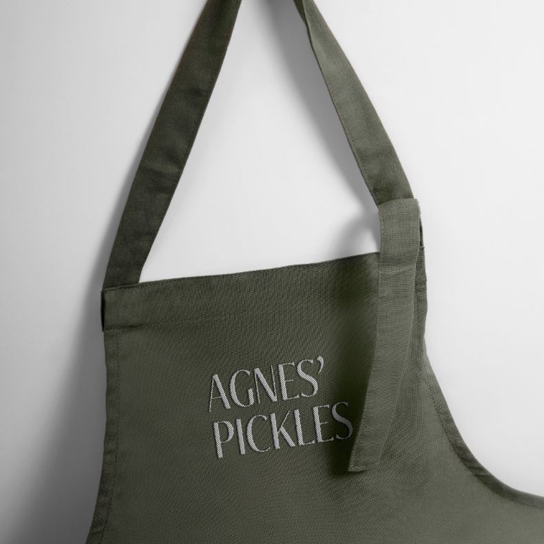
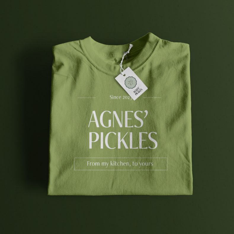
The Agnes’ Pickles project aimed to craft a visually striking identity for a client, focusing on a clean and elegant aesthetic. Agnes’ Pickles faced challenges due to a lack of visual identity, impeding its ability to connect with its audience. By integrating client feedback on style, tone, and feel, a cohesive visual identity was crafted, resonating with Agnes’ Pickles target demographic and enhancing its brand presence and engagement.
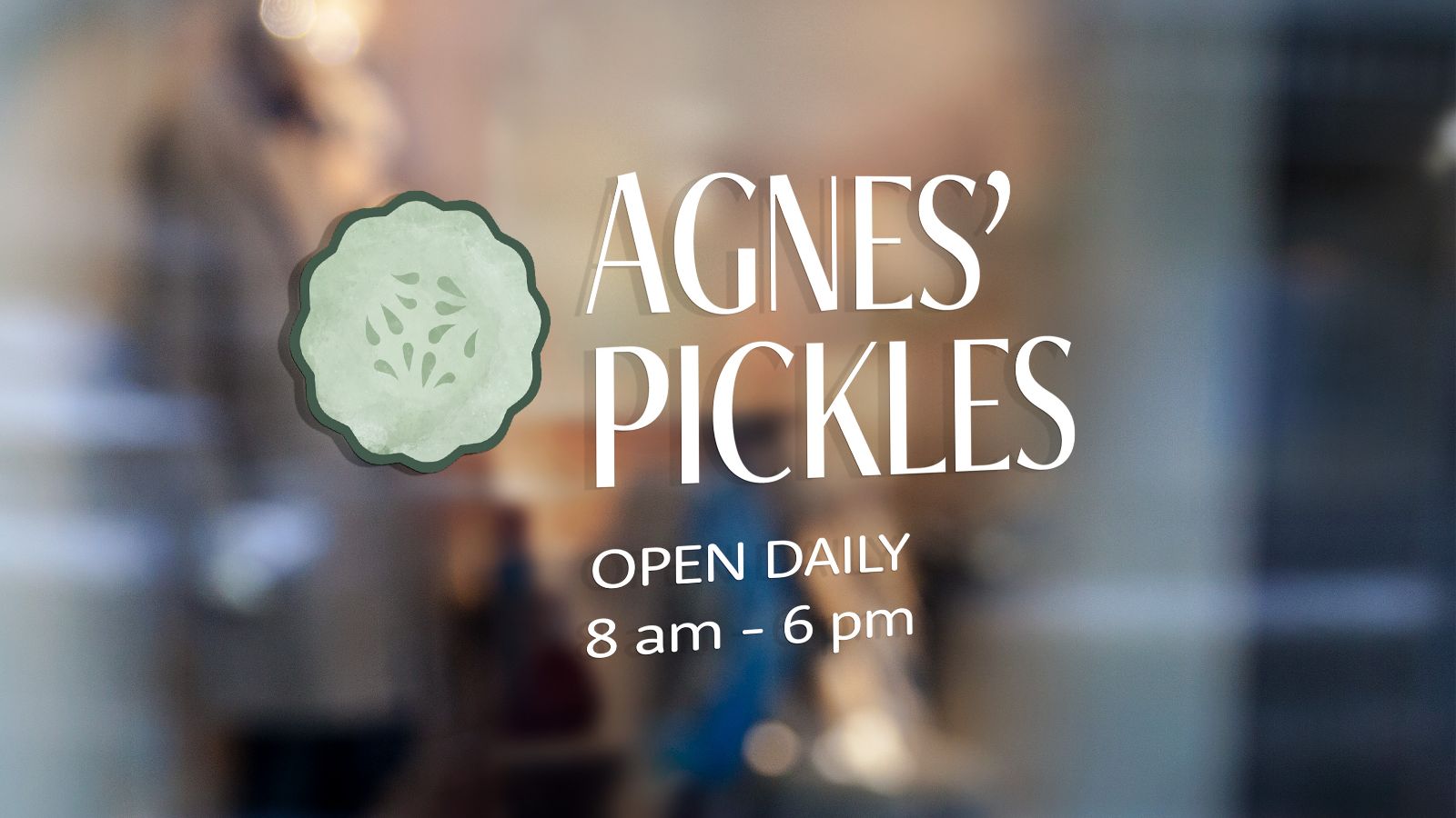
The goal of the design for Agnes’ Pickles window signage was to keep things simple and affordable, reflecting the company’s home-based operation. Choosing a vinyl sticker offered a clean, glossy, and refined exterior while keeping an affordable design.
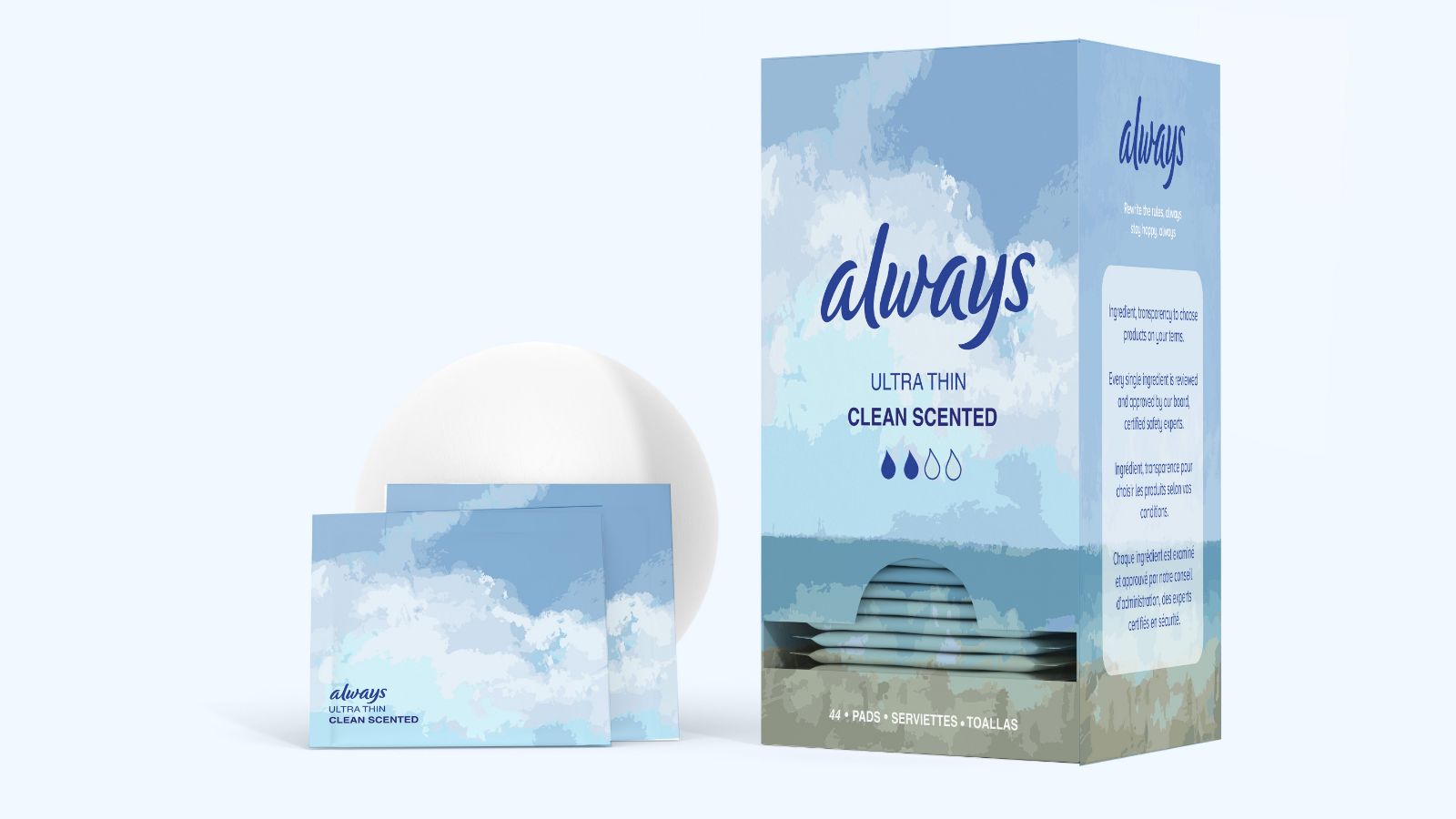
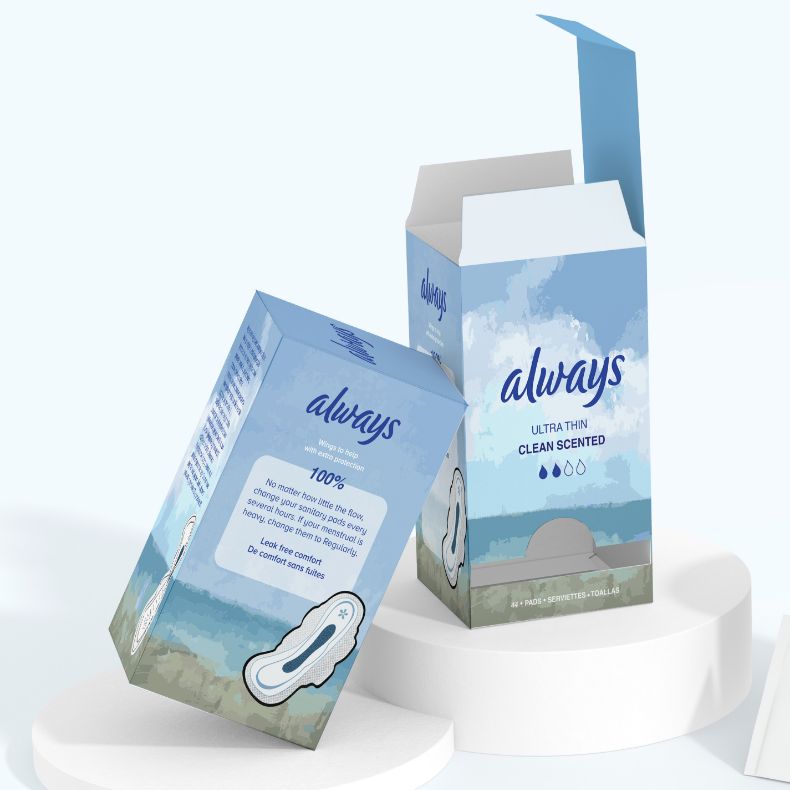
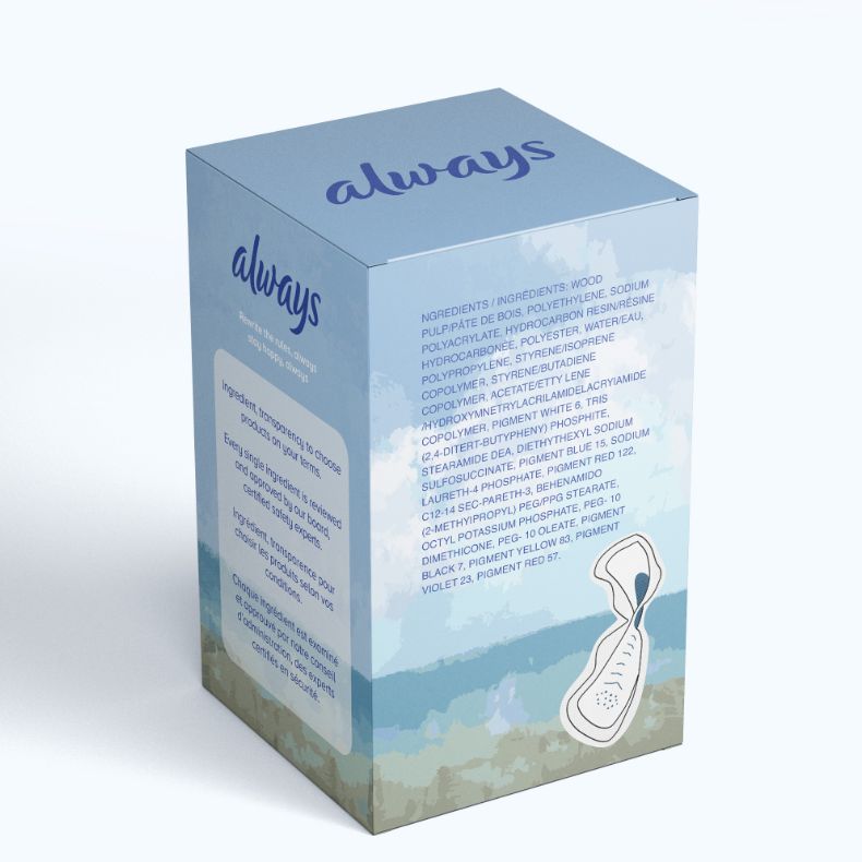
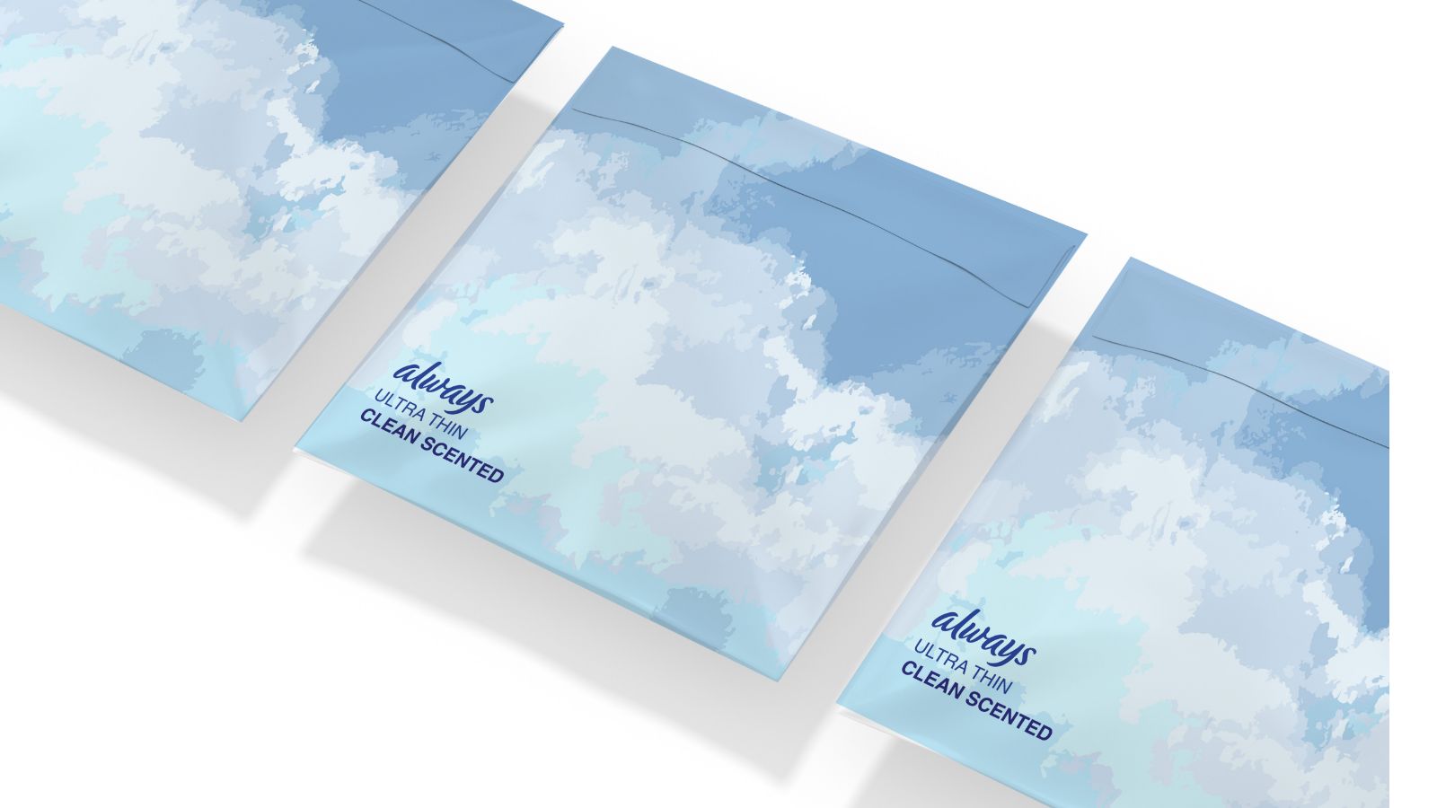
Always pads packaging features soft, clean illustrations, and aims to inspire women to reconsider menstrual product packaging. By injecting creativity designs, prompting a fresh perspective on how these products are perceived, empowering women to prioritize their health and individuality.
Always Pads faced the challenge of redesigning their packaging for improved accessibility and aesthetics. The solution involved creating a functional and eco-friendly design, enabling easy pad dispensing and storage while reducing plastic waste. Refined iterations ensured alignment with brand values and user preferences. By utilizing fewer materials, the final package enhanced the user experience and promoted environmental sustainability.