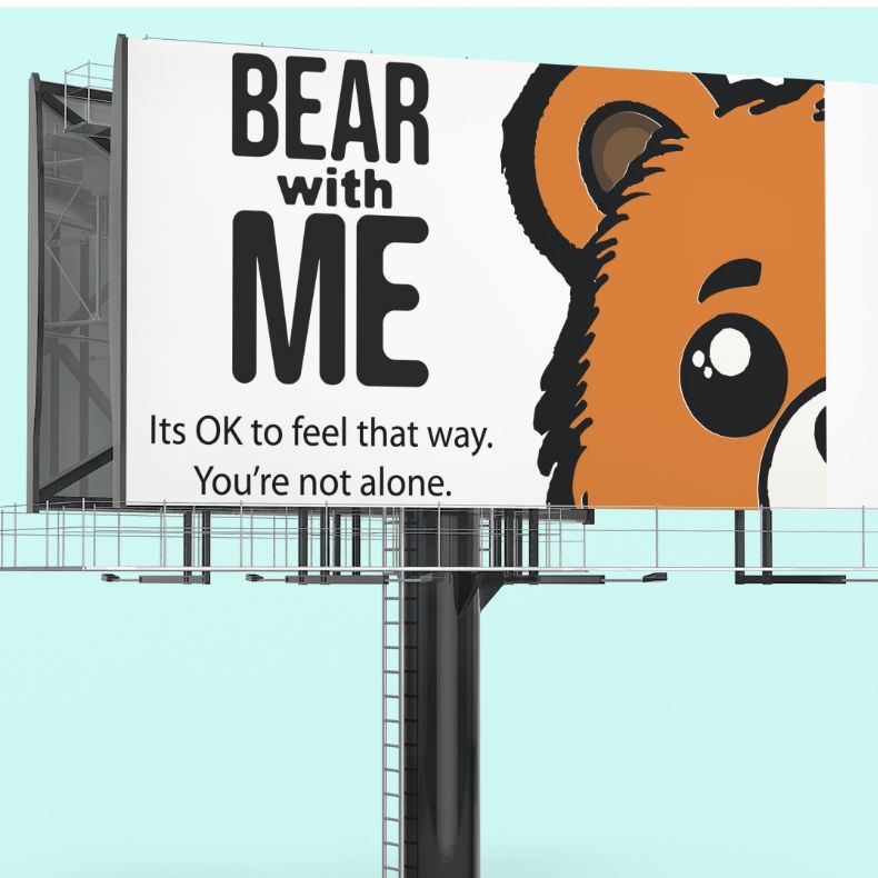
This book design / book launch evokes conversation, as it helps create a bridge between parents/guardians to talk to their children about their emotions and what and how they feeling. Creating this picture book for younger children who are starting school would give a tool that could potentially help them understand.
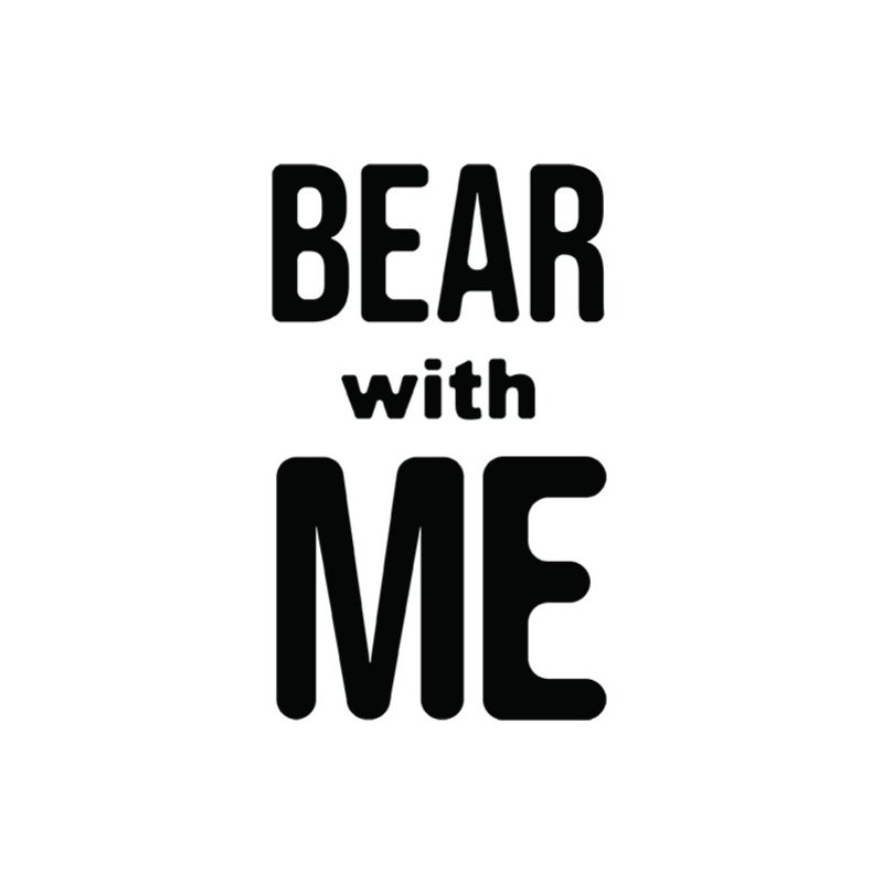
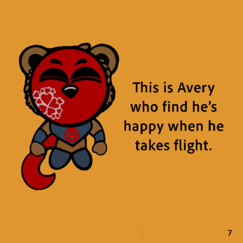
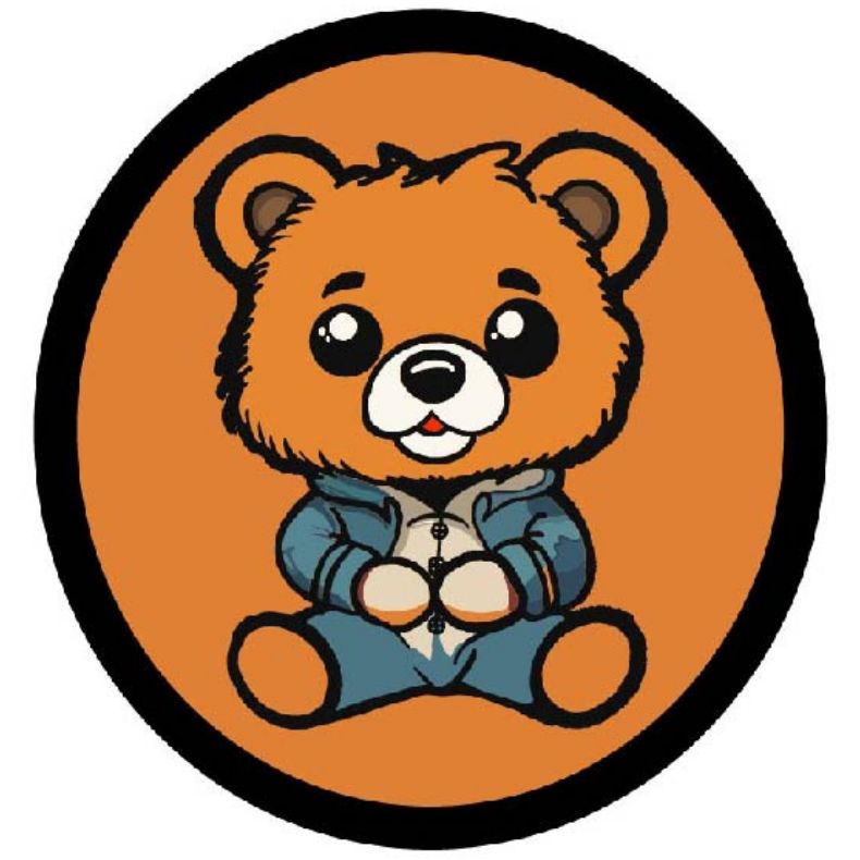
Bear With Me is a book designed to get families to talk about their children’s emotions. The child is guided through a day in the life of Avery the bear and how he uses his masks of emotions which allows Avery to show his emotions even though he is timid.
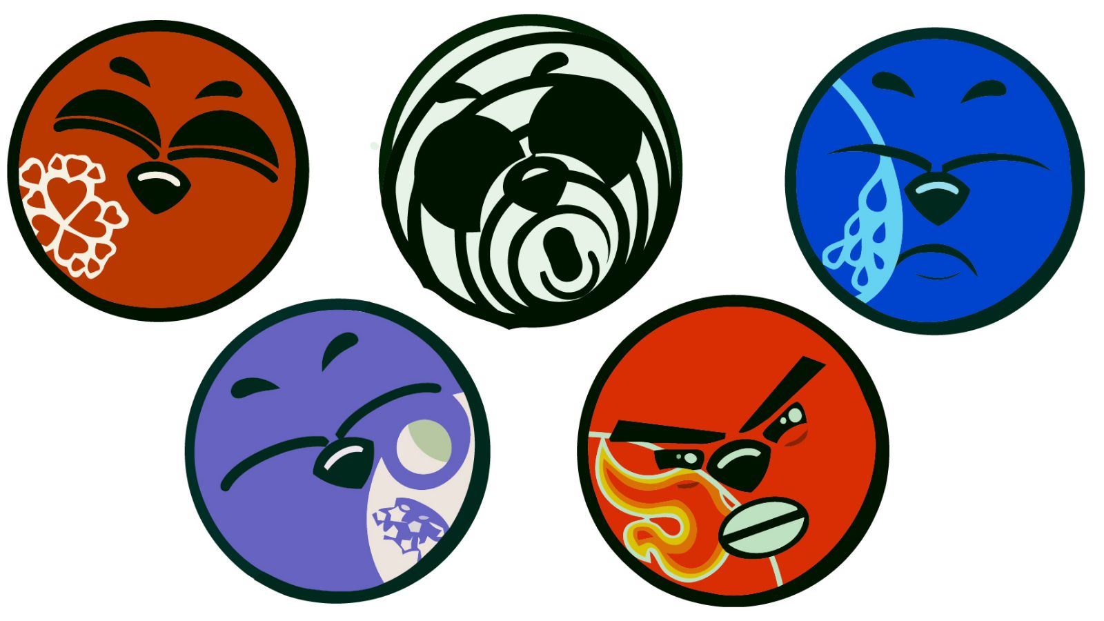
The journey that the child and Avery not only show what the most common emotions are but also develops emotional education for the child. If children are educated earlier about emotions this may help them develop these skills at an early age which will then help them in their later years as a teenager up to an adult.
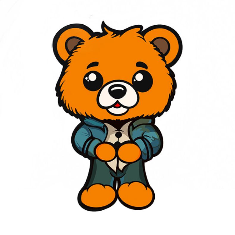
The Bear With Me book will allow families to work together to see how they can understand how and why their child is feeling a particular way. The masks of emotion will help demonstrate an image of the feeling, even if the child is unable to speak or is to shy to say how they are feeling the masks will be a tool that can be used.
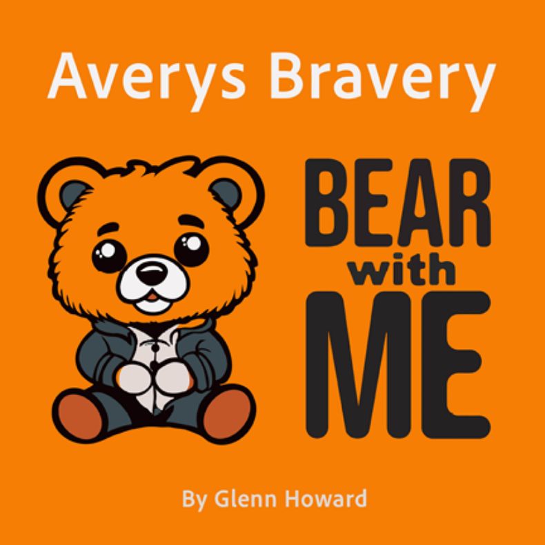
The book would be a good start for younger children who are attending school for the first time and with including stickers in the bundle, it will not make the book look to static. using an array of colours in the pages will allow the book to stand out and not look boring and stale.
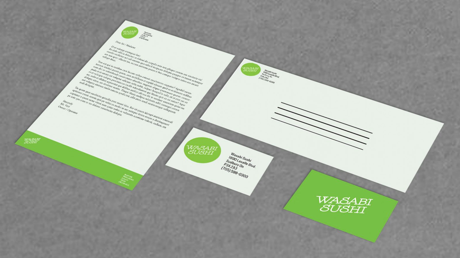
Throughout this project, the client would see changes made to help create a bigger brand awareness, and then would help create a higher level of revenue, motivating them to then look at expanding the brand into other venues or a second location. Once completed and the client sees that there is a value with a re-brand, the push to do more would increase and help the restaurant with brand awareness.
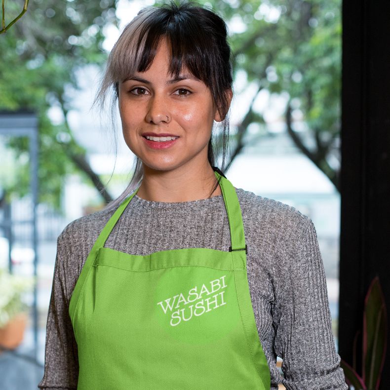
Re-branding a logo needs to have particular items, a clean look, easy to read and has symmetry all throughout the brand. The first point of contact with the customer is the restaurant’s brand. The look needs to have impact right away with bold colours and a look that stands out in a competitive market. Creating a lasting impression on the target audience would help give an awareness of the restaurants passion for the industry, and allow the brand to expand further, which would then reach out further and gain more attention for other target audiences.
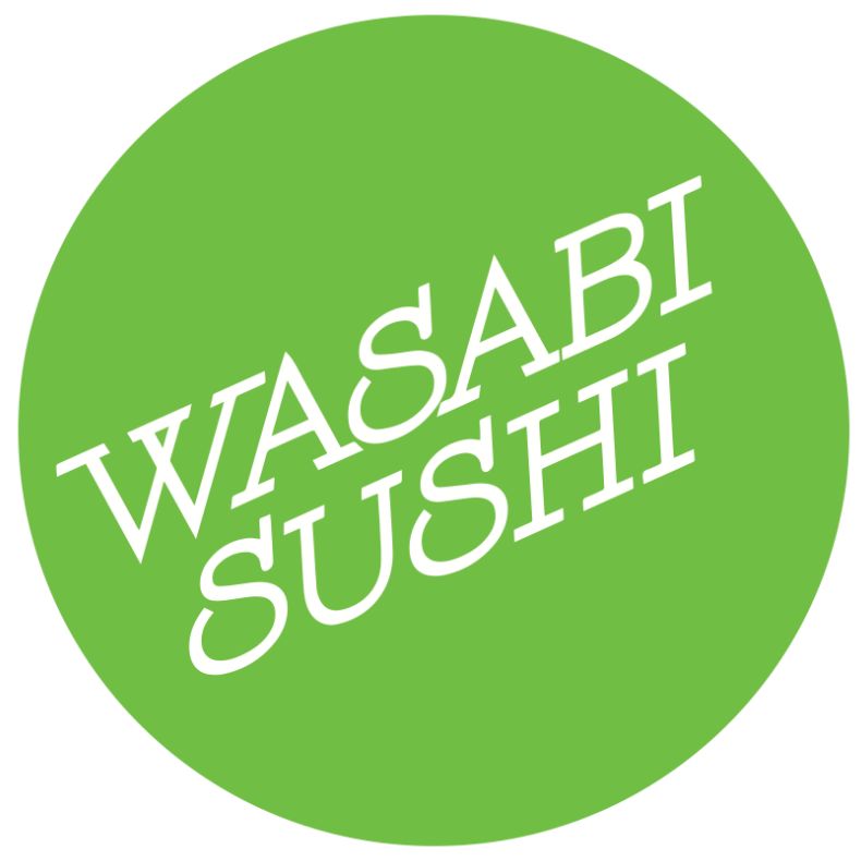
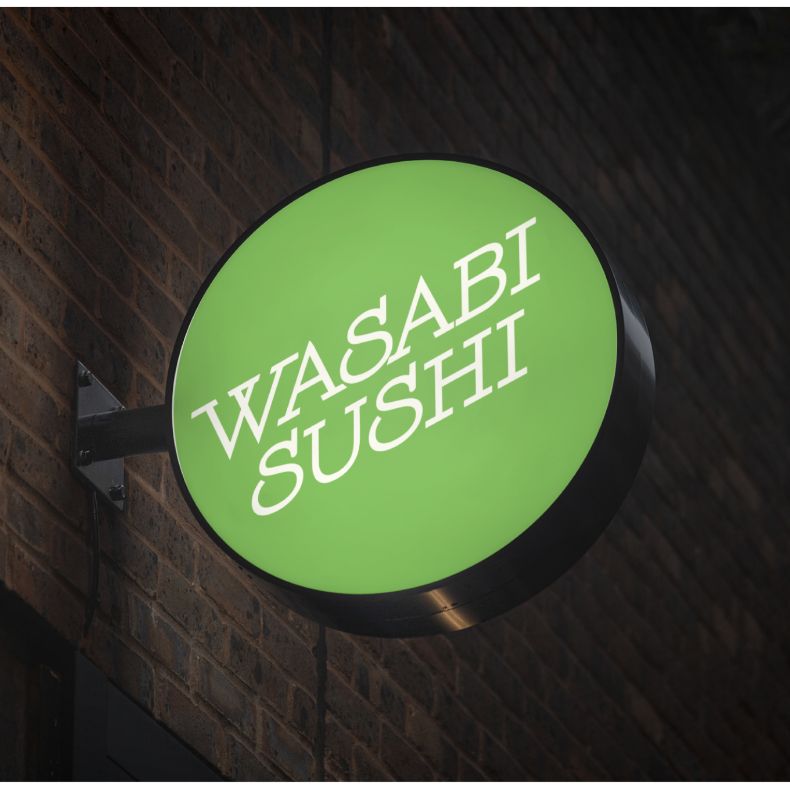
From the moment that the customer sees the restaurant's sign/logo it will trigger either a negative or positive reaction. Creating a backlight three dimensional sign instead of a flat non-illuminated sign would allow the restaurant to stand out of all the other businesses around the area in a positive way.
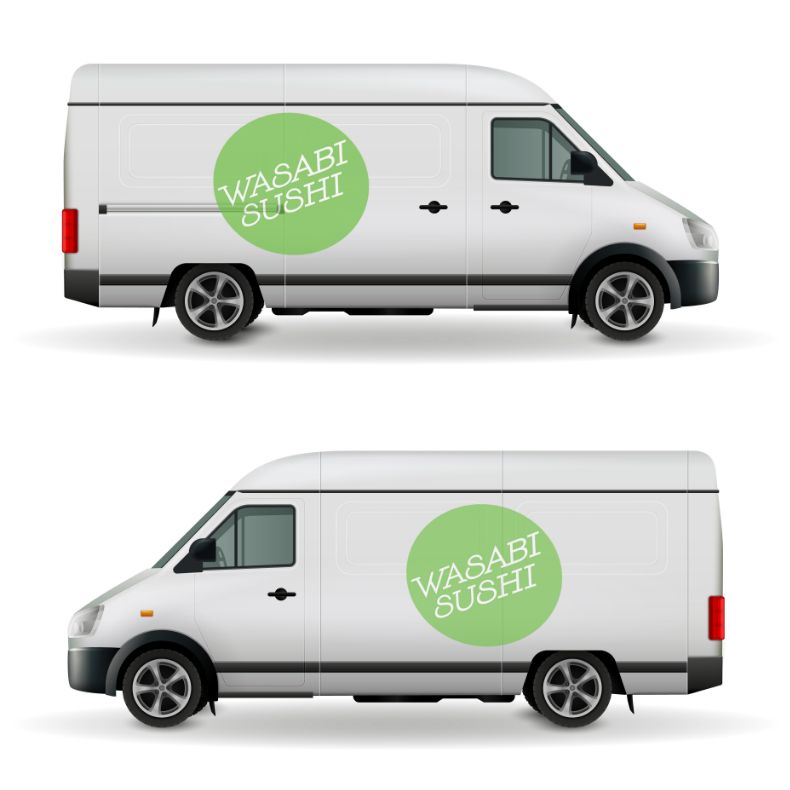
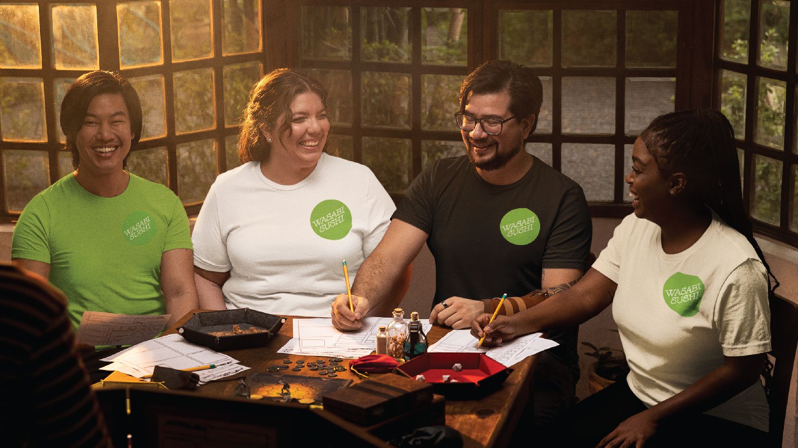
Having a clear and consistent brand identity throughout the inside and outside of the restaurant will help the brand stand out, but then adding a vehicle wrap to the delivery vans would help create a wider range of advertisement for the restaurant. Normally when you see a food truck style vehicle it shows that the restaurant wants to invest into their brand. This will then give the restaurant a higher success rate of making more revenue which will then impact their profit and loss margin is a positive way. Also, they are not just hitting the local target audience, but a higher success rate of reaching new customers in a broader area. .
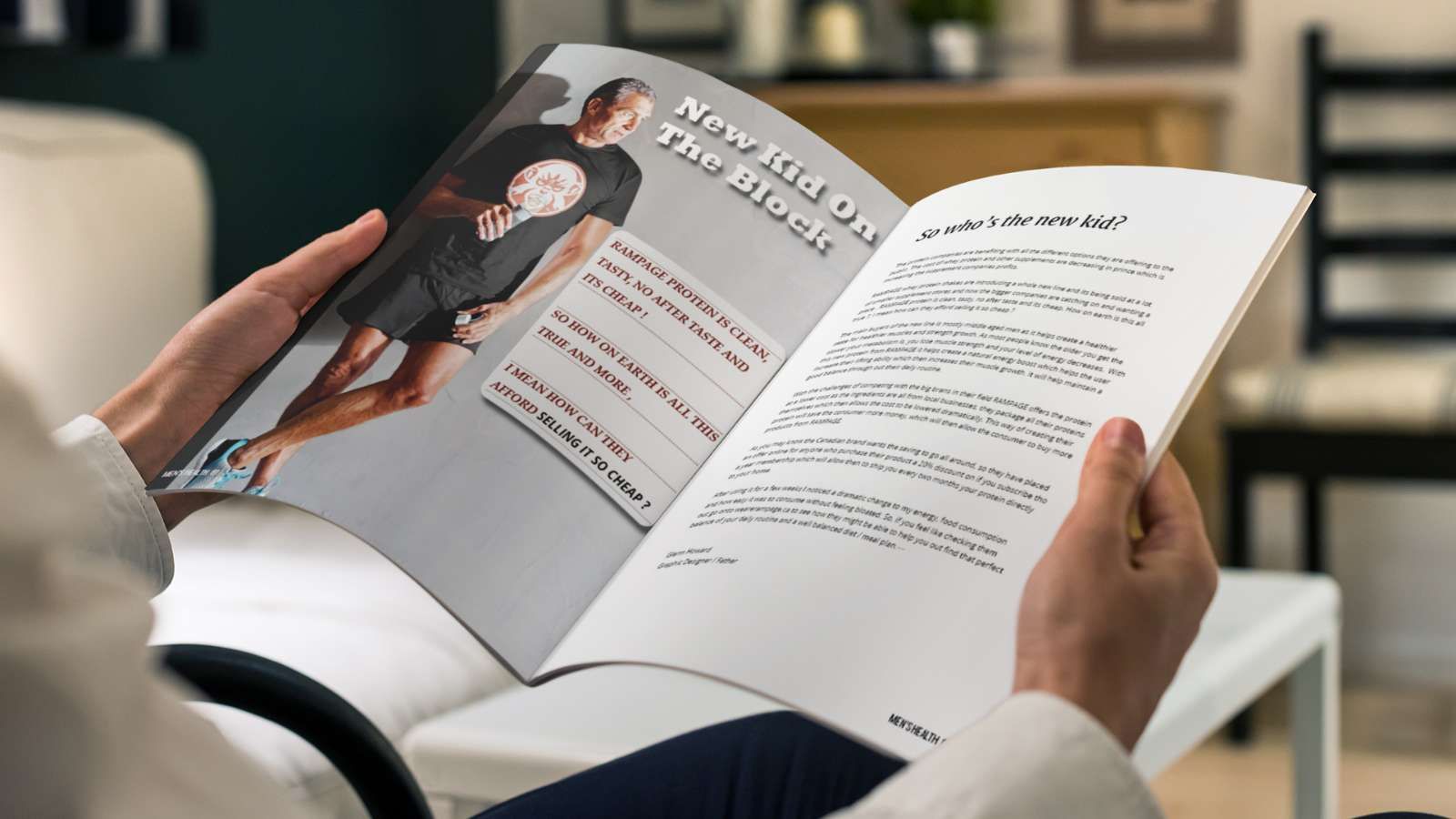
To evoke inspiration in the ad campaign would be to inspire the target audience Gen X, it will give them that push to keep going to the gym and working out, as this is the time that is important. Gen X is at that time of their lives where their muscle growth decreases as well as the drive to keep going to the gym. LET'S GO !
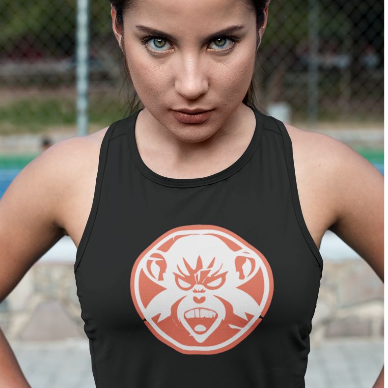
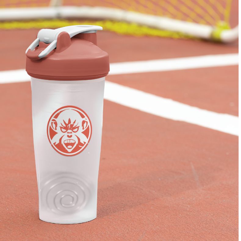
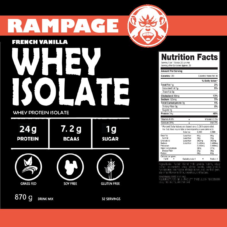
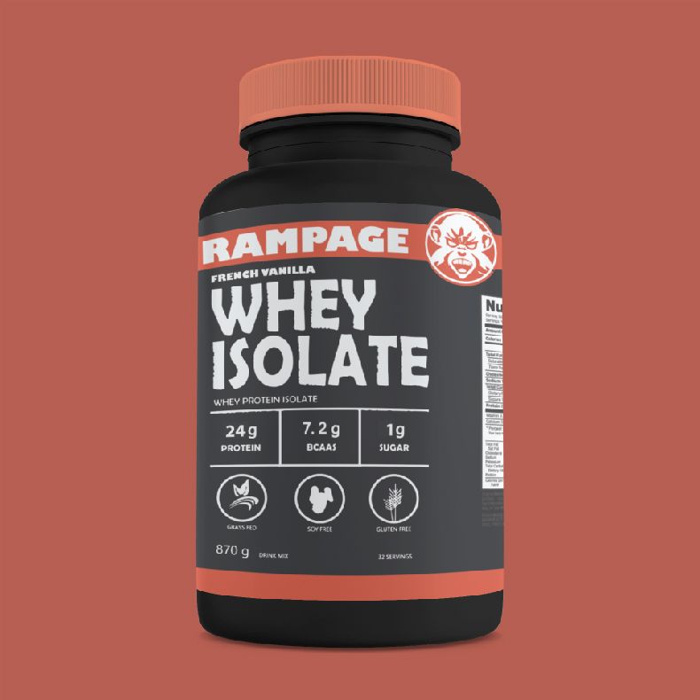
Creating a full brand design and developing a logo that is simple, clean and easy to see with just two colours was challenging but exciting. The reason for this brand was to create a brand that the target market was Gen X. With Rampage Protein this would be branded as to get that feeling of excitement and the need to gain that energy back.


Having a brand that can branch out to apparel, shaker cups and more would help create a better brand awareness, as there would be more deliverables to a potential client like GNC or Popeye's Supplements.