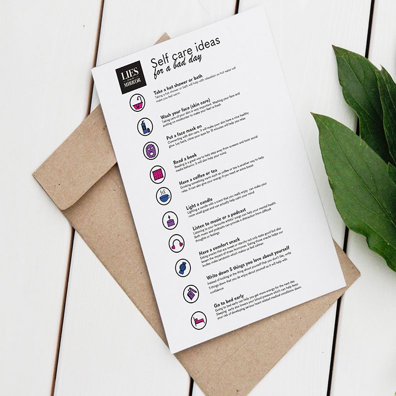
This project addresses the sensitive topic of body dysmorphia with empathy and relatability. By highlighting the campaign’s goal to shed light on BDD and offer support, it conveys compassion and a strong desire to help, eliciting an emotional response from the reader.
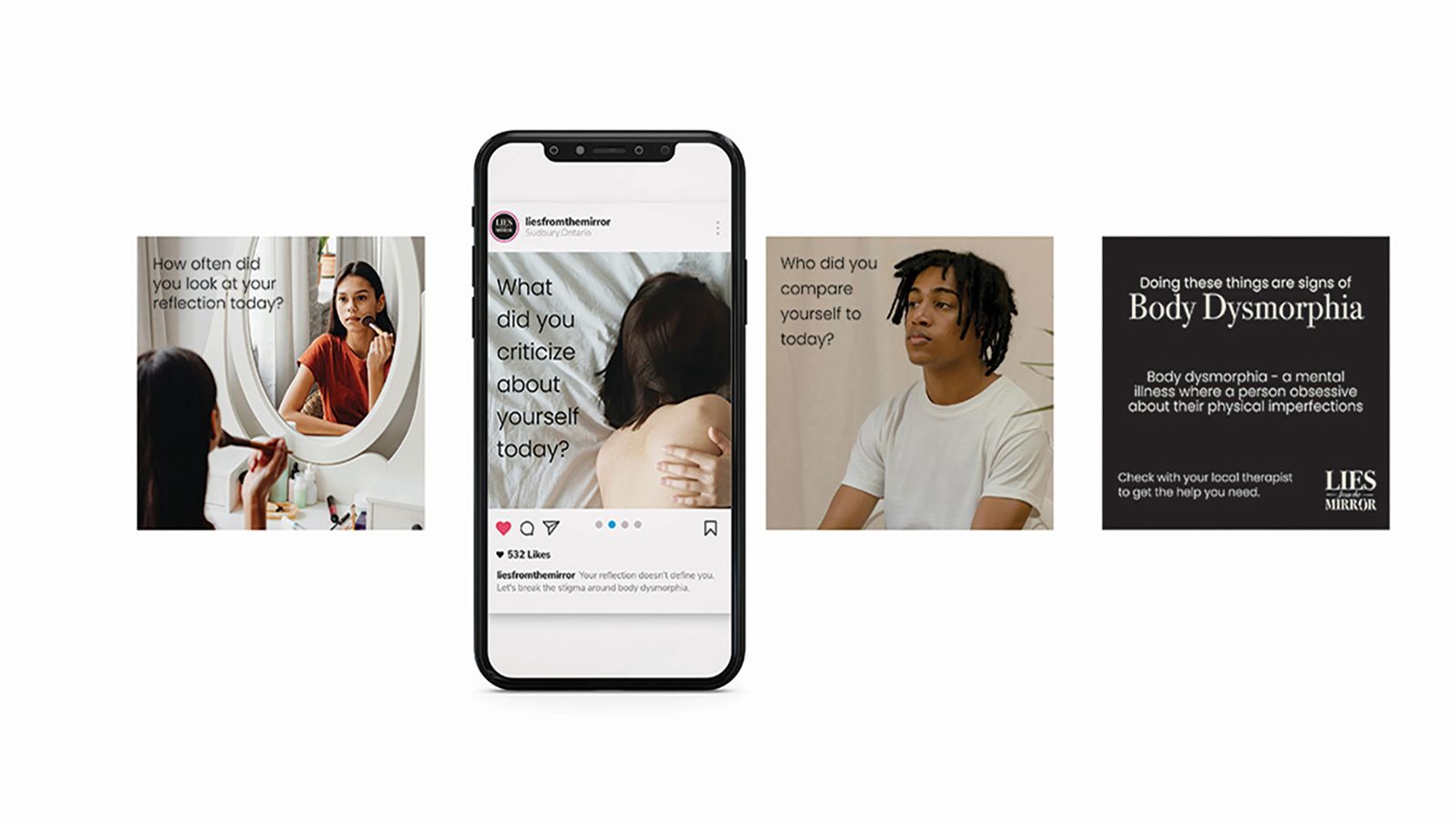
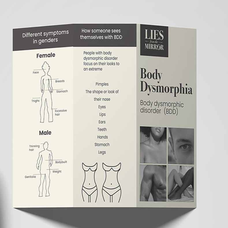
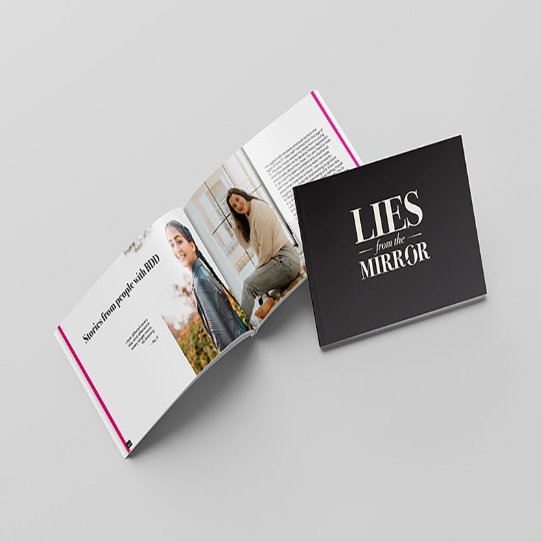
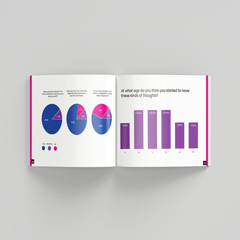
Lies from the Mirror is a campaign that speaks directly to young teens and college students, tackling the tough issue of body dysmorphia. It’s a mental health challenge that affects a surprising number of us, with over 40% of males and a shocking 60% of females dealing with it daily.
The campaign’s goal is clear: to shed light on Body Dysmorphic Disorder (BDD) and offer a helping hand to young adults facing these struggles. Because these are issues that need to be talked about, understood, and supported.
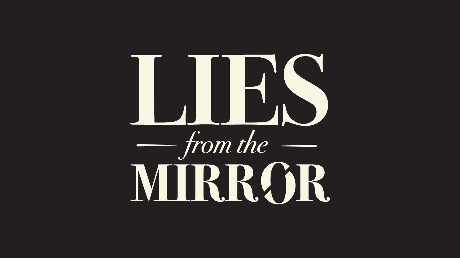
The font Bodoni 72 in the logo makes it like it belongs in the world of luxury fashion. The twist is the brand is actually about body dysmorphia. It’s this contrast between structure and meaning, where the typeface tricks you into believing it’s all about fashion but, in reality, it’s about something much deeper.
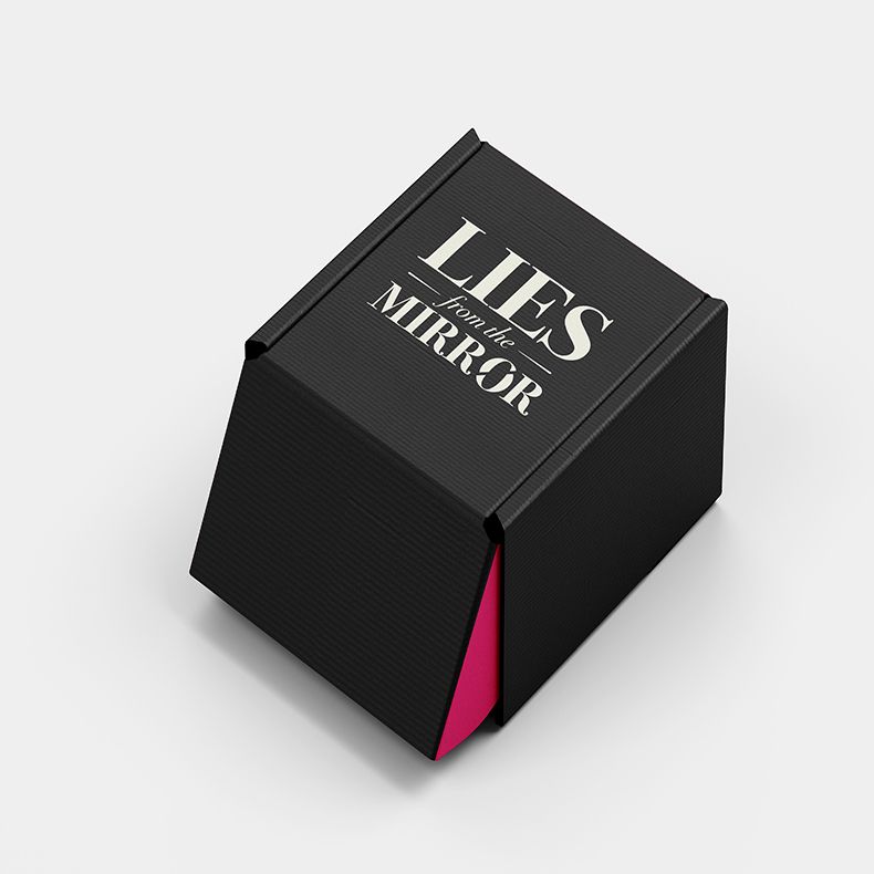
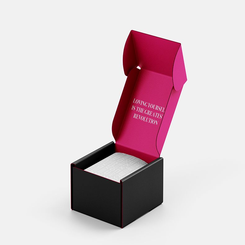
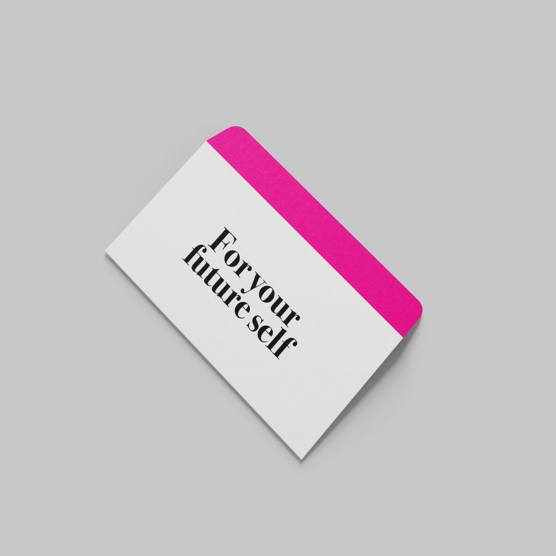
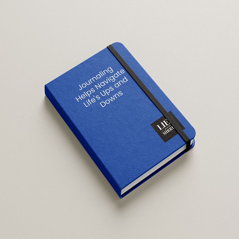
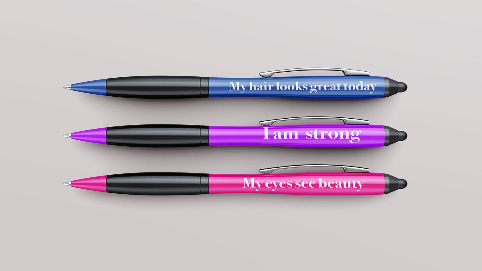
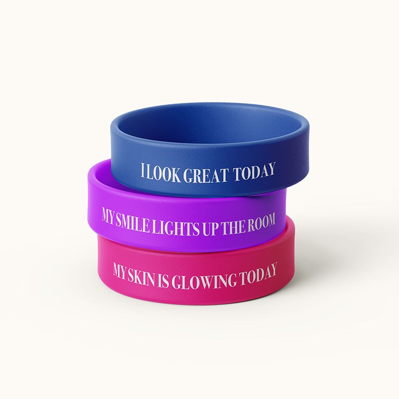
The brand’s kit box is a thoughtfully assembled assortment of products meant to encourage self-care and a healthy body image. Helpful materials like self-reflection journals, pens and brackets with inspirational words engraved on them, and envelopes to send letters to one’s future self are all included in each box. The kit box aims to promote self-acceptance and self-love by offering an in-depth approach to mental wellness.

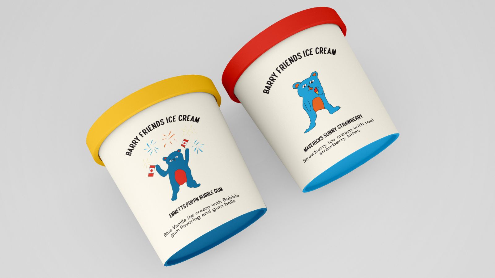
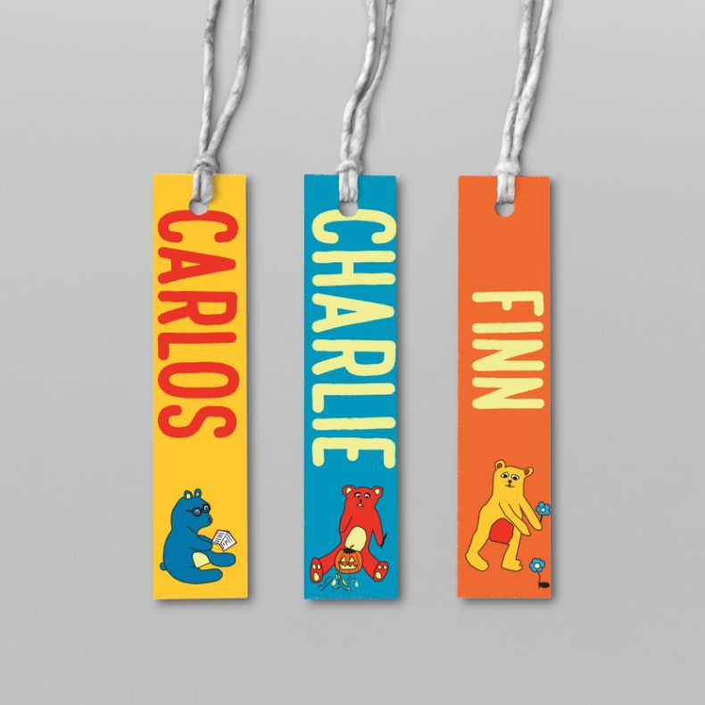
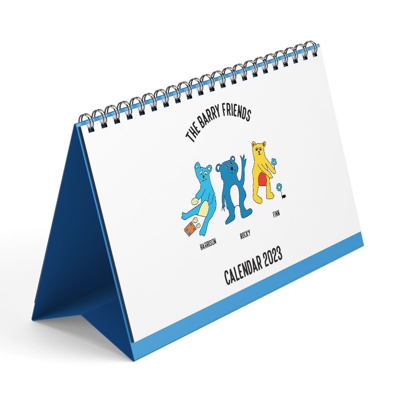
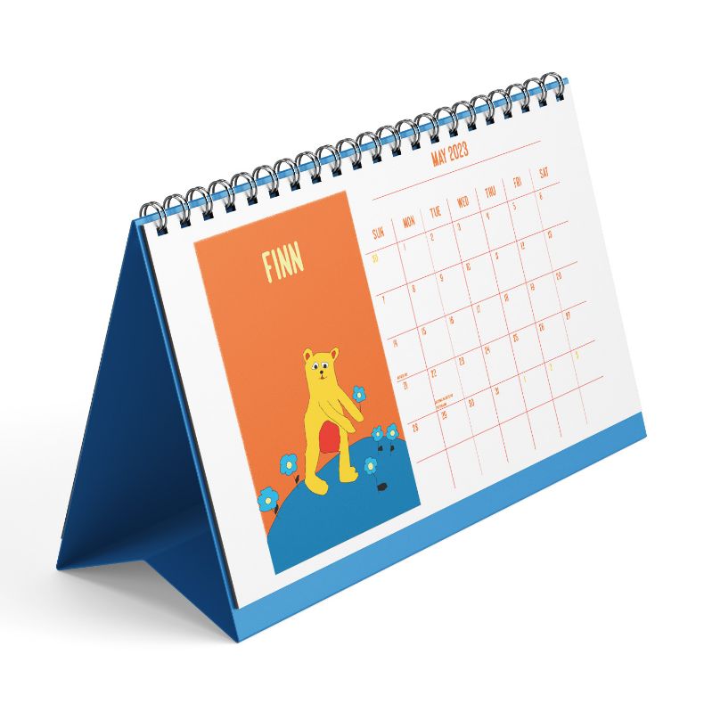
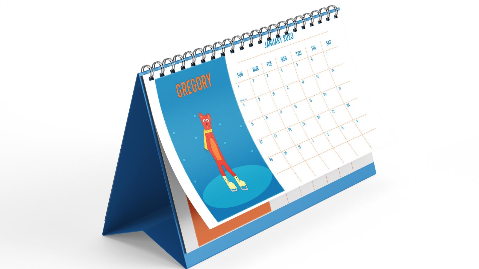
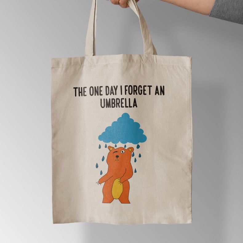
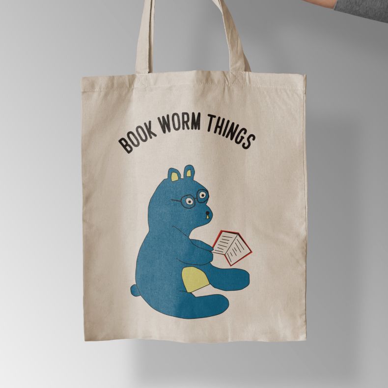
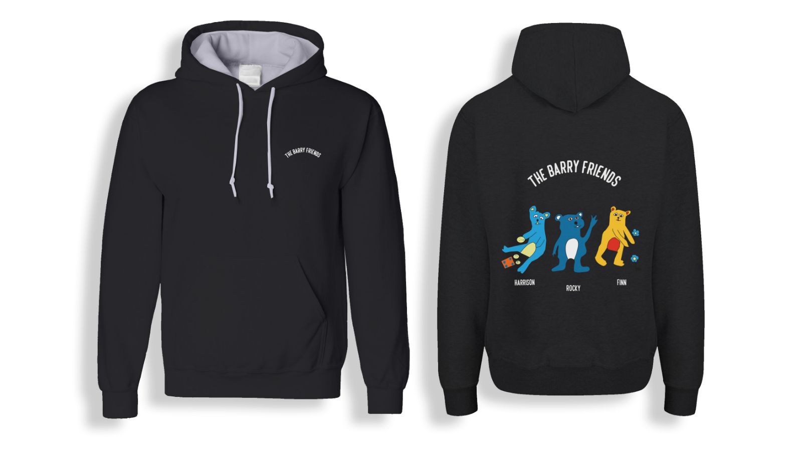
This project with the Barry Friends company seeks to draw in new clients while re-connecting existing ones to reclaim their customer base. We’re boosting interest in Barry Friends’ products with creative approaches, providing a refreshed experience for everyone who enjoys the brand.
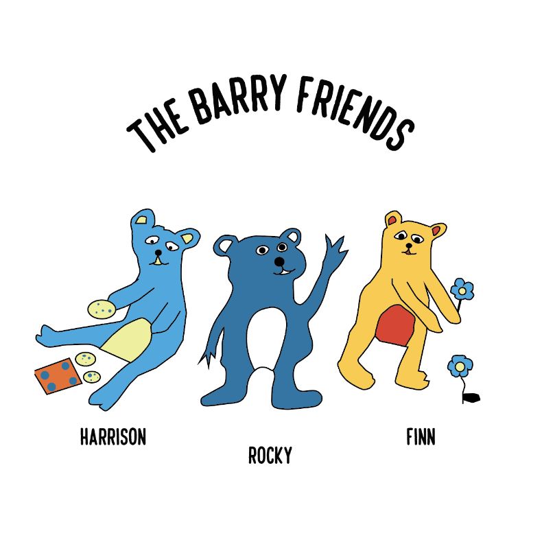
The Barry Friends company is a delicious ice cream brand known for its adorable bears. They offer 13 different flavours, each linked with a unique character. Fans of the brand, or anyone who adores the cute bears, can also enjoy their calendar and merchandise.
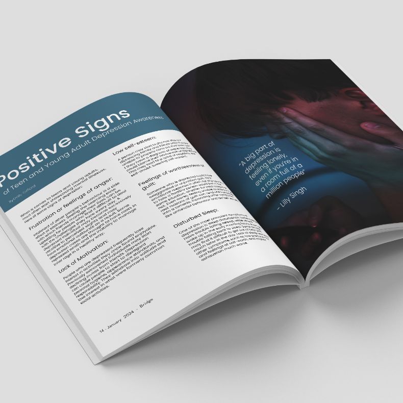
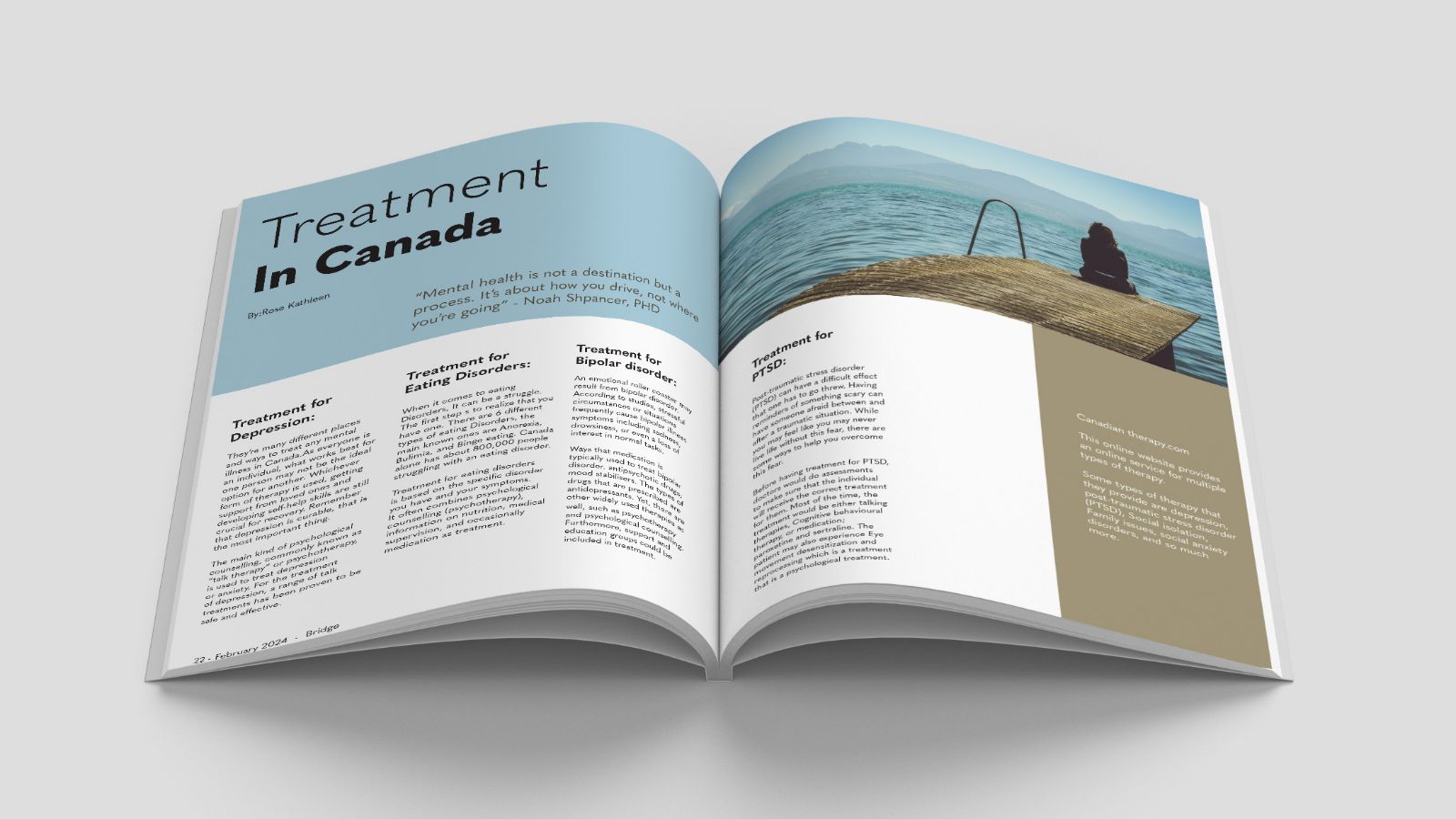
Bridge magazine’s proactive efforts in providing insightful analysis, helpful links, and guidance to individuals dealing with mental health issues reflect its dedication to reader empowerment. This commitment is further demonstrated through the magazine’s aim to inform and assist individuals in enhancing their mental well-being, showcasing a genuine concern for their readers.
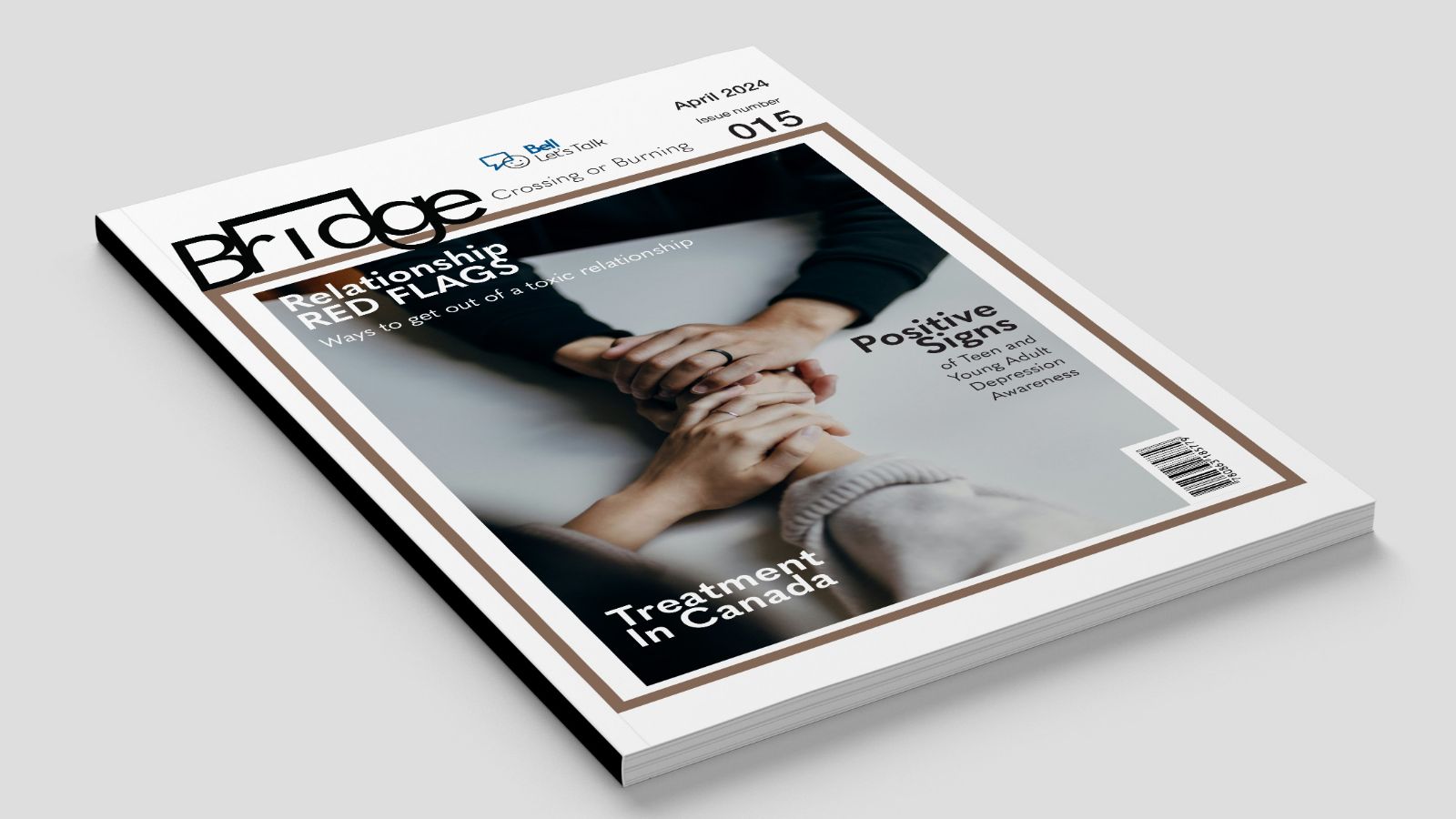
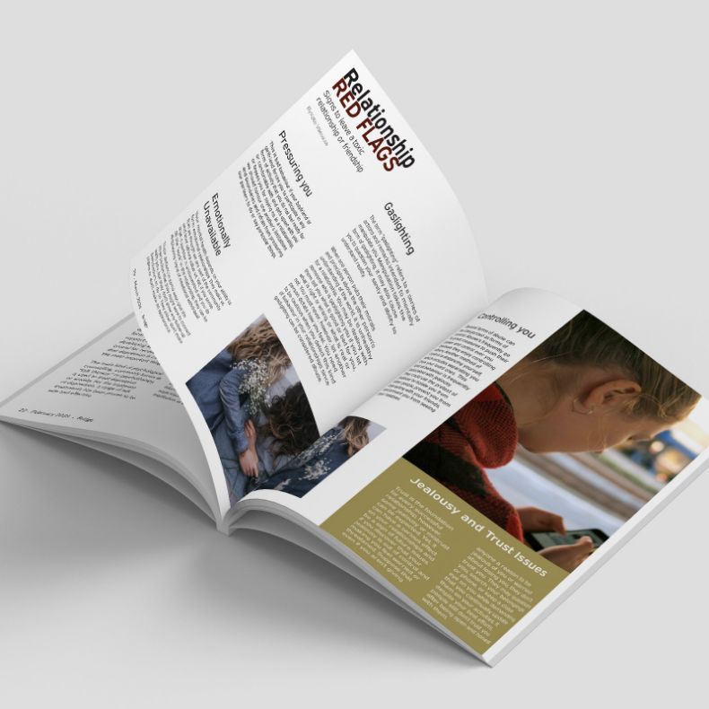
Bridge Magazine is a mental health-focused publication. It offers a range of articles addressing topics such as depression, eating disorders, bipolar disorder, and more, providing valuable insights and resources for those struggling with these issues. The magazine also includes articles highlighting warning signs of these disorders and provides information on treatment options available in Canada. Additionally, some articles discuss “red flags” in toxic relationships or friendships, offering guidance on how to navigate and exit such situations.