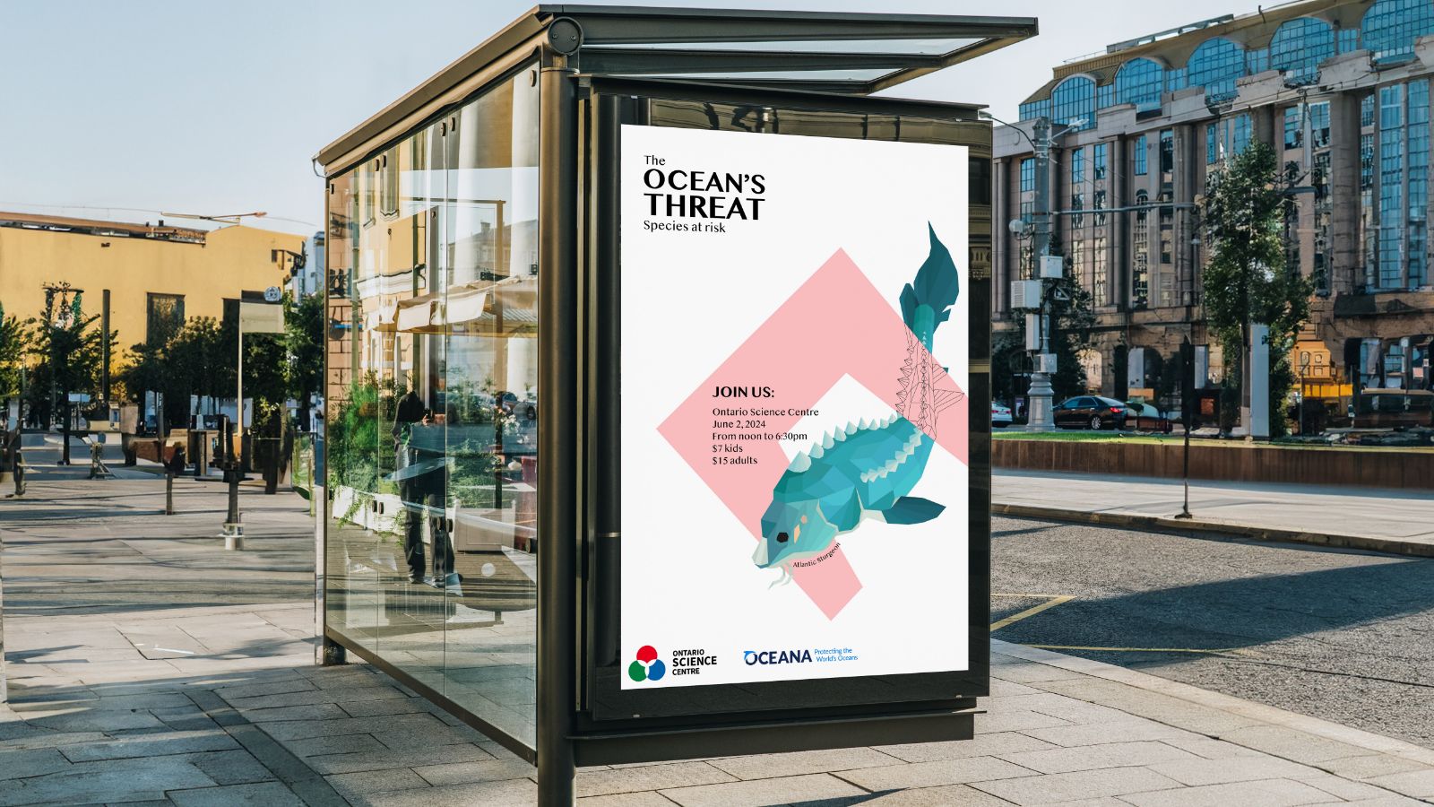
This project aims to encourage the audience to begin a journey of education on the environmental impacts we have on marine life. Motivating them to take action.
There is pressing threat against our ocean life, yet the education about the topics that affect it have been minimal. The Canadian OCEANA organization is fighting these issues currently, and few know about their work efforts.
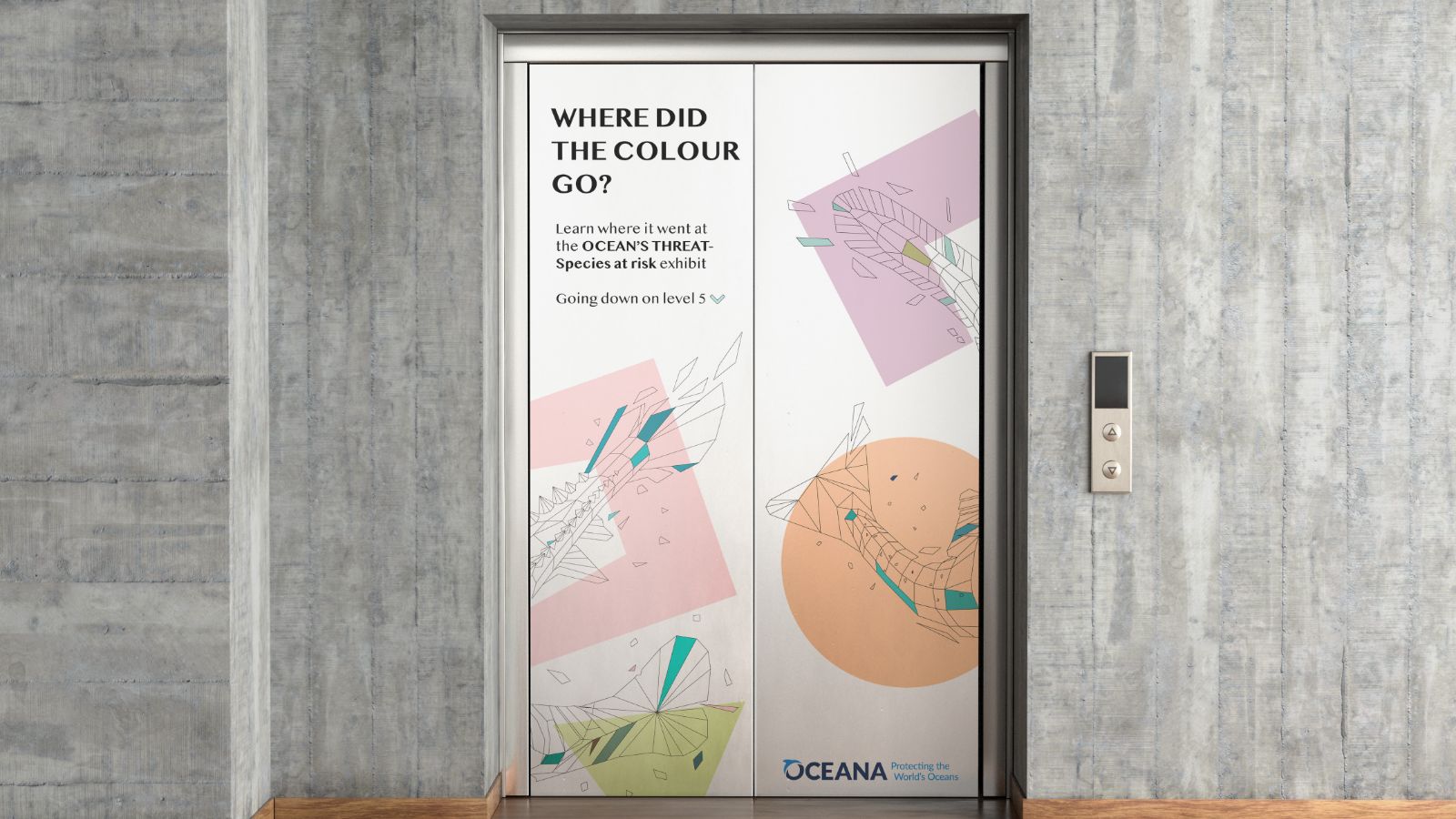
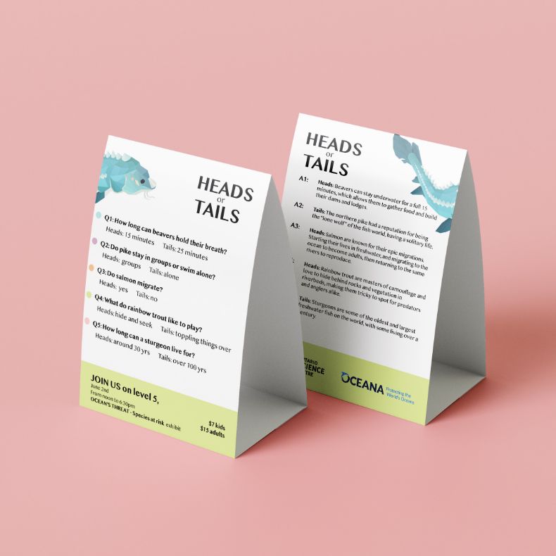
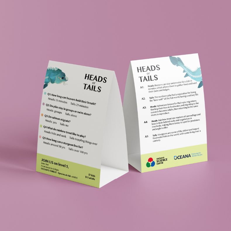
The most effective way to make an impact is to educate both parents and kids in an environment that can sets the tone for proper learning. A place like the Ontario Science Centre allows for the perfect location for said event.
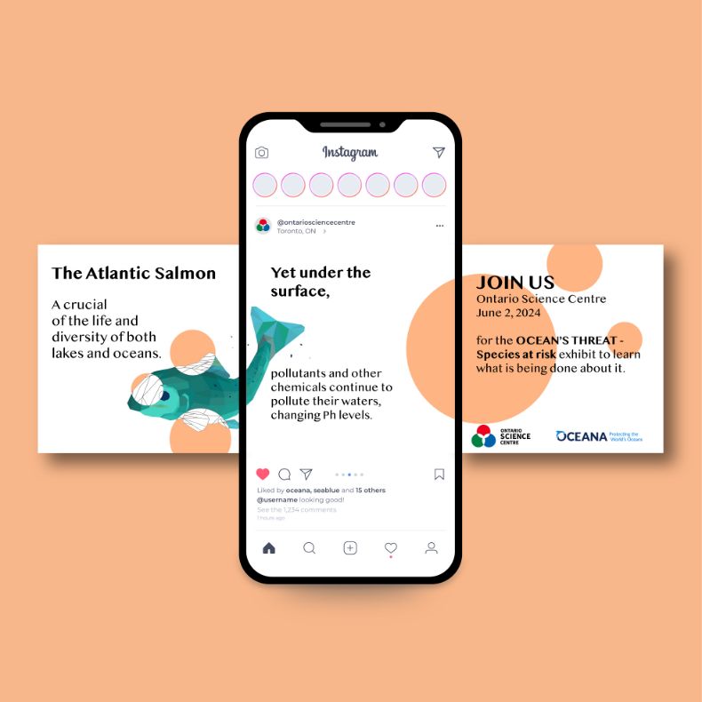
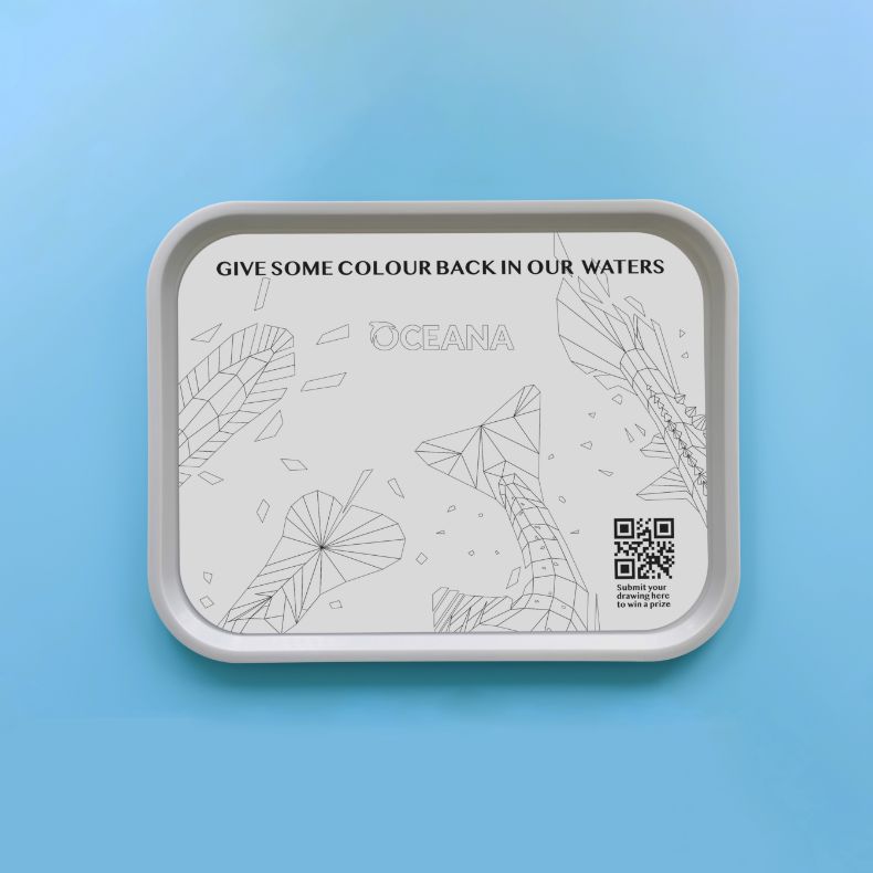
Advertising said event would need to target both inside and outside the Ontario Science Center using social media (Instagram) and rest areas (public bus stops, eating areas and elevator inside the OSC). Grabbing, both the attention of kids and parents.
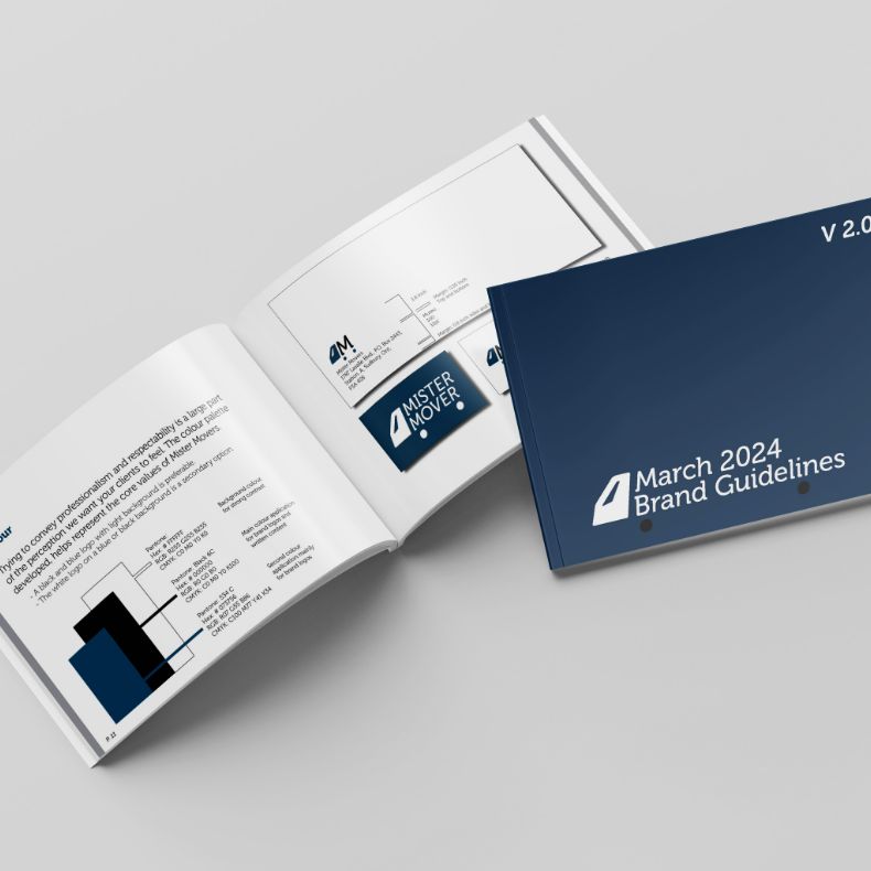
Throughout this project, locals are asked to reconnect with a brand that has been influential to their community for over 50yrs.
Mister Mover has made its place in the City of Greater Sudbury since 1968, and have helped both businesses and customers alike, with specialty moves, and exceptional service. Yet, having had their old brand identity for some time - although distinct - does not compete with other newer local and commercial companies.
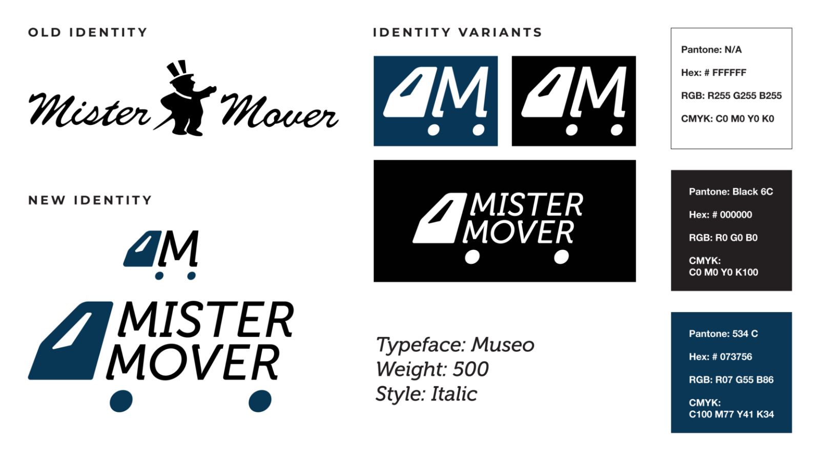
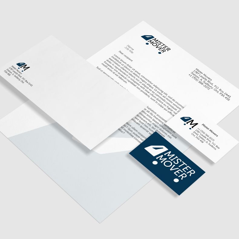
In response to this dilemma, they have gone through a rebrand to revitalize their image. This came in the form of a contemporary design, with a slanted font.
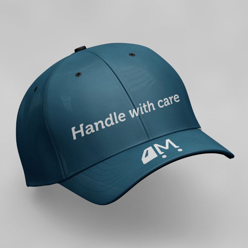
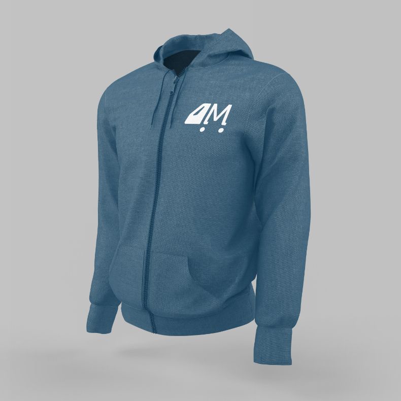
The logo variations give them the option to demonstrate a playful and simple truck in movement.

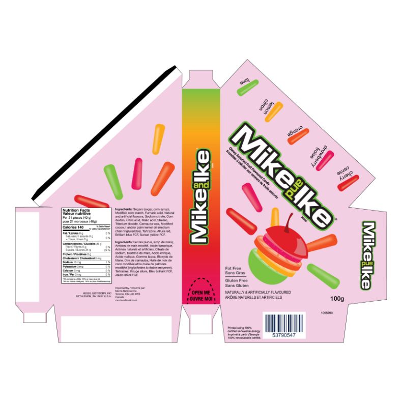
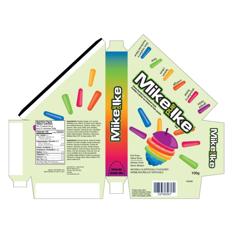
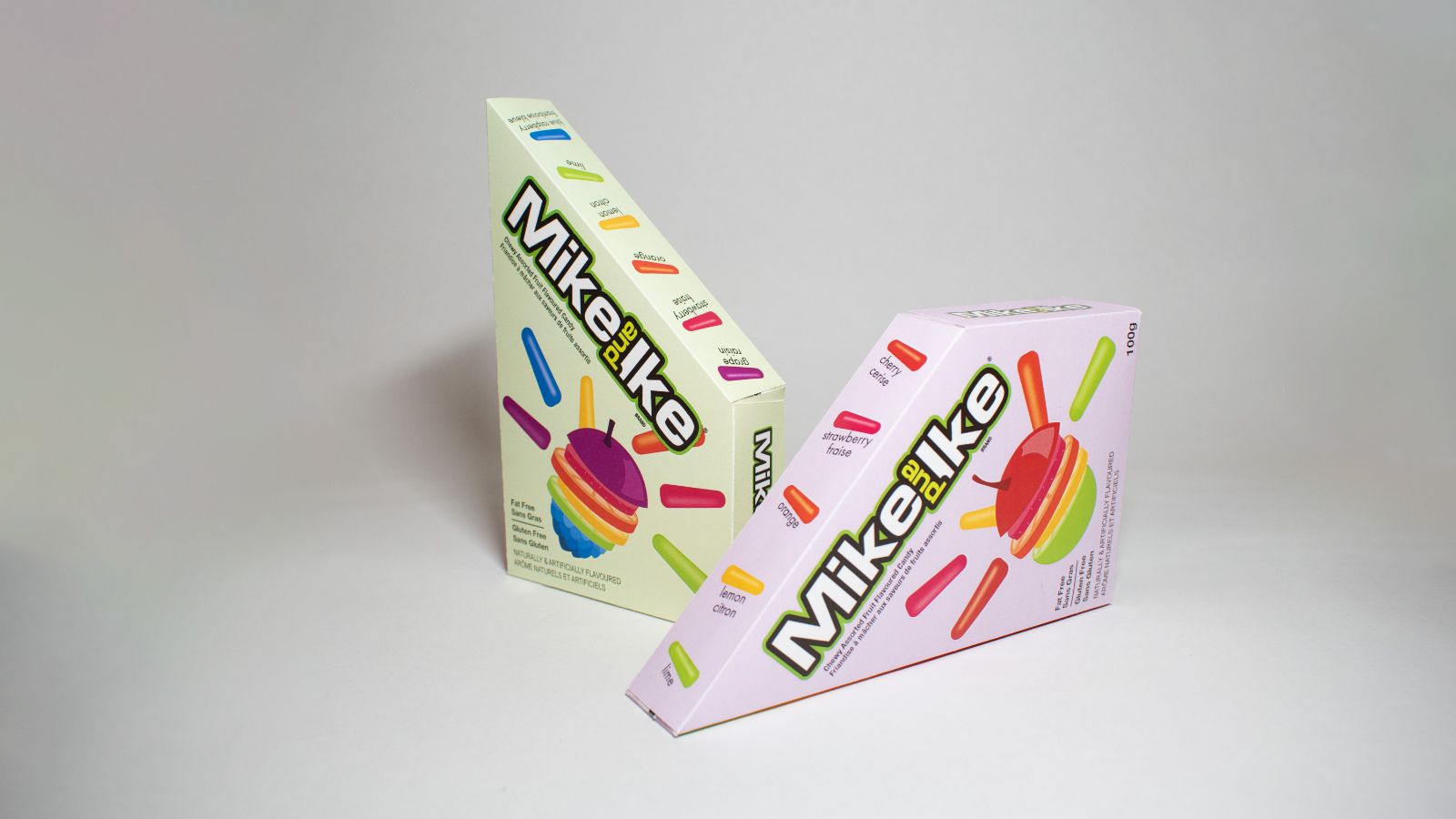
This redesigned packaging is now more accessible to all, using brighter colours and a distinct shape. This gives it more contrast and clarity on the shelf.
“Shrinkflation” occurs when companies reduce product quantities while maintaining prices, aiming to boost profits. This has become common practice for many industries, in order to stay relevant and maximize finances. In Mike and Ike’s case, they need to compete with their competition.
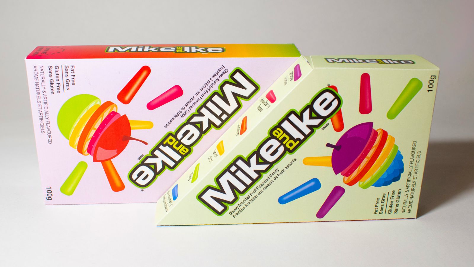
In order to stay relevant in the candy market (among consumer spending concerns), Mike and Ike have a new cost-cutting packaging design. The new packaging is visually appealing to attract consumers’ attention while also optimizing shelf space and reducing shipping costs.
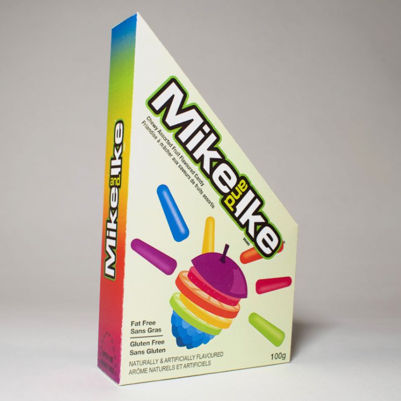
This approach not only addresses the challenge of shrinkflation but also positions the brand as an innovator in the competitive confectionery landscape. By doing so, they manage to preserve customer loyalty and potentially attract a broader market base, balancing cost-effectiveness with consumer satisfaction.