I utilize a multifaceted skill set in social/ psychological communications to create thoughtful, effective, and collaborative design solutions for clients.
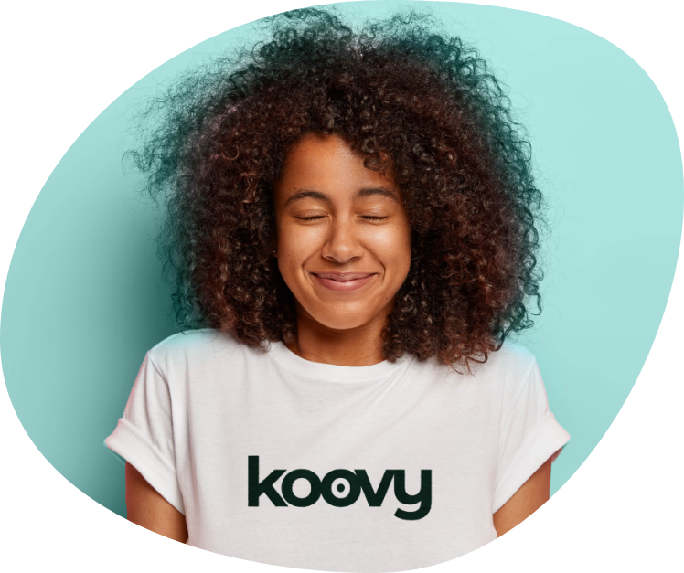
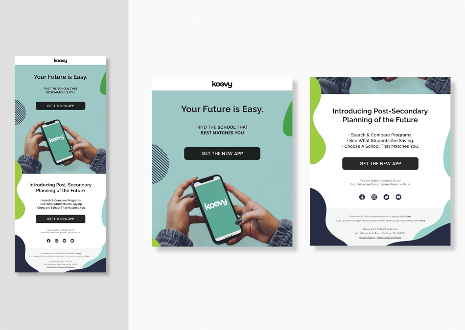
Koovy is an education app that allows students to personalize their post-secondary future. The brand identity, advertising, marketing, and social media campaign takes an interactive & youthful approach to engage the target audience.
The app features a comparison function, personal profile filter, and the ability to research and save information & dates to not miss those important deadlines.
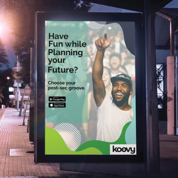
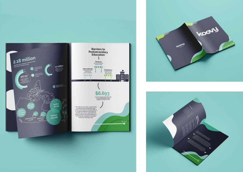
Bus advertising is located near Colleges/Universities. A report highlights the number of students in school and the barriers students often face to post-secondary. This information assists the print and digital campaign to better understand where to market and what information may be most important to students.
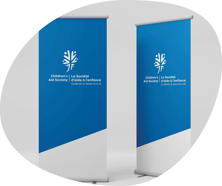
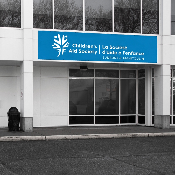
The Children’s Aid Society of Sudbury & Manitoulin is a government funded, non-for-profit child welfare agency that supports the safety and wellbeing of children, youth & families. The logo rebrand recognized the value of the diverse populations the organization serves and collaborates with everyday.
The new design for the Children’s Aid Society of Sudbury & Manitoulin aimed to highlight the organizations’ core values of respect, inclusivity, accountability, kindness, & integrity, while nodding to the community, diversity and growth that exists within the child welfare sector.
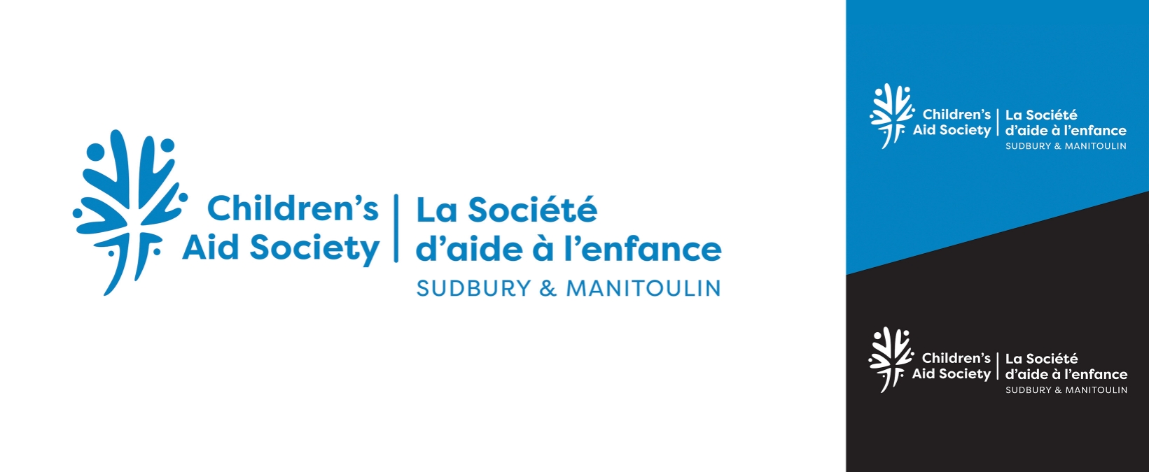
The icon is organic in shape to appear approachable and friendly. A sans-serif was chosen to support accessibility & readability. Lastly, the colour blue was selected as the main colour to create some unification and familiarity in the visual brand from the previous logo.
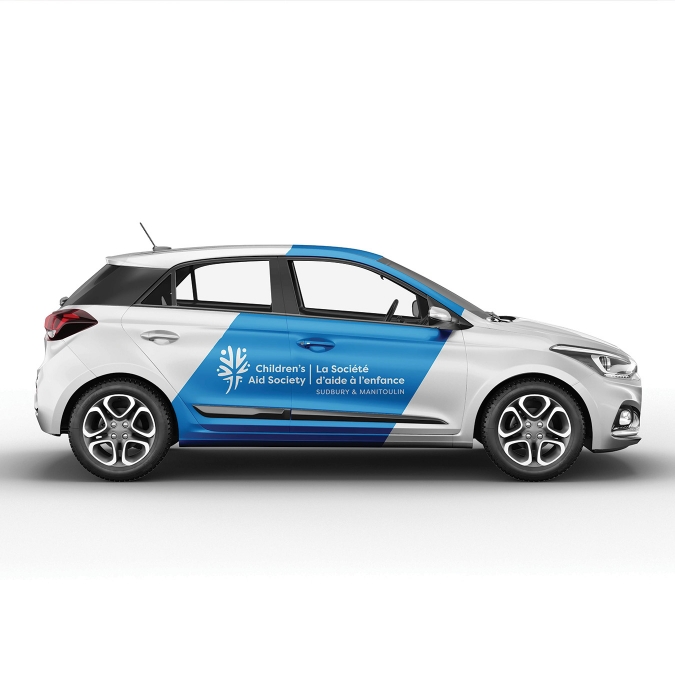
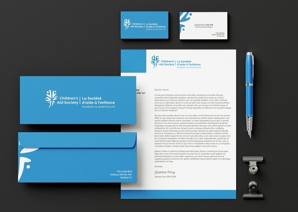
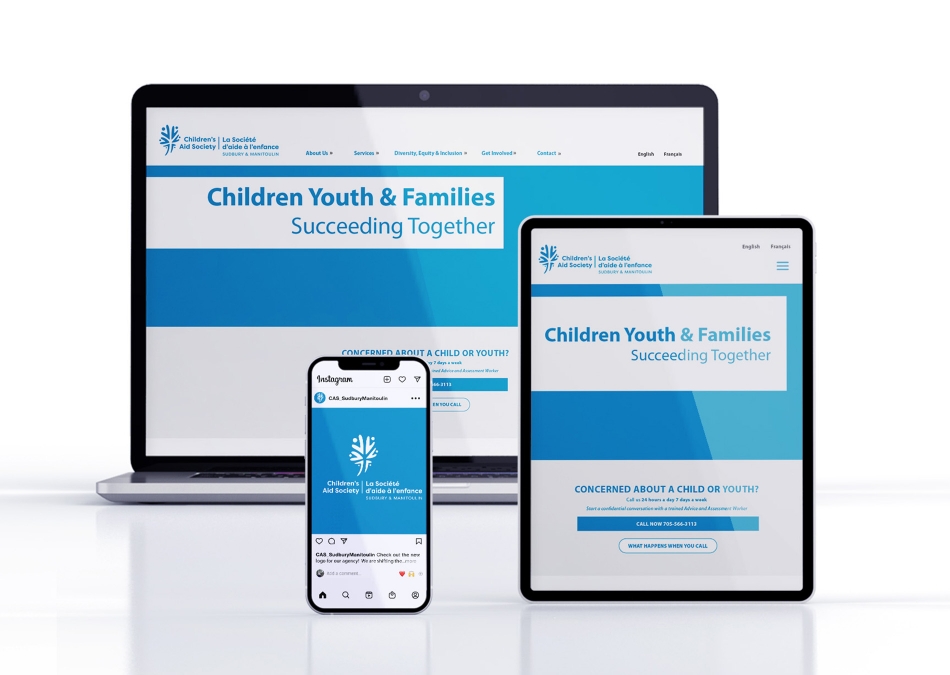
Print, digital, and environmental applications show the versatility of the brand identity and how it is seen in day-to-day life for workers, clients, and the community at large.
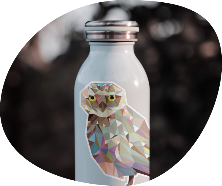
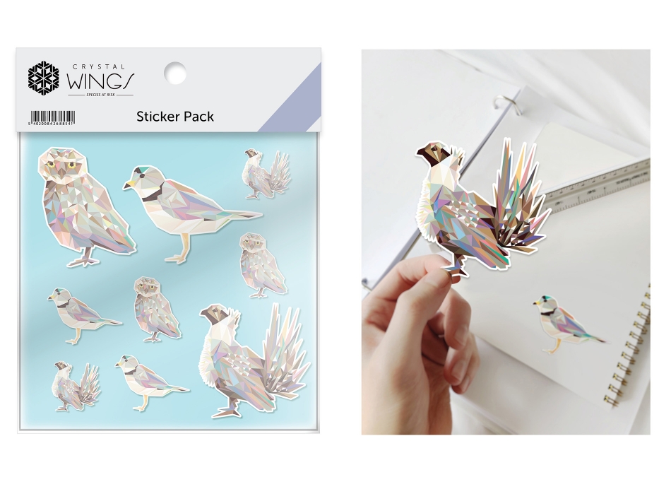
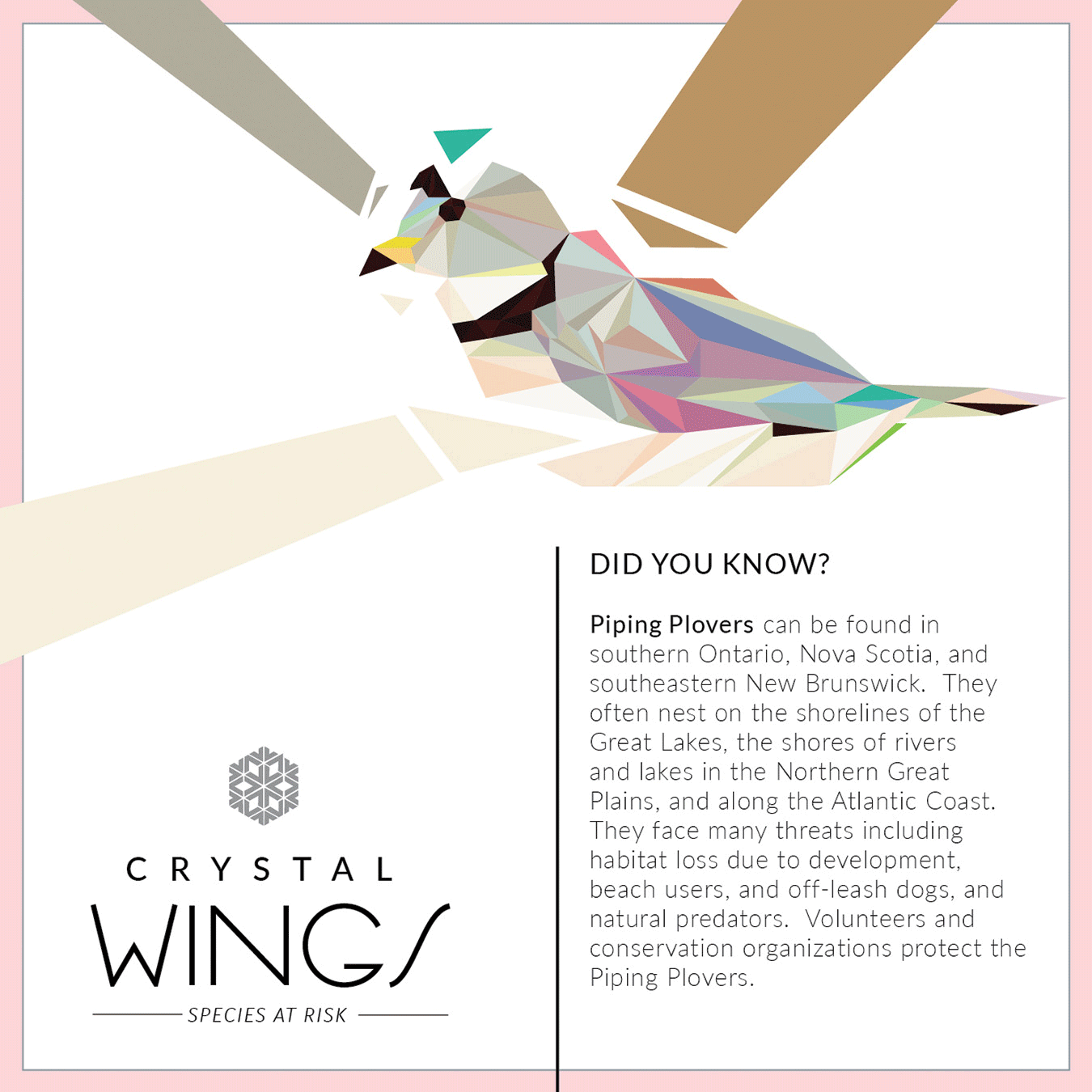
Science North needed to promote their upcoming exhibition on endangered species. Crystal wings featured three endangered birds located in the West, Central, and Eastern Canada. Designs were required to appeal to a youthful & family friendly audience in a low-poly illustration style.
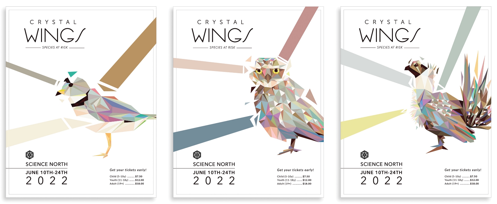
The metaphor of the crystal was used throughout the campaign to allude to the fragility of the species. Colour and typography paralleled the metaphor and subject matter and were selected for readability, contrast, and playful energy.
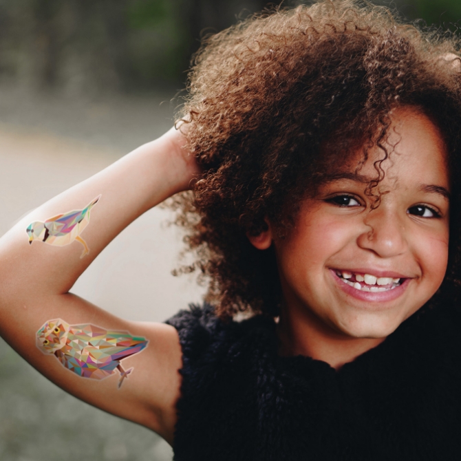
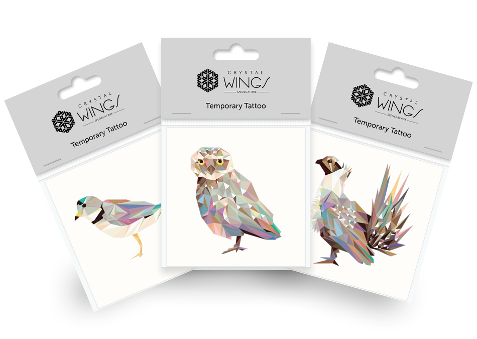
Giveaway cards provided more information on the endangered birds and why they are at risk. Merchandise like a water bottle, and tattoo & sticker packs offer a way to carry these precious birds with you and your family while exploring the outdoors to find them!