


I'm an illustrator, designer and thing-maker. I strive to bring life and creative solutions to my projects and one day, make an impact on the graphic design community.
Rise is different from your average "Save the planet, buy green!" identity. By taking a major problem and expanding on that solution in a playful way, Rise was created.
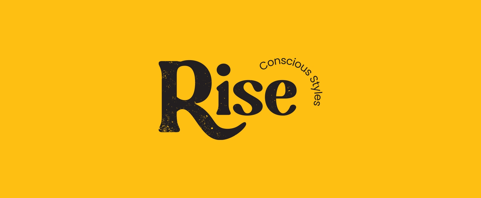
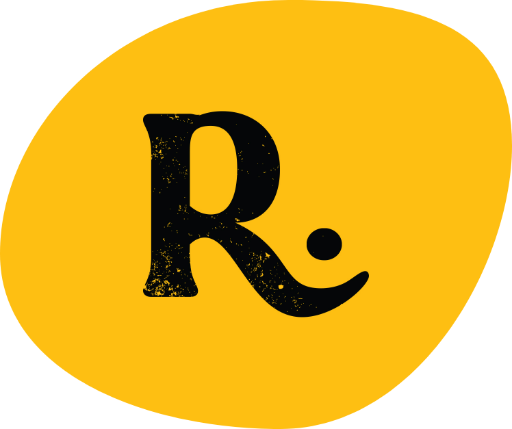
Rise was created to reduce clothing waste. It allows anyone to drop off clothing, deemed not good enough for thrift stores or donations. 100% of clothes given, will be recycled and created into new items. We like to focus on yellow since our mission is to achieve a brighter future.
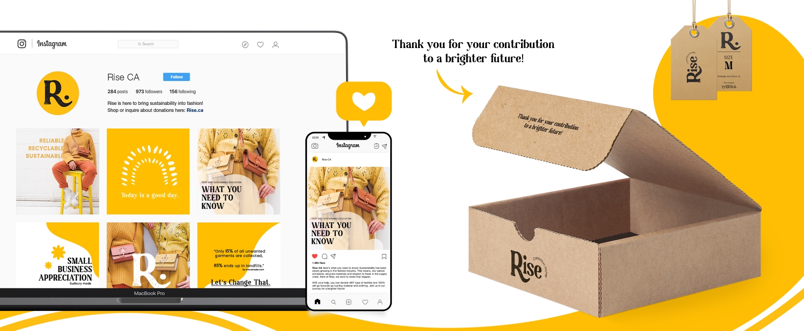
With online platforms, Rise can make a cost-effective impact. Another cost-effective decision Rise takes up, is sustainable packaging. From cardboard tags and boxes to limited ink usage.
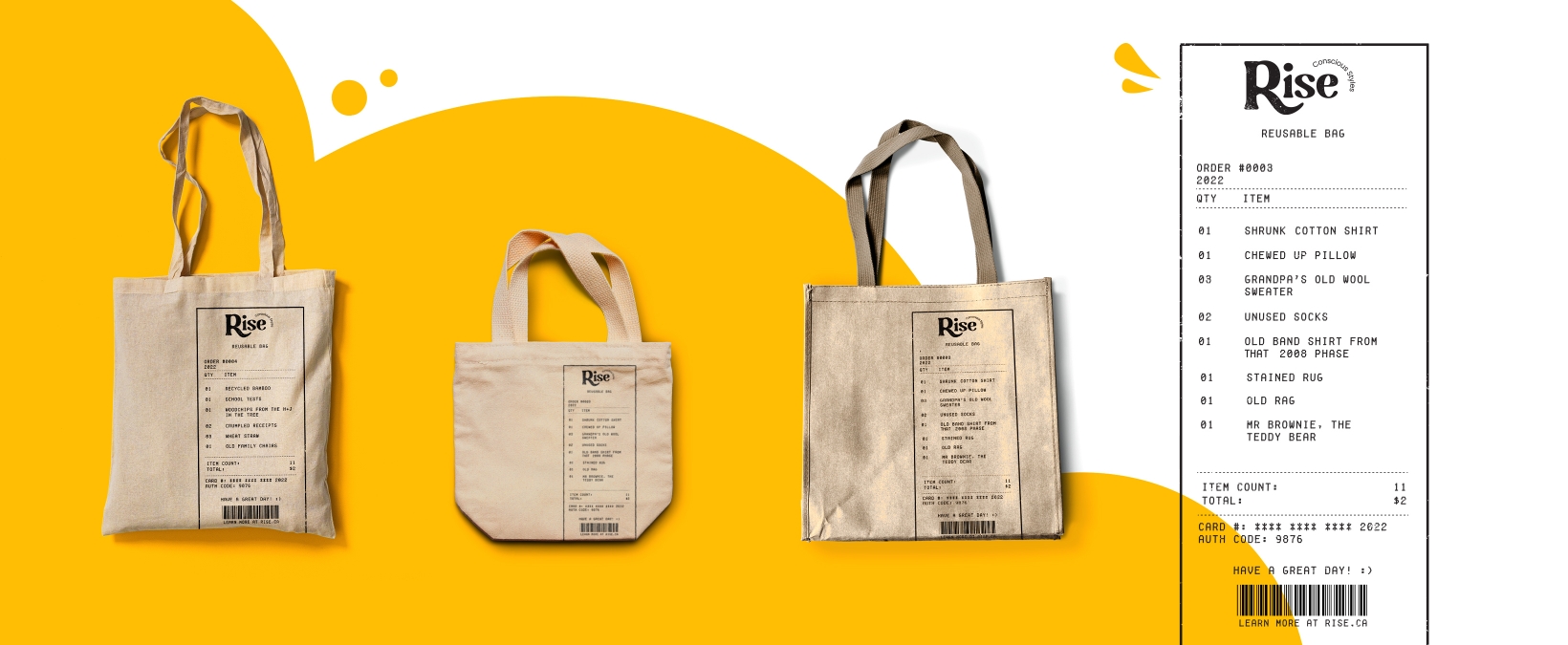
Rise has life to it. even the designs. Using recycled material, we created reusable bags in all shapes and sizes. As well as minimal ink created a fun receipt design of all the things that can be donated to Rise, ripped, dirty, or even stained.
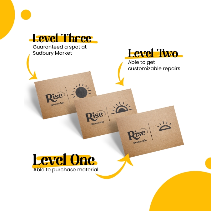
We provide a service for people to donate and feel good about where their items are going towards. What does Rise offer to people? A handy and local workshop. Getting a membership includes three levels with special perks.
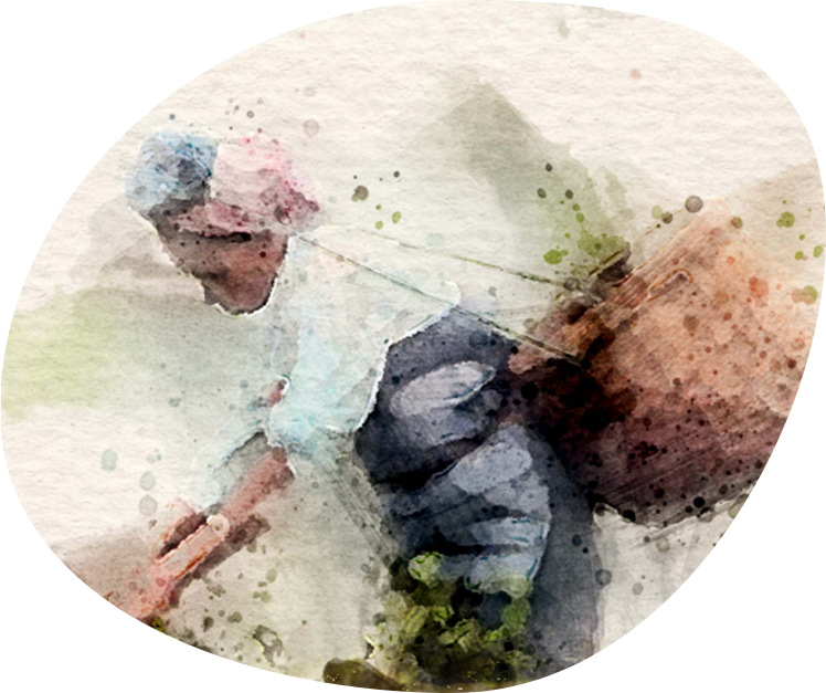
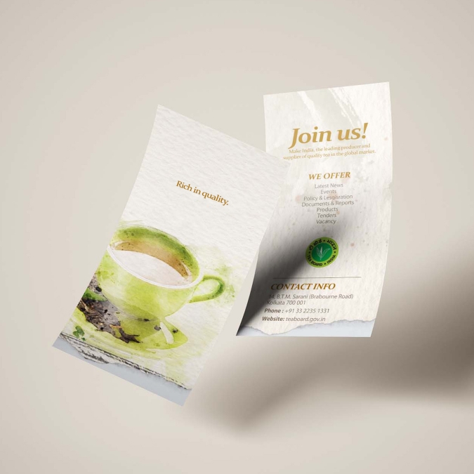
The Tea Board of India is a state agency of the Government of India. They focus on the cultivation, processing, trade and export of tea from India. With such an important position, these Ads will make it less overwhelming and more natural.
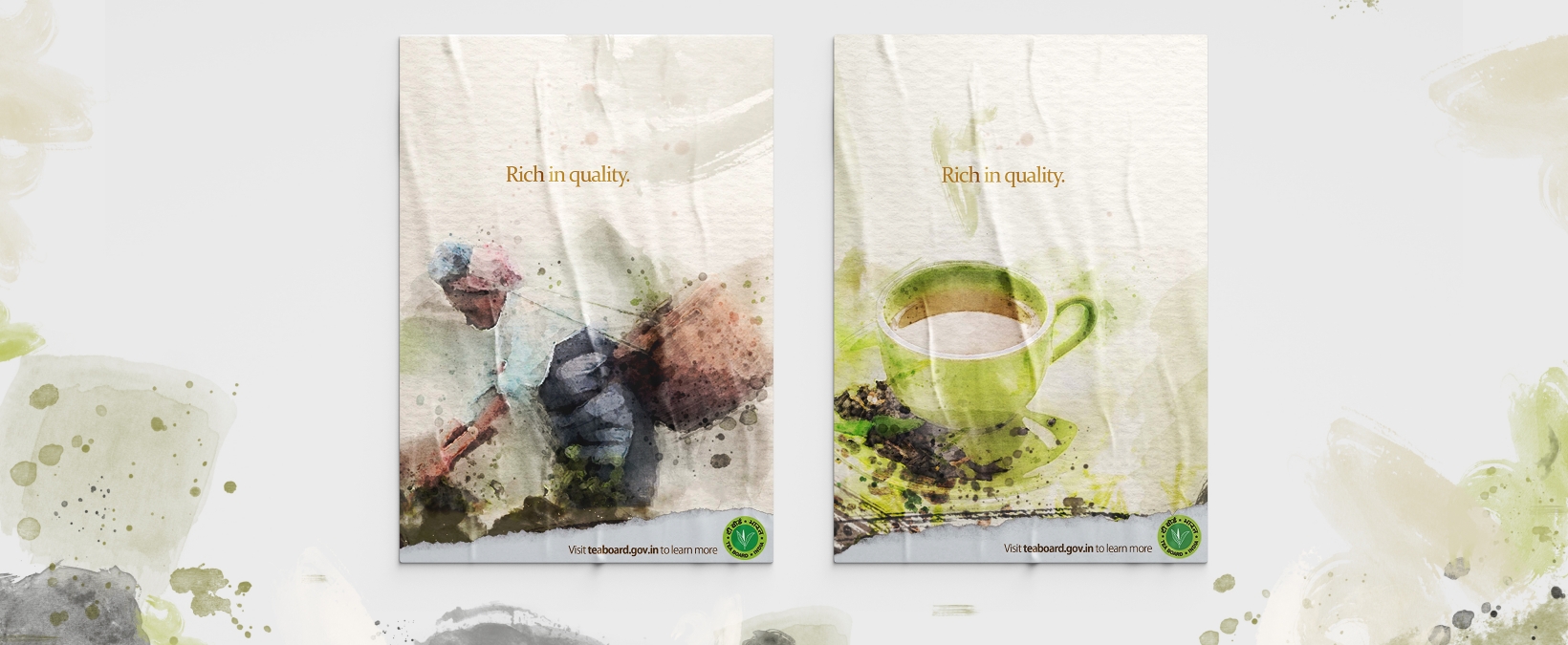
Since they pride themselves on their tea, the direction was to illustrate using watercolour techniques that show natural and rich effect. With the authenticity of picking tea leaves in India, and the warmth of a hot cup of Chai tea. these ads express the origin and the quality they serve.
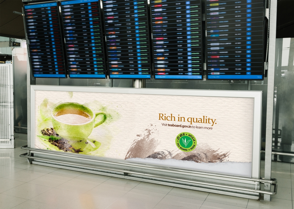
The Tea Board of India is related to business. That's why the content will be more directed to Airports in India. The audience we're trying to target are businessmen, flying from different states or countries.
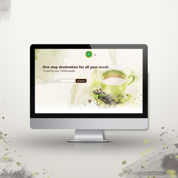
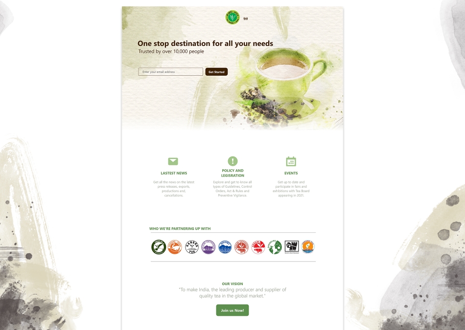
This new and improved landing page is here to direct and inform the users. Keeping the watercolour, even to a screen, helps calms any overwhelming feelings to information.
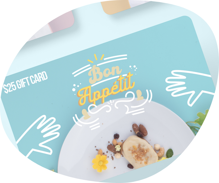
Dash of fun was a personal project expanding into a marketing field. Using a pinch of expressive type and a full plate of food photography.
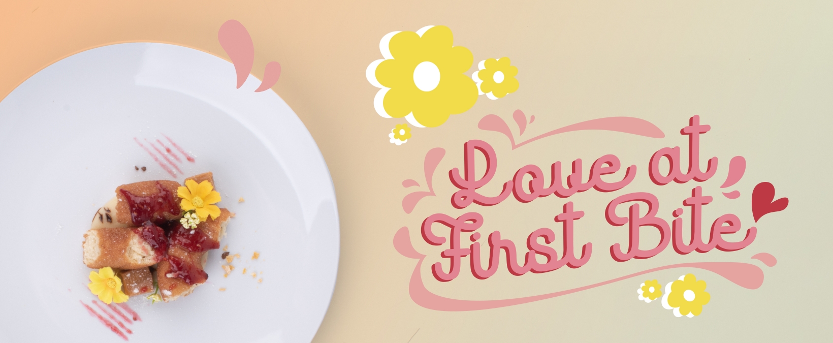
This project touch foodies with an artistic taste. Playing with the original colour of the food, condiments of props, a whole new look was created.
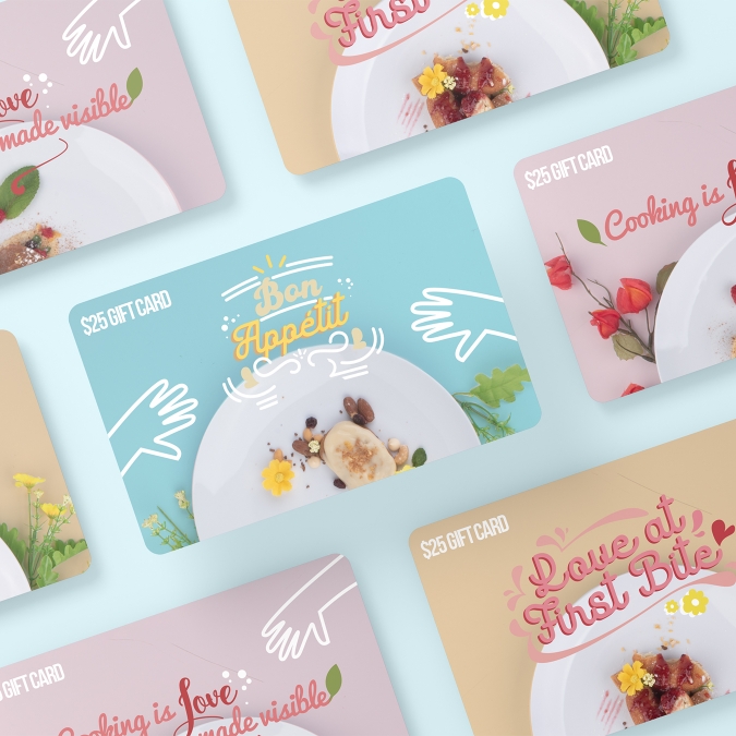
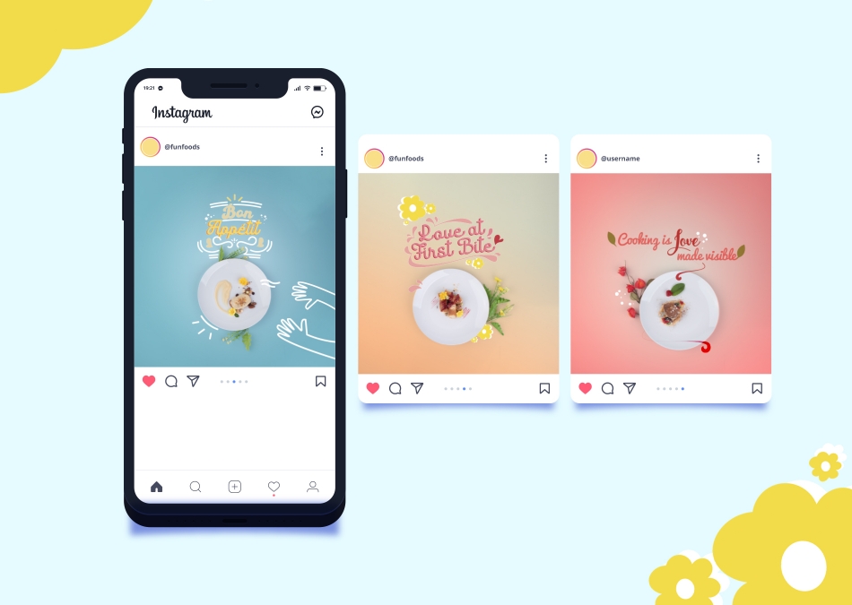
This project expands into the marketing field. Perfect for restaurants wanting to play around with gift cards or even food snapshots you want to add to Instagram!