There was always a side of myself that was constantly creating a new identity each day, evolving my skills giving confidence and drive to move forward in my passion of design.

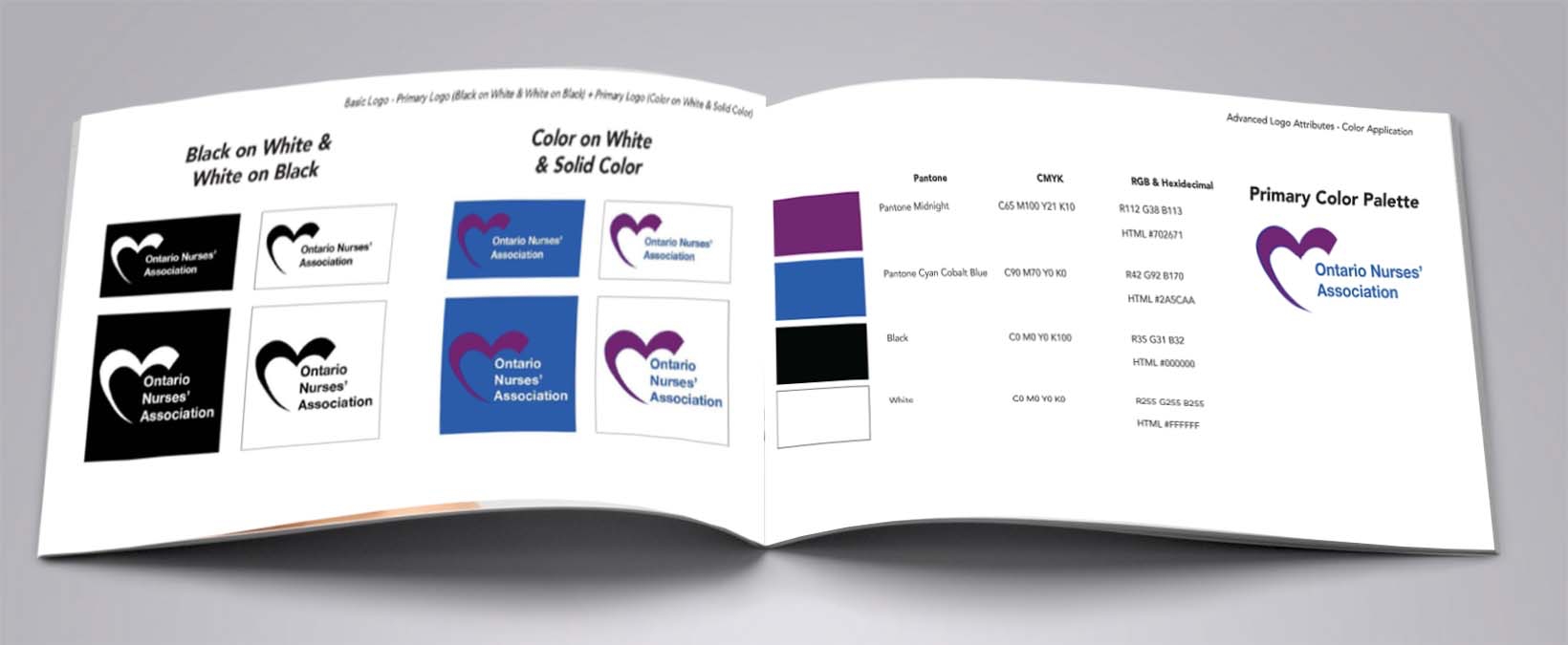
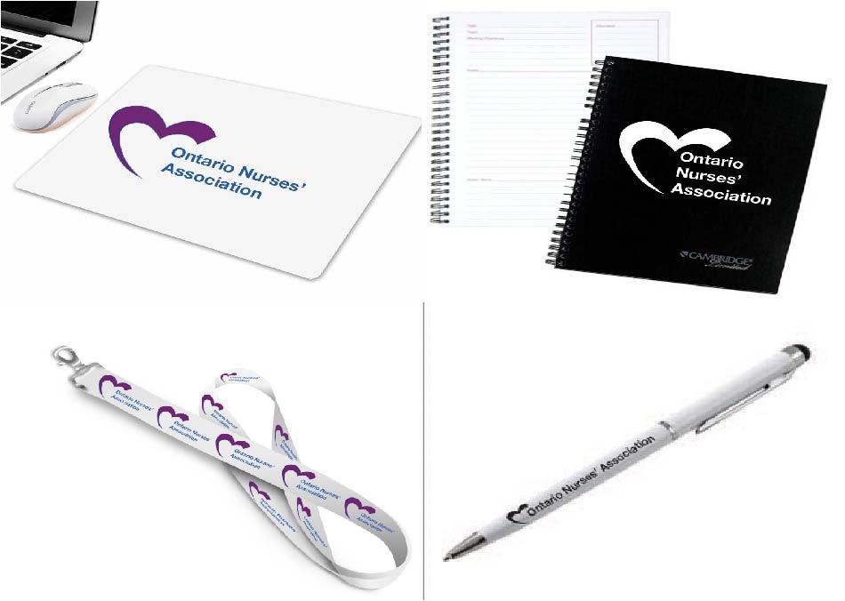
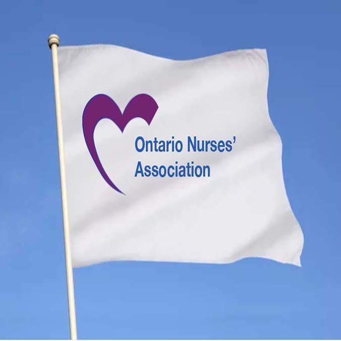
The new Ontario Nurses’ Association logo maintains the importance behind the organizations mission, while visualizing its values but it also represents much more Empowering members into taking collective action for safe, equitable workplaces and high-quality health care for all Ontarian’s.
The Ontario Nurses’ Association mission is to defend the rights of and advocate for nurses and health-care professionals who care for the health of Ontarians.
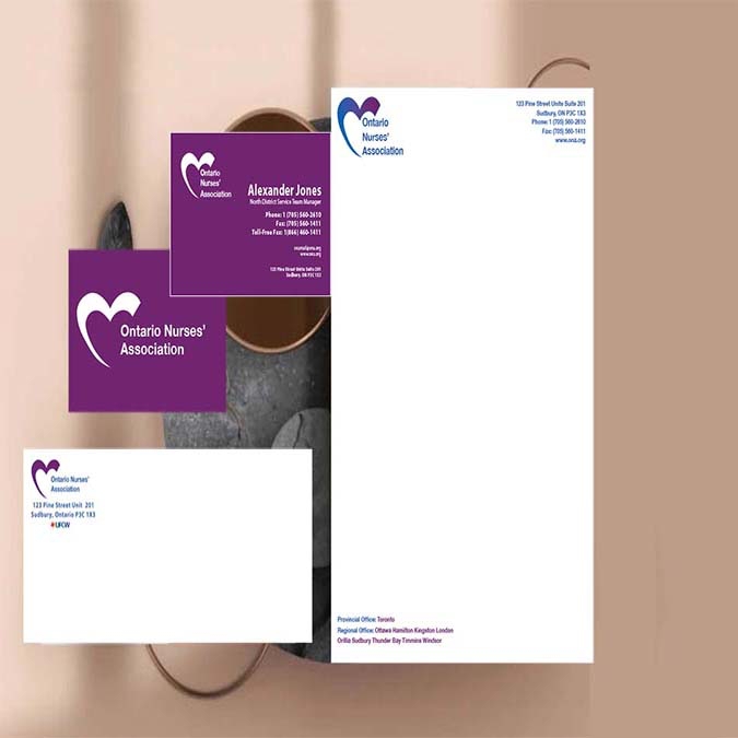

The Ontario Nurses’ Association represents the 68,000 nurses and health-care professionals, as well as 18,000 nursing student affiliates — who provide care in hospitals, long-term care, public health, the community, clinics, and industry. The various applications help the brand’s memorability as well as the uniqueness by utilizing purple, the main brand colour.

Gear is an editorial magazine centred and focusses on the living styles of others of architecture, as well as rising newcomers to the industry of trade, and self-taught at home builders, sustainable designers, and architectural styles.
Home living magazines tend to portray specific styles on different types of households. They advertise current trends on people that don’t represent the majority, which can lead to high income payment issues and lack of confidence in their future renovations for homeowners. Some even share unrealistic lifestyles and homestead habits that encourage the wrong messages.


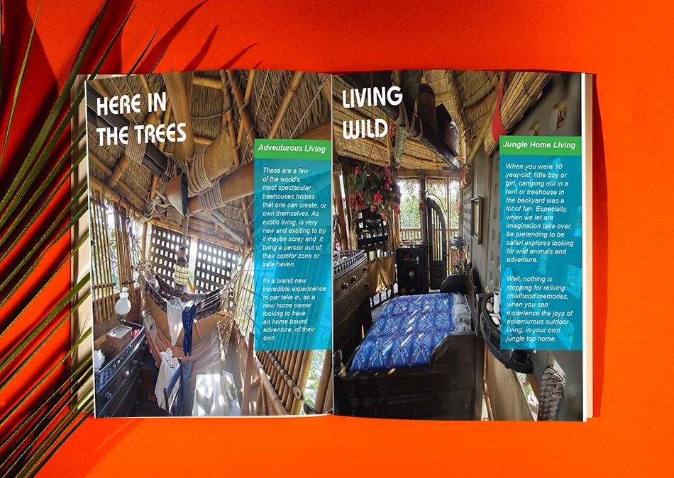
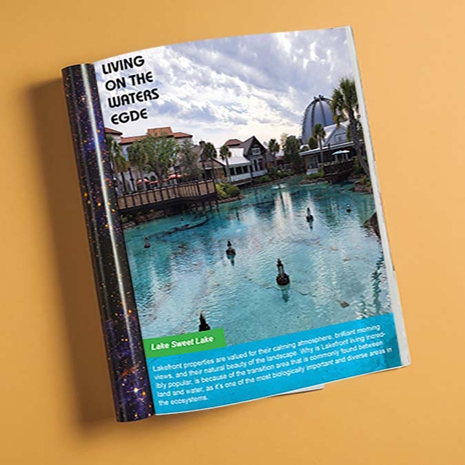
Gear is an inclusive editorial magazine targeted toward young adult homeowners. It features current trends, including styles on a variety of bedroom renovations, as well as articles meant to encourage DIY builders to share their opinions regardless of the middle to higher income. There are also educational articles, like the history behind architectural lakeside buildings.

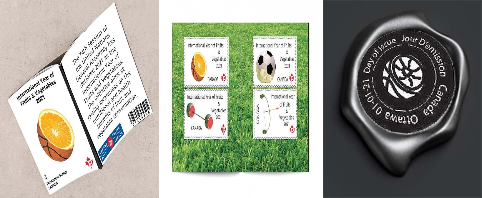
International Year of Fruits and Vegetables stamps were a concept for Canada Post. This campaign would not only have the stamps and limited-edition packaging but would also hold a sponsored event to bring awareness to healthy food eating habits across the world.
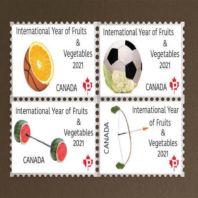
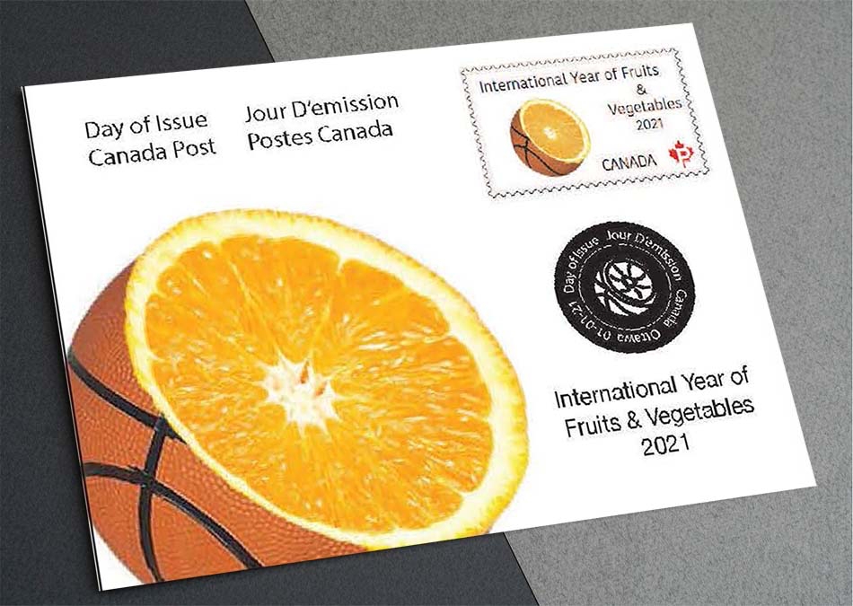
Fruits and vegetables are constantly overlooked when being offered as a snack after a workout, and event sporting events such as basketball, soccer, weightlifting, and archery.
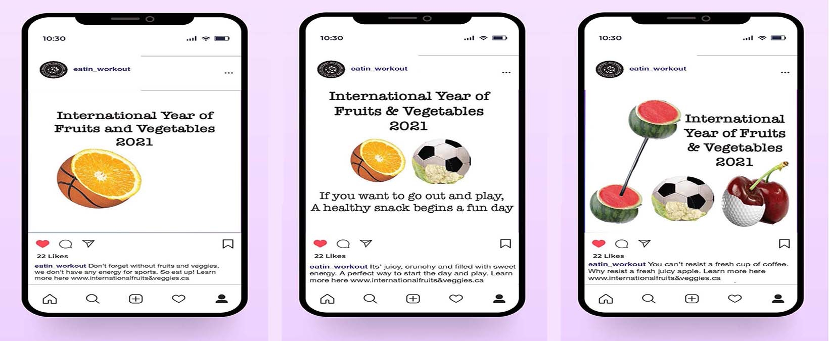
Creating healthy alternatives at home has been more popular than ever due to the pandemic so bringing more attention to healthy and active eating habits each year would be the ultimate goal of this event.