


Growing up in a small town, my passion has always been to help small businesses express themselves and grow through great brand identities.
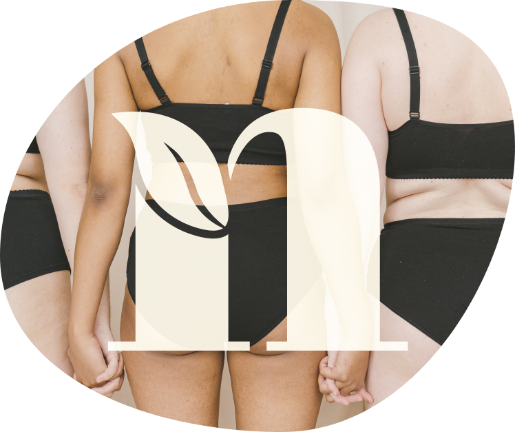
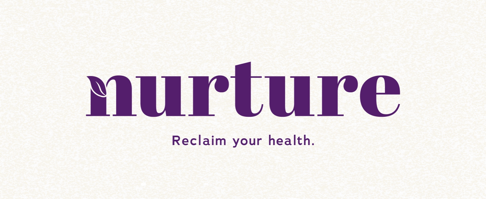
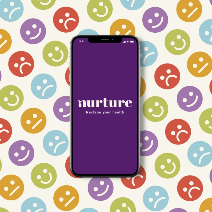
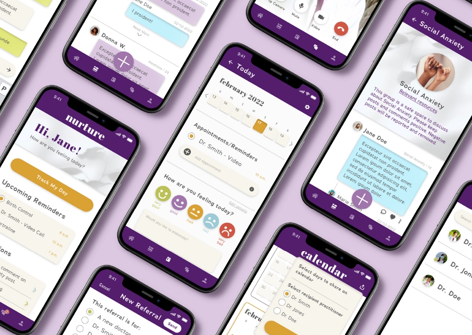
Nurture is a safe space for patients to talk to medical practitioners without receiving bias diagnoses, and lets them share past experiences with a supportive community. Graphic design has a big impact on how people view healthcare. Nurture is built to be friendly and welcoming; inviting you to reclaim your health.
Medical prejudice, or medical bias, is the act of getting altered medical advice based on things like weight, gender identity, age, race, etc., rather than based on legitimate symptoms. Because of this, patients aren’t getting the medical help and advice they require, making them feel vulnerable and inferior around medical professionals. In these cases, they’re either not reaching out for help at all, or are getting bias diagnoses.
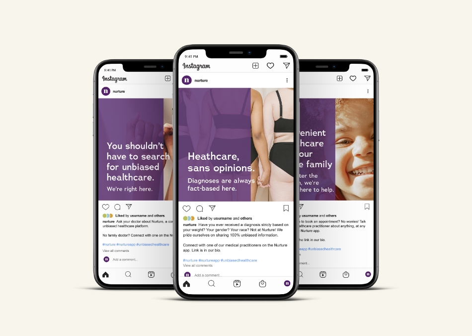
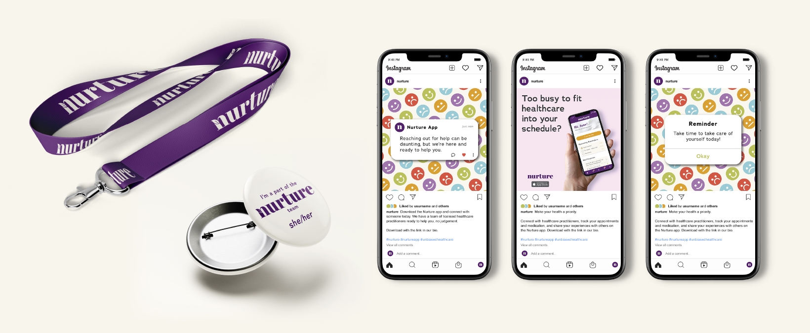
My solution is to create a safe space for patients to talk to medical professionals without receiving biased information, and for them to be able to share past experiences —good and bad— with a supportive community who have gone through similar experiences. Graphic design has a big impact on how patients view the platform; the colours and typography are sophisticated yet friendly, and the imagery is calming and inclusive, making everything very approachable to the target audience.

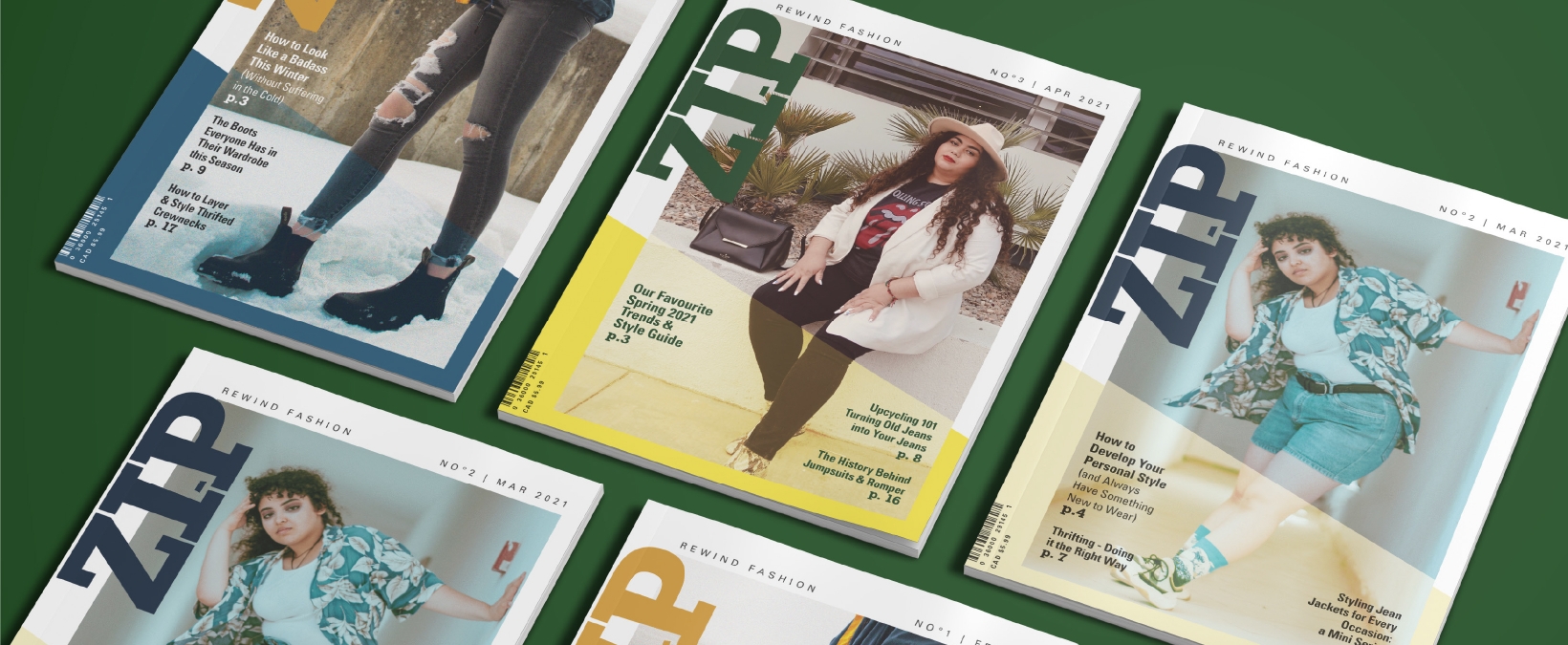
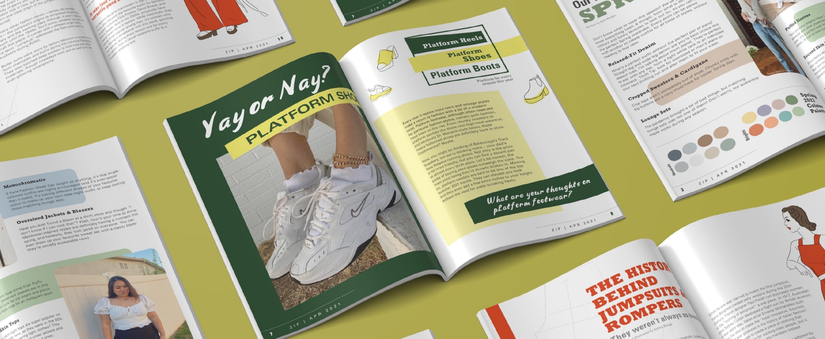
ZIP is an editorial magazine centred around vintage fashion, and features models of all gender identities, races, and body types. It includes educational content, as well as current trends, yet pushes the reader to form their own opinions.
Fashion magazines tend to portray specific styles on specific body types. They advertise current trends on people that don’t represent the majority, which can lead to body image issues and lack of confidence in their younger audience. Some even share unrealistic lifestyles and habits in order to encourage the wrong messages.
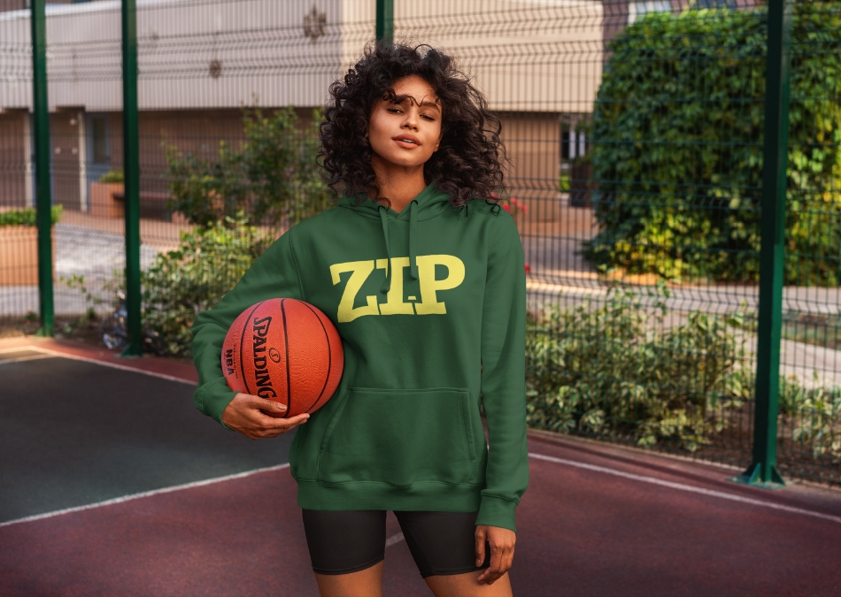
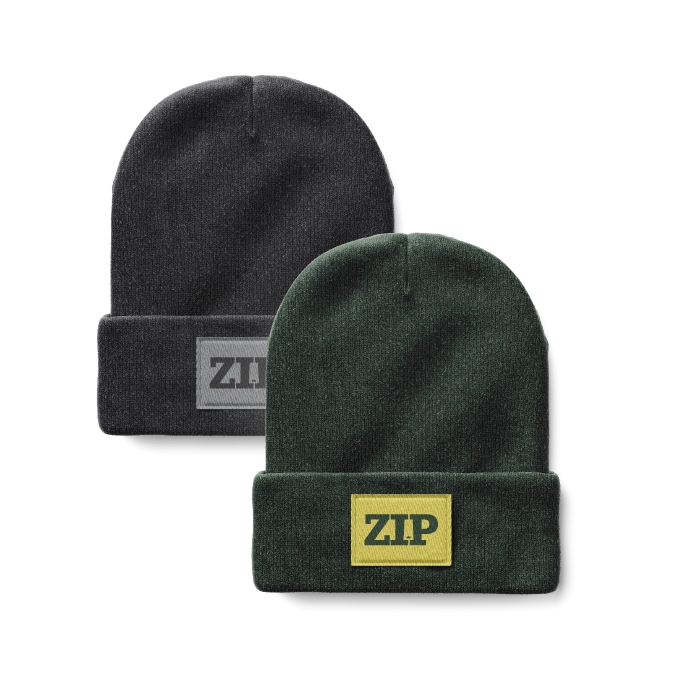
ZIP is an inclusive editorial magazine targeted toward teens and young adults. It features current trends, including styles on a variety of body types, as well as articles meant to encourage teens to form and share their opinions. There are also educational articles, like the history behind certain fashion trends.
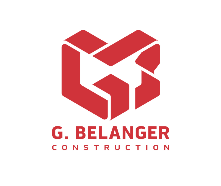
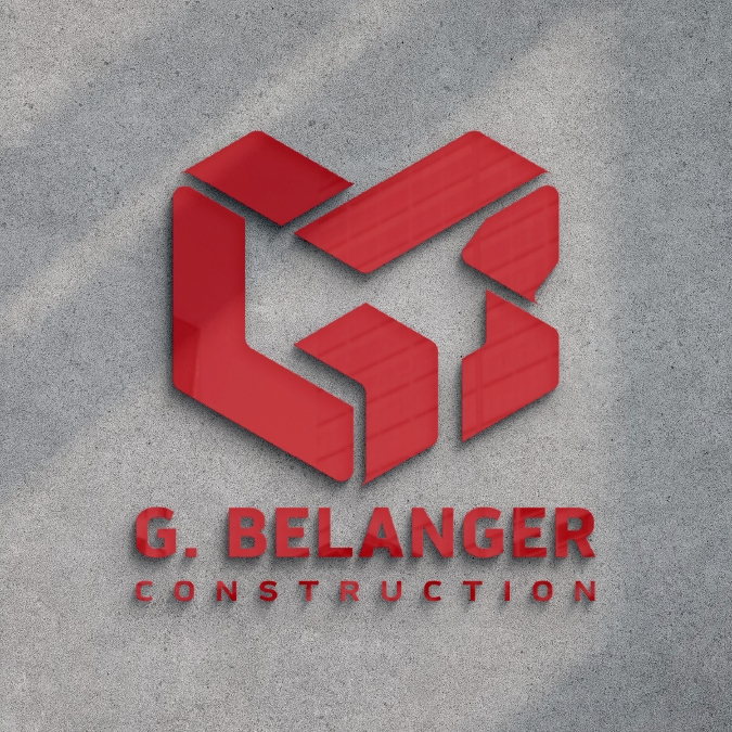
The updated brand identity for G. Belanger Construction represents the life-cycle of every project the company has completed. This new identity is fresh, memorable, and ready to tackle any project.
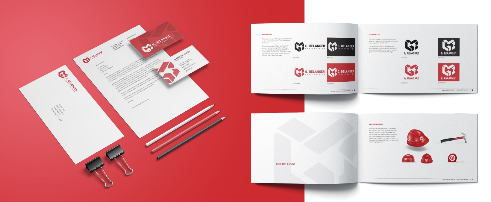
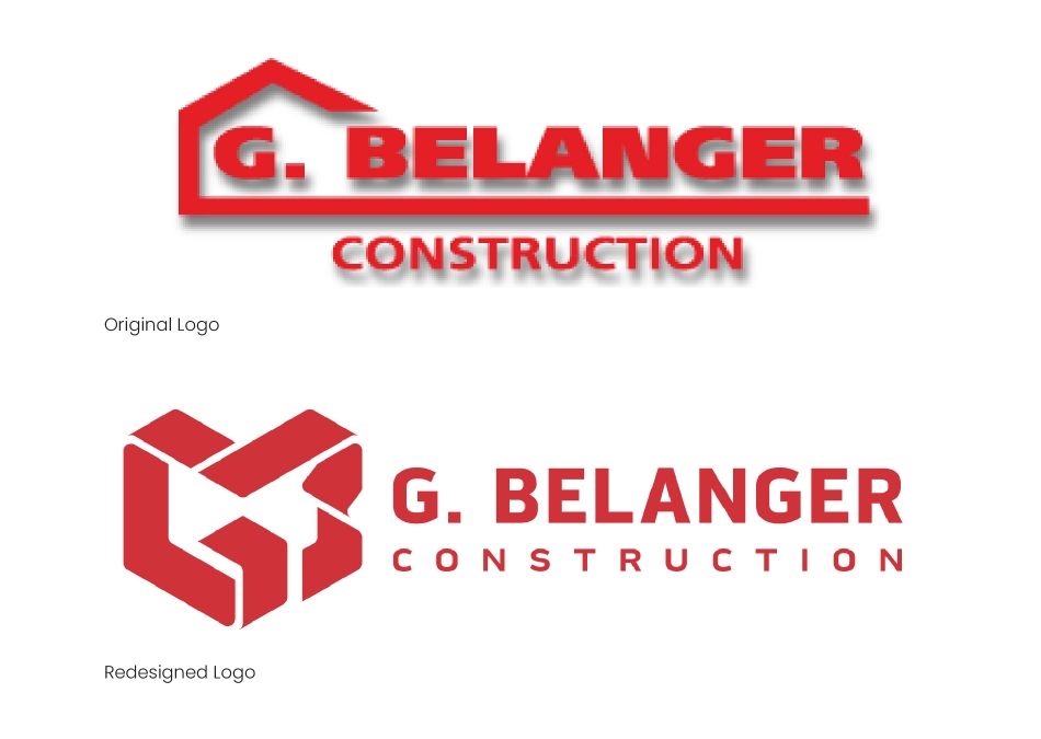
G. Bélanger Construction is a construction company based in New Liskeard, Ontario. The company’s current visual identity is limited in it adaptability and memorability, as it’s exactly what you’d expect from a construction company.
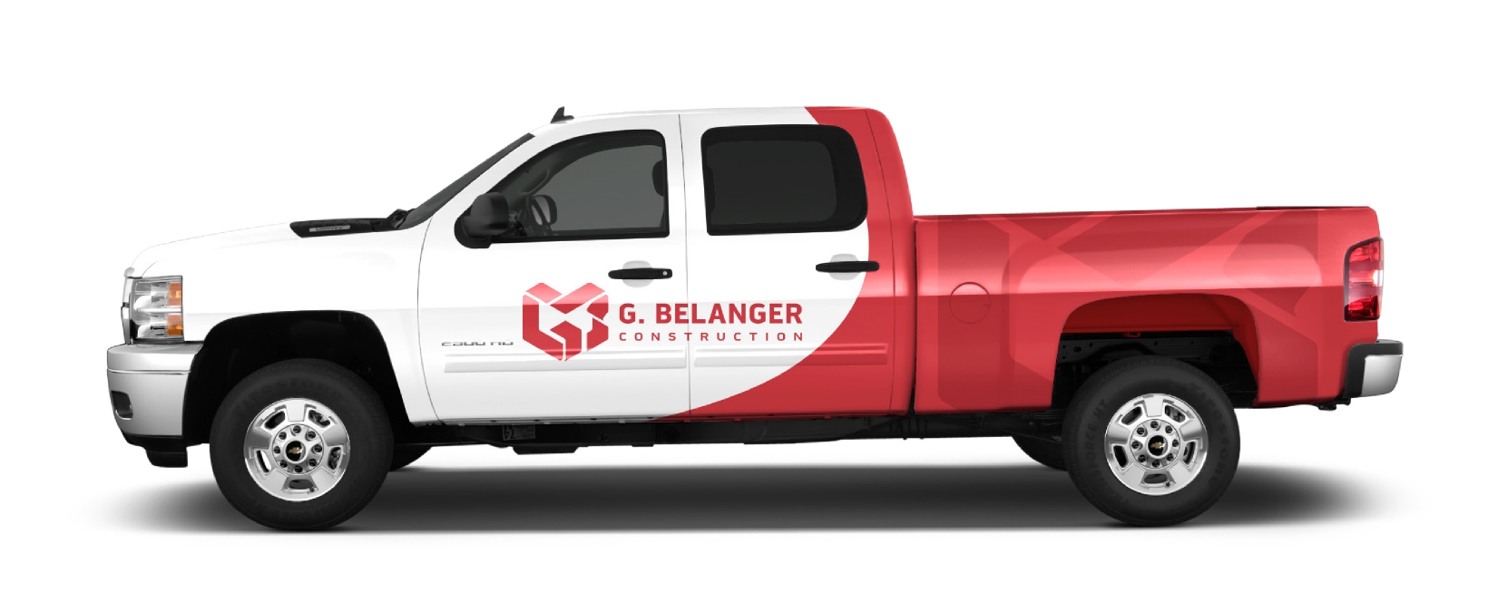
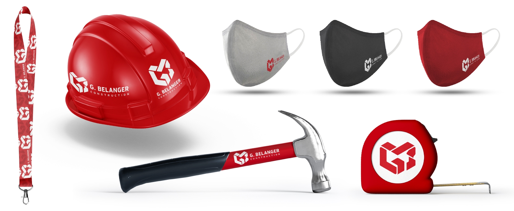
This new G. Bélanger Construction logo maintains the history behind the 30 year-old company, while visualizing its values. It represents its late founder Gaston Bélanger with the “G.B.” initials, but it also represents much more. The ribbon-like (or measuring tape-like) effect contouring each letter illustrates the life-cycle of every project the company completes with pride. The various applications help the brand’s memorability by utilizing red, the main brand colour.