Coming from the south of India, I have always been passionate about clean and bold design. And now, I am on a journey to create impactful and creative solutions for the greater good. Also, UI/UX is my high.

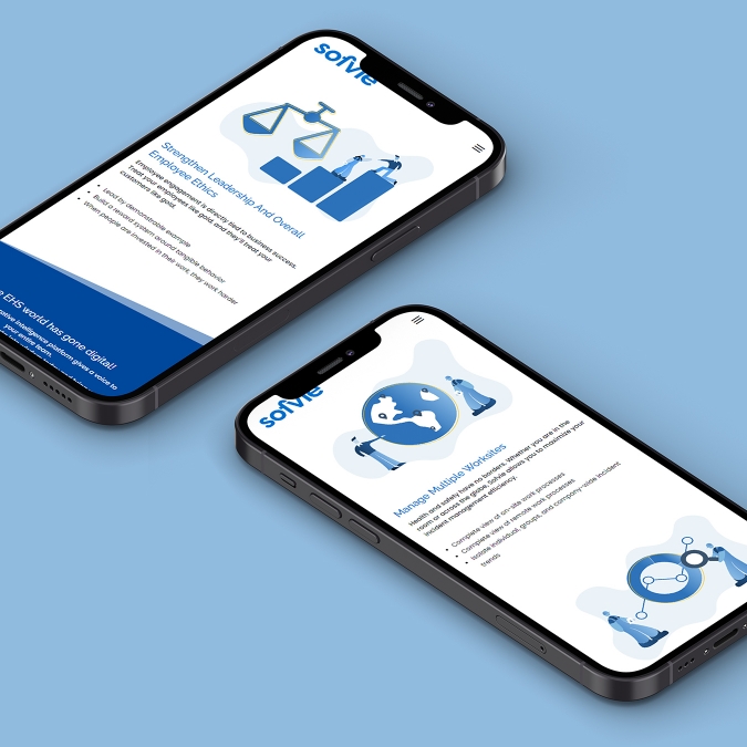
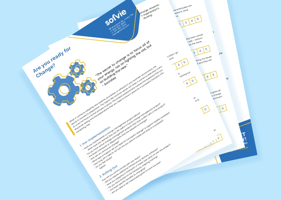
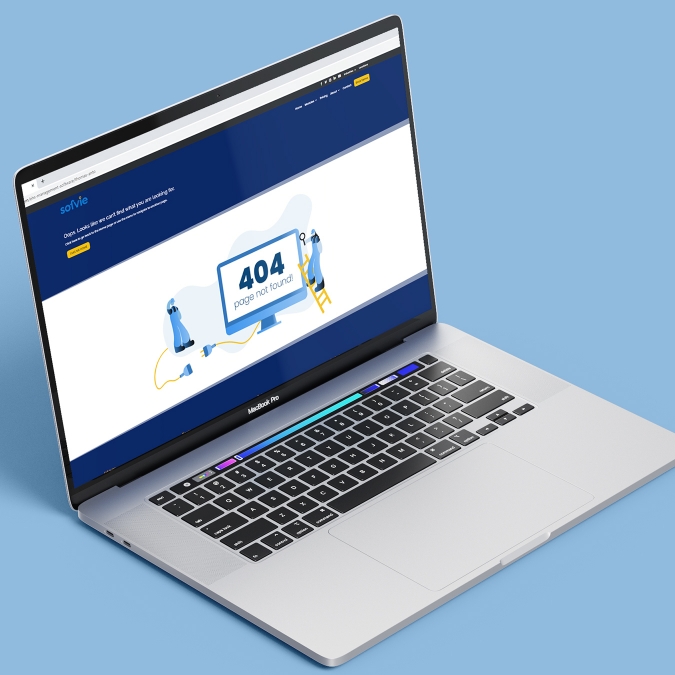
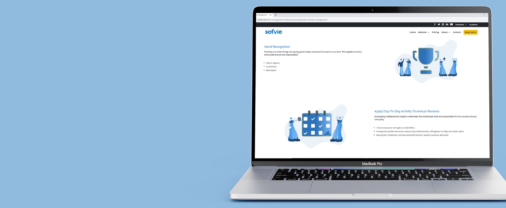
As part of the Sofvie Inc.'s website revamp, part of my job apart from assisting to create sections of the website was to create illustrated assets, and redesign the lead magnets.
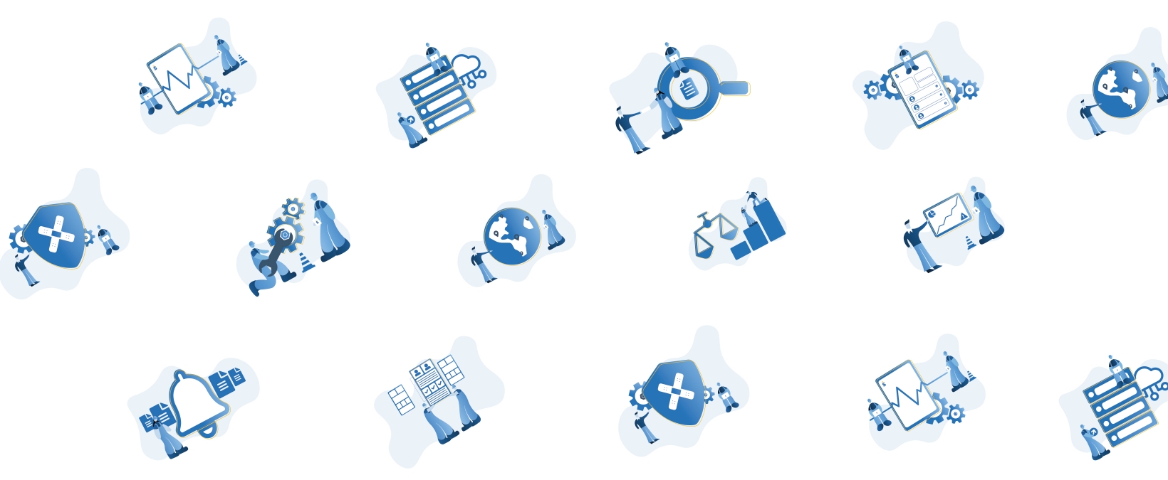
To give the website a more simple, positive look and convey the titles it represented, I used the Alegria art style to create the characters and other properties.
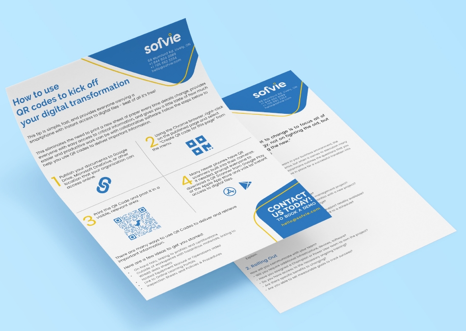
Following the branding identity, I developed the lead magnets with a spaced and polished layout of content.
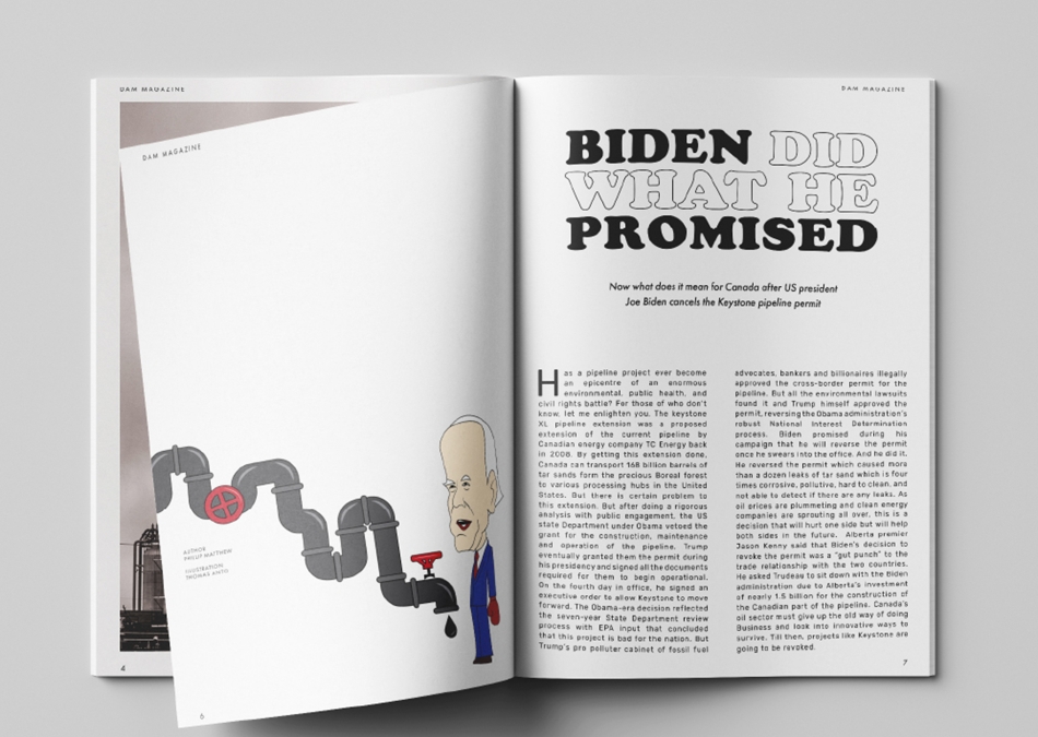
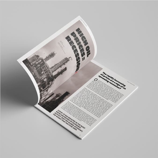
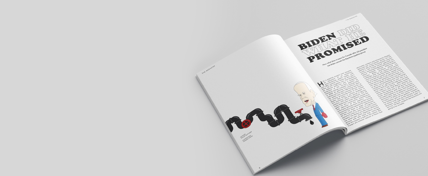
DAM - A socio-political magazine that focuses on climate change and energy. A dominant cover photograph, a simple and clean layout of content to complement the photographs inside, makes this magazine design - a compelling one.
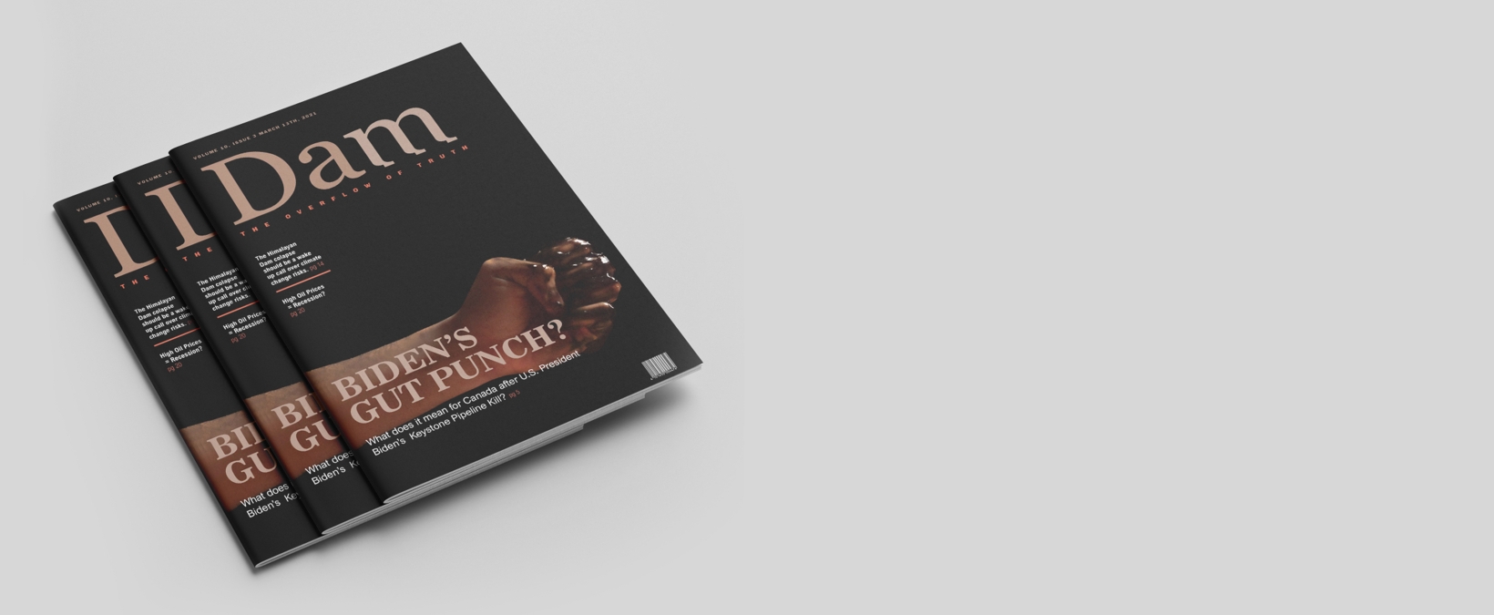
The cover page features a photograph of a fist covered in crude oil - a nod to the Cover title. The magazine caters to an audience who are between the age of 25-45, who are passionate about clean energy and the environment.
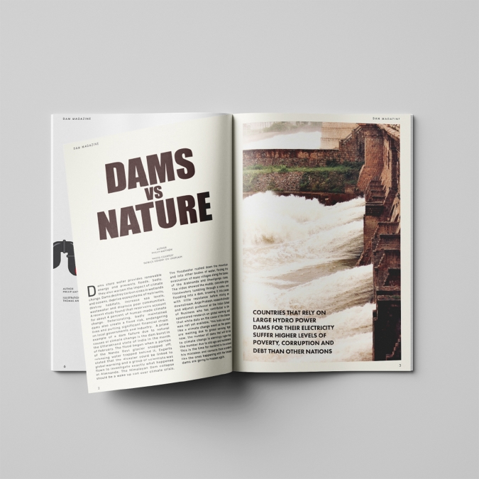
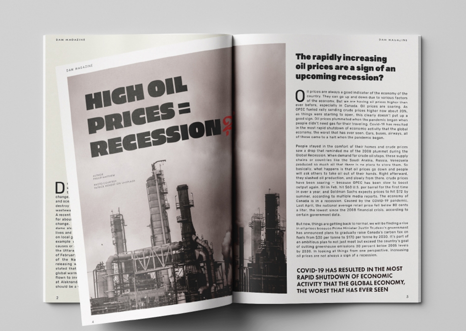
Simple and clean layouts on three articles with emphasis on bold, display fonts on the titles to complement the photographs and illustration inside.

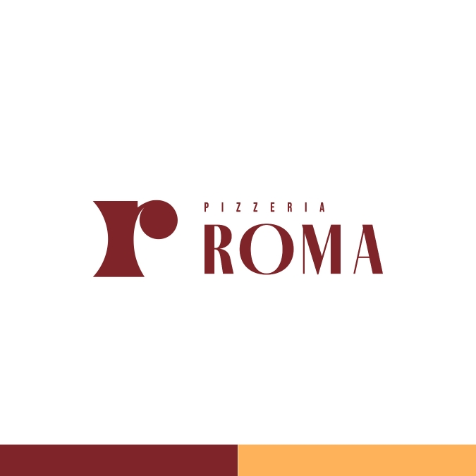
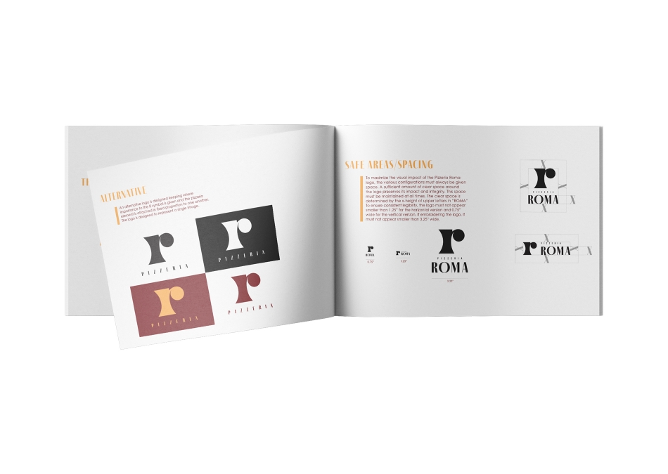
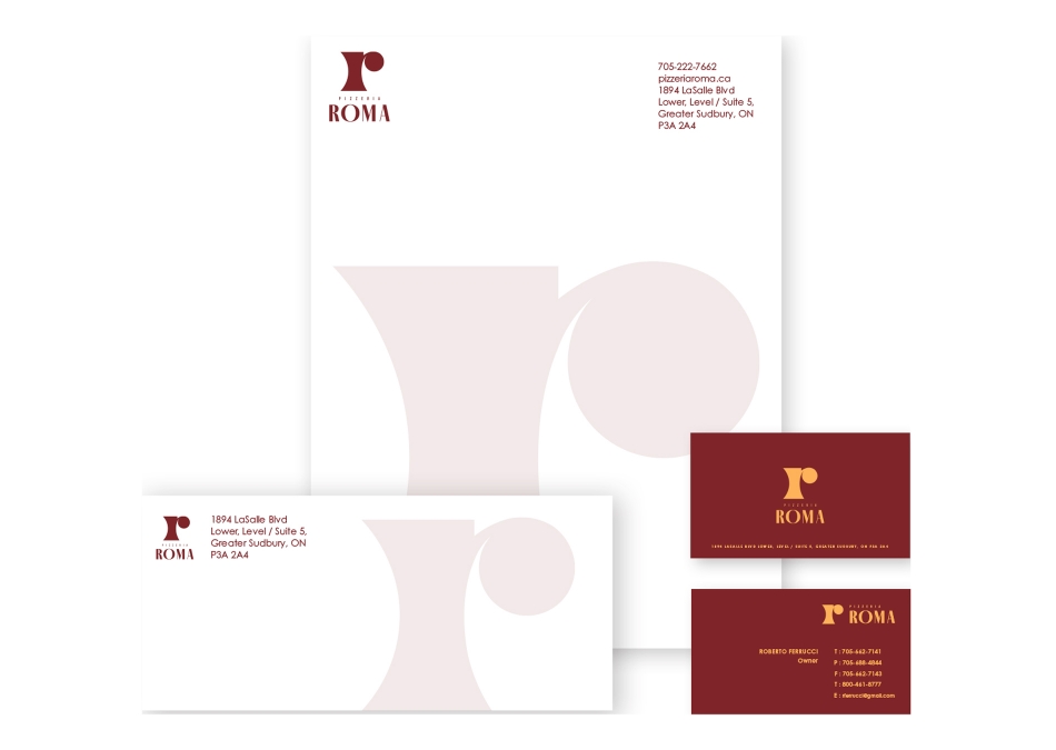
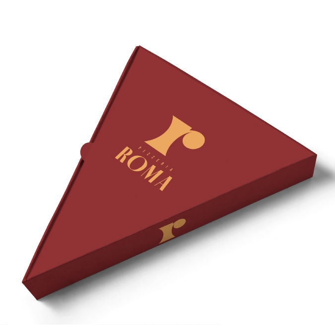
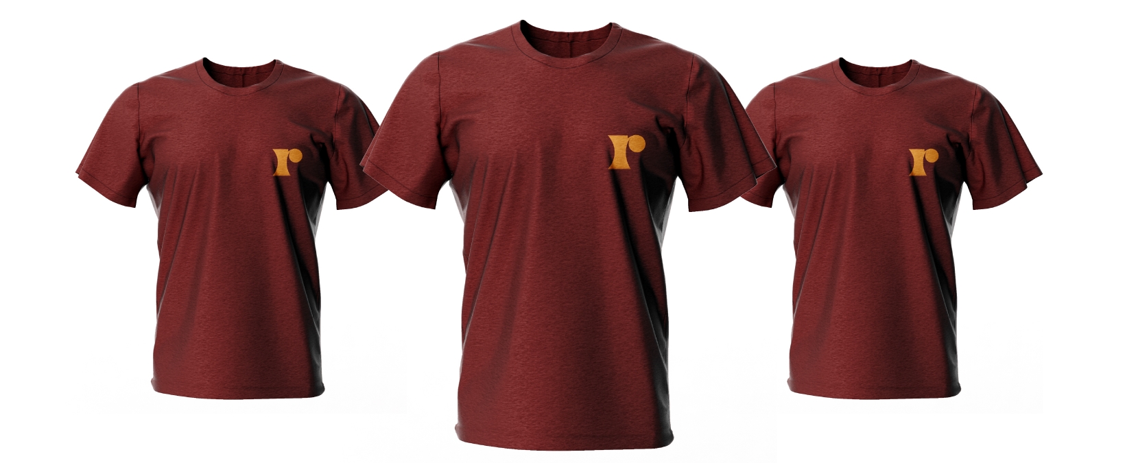
The Pizzeria Roma is a rebranding project based on a local pizzeria. The Rebranding focuses on a more meaningful logo and appropriate target audience.
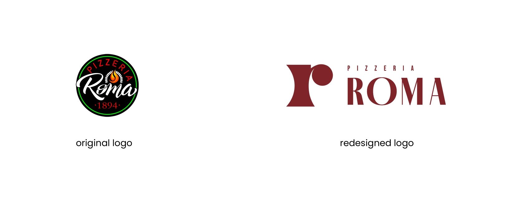
The R Logo is a combination of a pizza cutter, a wood oven, and a corner of a pizza. The type element uses a high contrast font inspired by the Italian type families.