Hi, I'm Scott. I'm a multi-disiplinary graphic designer, photographer, doodler and WWII fighter plane enthusiast.
Coffeetime is a small Canadian franchise that doesn't have an identifiable identity. Their current brand has a hard time separating itself from other big coffee chains like Second Cup or Tim Horton's


Left: Coffeetime logo at the time of starting rebrand.
Right: Coffeetime proposed rebrand

Coffeetime could set itself apart in a saturated coffee market by aligning itself with blue collar coffee drinkers. Coffeetime could take an unassuming approach and add value by reducing its menu instead of trying to keep up with its competition.

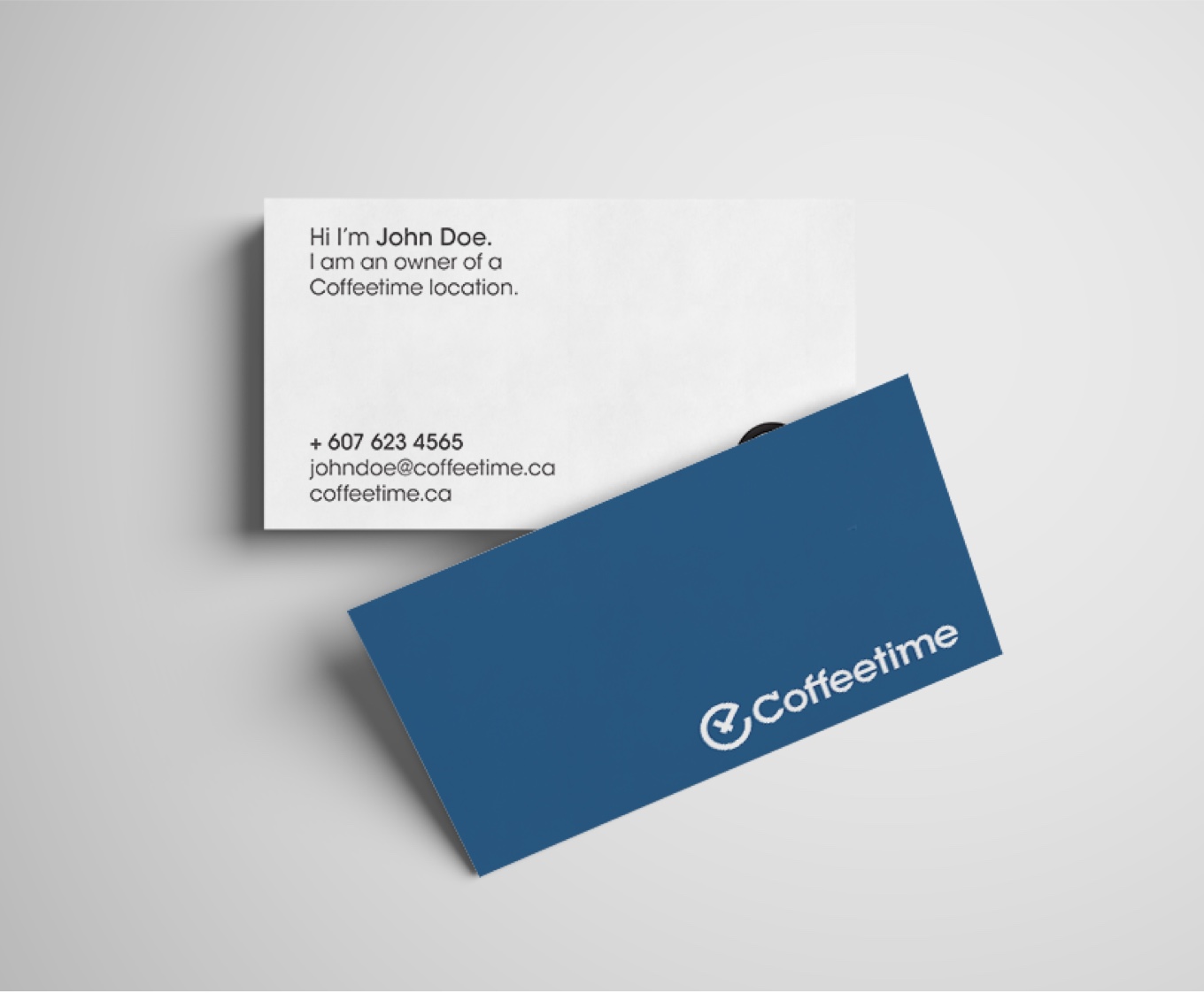
Enamle mug and business cards.

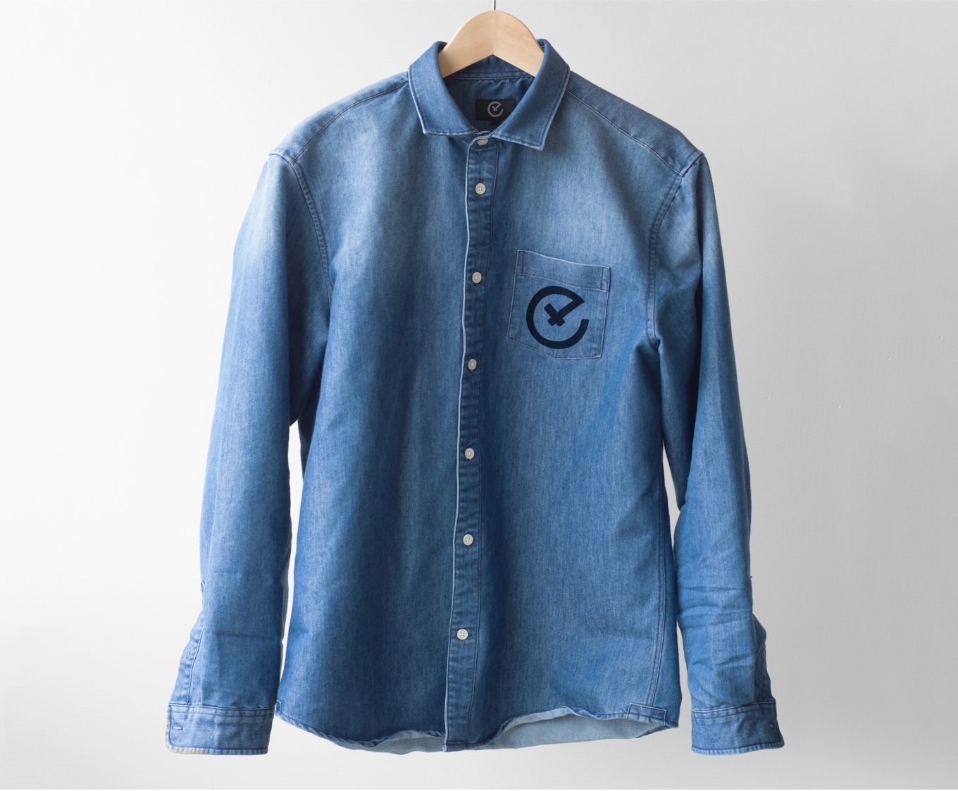
Denim Shirt uniform, and take away cup.
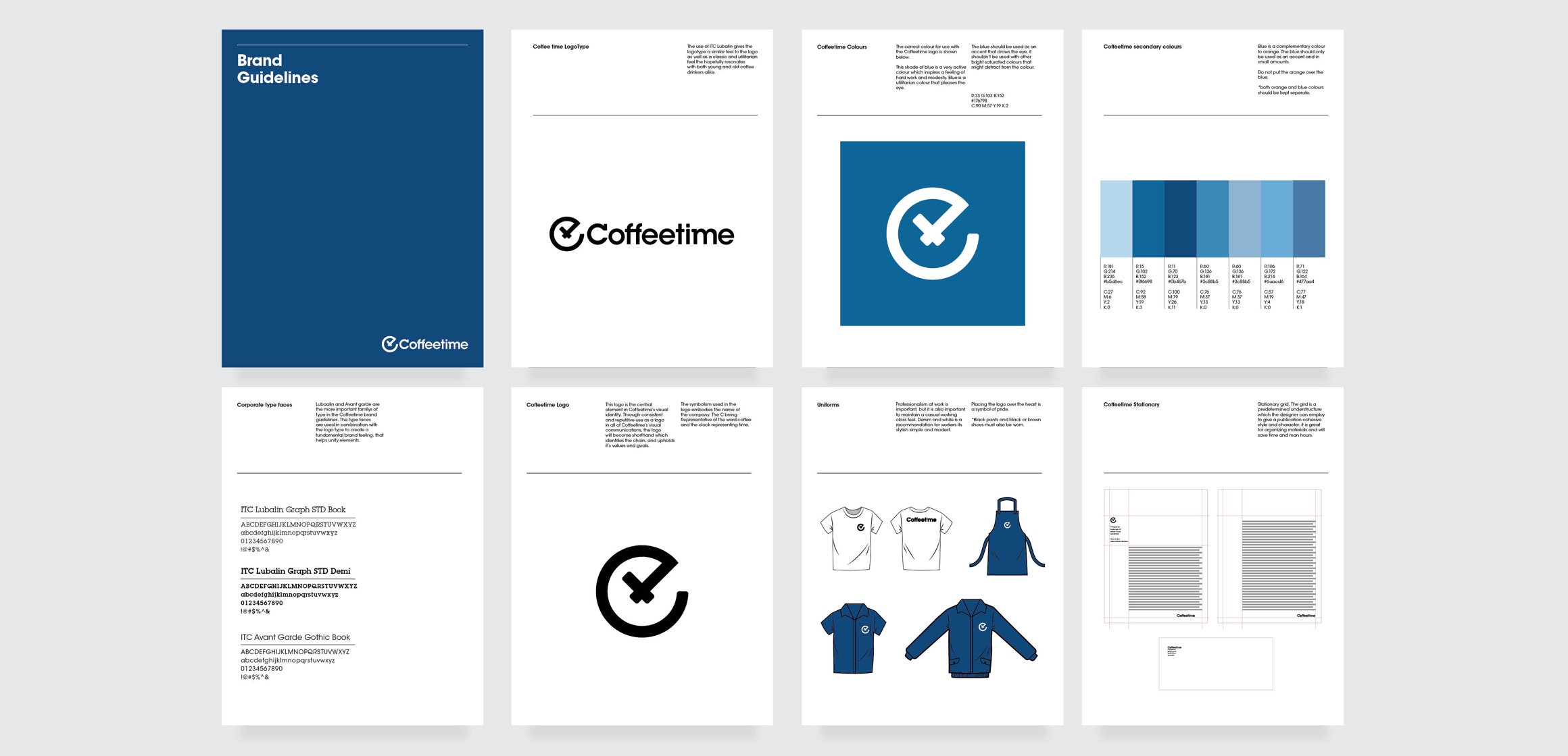
Brand Guidelines sample.
F**k Perfection is a screen printing collective about creating things for the sake of it. There is an oversaturation of work on the internet and it's hard to feel confident in ourselves, F**k Perfection tries to push against that.
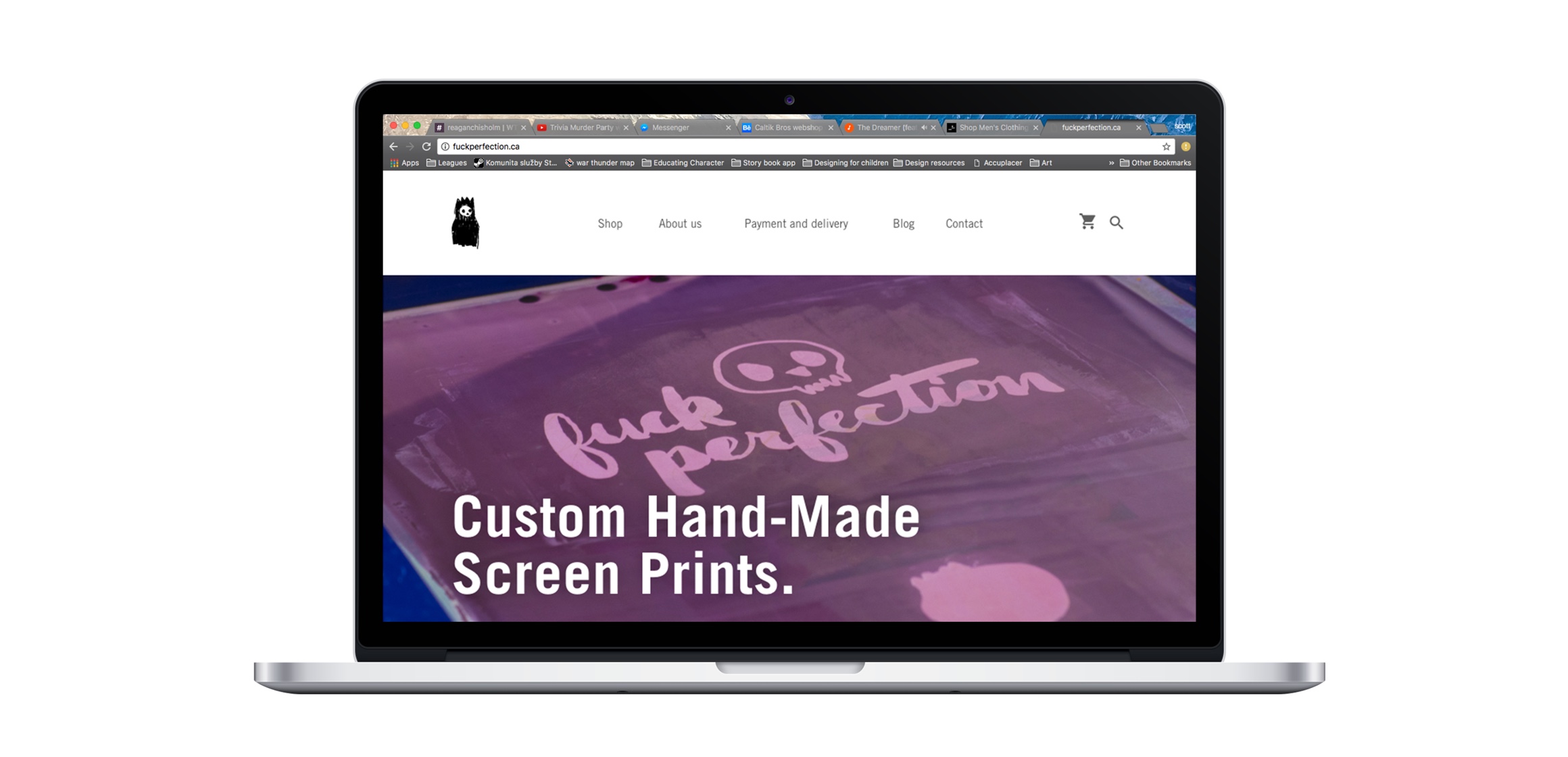
Website landing page.
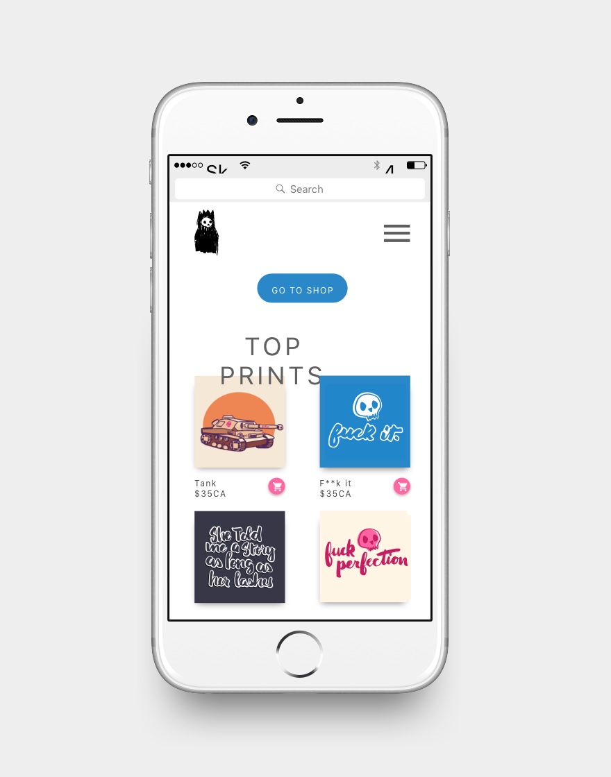
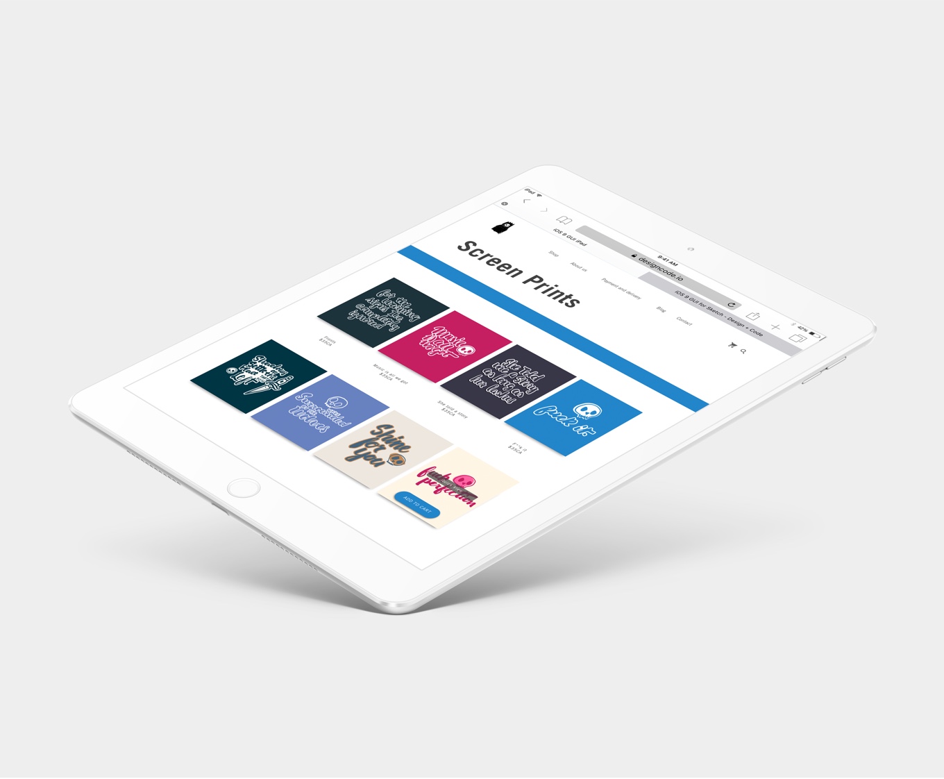
Mobile and iPad views.
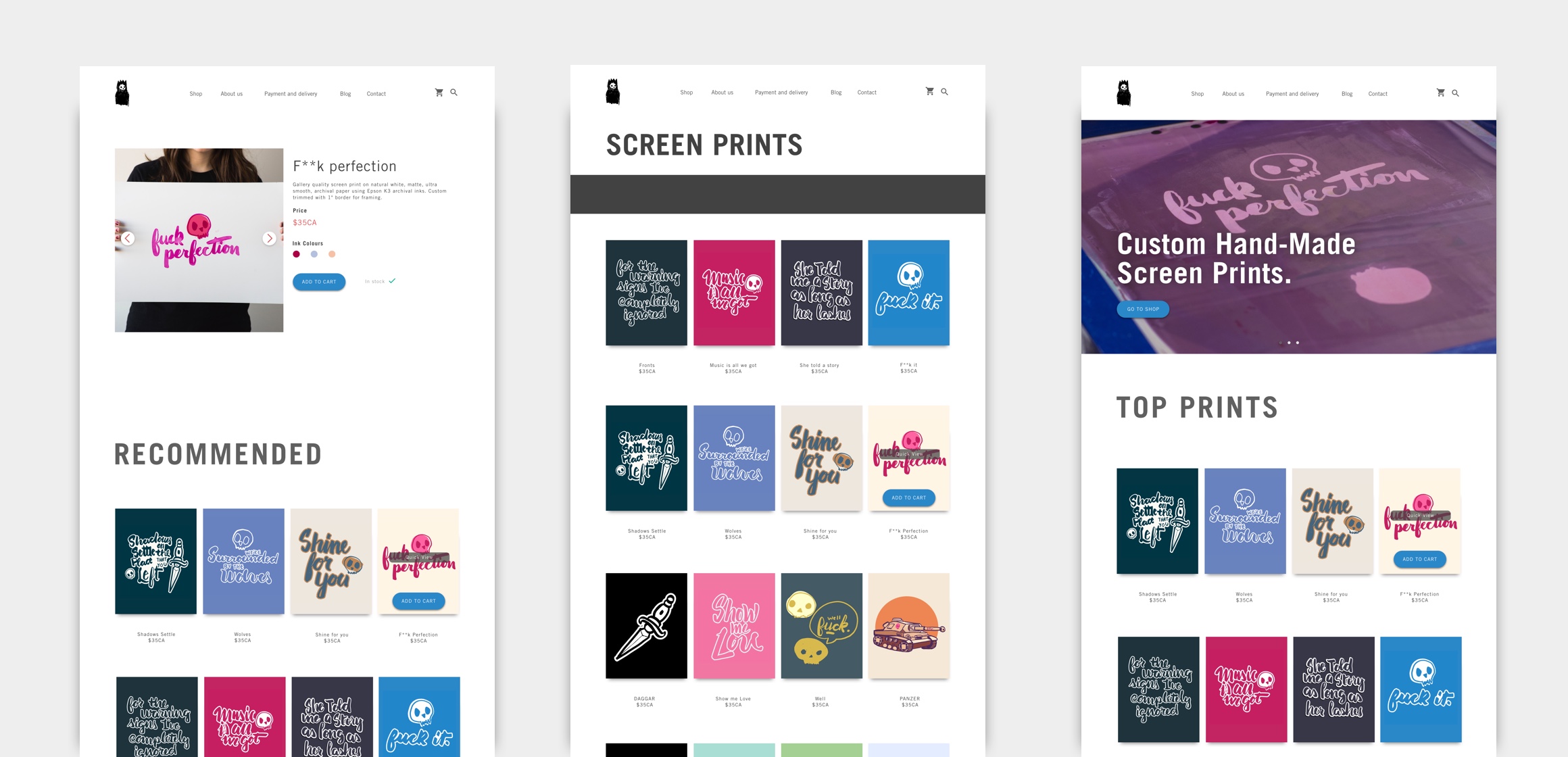
Left: Item info page. Center: Screen print shop page. Right: Homepage.
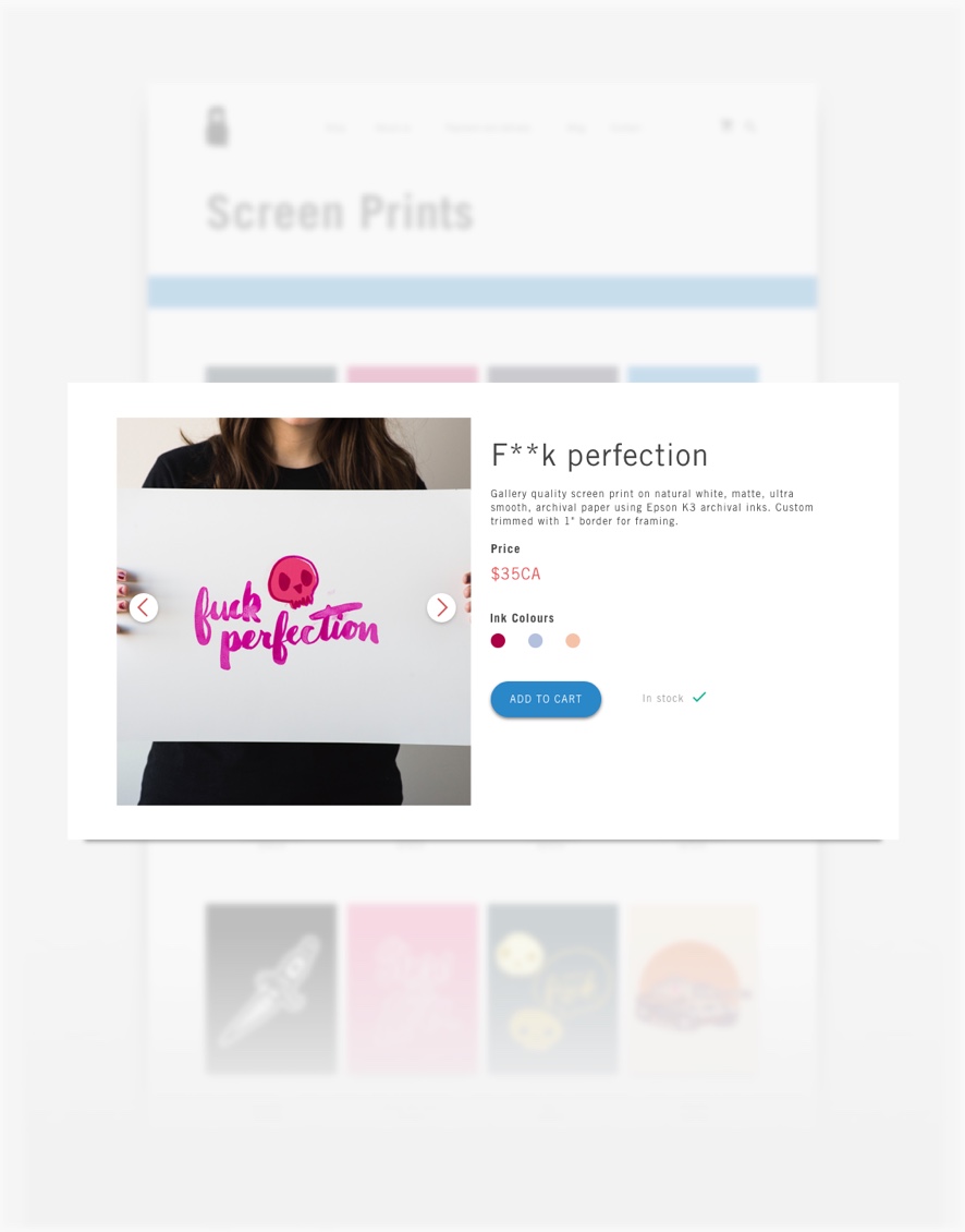
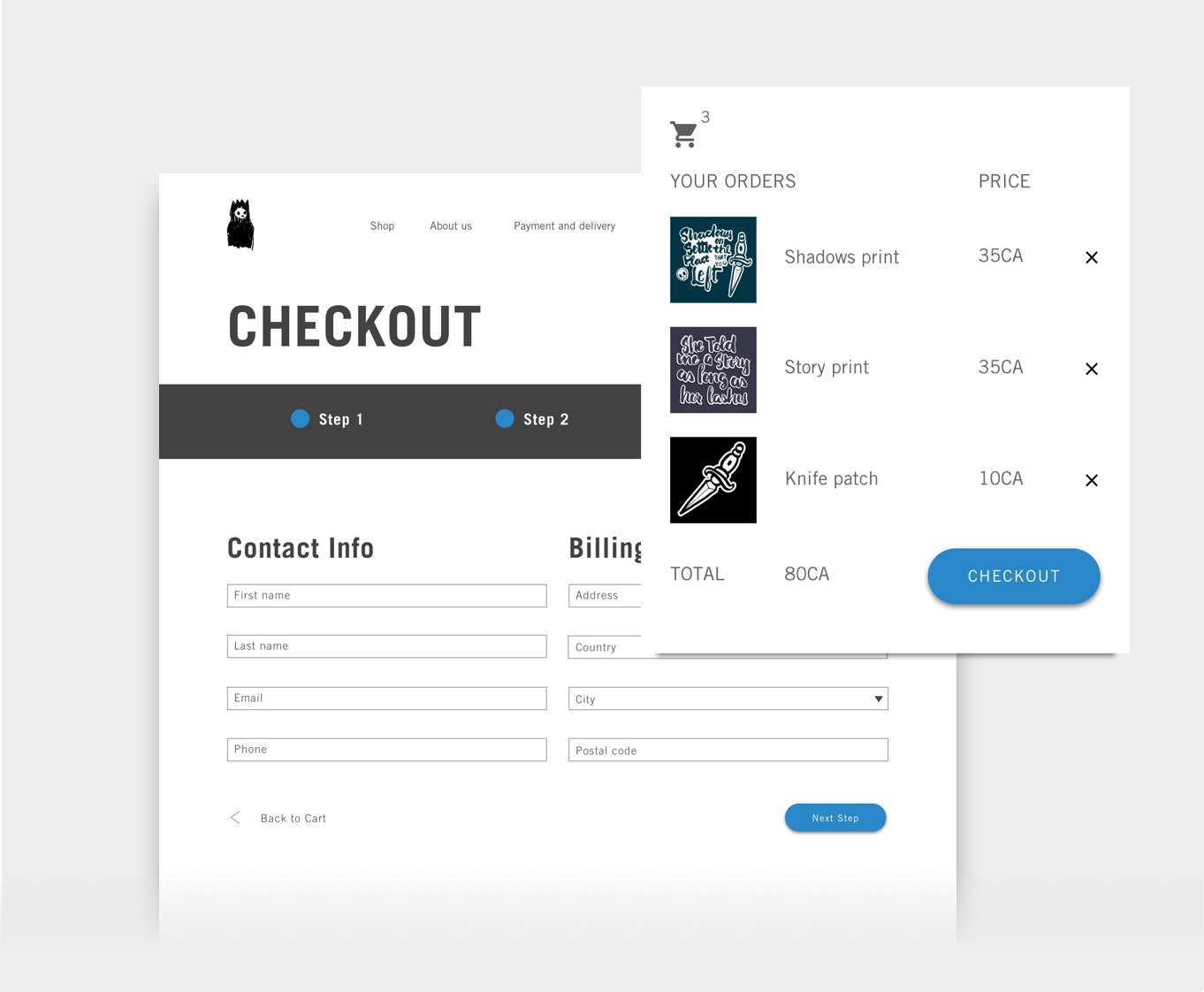
Left: Shop Quick View. Right: Check out and Cart Pages.
Whispers in the Mist was a personal journey. It documents a solo trip across the Canadian east coast. The trip was isolating and beautiful and the pages echo a lonely and peaceful journey.
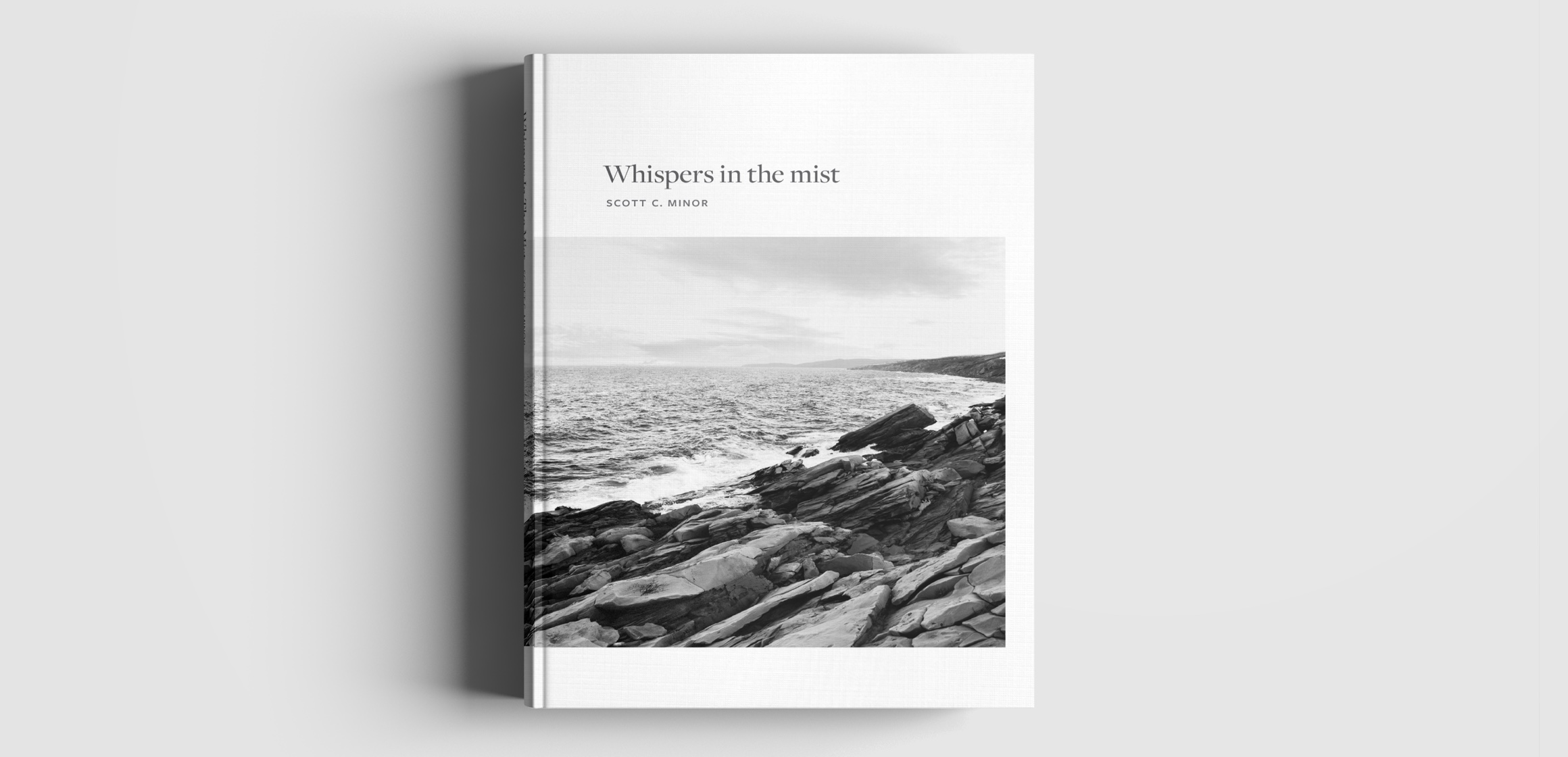
Photo: Western coast of Cape Breton.
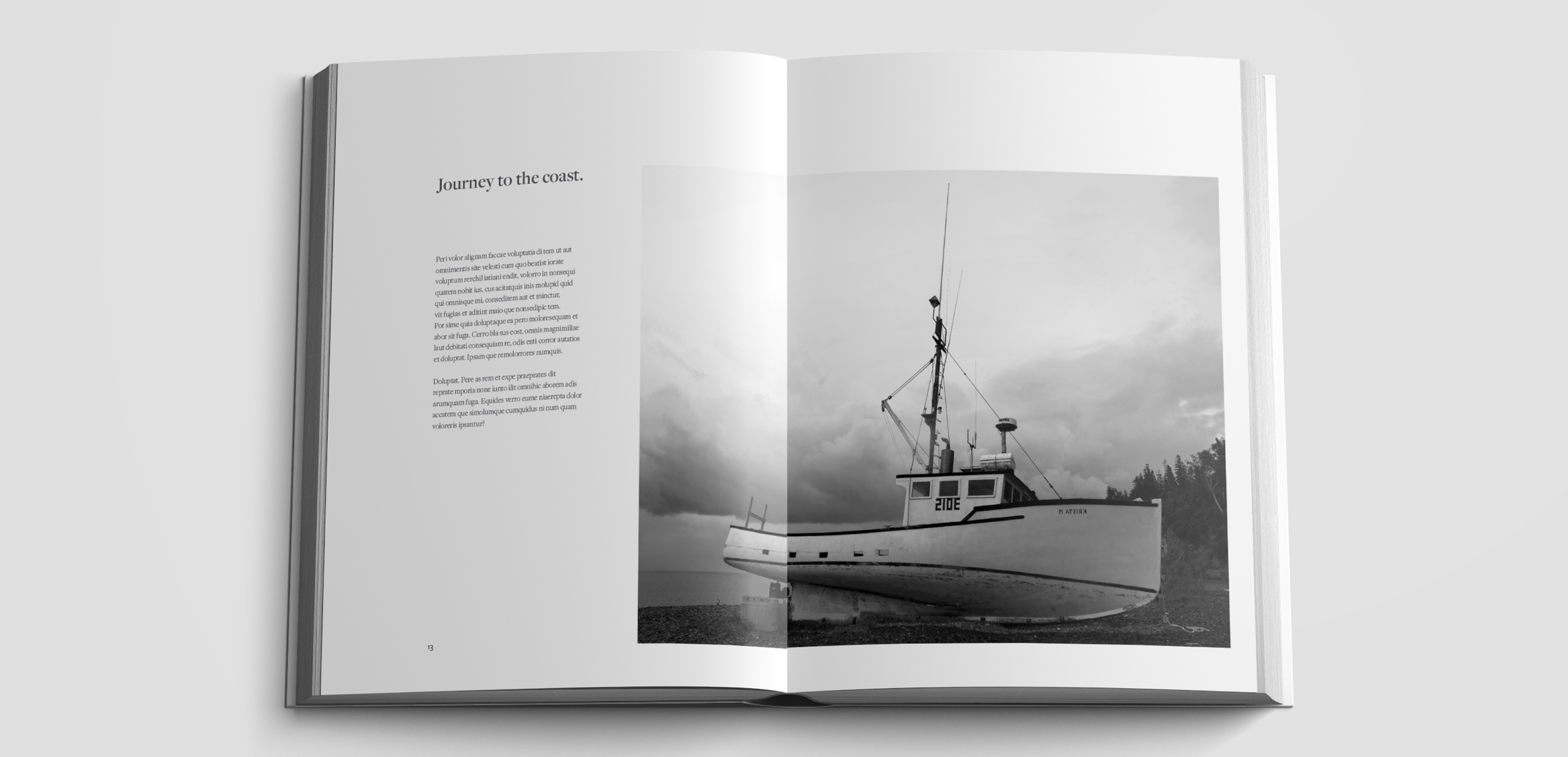
Photo: Harbourville.

Photo: Cape Breton Trail.
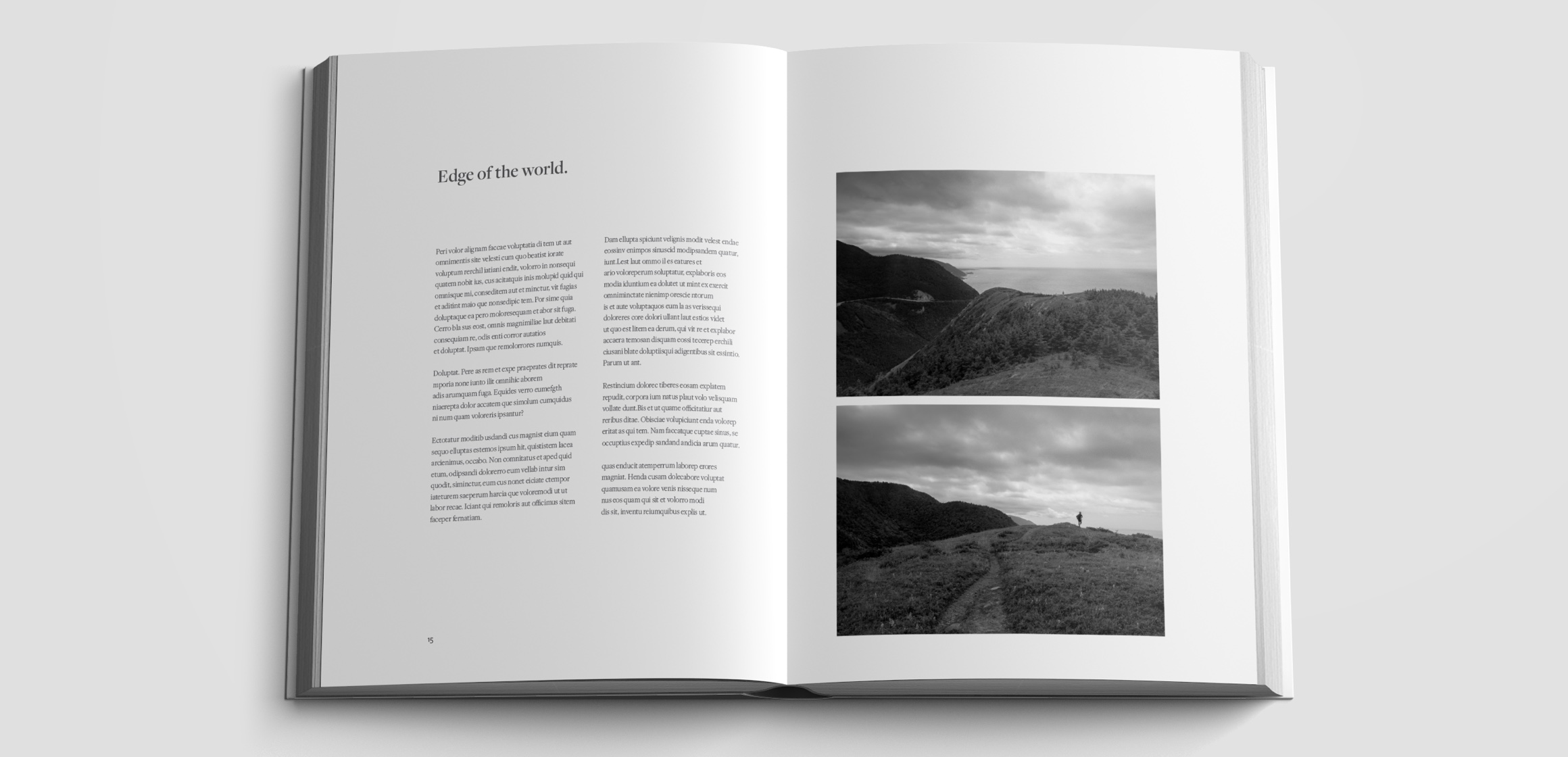
Photo: Cape Breton Skyline trail.
Select a participant to view their work or learn a little more about them.