Ti Amo
By Kristal-Lynn Lafleur
![]()
![]()
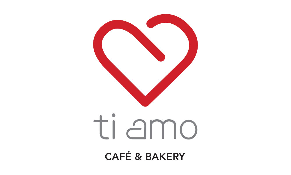
The re-designed logo for Ti Amo is an abstract lower case “a” that has been formed into the shape of a heart. Discreetly, this uses typography to create symbolism for the brand. The logo is a clean, simple and curved shape that illustrates the brands new image. Using the symbol demonstrates a more romantic mood and relates to the environment envisioned by the end user, making it effective and aesthetically appealing.