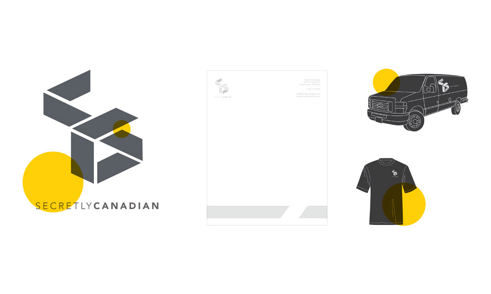
The original draft of logo had some consistency issues between segments of the logo. Typography placement created an unbalanced overall logo. Applications were unrealistic (i.e. blacked out windows and headlights on van.)

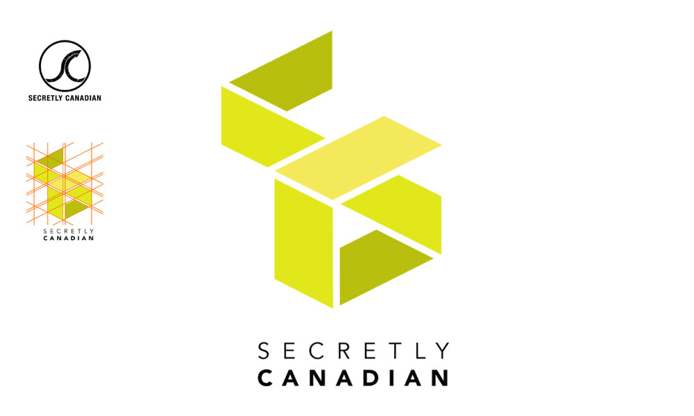
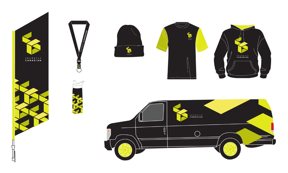
Complete re-brand of the record label Secretly Canadian. Original logo is shown below. Secretly Canadian is a record label that signs bands such as “Suuns” and “the War on Drugs”. The new logo is sleek and modern while keeping an energetic feeling with the lime green colour. Logo represents the S & C of the label as well as being an abstracted music note.


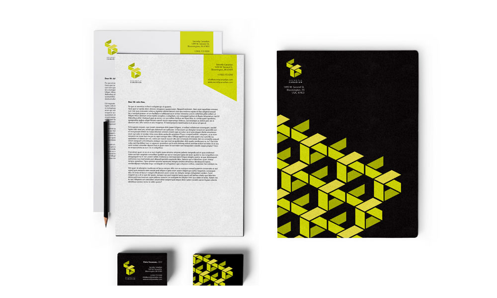
Letterhead, business card and folder design utilizing a pattern created from the logo.


