Pop Icons
by Natasha Smal
![]()
![]()
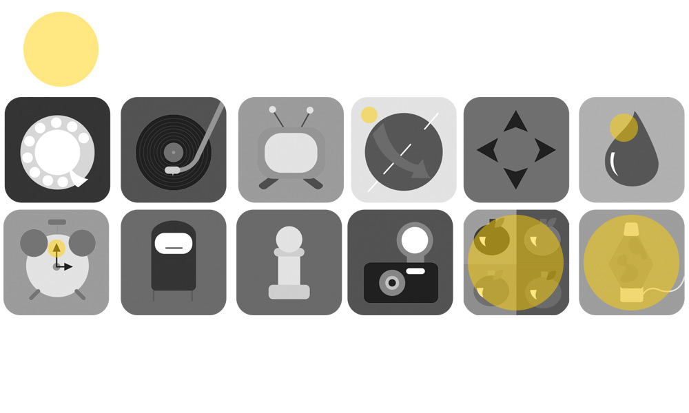
The first draft of this 1960s themed icon design project had numerous issues. One flaw was inconsistency in shape (sharp edges versus round) which led to a break in unity. Another was using too many different colours in the background of the icons; this too was a break in unity. Some of the concepts of the icons were weak, confusing or cliche. There wasn’t any continuity to the design nor were the icons applied or associated to any real life technical application.
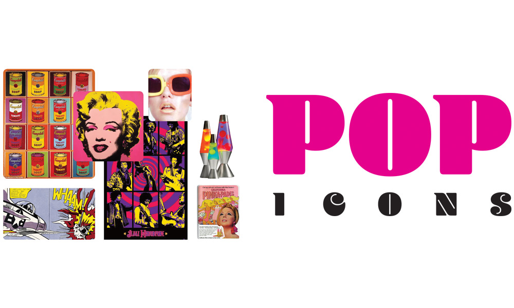
A 1960s mood board was created along with a logo type to ensure consistency in feel and design.
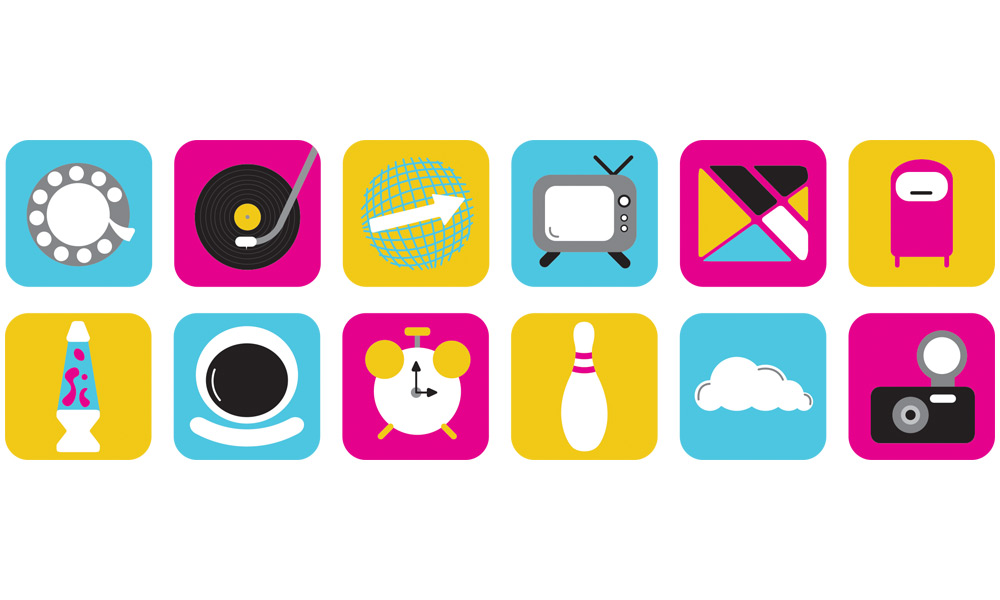
The icons were redone to correct the unity problems. Consistency, colour scheme and thematic issues have all been fixed.
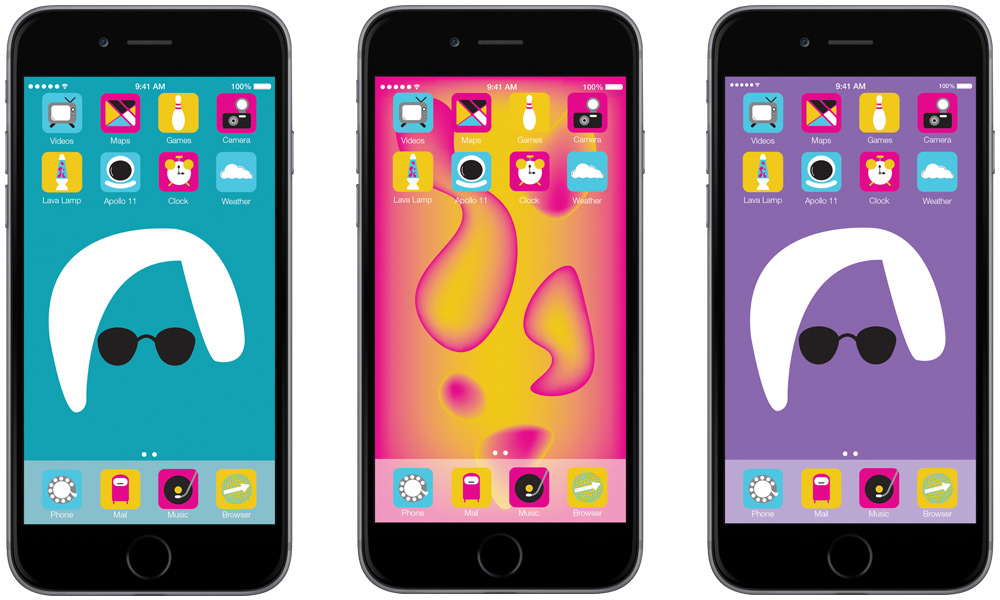
The icons are presented on the iPhone 6 with an two Andy Warhol and lava lamp dynamic backgrounds, building on the 1960s theme. This begins to associate the icon designs to a popular tech tool.
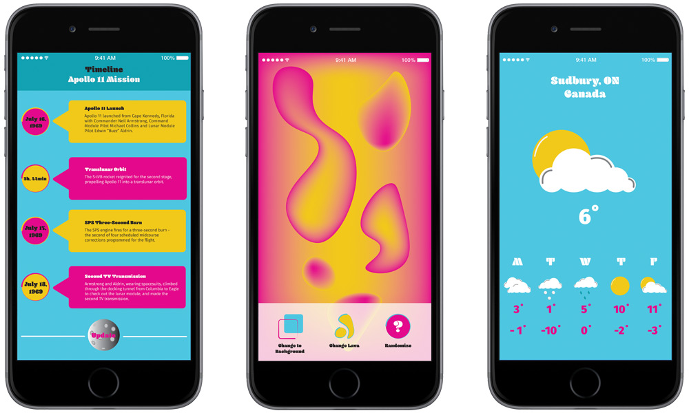
The icon designs have been associated to standard applications that you would find on the Phone system, giving the phone and the applications that 1960s feel.