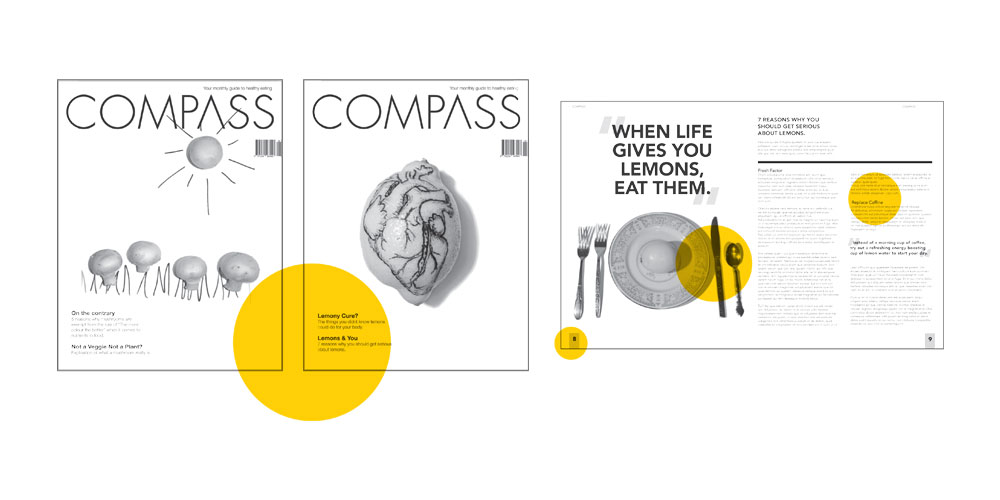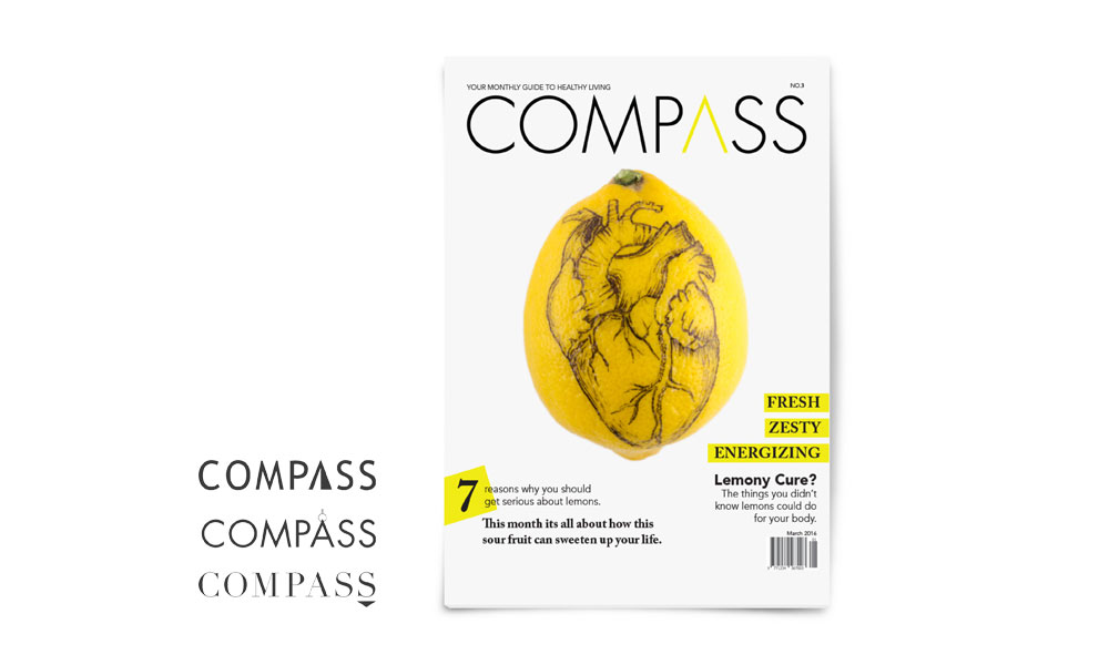
The design above was at first very plain for the target audience I was trying to reach. Awkward placement of the barcode along with very little experimentation in typography leaves the cover feeling unfinished. The layout itself had some issues with type hierarchy. Over all the photography was grainy, dark, and had shadows that distract.

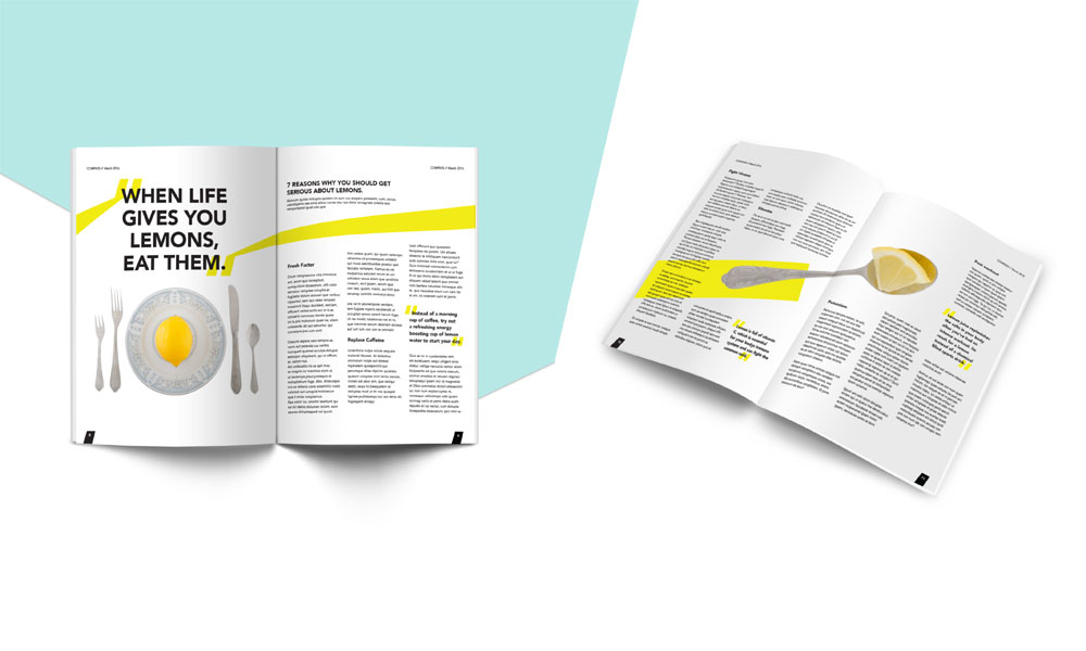
Compass magazine is a healthy living magazine targeted towards 18-25 year olds. Articles would feature organic foods, recipes and health tips.

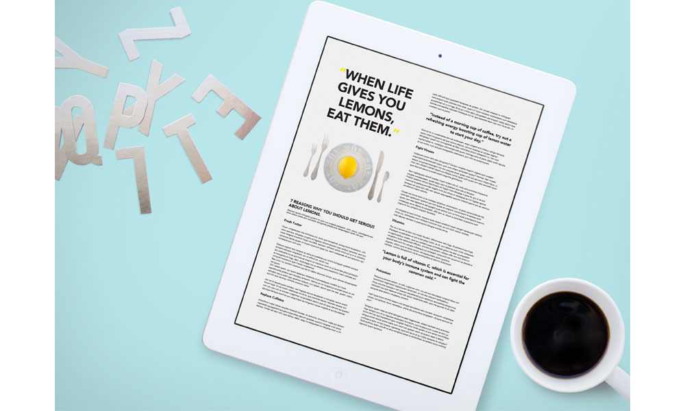
EPub version of Compass Magazine featured below.


