
Julie Gravelle
EmailThe sweet thing about the Cambrian College graphic design program is that I've learned that design is more than making things look nice. It's about having a great idea and meaning behind the work itself. The bitter thing about the program is staying up really late not having much time for friends, family or work. I also found myself often not knowing what to do or how to do certain projects. It was very difficult for me to create a concept behind my work especially on high stress, tiredness and deadlines.
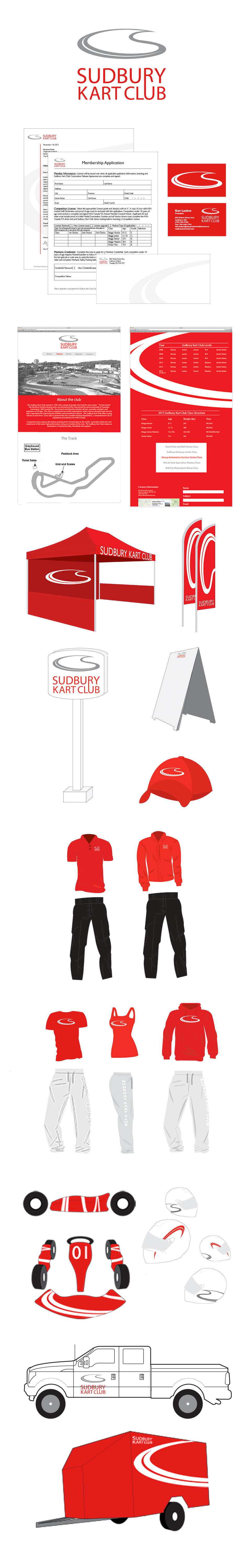
The Sudbury Kart Club features races all over Northern Ontario. In order to stand out, the redesigned identity is inspired by the unique shape of a kart track and includes the form of the "S" to represent Sudbury. The brand's new colours help create a stronger image in order to attract more members and gain more attention. With this new Identity, the community is able to gain a new sense of pride for it's racers.
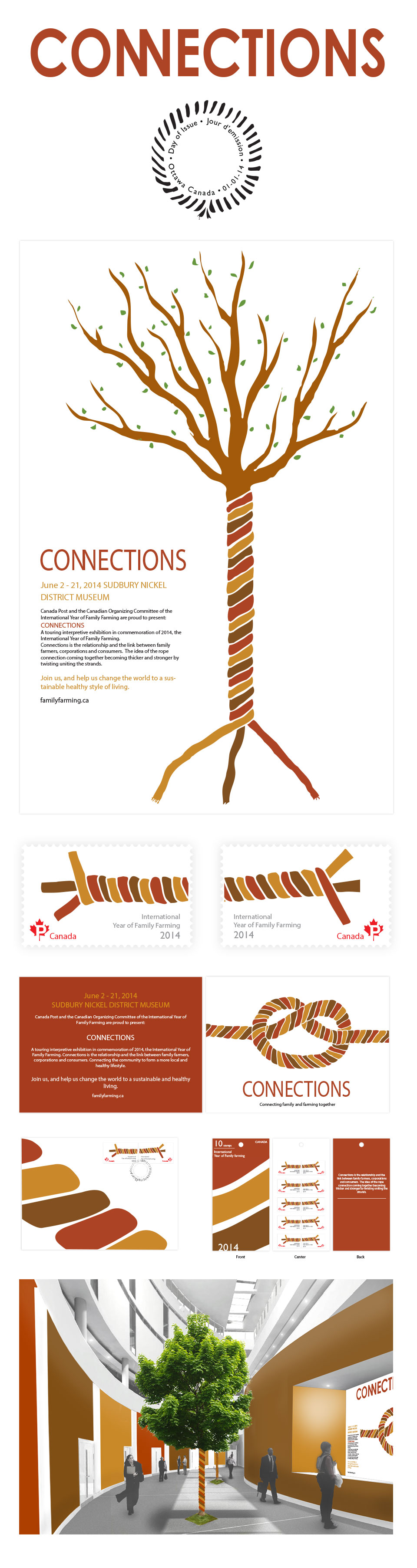
The approach was to come up with a way to connect families, family farmers and corporations together in order to create a healthy, more local lifestyle.

Bow magazine is specifically targeted towards the natural woman. The inspiration for the name came from the crossbow as you see the hidden arrow within the logo.
In association with:
