
Jesyka Bastelak
EmailGraphic Design was for me a leap of faith into a world I knew very little about. A world full of large egos, heated debates, and fun facts on typographic kerning which barley keeps the family awake at Christmas Dinner. All in exchange for the opportunity to make a difference in the lives of people, using creative design. I would be lying if I didn’t say the industry itself was bittersweet, but I would also be lying if I told you I didn’t love it for all its imperfections and eccentric individuals.
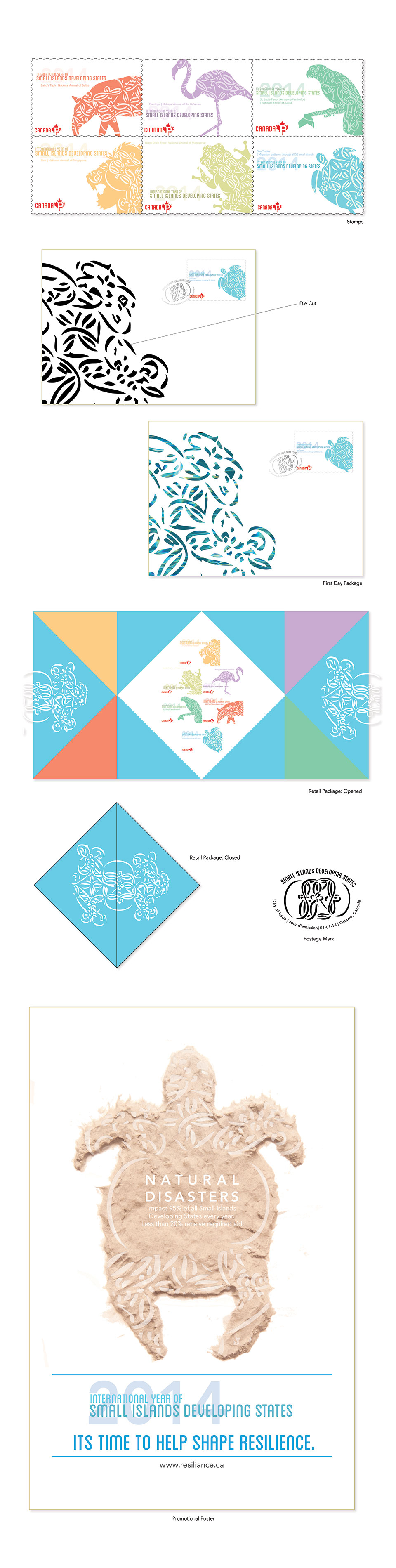
Taking inspiration from popular Vanuatu Sand Drawings, this work combines the unique geometric and cultural relevance of the sand drawings with 6 of the popular national animals of the 52 Small Islands Developing States. Combining unique graphic elements, beautiful illustrations and striking colours.
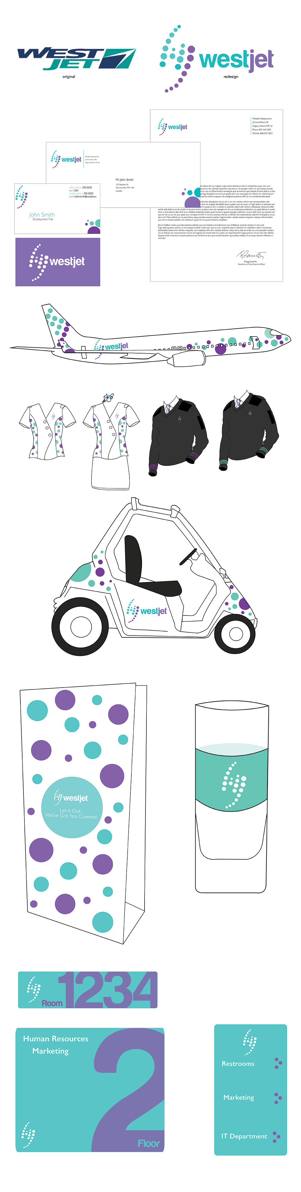
Using inspiration taken from jet paths and location placements on maps and other devices, the new logo uses a rhythmic circular movement of graphical elements to create a gestalt “W” and “J” within the logo. Colours keep the brand from falling into a boring sterile trend of modern airlines, and plays with a more family friendly and playful aesthetic.
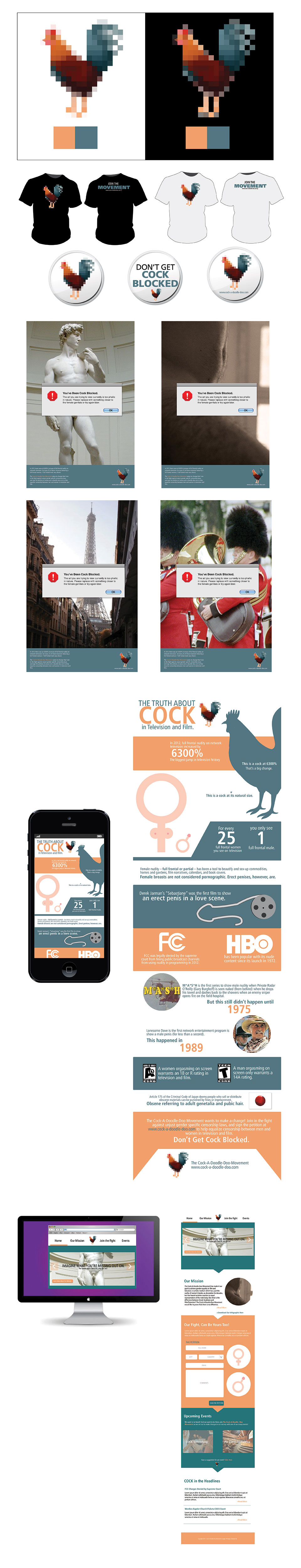
A witty and humorous campaign which focus’ its target on encouraging the artistic representation of male genitalia in television and film. Using creative copy, witty graphics, and relatable metaphors to raise awareness on an awkward topic for the general viewing public.
In association with:
